Imagine you’re at work, and a coworker rushes in. “Quick!” they say, staring at their phone. “Can you remember the number 42 for me?” Well, you probably can, and it seems important, so you make a mental note, 42. Then, they ask you to remember another number. And another. And another. By now, you’re probably breaking out the notepad and pen as you try to remember this long set of numbers.
There’s a good reason for that. The ability of our memories varies considerably, but like most things, it exists on a spectrum. Up one end, some people can remember and draw the skyline of New York with only a brief glimpse. Down the other end, there are those of us who exist on scraps of sleep as our 11-month-old wants to stay up late and show us his recently learned skill of clapping.
Most of us fall somewhere in between, capable of retaining just a few pieces of information at a time. This is where chunking becomes vital — breaking complexly architectured information into smaller, more digestible bits to help users understand and remember it better.
Everyday chunking
We already use chunking in our daily lives to make things easier to remember. Take a shopping list, for example. Instead of writing it as a random sequence like this — “potato, 3x tomato, 2x milk, eggs, spinach,” you’d likely categorize the items:
- Vegetables — Potato, (3) Tomato, Spinach
- Protein — Eggs
- Drinks — (2) Milk
By chunking items into categories, they become easier to remember. Your brain doesn’t have to track five different things at once — it just needs to recall the three categories.
This cognitive strategy is a cornerstone of memory. Breaking information down into smaller, more manageable chunks helps overcome the limitations of short-term memory and allows users to retain more.
Chunking content in web design
Chunking works on cognitive psychology — it can help outlive typical constraints of short-term memory to allow someone to retain more information on something.
I’ll use an example.
Back in 2013, bloomberg.com looked like this:
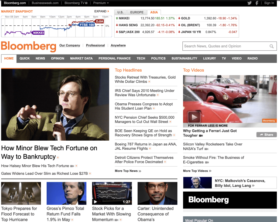
It’s a lot. How many individual items are there on the page? I’ve lost count.
Headlines are displayed, but there’s no categorization to them, covering a wide range of topics. Maybe you’d remember the tech fortune one, but not much else. There are a lot of topics across a range of categories that make it hard to sort through and remember.
But look at it today:
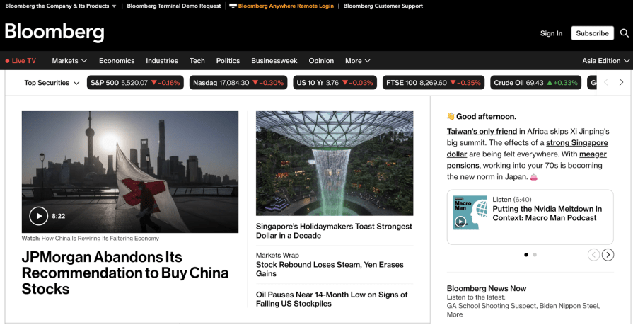
We begin to see a handful of items. And they all exist within the same realm — finance. In fact, a third of the page is given to a hand-waving emoji and a short summary of the news. But it’s easier to take in, and what we see here will probably stick with us for a longer time. There’s an obvious headline and sub-items on the page as well.
We could glance at this version of the website, and parts of it are likely to stay with us for longer. Pieces with a common theme are chunked together and effectively categorized.
Benefits of chunking content for UX
Of course, breaking information into smaller chunks has a trade-off: showing less at once. But the truth is that displaying less often leads to more being understood and retained.
Let’s look at a simple example.
Can you remember 20240905? Probably not. But what if you chunk it? 2024-09-05 becomes an easily recognizable date — September 5th, 2024. Instead of eight separate digits, you now have three easy-to-recall chunks. This method helps users retain information longer and more effectively.
It comes down to one question — how many things can we keep in our minds at once?
Well, Miller’s Law suggests that the human brain can only handle about seven chunks of information at a time, plus or minus two. So, overloading users with too much data will lead to cognitive fatigue, making your interface feel busy and frustrating.
Using chunking to your advantage
So, how can we use chunking to benefit our UX? Let me answer that for you:
- Understand your target audience — Who are you trying to connect with? Different people will have different interests, so surfacing the correct information from what you have on hand is important when you have to be strict about what you intend to show
- Stick to Miller’s law — People can only remember about seven things, give or take two. Think about what information you would like to place into those seven-ish things. But don’t split your page up into seven parts and then write a thousand-word essay for each part — that defeats the purpose
- Make excellent use of center stage — This isn’t the space to upsell or run an advert. Give short, concise, and relevant information here that the user will remember
- Clearly delineate unrelated information — If you’re looking at a list of news, how confusing would it be if all the headlines ran together? Keep each chunk on point for the given topic at hand
- Don’t over-chunk it — If you have a lot of information and you split it up without thinking about it, you’ll just have the same information spread out all over the page. Rationalize what needs to be shown to maximize what the user takes in
LinkedIn: A poor example of chunking
There’s no question that LinkedIn is a highly complex product when viewed in the context of software — there’s social media, content, recruitment, and so on.
So, what do you do? Your product does a thousand things, and your average user can only really work with six or so chunks at a time.
It can be tempting to split up the page into a few different sections, which is a good idea. But then, packing too much information into these different sections leads to an experience that feels cluttered or even jumbled. Just like the screen you see when you log into LinkedIn:
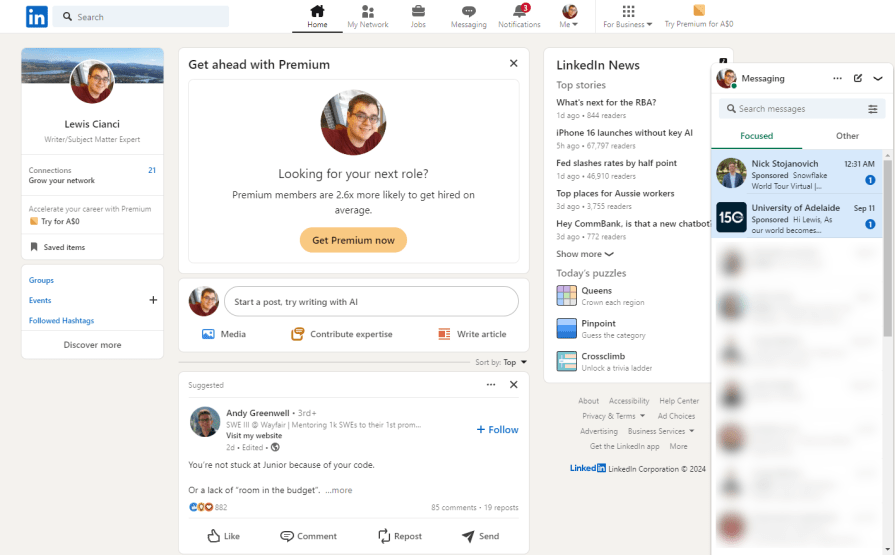
Technically, there is some chunking going on here, as individual page sections occur in seperate boxes. But, with only six boxes to show on this initial page (well, seven, counting the open messaging window), the contents of these windows are poorly rationalized.
For instance, the “Today’s Puzzles” section awkwardly sits under LinkedIn News. It’s a puzzling choice, pun intended. Why place unrelated content in the same section? The mix of news and games, along with cluttered sidebars, leads to a visually chaotic and overwhelming experience.
Plus, the center stage is underplayed, too. It is supposed to be the most important part of any webpage, so ideally, you should use it to show the most important, most relevant piece of information to the user and draw them in.
Unfortunately, LinkedIn squanders this real estate to upsell LinkedIn Premium. Instead of being drawn in by what’s been given the most central part of this page, it’s actually somewhat repulsive. People don’t like ads, so stapling one to the dead center of your webpage is almost as brave as it is wrong.
And there are so many better options for center stage here!
I’m a developer. I’d actually read the post about the junior developer and engage with it more if there were more to read without having to expand. Frustratingly, LinkedIn knows what posts are the most popular among people, but it doesn’t use that information to control what’s dead-center for you, though — poor UX.
Facebook: Ideal example of chunking
Despite being packed with features, Facebook excels at chunking its information effectively:
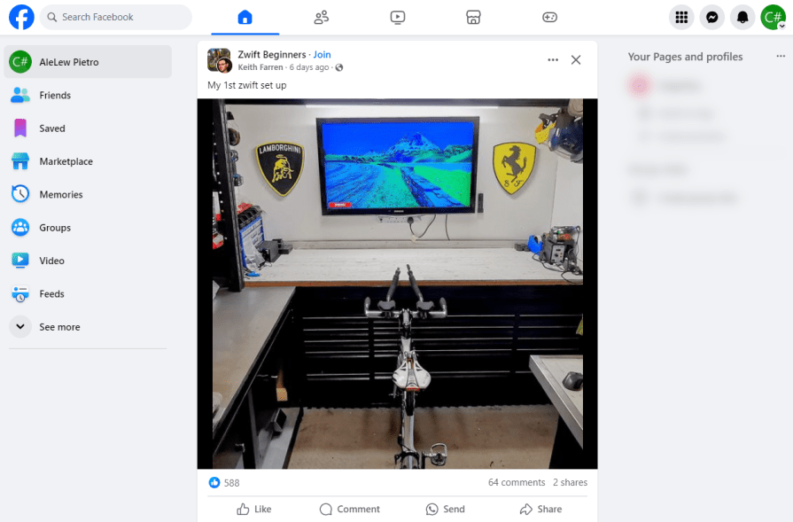
For a product that does such an extreme amount of things, the work put into simplifying what the user sees on their home page is plainly evident.
Information in the chunks is related. The left bar has a link to other pages. The center shows recent posts. Facebook knows that I haven’t seen that specific post before, and it knows that it’s popular because of how much it has been liked. That’s a great contender to put in front of me because I might actually engage with that post.
And there’s good use of icons. The buttons along the top are icons only because their use is clear. It’s not so hard to equate that a gamepad is a way to play games, for example. The more non-obvious links are to the left with a text description.
Plus, the minimal amount of information is shown to encourage engagement. By rationalizing what to show and only showing the minimal amount, my attention is drawn to the most colorful part of the page. And it’s a post showing someone’s Zwift setup in their shed. You know — I’d probably come back to check that out later to see if I could improve my setup. That’s a really good sign of retention.
Chunking done right, Facebook!
Conclusion
Break information into chunks, which makes it more digestible to the user. You already know that. But chunking is about more than just that.
Information in chunks should relate to one topic. If we’re technically compliant with breaking information up into chunks but then throw a lot of unrelated information together in one chunk, it’ll be hard for the user to retain any of it. News has nothing to do with games, and putting them in the same card muddies the point.
And, more importantly — capitalise on center stage. Users’ eyes will track to the most colorful/appealing part of the page. It’s critical that we put this to good use. Putting something there that a user will bounce off, like an advertisement or a component that doesn’t work, will make them bounce off the page.
Plus, strategize on the information shown. No product team wants to be left off the front page, their hard work buried deep within the app. But at the same time, deciding what to show needs to be ruthlessly justified.
Happy chunking!