In my day-to-day life as a front-end developer, I generally treat CSS as a collection of 2D layers. Other than reordering them using z-index, I don't often move things in 3D space.
And yet, for years now, browsers have bundled in a surprisingly capable 3D CSS engine! Someone even built an experimental first-person shooter prototype using it 😮
Today I'd like to leverage that 3D engine to perform a neat trick: folding up an image.
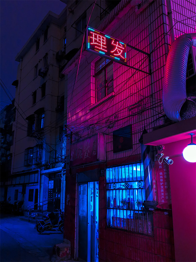
Here's what we'll be building. Check out how this beautiful neon photo(opens in new tab) by Francois Hoang is revealed through a 3D fold animation:
This effect could be useful in a number of scenarios:
As a preloader for images. They unfold once they're ready, and the folded copy could use a much-lower-res base64-encoded version!
As an on-mount animation when clicking to view an image, to add whimsical charm to an otherwise common feature.
For JS game development
This tutorial is React-specific, but the concepts can easily be ported to vanilla JS/CSS, as well as other front-end frameworks.
Link to this headingThe Trick
Unfortunately, the DOM has no primitive for this; you can't actually fold a DOM node in two.
Instead, we need to be sneaky; we'll use two images, and set them up so that it appears like a single image.
Each image is set to take up 50% of the real height, and then the bottom image has its background-position shifted up:
background-position: '0 0%'
Pretty convincing, right? By juxtaposing the same image twice, and tweaking the offset of the background image, we're able to give the impression of a single image.
To fold the bottom image up, we'll need to make use of a few CSS properties. This post will explain this technique in depth, but those who just want to see the code can find it on Github(opens in new tab).
Link to this headingTransform
Transform is our gateway to all sorts of effects. With transform, we can move stuff around, scale it larger and smaller, skew it, or rotate it.
In our case, we want to use a rotation, along the X axis:
transform: rotateX(0deg)

Link to this headingPerspective
By default, transforms still look very "2d". The rotations above don't look quite right, since objects closer to the viewer should look larger.
The solution to this is to apply a "perspective" property to the parent container. The value is given in px, and represents the distance that the viewer is from the item being transformed. The smaller the number, the more intense the transform effect.
perspective: 500px
Link to this headingTransform Origin
By default, rotations assume that you want to spin the items around their center point. The transform-origin property allows us to change the pivot point for rotation (and for all other transforms as well!)
Try changing it from the default "center" value to "top" or "bottom".
transform-origin: center center;
You’ll need to enable the rotation animation to see the effect of transform-origin. For more information about this property, check out my other post, “The World of CSS Transforms”.
Link to this headingOur MVP
With all those pieces, we can achieve a "minimum viable product" for this effect. Here's what we get when we combine them:
Code Playground
import React from 'react';
import styled from 'styled-components';
const FoldableImage = ({
  width,
  height,
  src,
}) => {
  const [foldAngle, setFoldAngle] =
    React.useState(0);
  const sharedStyles = {
    width,
    height: height / 2,
    backgroundSize: `${width}px ${height}px`,
    backgroundImage: `url(${src})`,
  };
  return (
    <div style={{ perspective: 500 }}>
      {}
      <div style={sharedStyles} />
      {}
      <div
        style={{
          ...sharedStyles,
          backgroundPosition: `0px -100%`,
          transform:
            `rotateX(${foldAngle}deg)`,
          transformOrigin: 'center top',
          willChange: 'transform',
        }}
      />
      {}
      <br />
      <label htmlFor="slider">
        Fold ratio:
      </label>
      <input
        id="slider"
        type="range"
        min={0}
        max={180}
        value={foldAngle}
        onChange={ev =>
          setFoldAngle(ev.target.value)
        }
        style={{ width }}
      />
    </div>
  );
};
export default function App() {
  return (
    <FoldableImage
      width={200}
      height={300}
      src="/img/city.jpg"
    />
  );
}
With a little bit of CSS and a sprinkle of React state, we have the fundamental effect we're after!
Link to this headingAccessibility
There's a subtle problem to this solution: images are meant to have alt tags, for users using screen readers. There is no way to specify an alt tag for a <div> with a background image. By using a background-image, we make this image invisible to assistive technologies.
Happily, there's an easy solution. Let's use a real <img> tag for the top half of our folding element. In order to prevent the whole image from showing, we'll put it in a half-height div with overflow: hidden.
Here's what this looks like:
Code Playground
import React from 'react';
import styled from 'styled-components';
const FoldableImage = ({
  width,
  height,
  src,
  alt,
}) => {
  const [foldAngle, setFoldAngle] =
    React.useState(0);
  const sharedStyles = {
    width,
    height: height / 2,
  };
  return (
    <div style={{ perspective: 500 }}>
      {}
      <div
        style={{
          ...sharedStyles,
          overflow: 'hidden',
        }}
      >
        {}
        <img
          src={src}
          alt={alt}
          style={{
            width,
            height,
          }}
        />
      </div>
      {}
      <div
        style={{
          ...sharedStyles,
          backgroundSize:
            `${width}px ${height}px`,
          backgroundImage:
            `url(${src})`,
          backgroundPosition: `0px -100%`,
          transform:
            `rotateX(${foldAngle}deg)`,
          transformOrigin: 'center top',
          willChange: 'transform',
        }}
      />
      {}
      <br />
      <label htmlFor="slider">
        Fold ratio:
      </label>
      <input
        id="slider"
        type="range"
        min={0}
        max={180}
        value={foldAngle}
        onChange={ev =>
          setFoldAngle(ev.target.value)
        }
        style={{ width }}
      />
    </div>
  );
};
export default function App() {
  return (
    <FoldableImage
      width={200}
      height={300}
      alt="A neon city at night"
      src="/img/city.jpg"
    />
  );
}
Adding whimsical details is great, but not when it comes at the expense of accessibility.
Link to this headingPolishing
You may have noticed, though, that it's missing some of the bells and whistles of the original demo. Let's flesh some of these out.
Link to this headingAdding a backface
In our original demo, the "back" of the card has a slightly-transparent white background. The idea is to make it seem like a slightly-seethrough piece of paper.
Let's tackle this problem in isolation at first, and then we can add it in to our full demo.
First, we need a new div, with a nearly-opaque white background. We'll position this in the same place as our card:
Code Playground
import React from 'react';
import styled, { keyframes } from 'styled-components';
const RotatingCard = ({
  width,
  height,
  src,
  alt,
}) => (
  <div style={{ perspective: 1000 }}>
    <Wrapper>
      {}
      <img
        alt={alt}
        src={src}
        style={{
          width,
          height,
          display: 'block',
        }}
      />
      {}
      <div
        style={{
          position: 'absolute',
          top: 0,
          left: 0,
          right: 0,
          bottom: 0,
          backgroundColor:
            'hsla(0, 100%, 100%, 0.9)'
        }}
      />
    </Wrapper>
  </div>
)
const rotationKeyframes = keyframes`
  from {
    transform: rotateY(0deg);
  }
  to {
    transform: rotateY(360deg);
  }
`
const Wrapper = styled.div`
  position: relative;
  display: inline-block;
  /*
    We'll only enable the animation for folks
    who have NOT ticked the “prefers-reduced-
    motion” checkbox
  */
  @media (prefers-reduced-motion: no-preference) {
    animation:
      ${rotationKeyframes}
      4000ms
      linear
      infinite;
  }
`
export default function App() {
  return (
    <RotatingCard
      width={210}
      height={280}
      alt="A neon city at night"
      src="/img/city.jpg"
    />
  );
}
Next, we need to make sure that this div is only shown when the card is facing the viewer. Happily, CSS has an elegant way to handle this scenario, built right into the language!
We need to learn about a couple more properties.
Link to this headingBackface Visibility and Transform Style
The backface-visibility property allows us to specify whether an item should be visible when it's rotated more than 90 degrees in either direction.
In this case, we also need to add transform-style: preserve-3d to the parent element (the one responsible for the animation). This property allows elements to be positioned in 3D space, and it allows backface-visibility to work correctly in this context.
Code Playground
import React from 'react';
import styled, { keyframes } from 'styled-components';
const RotatingCard = ({
  width,
  height,
  src,
  alt,
}) => (
  <div style={{ perspective: 1000 }}>
    <Wrapper
      style={{
        transformStyle: 'preserve-3d',
      }}
    >
      {}
      <img
        alt={alt}
        src={src}
        style={{
          width,
          height,
          display: 'block',
        }}
      />
      {}
      <div
        style={{
          backfaceVisibility: 'hidden',
          position: 'absolute',
          top: 0,
          left: 0,
          right: 0,
          bottom: 0,
          backgroundColor:
            'hsla(0, 100%, 100%, 0.9)',
        }}
      />
    </Wrapper>
  </div>
);
const rotationKeyframes = keyframes`
  from {
    transform: rotateY(0deg);
  }
  to {
    transform: rotateY(360deg);
  }
`
const Wrapper = styled.div`
  position: relative;
  display: inline-block;
  /*
    We'll only enable the animation for folks
    who have NOT ticked the “prefers-reduced-
    motion” checkbox
  */
  @media (prefers-reduced-motion: no-preference) {
    animation:
      ${rotationKeyframes}
      4000ms
      linear
      infinite;
  }
`
export default function App() {
  return (
    <RotatingCard
      width={210}
      height={280}
      alt="A neon city at night"
      src="/img/city.jpg"
    />
  );
}
Eagle-eyed readers—or, those who can read Chinese—might've noticed that this effect is backwards. Right now, we only see our white "back" when the card is facing forwards!
It makes sense, because both the card and the backside are facing the same way. We're only hiding the backside when the whole thing is rotated around.
We can fix this by being a little sneaky, and giving our backside element a 180-degree Y-axis rotation. When the card is facing forwards, our backface will be facing away, and backface-visibility: hidden will hide it.
We can also apply a very slight Z-translate, to push the element a bit further from the viewer than the card. This addresses an issue where the elements can appear to flicker, because both the card and the backdrop are occupying the same point in 3D space. We push it away from the user so that the backside is actually behind the card itself (which means it'll be in front of the card when it's rotated).
Code Playground
import React from 'react';
import styled, { keyframes } from 'styled-components';
const RotatingCard = ({
  width,
  height,
  src,
  alt,
}) => (
  <div style={{ perspective: 1000 }}>
    <Wrapper
      style={{
        transformStyle: 'preserve-3d',
      }}
    >
      {}
      <img
        alt={alt}
        src={src}
        style={{
          width,
          height,
          display: 'block',
        }}
      />
      {}
      <div
        style={{
          backfaceVisibility: 'hidden',
          position: 'absolute',
          top: 0,
          left: 0,
          right: 0,
          bottom: 0,
          backgroundColor:
            'hsla(0, 100%, 100%, 0.9)',
        }}
      />
    </Wrapper>
  </div>
);
const rotationKeyframes = keyframes`
  from {
    transform: rotateY(0deg);
  }
  to {
    transform: rotateY(360deg);
  }
`
const Wrapper = styled.div`
  position: relative;
  display: inline-block;
  /*
    We'll only enable the animation for folks
    who have NOT ticked the “prefers-reduced-
    motion” checkbox
  */
  @media (prefers-reduced-motion: no-preference) {
    animation:
      ${rotationKeyframes}
      4000ms
      linear
      infinite;
  }
`
export default function App() {
  return (
    <RotatingCard
      width={210}
      height={280}
      alt="A neon city at night"
      src="/img/city.jpg"
    />
  );
}
Spacial orientation is a hard thing to visualize (especially with nested rotations!), so don't be discouraged if it's not immediately obvious why this trick works. Playing with the live-editable code should help!
Link to this headingIncorporating into our original demo
How do we fit this into our <Foldable> component? We can add this new backside element to our "bottom half" div, and make sure to use 3D positioning:
Code Playground
import React from 'react';
import styled from 'styled-components';
const FoldableImage = ({
  width,
  height,
  src,
  alt,
}) => {
  const [
    foldAngle,
    setFoldAngle,
  ] = React.useState(0);
  const sharedStyles = {
    width,
    height: height / 2,
  };
  return (
    <div style={{ perspective: 500 }}>
      {}
      <div
        style={{
          ...sharedStyles,
          overflow: 'hidden',
        }}
      >
        <img
          src={src}
          alt={alt}
          style={{
            width,
            height,
          }}
        />
      </div>
      {}
      <div
        style={{
          ...sharedStyles,
          backgroundSize:
            `${width}px ${height}px`,
          backgroundImage:
            `url(${src})`,
          backgroundPosition:
            `0px -100%`,
          transform:
            `rotateX(${foldAngle}deg)`,
          transformOrigin: 'center top',
          willChange: 'transform',
          transformStyle: 'preserve-3d',
        }}
      >
        {}
        <div
          style={{
            position: 'absolute',
            inset: 0,
            background:
              'hsla(0, 100%, 100%, 0.9)',
            backfaceVisibility: 'hidden',
            transform:
              'rotateX(180deg) translateZ(.5px)',
          }}
        />
      </div>
      {}
      <br />
      <label htmlFor="slider">
        Fold ratio:
      </label>
      <input
        id="slider"
        type="range"
        min={0}
        max={180}
        value={foldAngle}
        onChange={ev =>
          setFoldAngle(ev.target.value)
        }
        style={{ width }}
      />
    </div>
  );
};
export default function App() {
  return (
    <FoldableImage
      width={200}
      height={300}
      src="/img/city.jpg"
      alt="A neon city at night"
    />
  );
}
Link to this headingFinal Details
Here our original demo is again:
There are a couple other small details we haven't covered.
Link to this headingShading
As the card moves through its first 90 degrees, the bottom half darkens, as if there's a light source that can't light the surface as well as it angles up.
For this effect, I added a new <div>, with a variable opacity. As the card rotation increases, I move closer to opaque.
See this line(opens in new tab) in the source.
Link to this headingThickness
As the card moves through the second half, there's the illusion of thickness, as if the card has an edge.
I discovered this one by accident, by playing with the amount of Z-axis translation when adding the backside. To get backface-visibility working, it technically only needs to be 0.01px, but by setting it to 2px, it gives this nice illusion of depth.
See this line(opens in new tab) in the source.
Link to this headingTranslation and Bug-fixing
In this demo, I wanted the whole card to move up as it's unfolded, so that it always appeared centered in the parent container.
This was accomplished with a transform: translateY() on the parent, using the percentage of opening as the value to tween based on.
I've also noticed that sometimes there can be a subtle flickering bug, in the crook of the fold, in certain browsers. The solution was to add a third copy of the image to fill in that small problematic area.
Full details available in the source(opens in new tab).
Link to this headingSpring physics
In the demo, I'm using React Spring to animate changes in value, when the slider is dragged. Spring physics produce much more organic, beautiful motion than using traditional easing. Its use is outside the scope of this article, but it has excellent documentation(opens in new tab) you can consult!
Link to this headingConclusion
Effects like this can be quite a lot of trouble, but the beauty of React is that it encourages the creation of reusable effects. After following this tutorial, you'll wind up with a <Foldable> component you can easily drop into any future project!
Because this effect is non-trivial, it's also quite rare. This means that it has more of a punch, because it's not something that users are accustomed to!
In this post, we looked exclusively at images, but you may wish to use this effect on other kinds of elements! You can do all sorts of fun things with this effect. ✨
Last updated on
September 13th, 2024