
How should a website look? What size should the buttons be? What layout should you use? Do your users need an OTP to reset their passwords? These are all questions that proper user interface and user experience (UI/UX) design answer.
Design prototyping and testing are critical steps in optimizing website UX functionality. One study reported that improving UX design led to a 400% increase in website conversions.
For such an important task, we need the best possible tools and resources we can get. And lately I’ve been enjoying using Sourcegraph’s Cody. Cody is an AI tool that speeds up coding by helping you understand, write, and fix code. It accesses information from your entire codebase, and also references documentation pages, to provide context about functions and variables, help create new code, and improve your design system.
When combined with Tailwind CSS, which is a utility-first CSS framework, you can rapidly build UI components that are both functional and visually appealing.
In this tutorial, I’ll teach you how to build UIs faster with Cody and Tailwind CSS so you can leverage AI to streamline your workflow.
Prerequisites
Basic understanding of JavaScript and front-end development.
Familiarity with Tailwind CSS.
Node.js installed on your system.
A code editor like Visual Studio Code (VS Code).
Cody. Sign up on Sourcegraph to get access (it’s free).
Table of Contents
What Will We Be Building?
How to Set Up Your Environment
How to Create UI Components with AI
More Complicated UIs
How to Improve and Manage Existing Codebases with Cody
Next Steps
What Will We Be Building?
Let’s build yet another Todo App, but with a spin. Each to-do item will have a timer that can be started, paused, and reset. This might be useful to track how much time you spend working on specific tasks.
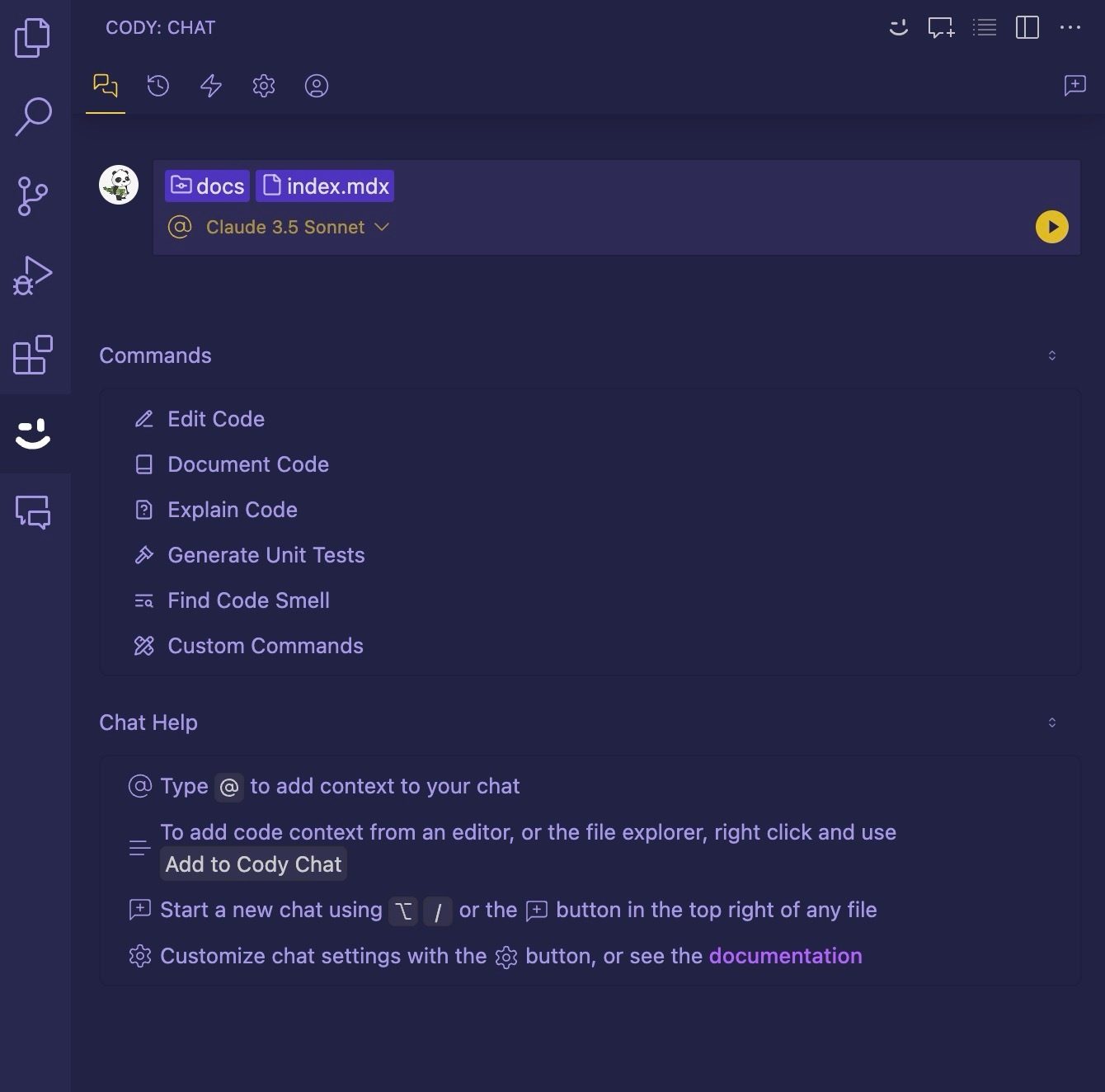
From the Cody docs, Cody's chat allows you to add files and symbols as context in your messages.
Type
@and then a filename to include a file as a context.Type
@#and then a symbol name to include the symbol's definition as context. Functions, methods, classes, types, and so on are all symbols.
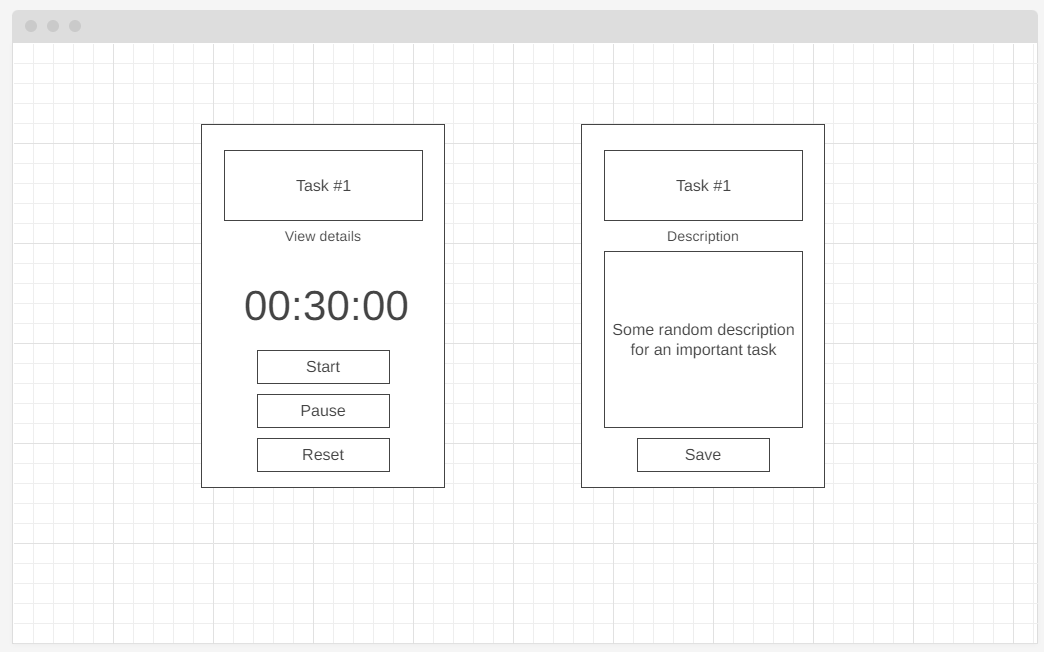
Even though Cody will be doing most of the heavy lifting, it’s great to have a plan of how we want the UI to look. Here are the wireframes I created with wireframe.cc:

Alright! Let’s get into it.
How to Set Up Your Environment
This tutorial uses Visual Studio Code, but the development process is similar across other code editors. If you haven’t set up an editor yet, choose one that suits your preference and install Node.js.
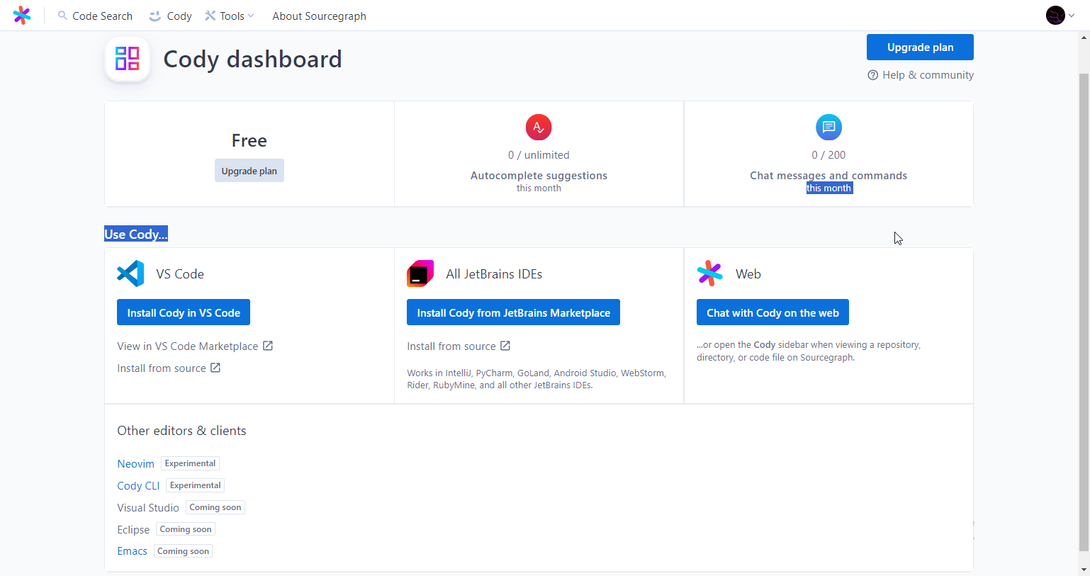
As of this article, Sourcegraph Cody is available on Visual Studio Code, Neovim, Cody CLI, Emacs, and all JetBrains IDEs
How to add Cody to your code editor
First, head over to the Cody landing page, click Get Cody for Free, and follow the prompts to sign up for a Sourcegraph account using your preferred authentication method—GitHub, GitLab, or Google.
Pick the right option for your code editor. If you’re using Visual Studio Code, that would be, Install Cody in VS Code.
Opening the extension in your code editor prompts a sign-in:
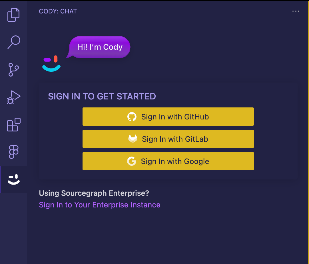
After signing in, we’re ready to go.
How to set up the project
We’ll be working with a Vite + React + TailwindCSS project, but these ideas can easily be applied to any other framework (think Vue, Astro, Svelte, or regular Vanilla JS) or styling library (like Bootstrap, Bulma, Foundation CSS, or anything you’d prefer).
Run the following command to create a new React project, abc-planning-todo-app:
npm create vite@latest abc-planning-todo-app -- --template react
Then install Tailwind CSS:
npm install -D tailwindcss postcss autoprefixer
npx tailwindcss init -p
Next, update tailwind.config.js with this code to configure Tailwind CSS for the project:
/** @type {import('tailwindcss').Config} */
export default {
  content: [
    "./index.html",
    "./src/**/*.{js,ts,jsx,tsx}",
  ],
  theme: {
    extend: {},
  },
  plugins: [],
}
Delete everything in ./src/index.css and add the following Tailwind CSS directives:
@tailwind base;
@tailwind components;
@tailwind utilities;
How to Create UI Components with AI
For consistency, let’s pick a color palette we’ll use for our to-do app.
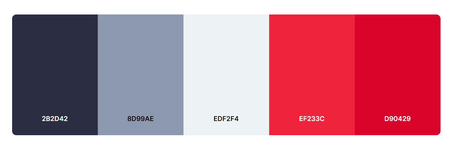
To use these colors in our Tailwind theme, we first need to give them descriptive names. Let's ask Cody for help!
For the rest of this article, all quotes represent a single prompt message used when chatting with Cody.
What would be good names for the following hex colors?
2B2D42
8D99AE
EDF2F4
EF233C
D90429
And then,
Update @tailwind.config.js to include these 5 hex colors above:
/** @type {import('tailwindcss').Config} */
export default {
  content: [
    "./index.html",
    "./src/**/*.{js,ts,jsx,tsx}",
  ],
  theme: {
    extend: {
      colors: {
        'midnight-navy': '#2B2D42',
        'cloudy-sky': '#8D99AE',
        'ice-white': '#EDF2F4',
        'vibrant-red': '#EF233C',
        'ruby-red': '#D90429',
      },
    },
  },
  plugins: [],
}
How to create basic UI components
First, we create the Header component. With templates for relatively uncomplicated components (for example text inputs, headers, buttons and dropdowns), it’s as simple as providing a name for the component, and the copy content it should contain.
Create a simple React Header Component with only company name on the far left and company motto on the far right. Use the Tailwind theme @tailwind.config.js
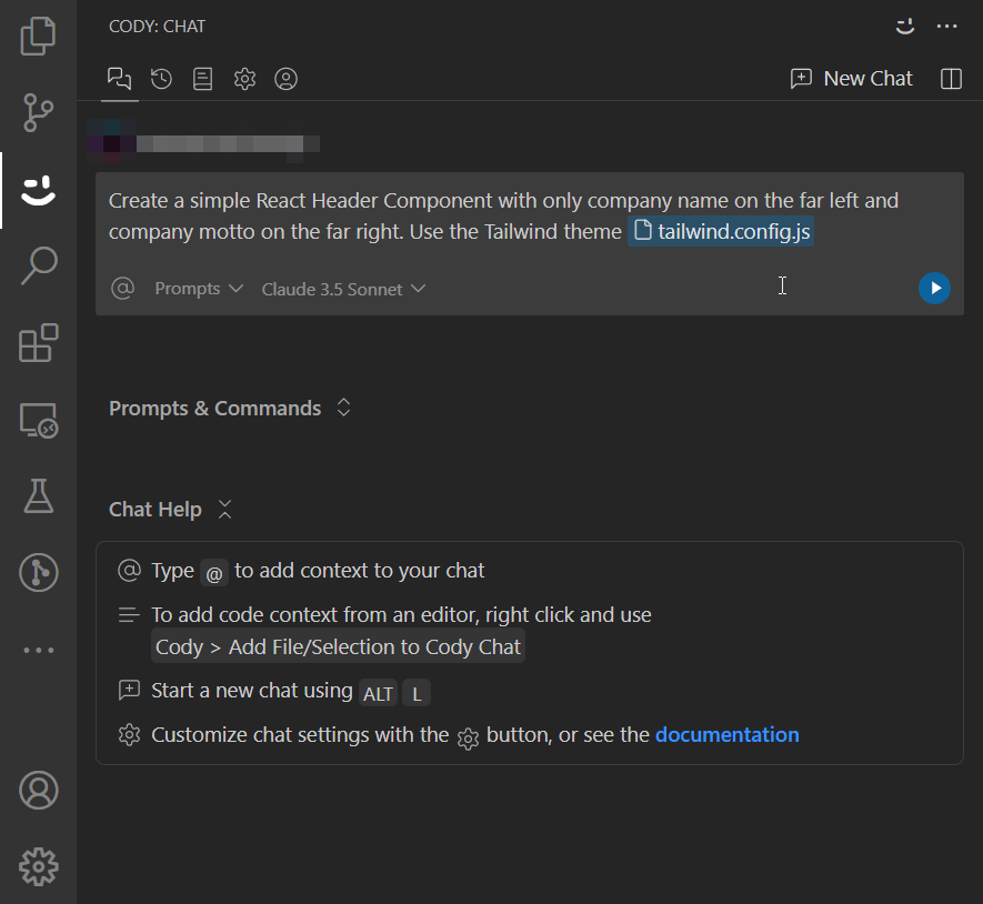
Cody will generate a Header component, which you can then copy and paste into ./src/components/Header.jsx.
You can also save the code to a new file in your project directly from the Cody chat.
// ./src/components/Header.jsx
import React from 'react';
const Header = () => {
  return (
    <header className="bg-midnight-navy text-ice-white p-4 flex justify-between items-center">
      <div className="text-2xl font-bold">
        Company
      </div>
      <div className="text-cloudy-sky italic">
        Innovate. Create. Inspire.
      </div>
    </header>
  );
};
export default Header;
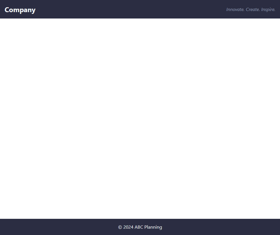
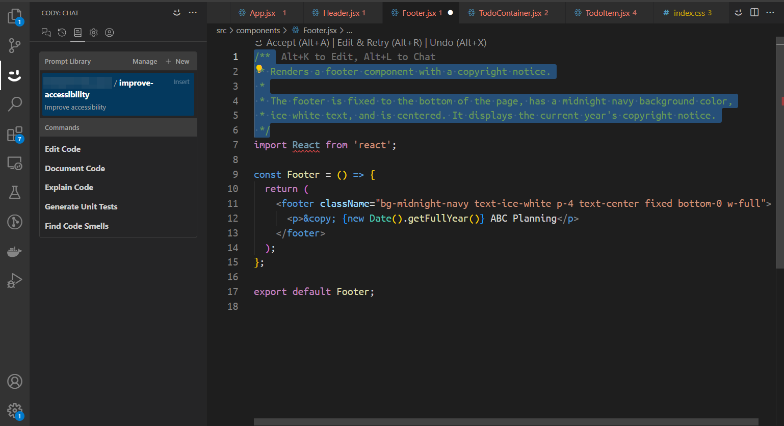
Next, create the Footer component with this prompt:
Create a simple React Footer Component with content Copyright C ABC Planning. Use the Tailwind theme @tailwind.config.js*. Ensure footer is always at the bottom of the viewport*
// ./src/components/Footer.jsx
import React from 'react';
const Footer = () => {
return (
<footer className="bg-midnight-navy text-ice-white p-4 text-center fixed bottom-0 w-full">
<p>© {new Date().getFullYear()} ABC Planning</p>
</footer>
);
};
export default Footer;
Let’s take a look at what we have so far.
More Complicated UIs
Next, we’ll need a container that will hold all our to-dos. Let’s ask Cody to create a to-do container component.
Create a React TodoContainer Component that will serve as a container for Todo items. Use the Tailwind theme @tailwind.config.js*. It should be mobile-responsive*.
We tell Cody:
What we want (a React component)
A brief description of how that component behaves/what it does (container for to-dos)
Any additional context – stylesheets, preferences, conventions, or anything else.
// ./src/components/TodoContainer.jsx
import React from 'react';
const TodoContainer = ({ children }) => {
  return (
    <div className="bg-ice-white min-h-screen p-4 sm:p-6 md:p-8">
      <div className="max-w-4xl mx-auto">
        <h1 className="text-midnight-navy text-3xl font-bold mb-6">Todo List</h1>
        <div className="grid grid-cols-1 sm:grid-cols-2 md:grid-cols-3 lg:grid-cols-4 gap-4">
          {children}
        </div>
      </div>
    </div>
  );
};
export default TodoContainer;
A good Chat-oriented programming (CHOP) strategy is to separate the creation of markup from the creation of content. This simplifies the prompting process.
Cody can generate both very well, but trying to fine-tune a single prompt for both tasks might be challenging. Each prompt should have a clear, specific goal for best results.
Let's now focus on the TodoItem component and split it into sections:
There's a to-do header which consists of a title with a border.
There's a View details button.
There's a timer showing how long ago the to-do was started.
There are control buttons (which reflect the state of the to-do)
Create a React TodoItem Component.
It consists of:
1. Task title. A header text with a border around it.
2. A simplified link/button "View details" below the todo header box.
3. A digital timer that shows hours, minutes, and seconds in the format 00:00:00.
4. Todo actions - "Start", "Pause", "Reset". Use relevant colors for each. The timer should be able to be started, paused and reset when the respective button is pressed.
It should look like a card (tall not wide) on a desktop.
It will be used with @TodoContainer.jsx
Use @tailwind.config.js theme
  // ./src/components/TodoItem.jsx
  import React, { useState, useEffect } from 'react';
  const TodoItem = ({ title }) => {
    const [time, setTime] = useState(0);
    const [isRunning, setIsRunning] = useState(false);
    useEffect(() => {
      let interval;
      if (isRunning) {
        interval = setInterval(() => {
          setTime((prevTime) => prevTime + 1);
        }, 1000);
      }
      return () => clearInterval(interval);
    }, [isRunning]);
    const formatTime = (seconds) => {
      const hours = Math.floor(seconds / 3600);
      const minutes = Math.floor((seconds % 3600) / 60);
      const secs = seconds % 60;
      return [hours, minutes, secs].map(v => v.toString().padStart(2, '0')).join(':');
    };
    const handleStart = () => setIsRunning(true);
    const handlePause = () => setIsRunning(false);
    const handleReset = () => {
      setIsRunning(false);
      setTime(0);
    };
    return (
      <div className="bg-ice-white rounded-lg shadow-md p-4 flex flex-col space-y-4 h-full">
        <h2 className="text-xl font-bold text-midnight-navy border-2 border-midnight-navy rounded p-2 text-center">
          {title}
        </h2>
        <button className="text-cloudy-sky hover:text-midnight-navy transition-colors">
          View details
        </button>
        <div className="text-3xl font-mono text-midnight-navy text-center">
          {formatTime(time)}
        </div>
        <div className="flex justify-between mt-auto">
          <button
            onClick={handleStart}
            className="bg-vibrant-red text-ice-white px-4 py-2 rounded hover:bg-ruby-red transition-colors"
          >
            Start
          </button>
          <button
            onClick={handlePause}
            className="bg-cloudy-sky text-midnight-navy px-4 py-2 rounded hover:bg-ice-white transition-colors"
          >
            Pause
          </button>
          <button
            onClick={handleReset}
            className="bg-midnight-navy text-ice-white px-4 py-2 rounded hover:bg-cloudy-sky transition-colors"
          >
            Reset
          </button>
        </div>
      </div>
    );
  };
  export default TodoItem;
From our wireframes, each to-do will have a detail state when its description is visible and can be updated. We’ll tell Cody to update the existing
TodoItem.jsxfile:Update @TodoItem.jsx to have a second state, when the view detail button is pressed. In this state, the TodoItem is composed of the following elements only:
1. Task header with the task title, same as before
2. A textbox with a description of the task
3. A save button, that emits an updateTask event, and switches the component back to its default state.
Include animations between the transition to create a clean feel and experience
  // ./src/components/TodoItem.jsx
  import React, { useState, useEffect } from 'react';
  const TodoItem = ({ title, description = '', onUpdateTask }) => {
    const [time, setTime] = useState(0);
    const [isRunning, setIsRunning] = useState(false);
    const [isDetailView, setIsDetailView] = useState(false);
    const [taskDescription, setTaskDescription] = useState(description);
    useEffect(() => {
      let interval;
      if (isRunning) {
        interval = setInterval(() => {
          setTime((prevTime) => prevTime + 1);
        }, 1000);
      }
      return () => clearInterval(interval);
    }, [isRunning]);
    const formatTime = (seconds) => {
      const hours = Math.floor(seconds / 3600);
      const minutes = Math.floor((seconds % 3600) / 60);
      const secs = seconds % 60;
      return [hours, minutes, secs].map(v => v.toString().padStart(2, '0')).join(':');
    };
    const handleStart = () => setIsRunning(true);
    const handlePause = () => setIsRunning(false);
    const handleReset = () => {
      setIsRunning(false);
      setTime(0);
    };
    const handleViewDetails = () => setIsDetailView(true);
    const handleSave = () => {
      onUpdateTask({ title, description: taskDescription });
      setIsDetailView(false);
    };
    return (
      <div className="bg-ice-white rounded-lg shadow-md p-4 flex flex-col space-y-4 h-full transition-all duration-300 ease-in-out">
        <h2 className="text-xl font-bold text-midnight-navy border-2 border-midnight-navy rounded p-2 text-center">
          {title}
        </h2>
        {isDetailView ? (
          <>
            <textarea
              className="flex-grow p-2 border-2 border-cloudy-sky rounded resize-none transition-all duration-300 ease-in-out"
              value={taskDescription}
              onChange={(e) => setTaskDescription(e.target.value)}
              placeholder="Enter task description..."
            />
            <button
              onClick={handleSave}
              className="bg-vibrant-red text-ice-white px-4 py-2 rounded hover:bg-ruby-red transition-colors"
            >
              Save
            </button>
          </>
        ) : (
          <>
            <button
              onClick={handleViewDetails}
              className="text-cloudy-sky hover:text-midnight-navy transition-colors"
            >
              View details
            </button>
            <div className="text-3xl font-mono text-midnight-navy text-center">
              {formatTime(time)}
            </div>
            <div className="flex justify-between mt-auto">
              <button
                onClick={handleStart}
                className="bg-vibrant-red text-ice-white px-4 py-2 rounded hover:bg-ruby-red transition-colors"
              >
                Start
              </button>
              <button
                onClick={handlePause}
                className="bg-cloudy-sky text-midnight-navy px-4 py-2 rounded hover:bg-ice-white transition-colors"
              >
                Pause
              </button>
              <button
                onClick={handleReset}
                className="bg-midnight-navy text-ice-white px-4 py-2 rounded hover:bg-cloudy-sky transition-colors"
              >
                Reset
              </button>
            </div>
          </>
        )}
      </div>
    );
  };
  export default TodoItem;
Now let’s create a new root component that makes use of our components:
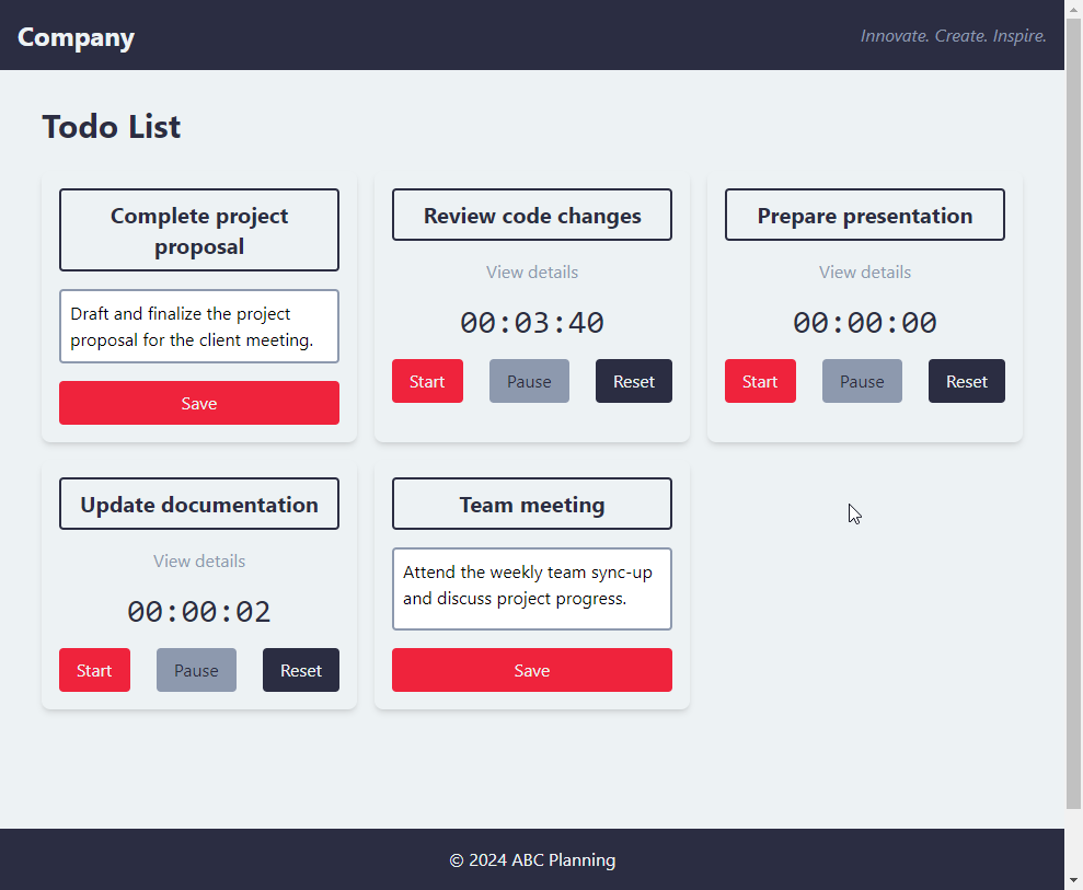
Generate an App.jsx that makes use of @Header.jsx*,* @TodoItem.jsx*,* @TodoContainer.jsx*, and* @Footer.jsx appropriately. Use simple JavaScript variables as state data and implement whatever functions are relevant. Have a minimum of 5 to-do items.
  // ./src/App.jsx
  import React, { useState } from 'react';
  import Header from './components/Header';
  import TodoContainer from './components/TodoContainer';
  import TodoItem from './components/TodoItem';
  import Footer from './components/Footer';
  const App = () => {
    const [todos, setTodos] = useState([
      { id: 1, title: 'Complete project proposal', description: 'Draft and finalize the project proposal for the client meeting.' },
      { id: 2, title: 'Review code changes', description: 'Go through the pull requests and provide feedback on the code changes.' },
      { id: 3, title: 'Prepare presentation', description: 'Create slides for the upcoming team meeting presentation.' },
      { id: 4, title: 'Update documentation', description: 'Review and update the project documentation with recent changes.' },
      { id: 5, title: 'Team meeting', description: 'Attend the weekly team sync-up and discuss project progress.' },
    ]);
    const handleUpdateTask = (updatedTask) => {
      setTodos(todos.map(todo =>
        todo.id === updatedTask.id ? { ...todo, ...updatedTask } : todo
      ));
    };
    return (
      <div className="flex flex-col min-h-screen">
        <Header />
        <main className="flex-grow">
          <TodoContainer>
            {todos.map(todo => (
              <TodoItem
                key={todo.id}
                title={todo.title}
                description={todo.description}
                onUpdateTask={(updatedTask) => handleUpdateTask({ id: todo.id, ...updatedTask })}
              />
            ))}
          </TodoContainer>
        </main>
        <Footer />
      </div>
    );
  };
  export default App;
Here’s what we now have:
How to Improve and Manage Existing Codebases with Cody
To further boost your productivity, Cody offers prompts and commands.
You can save frequently used prompts for future use and share them with other team members within your organization. Commands offer quick, ready-to-use shortcuts for common coding tasks like writing, describing, fixing, and identifying code issues.
Let’s add documentation to our code!
Firstly, select the code you would like to generate documentation for, we’ll use TodoItem.jsx for this example. Run the Document Code command, and we get a JSDoc docstring for the Footer component class.
Let’s make our components more accessible and inclusive
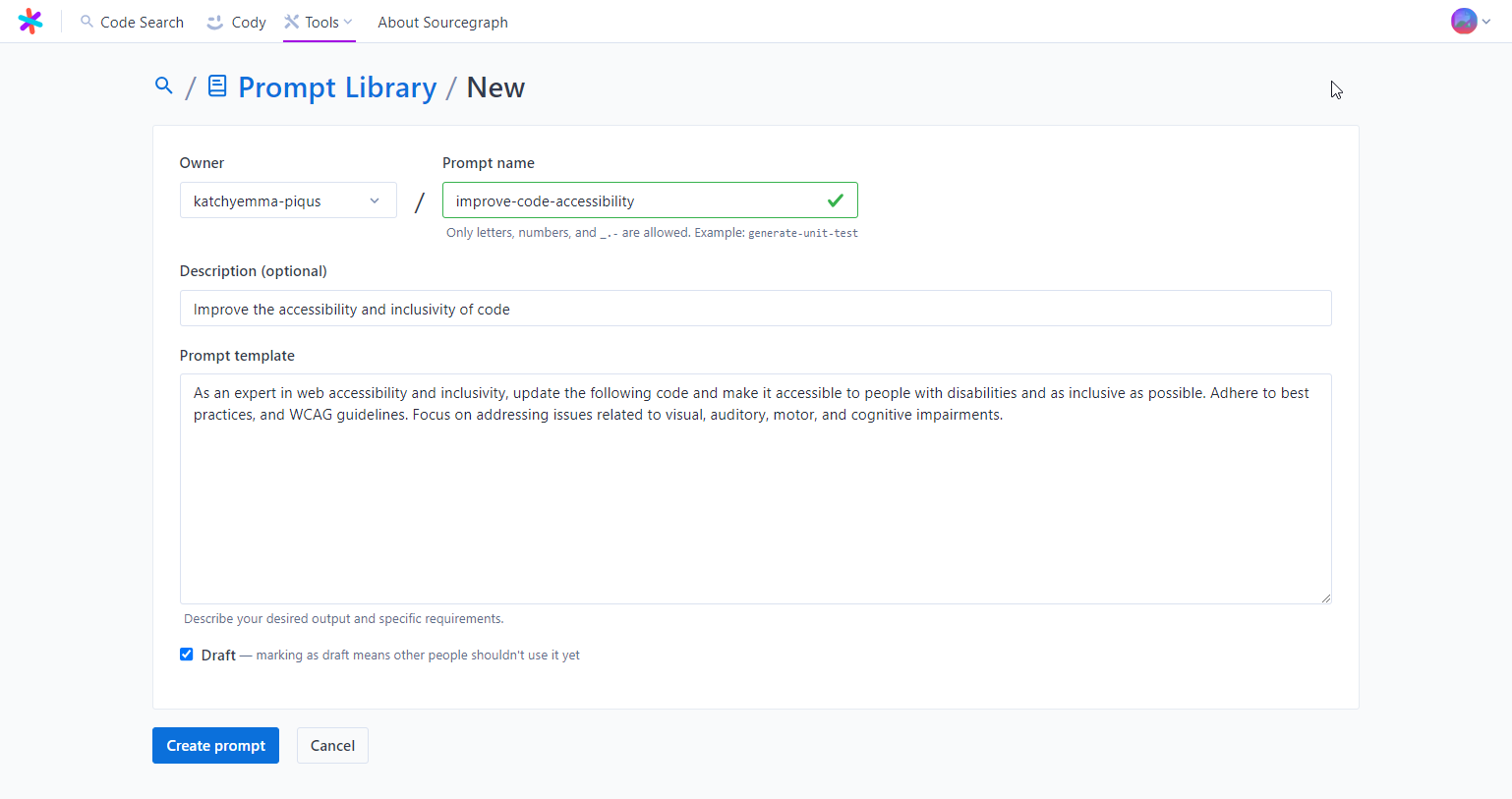
We can save our favorite and frequently used chat prompts on the Prompt Library via the Sourcegraph's Web UI.
Let’s create a new prompt to improve the accessibility of our web app and ensure it adheres to the WCAG standard.
We can now use this prompt back in VS Code.
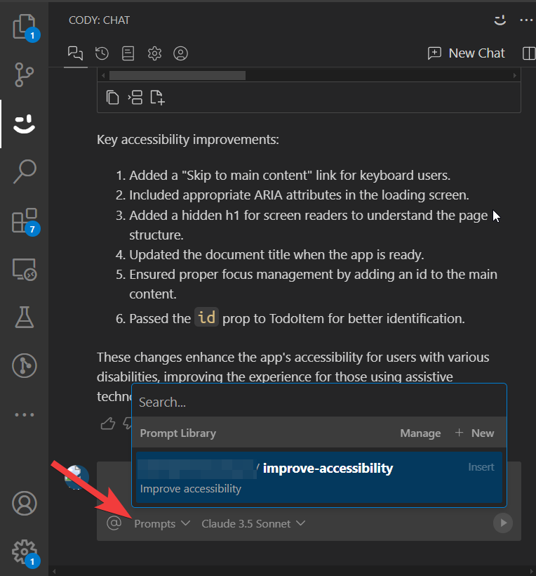
Above you can see the results from our accessibility prompt.
How to Use AI Responsibly for Code Generation
AI tools can significantly speed up your workflow, but it's essential to remember that AI is still a work in progress. As powerful as these tools can be, they can also make mistakes or "hallucinate," producing code that seems correct but doesn't actually work in your specific context.
To use AI responsibly for coding, it’s crucial to approach it from a point of understanding what needs to be done. Before relying on AI, make sure you have a solid grasp of the task at hand. AI works best when used as a productivity booster rather than a replacement for your expertise.
Here are a few key things to keep in mind when working with AI-generated code:
Double-check the code: Always run and test the code generated by AI. Even if it looks correct at first glance, there could be subtle errors or inefficiencies. It's your responsibility to ensure the code is functional and meets your project’s requirements.
Understand the output: Before using any AI-suggested code, take time to understand how it works. This will allow you to quickly identify any mistakes and integrate the code effectively with the rest of your project.
When used thoughtfully and carefully, AI can make your development process more efficient and help you focus on higher-level tasks. However, it’s essential to balance its use with human oversight to ensure the quality and accuracy of the code you're building.
Next Steps
Creating user-friendly UIs has traditionally been time-consuming and difficult to manage. But using Cody, we created an interactive and attractive user interface with minimal effort. Cody supported us throughout the entire development process.
Here are some potential enhancements you can make:
We can’t create or delete tasks. Try to fix that.
Develop a component to display total tasks and accumulated hours.
Add test cases for each component. We can do this quickly using the Generate Unit Tests command.
If you enjoyed learning about Cody, you can try more of its features and applications. Sign up for a free, forever account and boost your productivity designing, creating, documenting, and managing applications.
Further reading
If you want to learn more, you can read this article about chat-oriented programming (CHOP) and how to use Cody for it: Chat-oriented programming (CHOP) in action.