As a product manager, you often hear questions like “Why hasn’t someone dealt with my request?” or “Why haven’t you assigned it a higher priority?” These aren’t easy questions to answer because emotions come into play and overshadow product needs. Stakeholders tend to view their own requests as the most important and request higher priorities.
Knowing this, how should you organize your product backlog? Which elements should be implemented first?
For starters, you want to make sure that you have a way to present your decision-making process so that your strategy remains transparent and easy to understand. To help you get started, try using a Pareto chart to visualize the importance of requests for a particular problem.
This article unpacks Pareto charts, including how to create them, their application in product management, and their benefits and limitations.
What is a Pareto chart?
A Pareto chart combines a bar chart with a line chart to visually represent the Pareto Principle (80/20 rule). It shows the individual value for each item in descending order as a bar and a cumulative total as an ascending line.
The chart provides an easy way to identify the most important points that contribute to a problem. Once identified, you can prioritize your time and budget accordingly.
What is the Pareto Principle?
You might also have heard the Pareto Principle referred to as the 80/20 rule. Vilfredo Pareto was a professor of economics at the University of Lausanne. In 1906, he made a famous observation that 20 percent of the population of Italy owned 80 percent of the property.
In 1941, Joseph M. Juran generalized the rule from Pareto to the 80/20 rule and began to apply it to quality issues. The rule, often referred to as “the vital few and the useful many,” states that roughly 80 percent of the effects come from 20 percent of the causes. So, in other words, a small number of items (or causes) often leads to a large portion of the desired effects.
How to create a Pareto chart?
A Pareto chart places all elements in descending order and graphically displays the contribution of each individual element to the overall result. In this way, you can determine which elements contribute the most to the desired result.
To use Pareto analysis for product backlog management, you need to perform a few steps:
1. Define the problem you want to optimize
The first step is to define the problem you want to optimize with the Pareto chart. For example, do you want to maximize the value or minimize the risk?
2. Create a list of all your backlog items and choose a measurement
Once you define your problem, create a list of all your backlog items. Ideally, your backlog should be up to date and ready to use. After this, determine a unit of measurement to assess each of your backlog items. For example, you might choose user value as the measure and value points as the unit of measurement.
3. Estimate or assign your values to each backlog item
Next, assign each backlog item a value. You can estimate the values with your team or measure and objectify them.
4. Collect your data
Collect data in a suitable form and tool, such as Microsoft Excel or Google Sheets. Make sure to add a timestamp and a description of how you collected the data and values. For example, provide the data with a date and timestamp and note that the values were estimated using a planning poker from zero to one hundred and are copied from the product backlog.
5. Order and calculate the percentages
The Pareto chart is based on the following formula:
[unit of measurement per item] / [aggregated sum of all items] x 100 percent
For each item, calculate the percentage and order the list from highest to lowest.
6. Create an aggregate for the percentage value
Aggregate the percentage in a separate column row by row until you reach 100 percent in the last row.
7. Plot the Pareto chart
At this point, you can plot the Pareto chart. The first (left) y-axis represents the values/the measurement, the second (right) y-axis represents the cumulative percent values, and the horizontal x-axis contains the different items. Bars display the values of each item and the line graph shows the cumulative percentages:

8. Pareto chart analysis
Once you have the chart, analyze it and separate the “few vital items” from the “many useful” ones. In the best case, you get an 80/20 separation, which means 20 percent of the items contribute 80 percent of the solution.
9. Act on your findings
After executing the analysis act on your findings, reprioritize the backlog, and implement a strategy for your product.
10. Monitor, update, and repeat
Monitor the backlog and update your numbers as you learn more. You can also try to improve your numbers and objectify them. Repeat the whole process as you proceed with your product management.
Pareto chart example
To help you get started, consider the process for developing a new AI-powered calendar app. A Pareto chart would help you figure out which backlog items will bring the most value to your users. Assume the initial backlog has around 20 items.
The table below shows the backlog items with their estimated effort and user value in descending order:
| No. | Backlog item | Effort (hours) | User value (value score) |
0 | User registration/login | 15 | 120 |
1 | Group creation and management | 25 | 115 |
2 | Integrate calendar sync (Google, Outlook, etc.) | 120 | 110 |
3 | Automated time suggestion | 100 | 105 |
4 | Time zone support | 70 | 85 |
5 | Availability polling system | 85 | 80 |
6 | AI-based conflict detection | 275 | 75 |
7 | Automated reminders | 55 | 70 |
8 | RSVP and confirm meeting | 8 | 50 |
9 | Mobile-friendly interface | 25 | 45 |
10 | Meeting duration customization | 13 | 40 |
11 | Recurring meeting support | 65 | 35 |
12 | Meeting agenda input | 5 | 30 |
13 | Group availability visualization | 75 | 25 |
14 | Slack/Teams integration | 52 | 20 |
15 | Customizable availability preferences | 20 | 15 |
16 | User role management | 13 | 12 |
17 | Instant messaging for group coordination | 18 | 10 |
18 | Export meeting details to calendar | 30 | 8 |
19 | Privacy controls for availability | 8 | 5 |
Once you do this, calculate the cumulative value and percentage.
As an example, look at “user registration/login.”
The user value for registration and login is 120 Value Points because it’s an essential feature to use the application. The backlog contains 20 items, with a total of 1055 Value Points.
The formula for this item is:
[120 value points] / [1055 value points] x 100 percent = 11.37 percent
To calculate the value for the next item “group creation and management” you would add the 120 value points of the login feature plus the 115 value points of the group management feature:
[120+115=235 value points] / [1055 value points] x 100 percent = 22.27 percent
This results in a table like:
| No. | Backlog Item | Effort (hours) | User value (value score) | Cumulative value | Cumulative percentage |
0 | User registration/login | 15 | 120 | 120 | 11.3 percent |
1 | Group creation and management | 25 | 115 | 235 | 22.27 percent |
2 | Integrate calendar sync (Google, Outlook, etc.) | 120 | 110 | 345 | 32.70 percent |
3 | Automated time suggestion | 100 | 105 | 450 | 42.65 percent |
4 | Time zone support | 70 | 85 | 535 | 50.71 percent |
5 | Availability polling system | 85 | 80 | 615 | 58.2 percent |
6 | AI-based conflict detection | 275 | 75 | 690 | 65.40 percent |
7 | Automated reminders | 55 | 70 | 760 | 72.04 percent |
8 | RSVP and confirm meeting | 8 | 50 | 810 | 76.78 percent |
9 | Mobile-friendly interface | 25 | 45 | 855 | 81.04 percent |
10 | Meeting duration customization | 13 | 40 | 895 | 84.83 percent |
11 | Recurring meeting support | 65 | 35 | 930 | 88.15 percent |
12 | Meeting agenda input | 5 | 30 | 960 | 91.00 percent |
13 | Group availability visualization | 75 | 25 | 985 | 93.36 percent |
14 | Slack/Teams integration | 52 | 20 | 1005 | 95.26 percent |
15 | Customizable availability preferences | 20 | 15 | 1020 | 96.68 percent |
16 | User role management | 13 | 12 | 1032 | 97.82 percent |
17 | Instant messaging for group coordination | 18 | 10 | 1042 | 98.77 percent |
18 | Export meeting details to calendar | 30 | 8 | 1050 | 99.53 percent |
19 | Privacy controls for availability | 8 | 5 | 1055 | 100.00 percent |
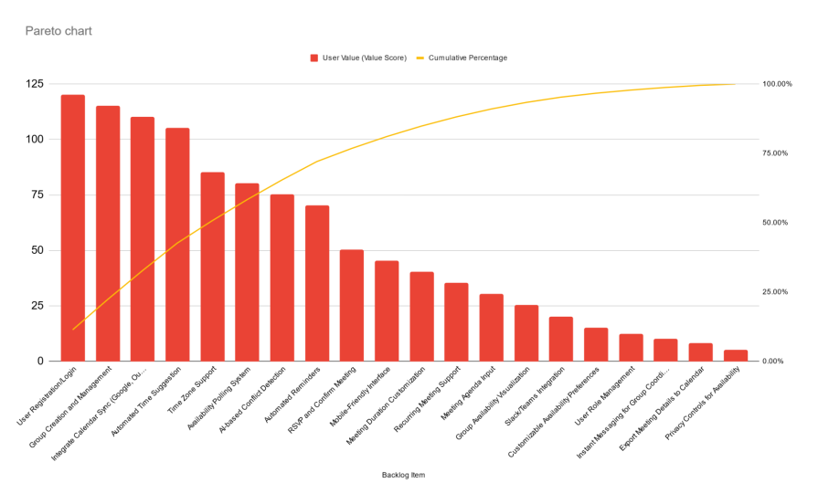
The Pareto chart of this data shows that the first eight backlog Items already deliver 72 percent of all the value points of the product:
You can use this information to focus on these features first. By doing so, you can deliver your product to market earlier so that you can collect feedback from your customers and make adjustments accordingly.
Benefits of using Pareto charts
Pareto charts offer you a way to handle prioritization and stand out for their:
Ease of use
The biggest advantage of a Pareto chart is its ease of use. It lets you quickly identify the 20 percent of root causes that generate 80 percent of the effect. All you need is some reliable data and a calculation program like Excel or Google Sheets.
Ability to update and improve
A Pareto chart allows for fast and quick updates, as well as the comparison of historical data. You can use its insights to guide decision-making regarding whether to stay the course on a particular strategy or to pivot and move towards something else.
Transparent decision-making
Pareto analysis bases decisions on transparent data. Because it’s easy to understand, you can easily share insights with shareholders and keep your team aligned.
Limitations of Pareto charts
Despite the benefits of Pareto charts, they do also come with a few limitations. These include:
Oversimplification of problem and solution
The method depends on the quality of your data and measurements, as well as the problem that you define. If your goals and measurements are off, prioritizing them in your backlog won’t solve your ultimate problem. Planning is vital.
Dependency on data quality
As alluded to above, the whole process depends heavily on the quality of your data. In the example you saw, all the measurements were estimated. If your estimation team fails to provide accurate information, the Pareto analysis won’t produce meaningful results.
Not keeping feedback loops running
Many times, product managers forget or run out of time to implement feedback loops into the Pareto process. You cannot base your strategy on a static set of data. Revisit and recalculate your Pareto charts with updated data on a routine basis.
Key takeaways
Pareto charts are an important tool to help you make data-driven decisions. With a defined Pareto analysis process, you can utilize the 80/20 rule to identify the most effective actions that ensure your product’s success.
Remember that the method depends on the quality of your data and goals. Avoid thinking of Pareto charts as a static solution. Product development is dynamic, and regular updates to the backlog and re-calculation of the Pareto analysis ensure that decisions remain relevant and responsive to evolving product needs and market conditions.
Featured image source: IconScout