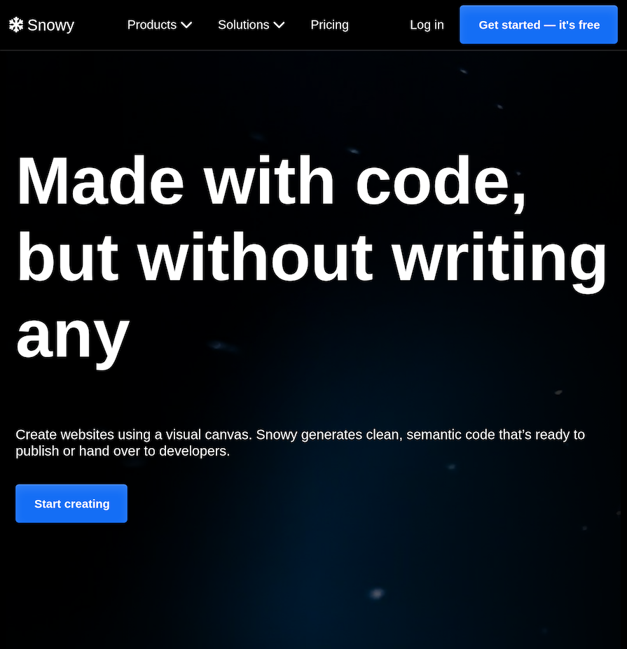
As a designer or developer, there are times when you want to alter the flow and alignment of text content to make it look more legible and aesthetically pleasing. For example, imagine you have a headline with just one word in a line.

Visually, this looks odd:
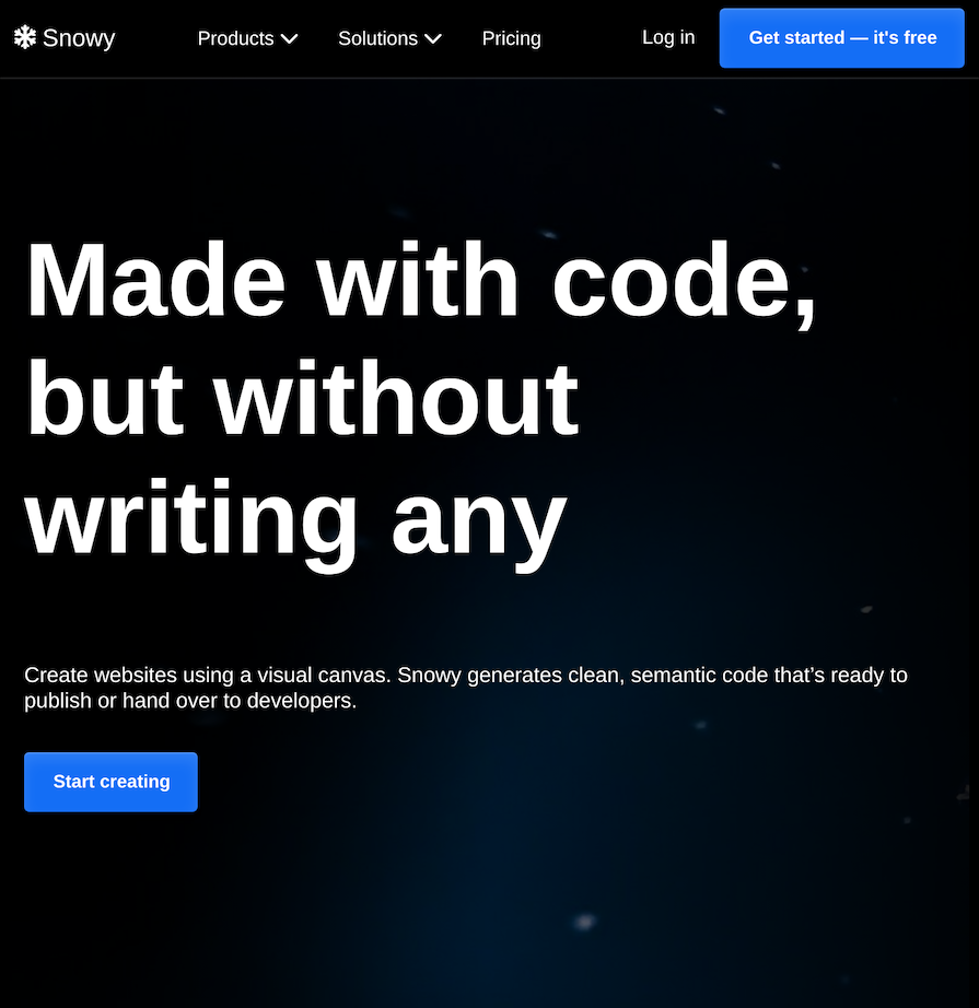
There is even a special name for this! Whenever a line has a single word, this is known as a widow or orphan. If you even out the length of the lines, it looks more legible and appealing:
This formatting technique used to be a predominantly manual process. The control of text wrapping, which is the process of breaking text up over multiple lines, has been quite limited in CSS. When you couple this with responsive layouts and the variability of content, it makes it difficult to deliver consistent text formatting outcomes as a developer.
Fortunately, some changes proposed in the CSS Text Level 4 Specification have made it to browsers and are coming to our rescue! 🛟 There are two new values for the text-wrap property: balance and pretty, which can be used to hand this tedious work over to the browser.
The limitations of other text-wrapping techniques
There are a variety of methods for breaking up words and lines to control the text flow. They all fall short in some respect and typically require manual intervention.
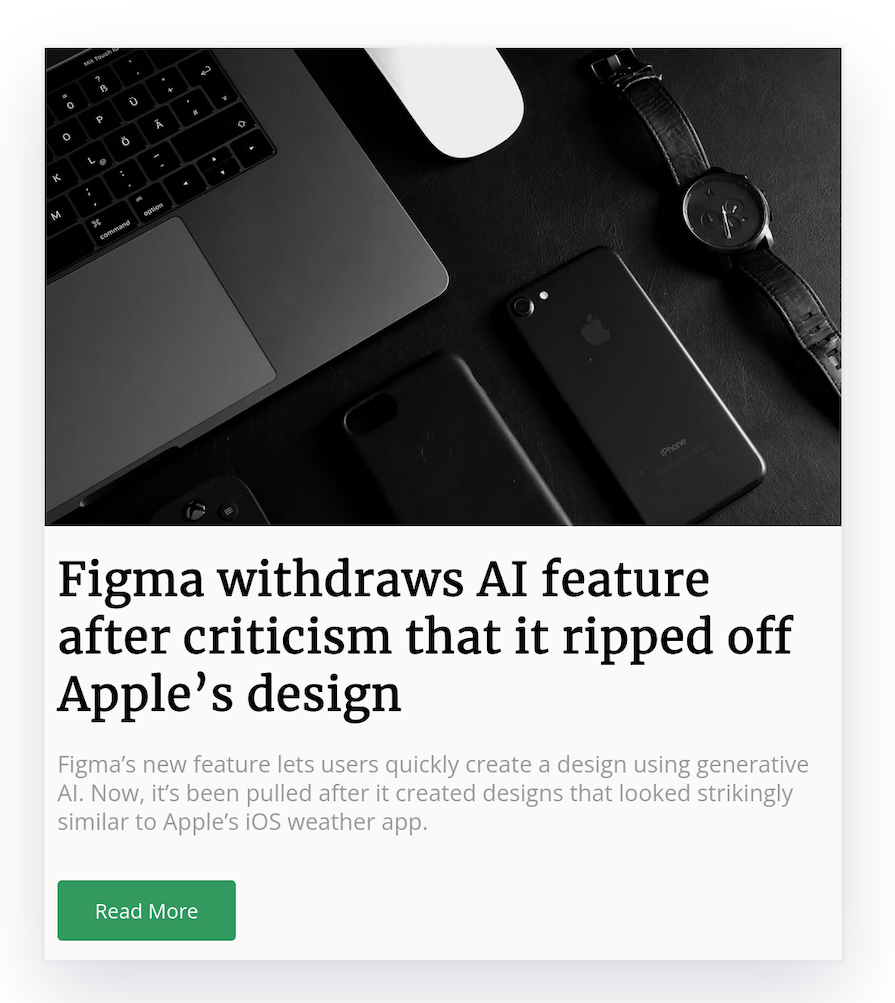
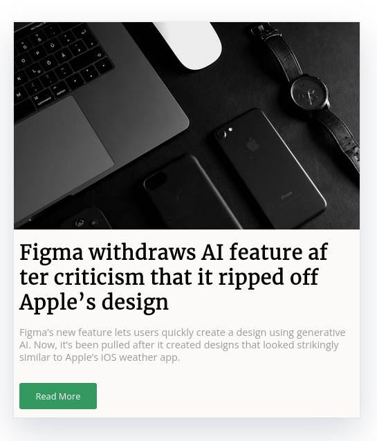
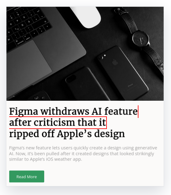
Let’s look at an example to highlight the shortcomings of the other techniques. Below is a card for a blog post that has a <h2> heading with the headline “Figma withdraws AI feature after criticism it ripped off Apple’s design.” The headline looks unbalanced, in particular, the third line is half the size of the other lines:
Let’s look at how we can rectify this if we pretend that the year is 2023 and balance and pretty haven’t yet been introduced.
Breaking up words
You can use the hyphens CSS property to allow the browser to break up words across multiple lines using a hyphen. The auto value will let the browser automatically break words at appropriate points, following whatever rules it chooses:
h2 {
  hyphens: auto;
}
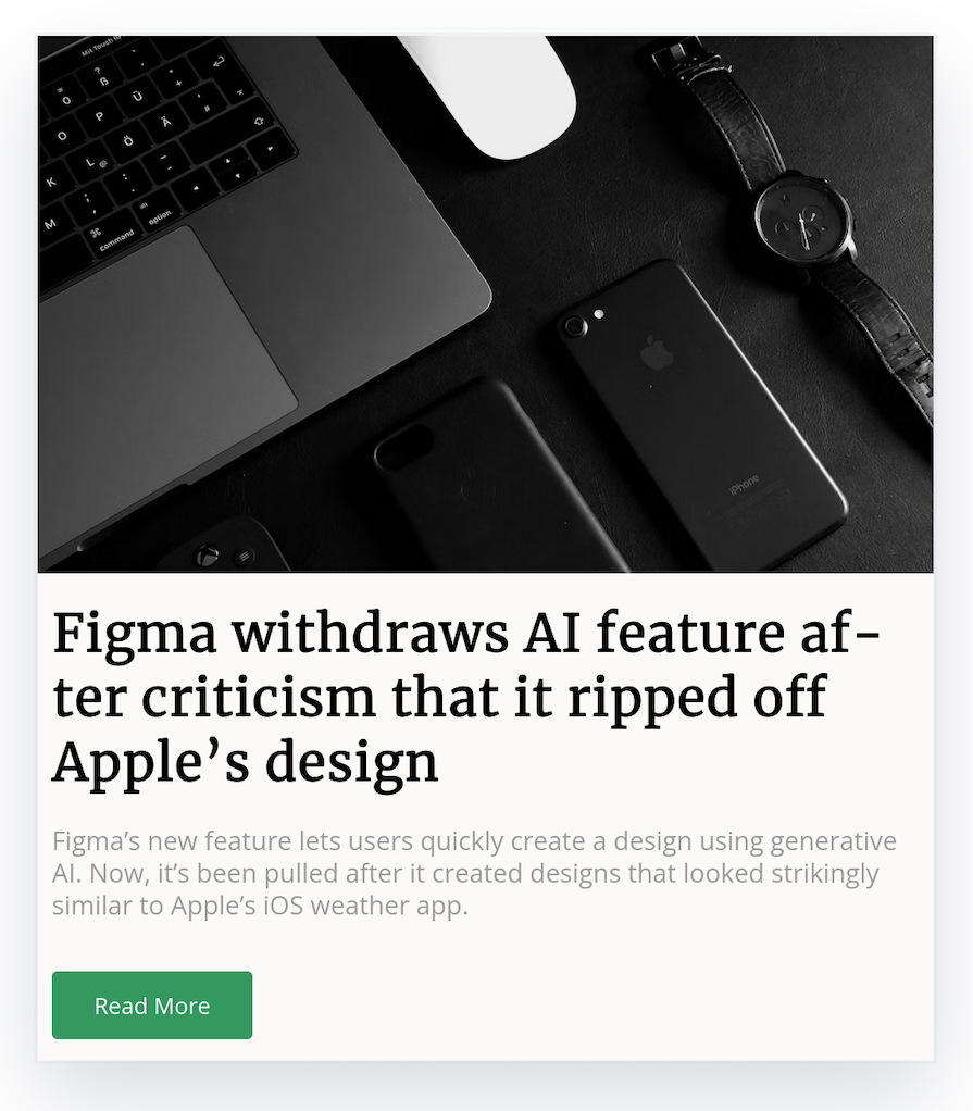
The result in Firefox is that the headline fills out the first line by breaking up the word “after.” So now the first two lines look more even. The third line remains the same:

The result is different in Chrome — the headline is not altered at all! What do you see in your browser? 🧐
See the Pen
Blog card with hyphens:auto by rob2 (@robatronbobby)
on CodePen.
Alternatively, you can break up words manually with a “soft hyphen” in HTML. A soft hyphen is a character that is used to indicate a potential word breakpoint within text. The character itself is not rendered. You can use the ­ character entity as a soft hyphen.
For it to be taken into account, you must use the default value for the hyphens property i.e., hyphens: manual:
<div class="card">
<h2>Figma withdraws AI feature aft­er crit­icism that it rip­ped off App­le’s design</h2>
<!-- other content -->
</div>
Here is the CodePen for this demo.
Additionally, you can provide a hint to the browser about where to break up a word with the <wbr> element. The <wbr> element does not introduce a hyphen at the line breakpoint:
<div class="card">
  <h2>Figma withdraws AI feature af<wbr>ter crit<wbr>icism that it rip<wbr>ped off Apple’s design</h2>
    <!-- other content -->
</div>
Here is the demo for this example.
Breaking up words to create line break opportunities can be useful in some cases to improve the text layout. However, it is not a very practical general approach.
Spacing out text
You may have heard of justified text. This is where text content is spaced out to line up the edges of the text to the edges of the border box, except for the last line:
This would be done using the text-align property, specifically text-align: justified.
This practice is strongly discouraged. The inconsistent spacing between words created by justified text can be problematic for people with cognitive concerns such as Dyslexia.
Breaking up lines
If you want to alter the length of lines, you need to use a forced line break. You need to tell the browser the exact position to break a sentence using the <br> element (the line break element):
<div class="card">
      <h2>Figma withdraws AI feature<br> after criticism that it<br> ripped off Apple’s design</h2>
    <!-- other content -->
</div>
See the Pen
Blog card with manual line breaks by rob2 (@robatronbobby)
on CodePen.
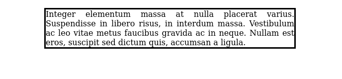
Alternatively, you could use a pseudo-element trick to force a line break. First, you would need to add an inline element such as a <span> element to divide the text content of the element, which is the <h2> in this case. Then, you would need to add a CSS rule to create ::before and ::after pseudo-elements for that <span> to add a line break. The content of the pseudo-element is set to '\A', which is the new line character. We would also add white-space: pre to ensure that the new line character is respected by the browser:
<div class="card">
      <h2>Figma withdraws AI feature<span> after criticism that it</span> ripped off Apple’s design</h2>
    <!-- other content -->
</div>
h2 span::before, h2 span::after {
  content: '\A';
  white-space: pre;
}
You can see the result below with the span outlined with a red border:

Here is the demo of this trick.
One CSS-only approach that you may see used is to constrain the width of an element, usually with the max-width property. The technique is to hunt for a sweet spot until the texts wrap as you would like it to. However, it may not go your way, as it depends on the layout and the browser! This is not a technique you can use consistently.
People who want to skip the manual side of things may use a JavaScript solution. For example, there is a React component called React Wrap Balancer that will dynamically balance lines out.
Using the text-wrap property
The text-wrap CSS property is used to control text wrapping, no surprises there! It determines how the browser uses line breaks.
The text-wrap property is specified as a single keyword chosen from the list of values below:
wrap: This is the default value. Text is wrapped across lines at appropriate characters, usually at spaces towards the edge of the border box of the elementnowrap: Text does not wrap across lines. Text will overflow the element rather than break onto a new linebalance: Text is wrapped to even out the number of characters on each line. This enhances legibility and layout. Because this process is computationally expensive, this value is only supported for text blocks of a limited length. The specification proposes that beyond 10 lines, the value reverts towrapto prevent performance degradation. Currently, Chromium enforces this limit at six lines, while Firefox enforces a limit of 10 linespretty: The browser will use a slower algorithm to wrap text that favors better layout over speed. This is intended for body copy where higher layout quality is favored. It will remove orphans (in the last line only) when they are encounteredstable: You rarely need this value. The behavior is very similar towrap. The exception is when you are editing the text content of an element, the preceding lines are not re-wrapped. This is aimed at scenarios where you have an element with editable text content, such as when you add thecontenteditableattribute to an element.
The value you choose depends on how many lines of text you anticipate styling, whether the text of an element is editable, and whether you want to prioritize appearance or performance (you can’t choose both).
The text-wrap property does not change the width of an element
The text-wrap property does not change the width of an element. It is important to emphasize this because some JavaScript solutions shrink the width of an element. This does not happen in CSS:
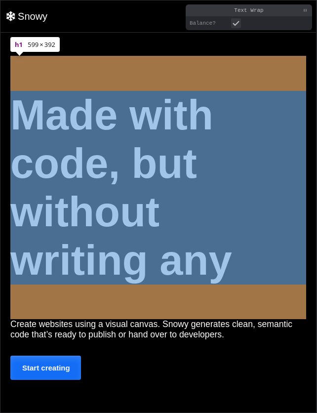
If you use text-wrap: balance on the <h1> headline for the hero section, open Chrome’s DevTools, and select it, you can see it has a bunch of extra space on the right-hand side. That is because this is only a wrapping style.
This fact may displease a designer or two on occasion. If there is an area of empty space, it may make the page feel unbalanced. Good grief! You can usually adjust this by using width: fit-content, though. Whew! 😌
.balanced-and-shrinked {
  text-wrap: balance;
  width: fit-content;
}
Just keep this fact in mind when you collaborate with others!
Usage with different languages
A powerful facet of the text-wrap: balance property is that it will style languages with alternate writing directions such as right-to-left (Arabic) and vertical (Japanese) without any additional effort:
See the Pen
headings using text-wrap:balance by rob2 (@robatronbobby)
on CodePen.
Interaction between text-wrap and the white-space property
The text-wrap property can compete with the white-space property because both can affect text wrapping. The white-space property has a nowrap value that prevents text wrapping. If you want to wrap text and there is an existing, conflicting white-space style, you can unset it to use text-wrap as you wish:
.pretty {
  white-space: unset;
  text-wrap: pretty;
}
Use cases for optimizing text layout
Typically you will use balance for titles and captions and pretty for body text. The rule of thumb for optimizing the layout of text is to use the balance value for shorter text blocks (generally less than 10 lines) and pretty for longer text blocks.
It is important to note that the two values produce different results. The balance value produces equal-length lines of text, whereas the pretty value produces text blocks where the last line is expected to be a bit shorter than the average line. Because the width of the element is not altered when the wrapping style is applied, this can create some extra whitespace. This can lead to some use cases that are less clear-cut and will require your discretion.
Let’s look at a few examples to give you a better idea of where and when you might apply these values.
Optimizing text layouts for the hero section/page
The title of the hero section or page is the first thing that catches a user’s eye. A title is typically short and pithy. I would favor using the balance value in this use case:


See the demo for this example.
Optimizing text layout for headings
This is the clearest use case for balance:
h1,h2,h3,h4,h5,h6 {
  text-wrap: balance;
}
Keep in mind that just applying this style may not provide you with the results you expect because the text needs to overflow! A line of the text must exceed the width of the element. In many layouts, a containing element dictates this.
Text layouts for blockquotes
A blockquote straddles the line between short and long text. You would expect a blockquote to be in the ballpark of six lines, but it depends on the individual and the context of how the blockquote is being used. Even academic guidelines like APA and MLA don’t agree on the length of blockquotes!
In this use case, I would generally favor the balance value. I think a case for pretty could also be made based on the design of the website and context. The following is a blockquote example styled with text-wrap:balance:
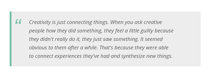
See the demo here.
Text layouts for card titles
In theory, the title of a card should be treated the same as a heading. Use the balance value, right?
In my opinion, balanced text wrapping is not something you always want. It can create an imbalance within a card by producing considerable whitespace on one side. For example, the first card below irks me — the title and description clash in their widths:
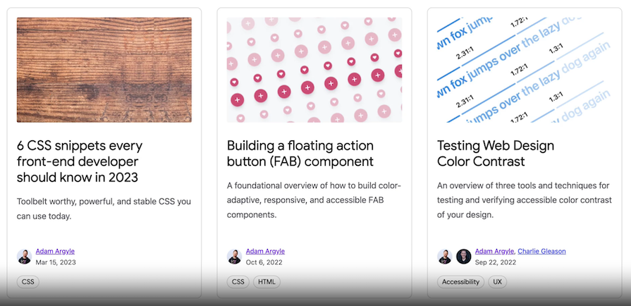
You can edit the content of the cards to fall in line (pardon the pun). You may need to evaluate this one in the context of your design.
Optimizing body text layouts
The UX community recommends that you remove orphans from your body text. You can use text-wrap: pretty to accomplish this.
Tooltips
Tooltips are generally short and are a good candidate for using the balance value.
Miscellaneous
Web development is not a “paint by numbers.” Occasionally, you will encounter a scenario where you can’t apply text-wrap to improve the text layout. There are times when text in fluid designs will be squashed or will wrap in an undesirable way. It’s good to be mindful that some layouts can spawn undesirable effects. Usually, the solutions are related to size and spacing.
One interesting example I saw recently was from Kevin Powell who was doing a coding challenge for a cart item:
Kevin outlined how the flex layout was problematic for the two bottom buttons. He wanted these buttons to always be the same size. He found that for smaller viewports, the buttons shrank and the text wrapped in an ugly way.
To fix this issue, Kevin tried flex-grow and flex-wrap, but neither resolved the issue. The solution was to prevent text wrapping by setting a min-width on the buttons! Check out the video if you are interested!
Browser support for text-wrap values
The values of wrap and nowrap are fully supported. At the time of writing, the newer values are supported as follows:
balanceis supported in all browsersprettyis only supported in Chrome and Edgestableis only supported in Firefox and Safari
Performance
Using text-wrap with balance or pretty invokes layout algorithms that require more work, which can lead to an increase in rendering time. It is a bad idea to apply these to everything!
/* Do NOT do this!!! */
* {
  text-wrap: balance;
}
It is better to be more selective:
h1, h2, h3, h4, h5, h6, blockquote {
  text-wrap: balance;
}
As discussed earlier, browsers safeguard against the flagrant misuse of text-wrap: balance by only doing the rendering work if the text block does not exceed 10 lines (or six lines in Chrome).
There is not much information out there about the performance cost. From what I tested crudely, the impact looks minor. I would test on your website to identify what the cost is. It will be influenced by the overall style and design of your pages.
I will always advocate for taking a holistic view of performance. Don’t discount adding something because the impact is small. Things add up quickly, especially when it involves many different people working on a web product over time and across departments. Account for it in your performance budget.
Conclusion
Altering the alignment of text on the web to make it look more legible used to be a tricky prospect. The good news is that now it is more straightforward to deliver consistently good-looking text layouts using just CSS. The new values for the text-wrap property, balance and pretty, can be used to hand over this cumbersome work to the browser.
Generally, you will use balance for shorter text such as titles, and pretty for body text. There is more nuance to it than that, which we covered throughout this article. There is also a performance cost, so test the impact on your webpage to gauge it. These properties are still new on the scene, so there is less feedback from them being used on websites in production.
I hope I’ve shown you how to get your text to flow like a beautiful brook! Thanks for reading.