We usually find it easiest to recall the last item on a list of things we’ve tried to memorize. This is an example of the recency effect — the human tendency to give extra weight or value to the newest information.

In marketing, a product’s features are emphasized to enhance memorability and attractiveness. In research, though, innate assumptions that privilege information purely because it is the newest is a bias that needs to be carefully monitored.
UX designers utilize the recency effect to create layouts and navigation pathways that are more accessible, intuitive, and memorable. By keeping in mind the cognitive load of a user, layouts are designed to be easy to use or the best places for buttons/input boxes to be identified.
The recency effect is a function of short-term memory at work. Almost like fundamental geometric shapes or primary colors, this feature of human cognition can be seen as fundamental to the practice of design. Shakespeare, too, wrote — all’s well that ends well.
In this blog, I delve deeper into the concept of the recency effect in the context of UX design. I’ll give my best tips on using it in your designs, and I’ll give some examples from real life, too.
What is the recency effect?
The recency effect is a specific type of cognitive bias. It is part of a larger cognitive phenomenon — the serial position effect. According to this theory, the sequence by which information is seen determines whether a person will give it importance or remember it.
The serial position effect was scientifically documented in the 1880s by German psychologist Hermann Ebbinghaus. In the 1960s, Bennett Murdock, Murray Glanzer, and Anita Cunitz made further important contributions, validating and expanding on EbbEbbinghaus’eory.
These experiments have revealed an innate tendency to remember the first and last items in a series better than those in the middle. The tendency to recall earlier items is called the primacy effect, while the tendency to recall later items is called the recency effect. And a UX design that balances these two can have powerful outcomes.
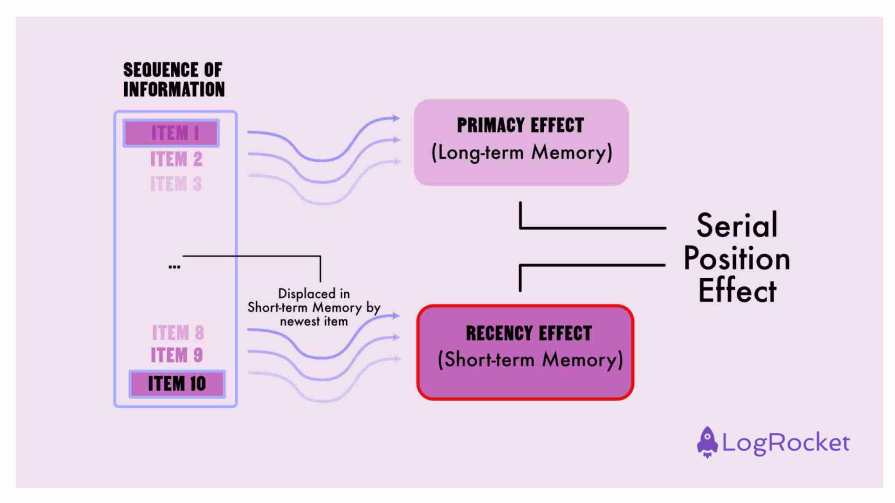
According to experts in psychology and human cognition, there are two types of memory — long-term and short-term. The primacy effect relies on long-term memory, while the recency effect is dependent on short-term memory. This short-term memory stores and makes available the most recently received information, making the recency effect a direct function of short-term memory.
When memorizing a list, items at the beginning or top are prominent and are rehearsed long enough to be transferred to long-term memory. This way, users can recall them later.
The short term memory, however, has very little capacity. Your users are less likely to recall information in the middle of the list. I say this because there’s little time to transfer it to long-term memory. Plus, it has been displaced by subsequent information in short-term memory.
So, items at the beginning and last are most likely to be retained in memory.
Importance of the recency effect in UX
It’s apparent that human attention and memory are limited. By being mindful of how human cognition is wired to work, UX design can reduce the cognitive load of information on users and create optimal pathways.
Think of the recency effect as a rare silver bullet resource.
The limited nature of user attention and memory can be managed through various techniques. Visual clues and feedback can keep a user engaged through their journey. Strategic placement of elements can be used to direct users to information that is a priority. A complex interaction, like a survey, can be broken up into a multi-step process.
Strategic use of the recency effect is a hallmark of good design. Designers know that they must reserve the recency effect for the most important and actionable information. For instance, they strategically place the most critical information or “calls to action” at the end of a user flow — whether that be the right-most corner or the bottom of a box on a screen. This thoughtful approach to design is what sets them apart.
By leveraging the recency effect effectively, designers create user experiences that:
- Are based on intuition
- Reduce the load on memory
- Guide users on a journey that requires minimum cognitive effort
How to utilize the recency effect in UX design
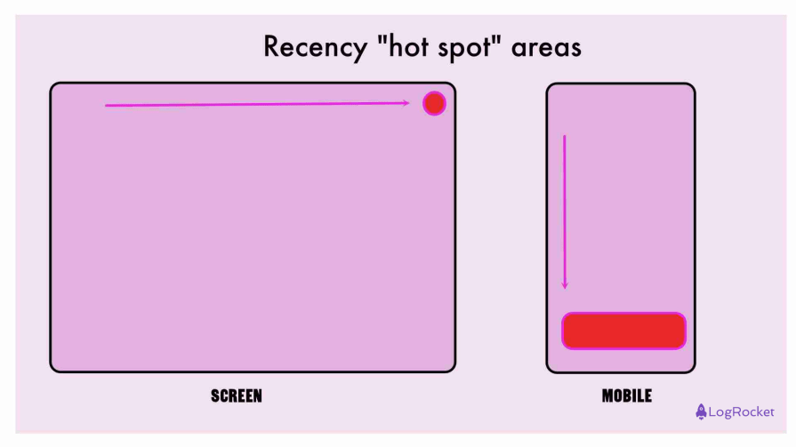
In Latin-language-based systems (scanned left to right) and on rectangular screens that are scrolled from top to bottom, we can identify a few cognitive hot spots. These hot spots, generated by the serial position effect, are located at the top and bottom corners of the screen.
The top-right-hand corner is the most important spot in many design systems. This corner balances both the primacy and the recency effect and can be regarded as the premier information hot spot, especially for screens. On phones, the oblong shape lends itself to the hot spot being at the bottom of the screen:
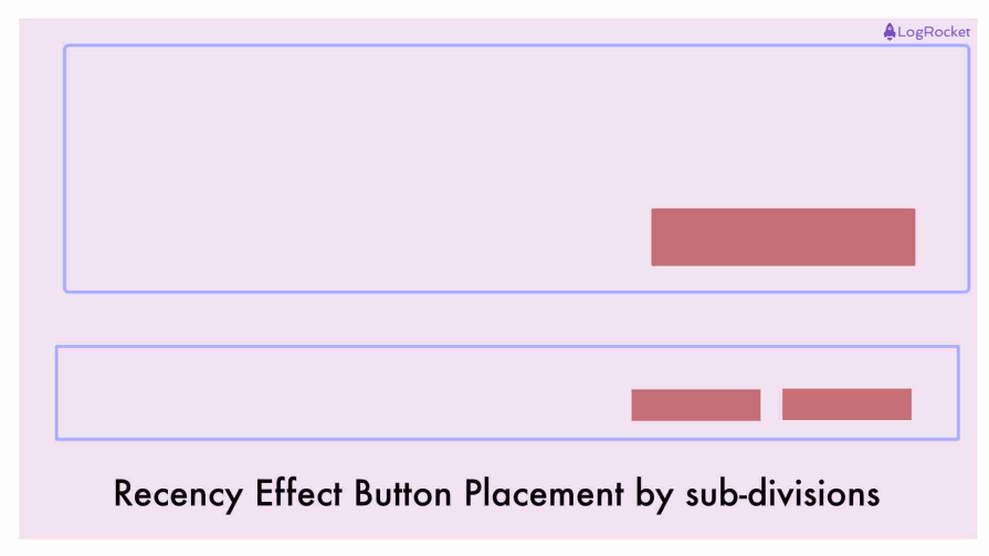
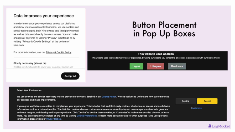
When boxes are created to demarcate areas of information on the screen, these subdivisions suggest a hierarchy of information. Generally, the bottom of such a box — especially in a pop-up window — contains large buttons that leverage the recency effect to prompt urgent action from the user:
These recency hot spot areas on the screen can be used with the following outcomes:
Improve form design and navigation
By placing critical fields or submission buttons at the end of a form, users are more likely to scan the entire document and complete the process. Frequently used links at the bottom of navigation menus can help users find and remember them more easily.
Enhance memorability
Positioning key elements towards the end of a sequence makes the experience more memorable. In educational contexts, summaries at the end improve retention. For long-form content, placing calls-to-action at the end boosts engagement and conversion rates.
Product displays
In e-commerce, persuasive product information is crucial to aiding sales. Listing enticing product features at the end of a description increases the chances users will remember and consider them in their purchase decision.
A carousel can go from basic to premium — and this will leverage recency to enhance the desirability of a product. Being saved for last can highlight value.
Exceptions to the recency effect
There is an important exception to the recency effect — the bottom of the screen is not always the most prominent area.
Customary usage suggests that the complete bottom of the screen is a kind of dead space. Here, one can often find, in fine print, extraneous detail, like further information, careers, complaints, contact information, legal, etc. There is no guarantee a user may scroll to the bottom, especially for a very long page.
Moreover, non-Latin-language systems, which convey information in a different sequence, may activate memory differently. The same applies to screens that aren’t rectangular.
Examples of the recency effect in UX
Shopping cart/account/chat icon
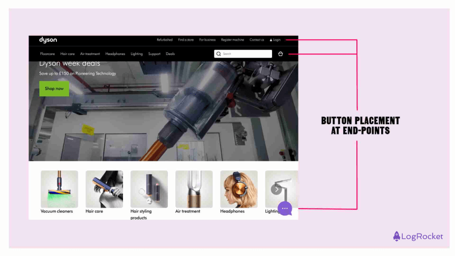
A common design choice across e-commerce websites is placing the shopping cart icon at the extreme right corner.
Look at any major e-commerce website — Google, Amazon, Nike, or Dyson. The account and shopping cart icons — the most important items for customer retention and monetization — will be placed at the right corner.
Important action
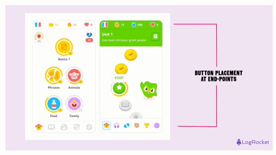
Duolingo, Paypal, and Coinbase — all emphasize the importance of actions like “submit” or “buy” using large buttons placed at the bottom of the screen:
Pop up boxes
Another common use of the recency effect is the “accept” or “reject” cookies box that pops up. In some cases, it appears in the middle, which can be disruptive. Placing it at the bottom of the screen doesn’t distract the user from the main content of the page.
Plus, within the pop-up box itself, the “accept” or “reject” buttons are at the bottom right corner — the most immediate space from the perspective of the recency effect:
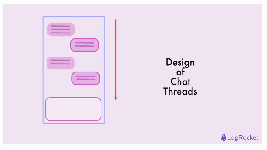
Chat threads
We see conversations take the shape of a list on chat apps like WhatsApp or a standard phone messaging function. Input is at the bottom, just below the latest message.
Would the opposite design — where the input bar was at the top of the screen with messages flowing downwards — have the same efficacy? Likely not.
Key takeaways
Human memory is a limited resource. And being aware of the limits of human cognition is an important objective of good design. By leveraging the recency effect, designers create user journeys that are cognitively engaging and memorable.
Since recency is a part of short-term memory, you should reserve it only for the most important and immediate responses required from the user, though.
By creating a hierarchy of information and breaking up information into a multi-step process or action prompts, you can manage the cognitive load of users.
This article uses the serial position effect for structure, too — the introduction leverages the primacy effect, and the conclusion (which summarizes and emphasizes the main point of the discussion), you guessed it — the recency effect!