Native dialog and popover elements have their own well-defined roles in modern-day frontend web development. Dialog elements are known to communicate with the user and collect their inputs, while popovers are more apt in providing low-priority secondary info to the user.

In a previous article about dialogs vs.popovers, we discussed that both these elements have their dedicated JavaScript APIs that allow us to make the most out of these two elements.
When it comes to adding animations and interactivity to these elements, JavaScript libraries are preferred over CSS. Such elements typically require minimal animations, and using huge animation libraries merely to add a few simple effects can significantly increase the unnecessary load on your app.
To remedy that, this article will help you code animation effects into dialogs and popovers using pure CSS techniques. We’ll cover CSS keyframes and the newly introduced @starting-style at-rule, both of which can be used to create subtle animations with improved performance.
The problem with animating overlay elements
Dialogs and popovers are overlay elements, which means they operate on the topmost layer rendered by the browser. As discussed previously, these elements also rely on dedicated APIs to manage their display and/or modality.
Let’s look at the challenges we face when animating dialogs and popovers using traditional CSS transition techniques.
Dependence on the display property
CSS in general doesn’t allow you to transition a discrete property like display from one value to the other. This means that the standard opacity zero to 100 percent approach for creating transitions won’t work either, as the display property does not permit delays between value switches for transitions to complete.
If you inspect the computed display property of the dialog and popover elements, you’ll notice how the browser intelligently manages it without any additional effort on our part, except for using the methods provided by APIs of the respective elements:
Note: The computed display for popover element in DevTools doesn’t update automatically for some reason. You have to select a different node and then reselect the popover node to see the updated value.
As displayed above, the on-screen visibility of the dialog and popover elements is handled by the browser internally using the CSS display property.
The following demo illustrates how the dependency of the dialog and popover elements on the display property makes the standard CSS transition approaches ineffective for them:
See the Pen
Opacity/Visibility transitions doesn’t work with dialogs and popovers by Rahul (@_rahul)
on CodePen.
Before concentrating on opacity and transformations to create transitions, we should consider the display property first, which governs how the associated elements are displayed on the screen.
Lack of initial styles before rendering
Another problem with overlay elements is the lack of initial styles, which is crucial to ensure proper transition for elements that are dynamically added to the DOM or have their visibility controlled dynamically with the display property.
Let’s say our element should fade in while it renders on the web page. In this case, we need to set the element’s initial opacity to zero, and then transition it to 100 percent once it completely renders on the page. The only initial state we usually have available to us is the present state of the elements, which if provided an opacity of zero, would make the element disappear on screen.
To turn this into a functional effect, we can use JavaScript to add programmatic delays, class switching, or CSS keyframe animations to emulate a transition-like effect.
In the upcoming sections, we will explore ways to address the display property’s inability to support transitions and the lack of initial element styles before rendering.
Transitioning discrete CSS properties
As discussed above, dialog and popover elements rely on the display property for their visibility on the screen, making them nearly impossible to animate using CSS transitions.
The display property is of discrete nature, which means it changes abruptly between values. For example, it might change from block to none without considering the delay defined in the transition-duration. This is because there are no logical intermediate states between such values, as we see with properties accepting additive values like opacity, width, height, and others.
To make discrete properties compatible with CSS transitions, a new transition property called transition-behavior has been introduced that allows you to make transitions behave in a certain way, especially for discrete elements that don’t have additive values in numeric form, pixels, or percentages.
Instead of transitioning smoothly between values, the allow-discrete behavior postpones the change from one discrete value to another until the specified transition-duration has elapsed:
.dynamic-display {
  transition: opacity 0.5s, translate ..., display 0.5s allow-discrete;
  ...
}
In the above snippet, the allow-discrete behavior ensures the display values will wait for half a second, as specified by the transition-duration, instead of switching abruptly.
This delay in switching discrete values allows transitions for other properties with additive values enough time to complete their job:
See the Pen
allow-discrete transition-behavior in action by Rahul (@_rahul)
on CodePen.
With the allow-discrete transition behavior, we now understand how the exit transitions can be added to elements whose rendering or display is managed dynamically.
However, the entry transition will not function in the absence of pre-render styles. The next few sections will explore a couple of techniques for adding entry transitions.
Animating dialogs and popovers with CSS keyframes
So far we have learned how to incorporate exit transitions to dynamically added and managed elements, and now we will apply the same technique to dialogs and popovers.
More great articles from LogRocket:
- Don't miss a moment with The Replay, a curated newsletter from LogRocket
- Learn how LogRocket's Galileo cuts through the noise to proactively resolve issues in your app
- Use React's useEffect to optimize your application's performance
- Switch between multiple versions of Node
- Discover how to use the React children prop with TypeScript
- Explore creating a custom mouse cursor with CSS
- Advisory boards aren’t just for executives. Join LogRocket’s Content Advisory Board. You’ll help inform the type of content we create and get access to exclusive meetups, social accreditation, and swag.
Let’s start by declaring both the entry and exit animations and examine how CSS keyframes can be effective in adding somewhat of an entry point for transitions to any element, regardless of its display.
Adding entry animation with CSS keyframes
Using CSS keyframes to mimic the starting styles for elements is simple. We’ll start with adding entry and exit animations for both the elements as well as the backdrop for the dialog element.
Let’s add some CSS keyframes to create a subtle fade-in and fade-out animation for the elements. Note that we need to define the keyframes for the elements and their respective backdrop (pseudo-element) separately:
/* Keyframes for dialog and popover elements */
@keyframes fadeIn {
  from { opacity: 0 }
  to { opacity: 1 }
}
@keyframes fadeOut {
  from { opacity: 1 }
  to { opacity: 0 }
}
/* Keyframes for the backdrop pseudo-element */
@keyframes backdropFadeIn {
  from { background: hsl(0 0% 0% / 0%) }
  to { background: hsl(0 0% 0% / 50%) }
}
@keyframes backdropFadeOut {
  from { background: hsl(0 0% 0% / 50%) }
  to { background: hsl(0 0% 0% / 0%) }
}
We can now use the above animation keyframes in different parts of our elements. We can also target the open state of our dialogs and popovers with the [open] attribute and the :popover-open pseudo-class as shown in the following code snippet:
.my-dialog {
  animation: fadeOut 0.5s forwards;
  &::backdrop {
    animation: backdropFadeOut 0.5s forwards;
  }
  &[open] {
    animation: fadeIn 0.5s forwards;
    &::backdrop {
      animation: backdropFadeIn 0.5s forwards;
    }
  }
}
.my-popover {
  animation: fadeOut 0.5s forwards;
  &:popover-open {
    animation: fadeIn 0.5s forwards;
  }
}
If we combine the above code snippets and use them in a dialog and a popover element, the outcome will resemble the demonstration shared below. This technique is great for entry animation, but it completely skips the exit animation part:
See the Pen
HTML5 Dialog and popover entry animation w/ CSS keyframes by Rahul (@_rahul)
on CodePen.
If you have an eye for micro-interactions, you’ll notice that the fading-in entry animation works well when opening the dialog box, but upon closing or cancelling it, the fading-out exit animation doesn’t seem to work. Let’s learn why in the next section.
Adding exit animations to the dialogs and popovers
The reason why the exit animation isn’t working in the above demo is the abrupt change in the computed display of the elements due to the popover and dialog APIs. We previously discussed how the transition-behavior property helps us manage discrete CSS properties alongside transitions. Let’s try using the transition-behavior property in this scenario to see if it resolves the issue.
See the Pen
HTML5 Dialog and popover entry & exit animations w/ CSS keyframes by Rahul (@_rahul)
on CodePen.
Fortunately, adding the allow-discrete behavior to the display and overlay properties has resolved the exit animation issue. Both the entry and exit animations are now working correctly.
In production, this approach ends up in a much bigger code with two to three vendor-specific variations for each block of animation declaration. The effects we implemented here are not too complex and could have been achieved using CSS transitions if it weren’t for the dialog and popover elements.
CSS keyframes are best intended to create keyframe animations, but they do not offer pre-render optimization even though they may seem to. However, with the newly introduced @starting-style at-rule, we can achieve transition-based effects without using CSS keyframe animations.
What is @starting-style at-rule in CSS?
Earlier we discussed how DOM-dependent elements require a starting point for initial styles to transition from, and that’s exactly what the new @starting-style CSS at-rule delivers.
The @starting-style at-rule is a CSS Transition Level 2 feature used to declare starting values for properties on a transitioning element, starting from its first style update.
The following syntax allows you to specify a starting point for the styles of a given element from which the transition will pick up and operate. The properties included within the selectors of this at-rule should be the ones that will be involved in the associated transitions:
@starting-style {
  .selector {
    opacity: 0;
    ...
  }
}
Try re-rendering the element dynamically in the below demo by pressing the trigger button, and see how straightforward it is to create an entry point for the transitions with @starting-style before the associated elements are rendered:
See the Pen
HTML5 Dialog and popover entry & exit animations w/ CSS keyframes by Rahul (@_rahul)
on CodePen.
The @starting-style feature is expected to gain solid support across major web browsers, and currently, it is well-supported on Chromium and Webkit-based browsers. See the latest support here.
Dialog and popover transitions using @starting-style
Following the pattern above, we can add subtle animations to dialog and popover elements using the allow-discrete transition behavior and @starting-style.
Before moving ahead, let’s first ensure that we use the allow-discrete behavior for the transition of display and overlay properties. This can be done explicitly by defining the transition-behavior property inside the selectors, or you can combine it in the transition property alongside other transitions as shown below:
.my-dialog,
.my-popover {
  transition: opacity 0.5s, translate 0.5s,
              overlay 0.5s allow-discrete,
              display 0.5s allow-discrete;
  &::backdrop {
    transition: background 0.5s,
                overlay 0.5s allow-discrete,
                display 0.5s allow-discrete;
  }
}
To handle the initial styles for the open state, we should add a @starting-style block and add the properties that are responsible for our transition effect. You don’t need to include the display and overlay properties here, as those are already managed by the dialog and popover APIs behind the scenes:
@starting-style {
  .my-dialog[open],
  .my-popover:popover-open {
    opacity: 0;
    transform: translateY(-1em);
  }
  .my-dialog[open]::backdrop {
    background-color: hsl(0 0 0 / 0%);
  }
}
With dialogs and popovers, we have the API advantage to ourselves, which means we can use certain attributes and pseudo-classes like dialog[open] and :popover-open to target the open states:
.my-dialog[open],
.my-popover:popover-open {
  opacity: 1;
  transform: translateY(0);
}
.my-dialog[open]::backdrop {
  background-color: hsl(0 0 0 / 10%);
}
Lastly, you can give the original elements styles that correspond to a closing transition, which is basically the closing state. In other words, keep the dialog element faded out and slid up by default:
.my-dialog,
.my-popover {
  opacity: 0;
  translate: 0 -1em;
}
.my-dialog {
  &::backdrop {
    background-color: transparent;
  }
}
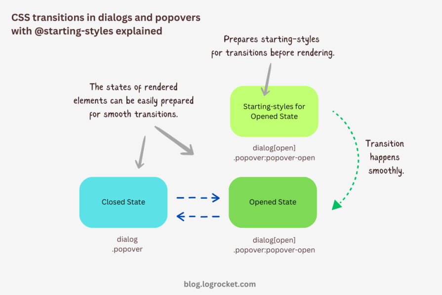
The following demo reflects the outcomes of applying allow-discrete behavior to transitions, defining initial styles with @starting-style, and styling for both open and closed states. Now both the entry and exit animations work smoothly with our dialog and popover elements, and we used less code compared to CSS keyframes:
See the Pen
HTML5 Dialog and popover entry & exit animations w/ @starting-style by Rahul (@_rahul)
on CodePen.
If you want to remember this sequence of states we covered when constructing the above example, refer to the below graphic which visually illustrates the changes and communication between states:
Advanced dialog animations with @starting-style
Let’s take it one step further by implementing different animations for dialog elements. The baseline remains the same: only the properties related to transformations and transitions will change.
Rotating-in-out dialogs
The idea behind creating a stylish rotating dialog box involves playing with the opacity and a couple of CSS transformation properties:
.my-dialog {
  transition: opacity 0.5s, translate 0.5s, rotate 0.5s,
              overlay 0.5s allow-discrete,
              display 0.5s allow-discrete;
}
The starting styles for the open state of the dialog include the following:
- Zero percent opacity to make it initially transparent
- A translation of -50 percent along the x-axis to shift the dialog from the center to the left
- A translation of -100 percent along the y-axis to move the dialog outside the visible viewport
- A rotation of -180 degrees to prepare it for positive rotation when opened
Here’s the code:
@starting-style {
  .my-dialog[open] {
    opacity: 0;
    translate: -50% -100%;
    rotate: -180deg;
  }
}
The closed state resembles the starting styles but with altered translations and rotations to reflect an opposite movement when exiting the dialog element:
.my-dialog {
  /* Previous styles */
  opacity: 0;
  translate: 50% 100%;
  rotate: 180deg;
}
The dialog element in the open state has 100 percent opacity, no translation on either axis, and no rotation, effectively positioning it at the center of the screen:
.my-dialog[open] {
  opacity: 1;
  translate: 0 0;
  rotate: 0deg;
}
The final output looks something like below:
See the Pen
HTML5 Dialog and popover rotating animation by Rahul (@_rahul)
on CodePen.
Bouncing in-out dialogs
To create a bouncing effect without using CSS keyframe animations, we can utilize a Bezier curve as the transition-timing function for the transformation and opacity transitions of our dialog. We’ll use the scale transformation for this effect.
Feel free to experiment with different x1, y1, x2, and y2 values for the Bezier curve, and implement them in your animation projects:
.my-dialog {
  transition: opacity 0.4s cubic-bezier(0.4, 1.6, 0.4, 0.8),
              scale 0.4s cubic-bezier(0.4, 1.6, 0.4, 0.8),
              overlay 0.4s allow-discrete,
              display 0.4s allow-discrete;
}
Now we can easily determine the starting styles and the open and closed states. The initial styles for the open and closed states will be the same — the dialog box will be scaled down to zero and completely transparent.
In the open state, the dialog box will have 100 percent opacity and be scaled to one. The rest of the transition effects will be handled by the Bezier curve-powered transitions:
@starting-style {
  .my-dialog[open] {
    opacity: 0;
    scale: 0;
  }
}
.my-dialog {
  opacity: 0;
  scale: 0;
  &[open] {
    opacity: 1;
    scale: 1;
  }
}
Here’s how this looks in action:
See the Pen
HTML5 Dialog and popover bouncing animation by Rahul (@_rahul)
on CodePen.
Sliding and bouncing dialogs
We will use the same Bezier curve in this animation to keep things simple, but the effect will be different compared to the previous one. The idea is to translate the dialogue along the y-axis instead of scaling it, as we did with the last effect:
.my-dialog {
  transition:
    opacity 0.5s cubic-bezier(0.4, 1.6, 0.4, 0.8),
    translate 0.5s cubic-bezier(0.4, 1.6, 0.4, 0.8),
    overlay 0.5s allow-discrete,
    display 0.5s allow-discrete;
}
The idea is to keep the dialog way up the viewport on the y-axis initially. Then, we will transform the dialog to zero when it is opened and finally translate it down the axis:
@starting-style {
  .my-dialog[open] {
    opacity: 0;
    translate: 0 -200%;
  }
}
.my-dialog {
  opacity: 0;
  translate: 0 200%;
  &[open] {
    opacity: 1;
    translate: 0 0;
  }
}
Instead of applying a 100 percent positive or negative translation, I doubled it to create the impression of urgency in the dialog box. See it in action below:
See the Pen
HTML5 Dialog and popover slide-up-down bouncing animation by Rahul (@_rahul)
on CodePen.
Subtle popover animations with @starting-style
The above effects suit the dialog elements well, but they won’t look great with the popover elements. This section is dedicated to some nice popover animation effects, which make the popover look like popovers and nothing more.
Rising-sinking popover
This effect resembles the popover effect we created initially. In that example, the popover appeared from the top and slide-fading down the y-axis, which isn’t what you’d expect from a popup in the bottom-right corner of the viewport.
Let’s rectify that by adding the same translation on the y-axis for the starting styles and the close state. Everything else remains unchanged:
See the Pen
Rising up and down popover animation by Rahul (@_rahul)
on CodePen.
Growing and shrinking popover
The process of creating a growing and shrinking effect is simple and involves the use of scale transformation with a twist.
By setting the transformation origin to the absolute bottom-right, we can ensure that the popover expands from the right, aligning with its current position at the bottom-right.
See the Pen
Growing and shrinking popover animation by Rahul (@_rahul)
on CodePen.
The toast popover
This technique is commonly used to create animations for notification toasts. To achieve this effect, you simply need to translate the popover element 100 percent to the right, putting it out of the viewport. Then, in the open state, you can translate it back to zero to complete the effect.
See the Pen
Slide in out from right popover animation by Rahul (@_rahul)
on CodePen.
Conclusion
We learned about incorporating CSS transition-based animations in dialog and popover elements using pure CSS. We discussed the complexities and issues of traditional transitioning with overlay elements, and then we addressed these problems one by one using CSS keyframes and, more importantly, the @starting-style at-rule, which is specially developed for transitions.
However, the @starting-style feature is fairly new and not yet available globally. Consequently, using CSS keyframes and the Web Animation API is an option that makes sense in production and provides more granular control over adding animation effects.
Having said that, I recommend the @starting-style approach once it gets adopted widely to keep things simple and lightweight with CSS transition applications.