We often use modals or popups to display important information or prompt users to take action. Unlike regular pop-ups that can be opened in new windows or tabs, these dialogues keep the user on the same page by overlaying the existing content. This ensures that users remain focused on the task at hand.
Modals are common and sometimes required. And if they're not implemented correctly, they can be a significant barrier. Ensuring that modals are accessible means they are usable by everyone, including people who rely on assistive technologies.
In this article, we'll build a modal and follow the guidelines to make it accessible.
Prerequisites
To follow along with this tutorial, you should have:
Basic HTML knowledge: Understand how HTML elements and attributes work.
Basic JavaScript knowledge: Familiarity with basic JavaScript concepts like functions, event handling, and DOM manipulation is helpful.
Understanding of ARIA: While the tutorial explains ARIA roles and attributes, having a basic understanding of accessibility concepts can be beneficial.
When Should You Use a Modal?
Using modals effectively requires careful consideration of the user experience. Here are some guidelines to help you decide if you should use a modal or not:
You should use modals when the user needs to make a critical decision, such as confirming a potentially destructive action (for example, deleting an item) or agreeing to terms and conditions
You can use a modal when a task requires the user’s complete focus and does not rely on information from the rest of the page (for example, filling out a form or completing a payment process).
You can use a modal for displaying temporary or transient information that doesn’t need to be permanently visible on the page (for example, alerts, notifications, or brief messages).
You should avoid using modals for tasks that require extensive interaction or input, such as lengthy forms or complex workflows. These can be frustrating in a modal because of limited space and navigation constraints.
You should avoid using modals for actions a user will need to perform frequently, as this can become repetitive and annoying. Inline options or tooltips might be better for repetitive actions.
You should not use modals if they interrupt the user’s natural flow on the site, especially if the content or action in the modal is not urgent or important.
Modal Accessibility Guidelines
Here are some tips to help you build useful and accessible modals:
- Provide a descriptive
aria-labelledbyattribute that points to the modal's title or heading. If there is no title, usearia-labelto provide a short, descriptive label.
Always include a visible and easily accessible close button within the modal, usually in the top-right corner. Label this button clearly, for example, with the text "Close" or an icon with
aria-label="Close".When the modal opens, move the keyboard focus to the first interactive element within the modal (usually a close button). When the modal closes, return the focus to the element that triggered the modal.
Keep the keyboard focus within the modal while it is open.
Allow users to close the modal by pressing the
Escapekey.
Following these guidelines, let's build a modal.
I prefer using the right HTML tags to build components, and in this case I'll be doing exactly that using the dialog tag.
How to Build a Modal Using the dialog Tag
In case you're not familiar with the dialog tag, it was introduced in HTML5. You use it to create dialog boxes like popups, alerts, and modals. It offers built-in methods and attributes that make it easier to manage dialog behavior without needing extensive JavaScript. The javascript built-in methods are show(), showModal(), and close().
show() and showModal()
The show() method is useful for a non-blocking dialog. This means that the dialog appears on top of the current content, but users can still interact with other parts of the webpage (clicking buttons, links, and so on) while the dialog is open.
This is useful in situations where the dialog is providing information that doesn’t require the user’s immediate attention. Here's an example:
<!-- Previous content here -->
<dialog id="dialog-box">
<!-- More content here -->
</dialog>
<script>
    const dialog = document.getElementById('dialog-box');
    dialog.show();
</script>
Result:
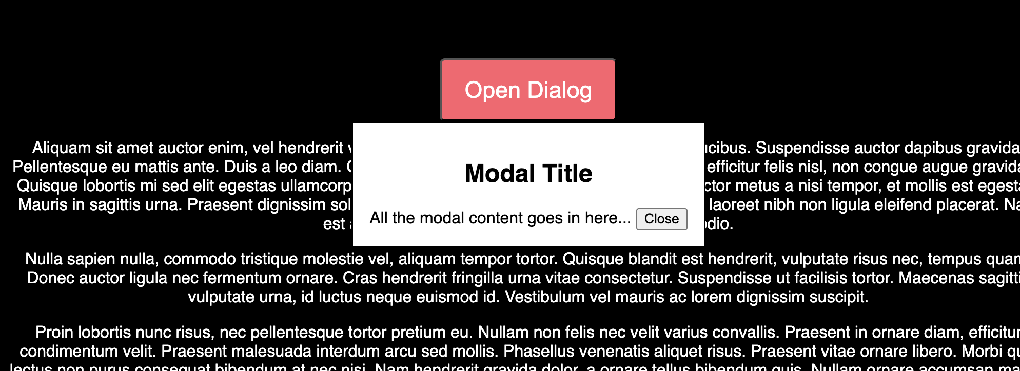
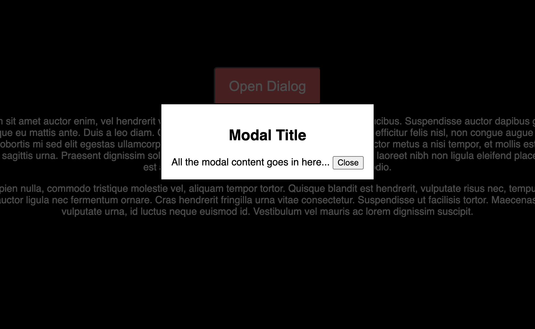
The showModal() method opens the dialog in a modal mode. This means that the dialog takes focus, and interaction with the rest of the webpage is blocked until the dialog is closed. The user cannot click on or interact with any other part of the page.
Depending on the browser, a semi-transparent backdrop appears behind the dialog, visually indicating that the rest of the page is not interactable.
When a dialog is opened with showModal(), focus is automatically trapped within the dialog. The user can only tab through elements inside the dialog, and the focus will loop within the dialog’s content until it is closed. Here's an example:
<dialog id="dialog-box">
<!-- More content here -->
</dialog>
<script>
    const dialog = document.getElementById('dialog-box');
    dialog.showModal();
</script>
Result:
The <dialog> element has default styles but can be customized using CSS to match your design. You can style the dialog box, add animations, or modify the backdrop. The backdrop can be styled using the ::backdrop selector. For example:
dialog::backdrop {
    background: rgba(0, 0, 0, 0.7);
}
The dialog also comes with some built-in accessibility features like focus management, backdrop, automatic announcement on open, and pressing the ESC key will close the dialog.
You can add the autofocus attribute to the first interactive element in the modal, such as the first input in a form or the close button. Alternatively, you can rely on the <dialog> element's native focus management.
Avoid using tabindex on the <dialog> element, as it is not an interactive element like a button or link. The <dialog> serves as a container for interactive content, and it is not intended to receive direct user focus.
The <dialog> element provides a native way to create modals. If you're building a custom modal, make sure its accessibility features match those of the native <dialog> element.
Bringing it all together:
<style>
    dialog::backdrop {
        background: rgba(0, 0, 0, 0.7);
    }
</style>
<body>
    <button id="open-dialog">Open Dialog</button>
    <dialog id="dialog-box">
        <h2>Modal title</h2>
        <div>
          <!-- More content here -->
          <button id="close-dialog" autofocus>Close</button>
        </div>
    </dialog>
<script>
    const dialog = document.getElementById("dialog-box");
    const openButton = document.getElementById("open-dialog");
    const closeButton = document.getElementById("close-dialog");
    openButton.addEventListener("click", () => {
      dialog.showModal();
    });
    closeButton.addEventListener("click", () => {
      dialog.close();
    });
</script>
</body>
You'll notice that I didn't use the aria-label attribute on the dialog as I listed in the guidelines. Well, that's because the dialog element, if well-structured, doesn't necessarily need one. In this case, there's a visible label in the dialog element (the h2 element).
If there are no visible labels present then you need to add one. Like in this example:
<dialog id="confimation-dialog" aria-label="Confirmation Dialog">
    <p>Are you sure you want to proceed?</p>
    <button id="close-dialog" autofocus>Close</button>
</dialog>
What is the inert Attribute?
When a modal is open, a screen reader might still navigate to and around content outside the modal. You would generally want the user's focus to be restricted to the modal itself, or stop the user from accidentally clicking on elements outside the modal to prevent confusion and errors. In these cases, you'll need the inert attribute.
The inert attribute makes an element and all of its descendants non-interactive and inaccessible to assistive technologies. When a modal is open, using the inert attribute on the rest of the page content will ensure that only the modal content can be accessed, making the dialog experience clearer.
How to Use the inert Attribute
When a modal is opened, you can apply the inert attribute to the rest of the page content (typically the <main> element). When the modal is closed, you remove the inert attribute.
Here's an example showing how to use inert with a modal dialog:
<body>
    <header>Site Header</header>
    <main id="main-content">
        <button id="open-dialog">Open modal</button>
        <p>This is the main content of the page.</p>
        <!-- More content here -->
    </main>
    <!-- Move the dialog outside the main element -->
    <dialog id="dialog">
        <h2>Modal Title</h2>
        <p>This is the content inside the modal.</p>
        <button id="close-dialog" autofocus>Close</button>
    </dialog>
    <script>
        const dialog = document.getElementById('dialog');
        const mainContent = document.getElementById('main-content');
        const openButton = document.getElementById('open-dialog');
        const closeButton = document.getElementById('close-dialog');
        openButton.addEventListener("click", () => {
           mainContent.setAttribute('inert', '');
          dialog.showModal();
        });
        closeButton.addEventListener("click", () => {
           dialog.close();
        });
        // the dialog elemnt has a close event, which is called when a user calls the close() method or presses the esc key
        dialog.addEventListener("close", (event) => {
           mainContent.removeAttribute("inert");
        });
    </script>
</body>
How to Animate the Open and Close States
When a modal appears (open state) or disappears (close state), it can be jarring for users if this transition happens abruptly. Animating these states can create a smoother user experience by gradually introducing or removing the modal, making it feel more natural.
Why Animate the Open and Close States?
Animating the open and close states of a modal can:
Enhance User Experience: A smooth animation can make the transition less abrupt and more engaging.
Draw Attention: Subtle animations can help guide the user's focus to the modal content when it appears.
Maintain Consistency: Consistent animations across your UI can create a cohesive and professional feel.
By default, the dialog is set to display:none when closed and display:block when open. You cannot transition from none to block in CSS, but you can combine the display properties with transform or opacity. The transform property can be used to scale or move the modal, while opacity controls its transparency.
Here’s an example of how you might animate a modal:
dialog {
  animation: zoom-out 0.5s ease-out;
}
/* an open attribute is added to the dialog when it is open  */
dialog[open] {
    animation: zoom-in 0.5s ease-out;
}
/* The display property in the keyframes is critical
because it toggles the modal’s visibility on and off.  */
@keyframes zoom-in {
    0% {
      opacity: 0;
      transform: scale(0.1);
      display:  none;
    }
    100% {
      opacity: 1;
      transform: scale(1);
      display: block;
    }
}
@keyframes zoom-out {
    0% {
      opacity: 1;
      transform: scale(1);
      display: block;
    }
    100% {
      opacity: 0;
      transform: scale(0);
      display: none;
    }
}
Final result:
Conclusion
The <dialog> element is the native way to create modals. It provides built-in accessible features for both keyboard and screen reader users
The <dialog> element is of two types, modal and non-modal. You can create a non-modal dialog using the show() method, and the showModal() method will create a modal dialog.
When you're not using the native dialog element, ensure your custom modal matches the native dialog in terms of accessibility to ensure a uniform experience for all users
You should also always remember to autofocus the most immediate interactive element, the dialog can do this by default.
Finally, you can use the inert attribute on other elements to prevent those elements from being accessed when the modal is open.
Resources:
Thank you so much for reading this article. If you found it helpful, consider sharing. Happy coding!
You can connect with me on LinkedIn.