Colors and color psychology charts, throughout history, have been a powerful tool used by artists, designers, and marketers to evoke emotion from their users.
A mere change in the color of a button can double the desired behavior percentages. When carefully considered, the cultural associations of colors with different user demographics can be a powerful tool to communicate with your target audience.
In this blog, I’ll share everything you need to know about color psychology.
I’ll start by explaining what it is and how color psychology charts work. We’ll explore some case studies of big brands playing with colors. I’ve also devised a step-by-step plan to help you get started leveraging color psychology as a UX designer.
What is color psychology?
Color psychology is the study of how colors affect mood and behavior. When used effectively, designers can use various colors to affect the psychological behaviors of their target audience.
Studies show that color has a profound effect on our daily behavior. Different colors represent different moods — red and yellow increase action, while green and blue increase comfort.
Since the 1960s, marketers and advertisers have used colors for their marketing and advertising campaigns. Major branding and product design decisions are also based on how people react to color.
Psychology behind different colors
According to a study, color influences 85% of shopper’s purchase decisions, and specific colors will target a consumer’s mood, behavior, and stress levels.
We’ve established that different colors have different psychological effects on the consumer. But exactly what colors produce what specific effects? Some shades of colors might have a subjective effect, but most of them have universal meanings.
Most warm tones, such as reds, yellows, and oranges, make us feel either warm and comfortable or angry and reactive. Meanwhile, most cool tones, such as blues, purples, and greens, can either calm the mind or induce sadness or melancholia. Universally, shades in the red areas are active, while shades in the blue areas are passive.
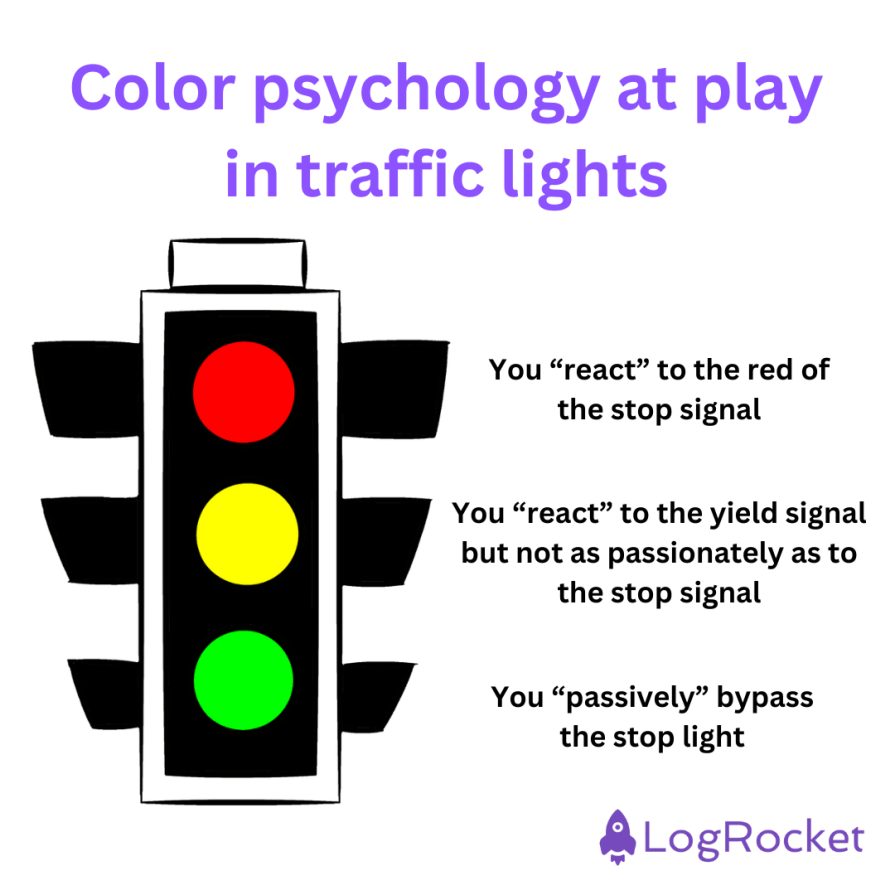
The stop light is one of the clearest examples of color in everyday life. It is universally accepted that red means stop (you “react” to the stop signal), yellow means yield (you “react” to the yield signal but not as passionately as to the stop signal), and green means go (you “passively” bypass the stop light):
If you’ve noticed, Coca-Cola uses red for its logos and branding. The pop of red accents with Coca-Cola mirrors the pop of a Coke can. Consumers know that when they’re buying Coke, they’re more likely to become active and engage in passionate pursuits. The brand story has made “Coca-Cola Red” a literal trademark:
There’s also the green logo of Whole Foods. The color choice is a reflection of their brand story of “going green,” or staying healthy to save the environment. The “greenification” of their website tells a lot at the outset:

As consumers, we make decisions based on emotions, not logic. When presented with choices, we go with those that elicit a reaction. And color psychology charts can be a huge part of that.
Color psychology chart
Let me share a handy color psychology chart showing different colors and their corresponding meanings:
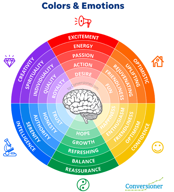
Clearly, different shades of color represent different emotions. I’ll summarize the color psychology chart for you:
- Blue — calm, peach, and trust
- Green — health, growth, and generosity
- Purple — luxury, power, and creativity
- Red — passion, energy, and confidence
- Pink — love, kindness, and innocence
- Orange — success, enthusiasm, and warmth
- Yellow — hope, joy, and positivity
- Grey — authority, dignity, and knowledge
- Brown — strength, security, and nature
- Black — mystery, power, and formality
- White — purity, safety, and goodness
Application of the color psychology chart in design
It is exciting to see how existing companies use color psychology. I’ll focus on three domains — branding, advertising, and web design to see how a color psychology chart works in design:
Branding
There is more color psychology than blue means this, and green means that. Big companies are usually synonymous with one particular color rather than a ton of colors — Coca-Cola’s red and Sprite’s green. This is all a part of their branding strategy.
Think of Facebook. Facebook is a very particular shade of blue, right?
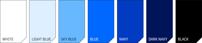
Well, Mark Zuckerberg is color-blind. He cannot see green and red and mixes up these colors. And blue is the clearest color that Zuckerberg can perceive. And yet, Facebook’s blue has symbolized openness and communication for the brand. This is Facebook’s palette:
For Facebook, blue, which is also the most used color for banks and security companies, provides security in an age of cyber dangers. It comforts the consumer, who knows that they are safe on Facebook.
Blue is also the most popular color for brands, solidifying Facebook’s popularity. These color psychology factors, along with Zuckerberg’s personal comfort, were considered for Facebook’s branding.
Advertising
Color psychology plays itself out everywhere we see ads. For advertising campaigns, it’s imperative to show consumers products they want to see based on how they see the brand.
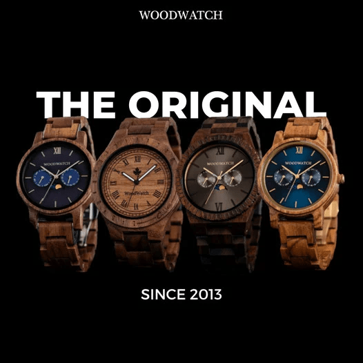
I’m thinking here of luxury brand Woodwatch’s ad campaign. They went back to nature, showcasing colors found in nature, such as woody browns. This is the perfect match for their brand, which specializes in wooden watches:
Let’s take another example.
Think of Xiaomi. This brand creates a huge demand for its newly launched products through advertisements. Whenever they have a brand to launch, they advertise. Let’s take a look at one of their adverts:
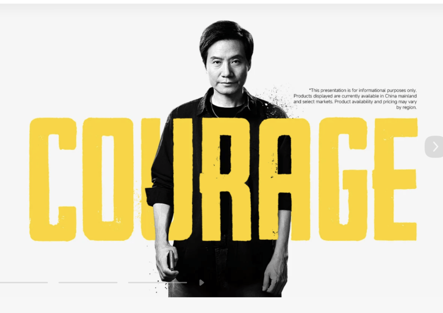
This advertisement showcases Lei Jun, the CEO of Xiaomi, with the color yellow in bold. Yellow is associated with hope, energy, and, yes, courage. This bold yellow color on a neutral light gray background makes for a bold statement.
Look at their summer sale ad, too. It features a blue foreground, reminiscent of comforting blue skies, with the words summer and sale in gradients of yellow and orange. Orange appears in the logo for Xiaomi, and they use orange to portray the warm optimism of summer:

Web Design
As a web UX designer, you want consumers to take actionable steps on the website, which might mean looking at your landing pages or clicking certain buttons. You have to keep them engaged. One way to do that is through color psychology.
For example, you should not use bold and bright colors such as red or green except as an accent. If you’re looking to build a well-designed page, you will certainly need a palette, as monotone colors will overpower the rest of the page.
For harmonious effects of color, it’s advisable to balance your color scheme between warm and cold colors and loud and quiet colors. This is done by picking between different shades, tints, and tones of a single color or the hue (differing shades of the pure color), saturation (the intensity of a color), and luminance (the light to dark of a color). Too many bold colors can either distract or disorient visitors to your landing page, so keep them to about 10% of your page.
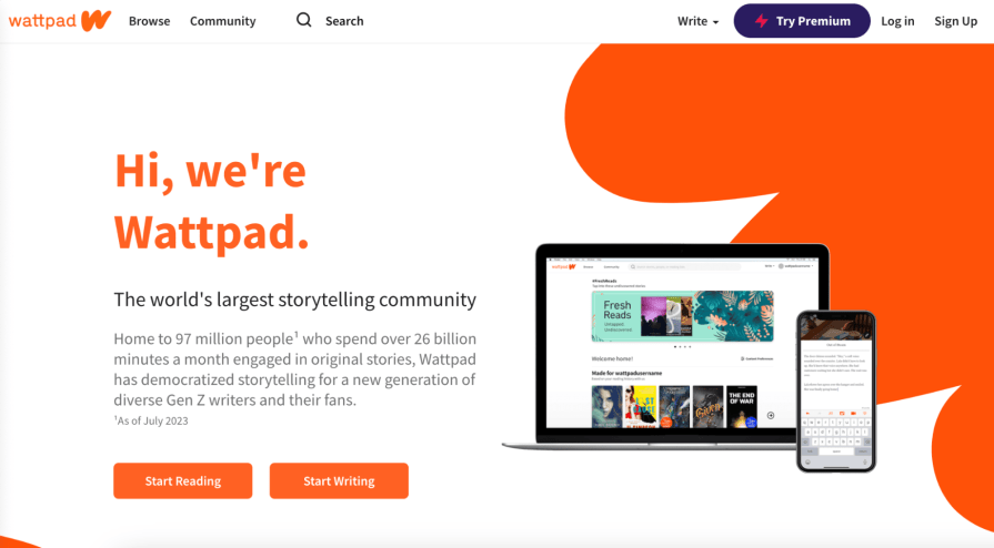
Let’s study Wattpad as an example. Wattpad uses its logo color, a reddish-orange, as an accent on its homepage. This tells the consumer that it is young, energetic, and passionate. And this tells a story — their passion for storytelling is allowing others to tell their own stories. That’s exactly what Wattpad offers — the chance for anyone to become a writer:
How to use a color psychology chart in design?
With all that theory in mind, I’ll help you build a step-by-step guide to using color for design and marketing:
Step 1 — Learn about color psychology
First and foremost, if you want your brand to take a more inward look at human behavior, be willing to learn the basics of color psychology charts. This could mean reading books on color psychology, such as Color: A Natural History of the Palette by Victoria Finlay and The Secret Lives of Color by Kassia St. Clair.
Look at different brands to see how they build their cases with color. Compare your brand’s color scheme across the board. Does your website have different colors that you’re not utilizing properly in your advertisements?
Having consistent, impactful color coordination and color scheme is key to leveraging color psychology. Looking at how you are utilizing color in your brand is the first step towards using color in your designs.
Step 2 — Pick an emotion for the design
What specific emotion are you looking to evoke in your consumers? Are you targeting excitement or calmness, or does your brand promise security or power?
These questions should find answers in the mission and vision of your company. These are answers to problems that you see in the market, whether it be feeling passionate about brick-and-mortar shops or compassion for the environment. Start by outlining how emotions complement your brand’s goals.
Step 3 — Look at other brands as an example
Whether they are in the same industry and size as your company, or they are brands you idealize, look at other brands as an example of how they use color psychology for designs and marketing. It always helps to scope out the competition, and knowing how other brands use color is a key step in the process.
Perhaps Ikea is inspiring your furniture brand. Look at their color scheme.
By seeing how others make a difference in the world through color, you can also be inspired in the same colorful way.
Step 4 — Match colors with your branding
The most important step in this process is making sure your colors are a match to your branding. Once you’ve figured out how you’re going to target consumers, with what color scheme, and you’ve seen that no other brands use that specific color palette, you are ready to make sure that your colors are relevant to your branding.
The easiest way to do this is to keep consistent.
If you’re a brick-and-mortar store, think about changing your walls, pamphlets, and other physical elements to complement the colors you would like to retain.
If you’re an online store, make sure every landing page is consistent with your use of color psychology chart — from the home page to the About page to the Add to Cart page.
Step 5 — Ensure consistency with cultural demographics
If you’re in China, you already know that the color red is a huge color to use. If you’re in Sweden, you are going to look at certain colors that reflect the Nordish culture. Your color psychology will depend highly on associations that are consistent with the culture of your consumers.
Look at how Huawei uses the color red in its logo because of China’s cultural symbolisms in the color red or how Ikea uses blue and yellow because of the Swedish flag in its palette. These are not just stylistic choices but cultural choices due to culturally determined associations with color.
Choosing to ignore cultural differences in color, can also prove detrimental to how you use color. A UK company, Orange, had to change their slogan and consider changing their name because in Northern Ireland, the Protestant Loyalists were associated with the color orange.
So research, research, and research your consumer demographic.
Step 6 — Create a brand color palette
The last and most crucial step is creating a color palette for your brand. Through your research, you already know what colors you want to use. But use these guides to inform your color choices:
- Analogous colors — These are colors that are next to each other on the color. Think how pink changes to red and red changes to orange.
- Complementary colors — These are colors that complement each other, but are on the opposite sides of the color wheel. Think of purple and yellow, or blue and orange.
- Monochromatic colors — These are colors that are shades of one primary color. For example, gray and black, or sky blue and indigo blue.
Once you’ve created your brand palette, it’s up to you to use it for your brand’s color scheme. Run tests with your users, and find out their primal, emotional reactions to your color palette. Does it align with your brand goals? If it does, you’re on the right path.
Key Takeaways
Color can be a powerful tool in any marketing juncture. In this article, I’ve shown the tremendous psychological effects of color, inducing emotions in the consumer.
It’s important for you, as a designer, to understand how a color psychology chart works because colors can influence the consumer journey and consumer decisions.
If you really are an outward-facing brand that is conscious of your customers, you have to use the color wheel to your advantage.
gd2md-html: xyzzy Wed Aug 07 2024