As a frontend developer, you most likely have heard the house analogy used to describe HTML, CSS, and JavaScript. HTML is the structure (walls, rooms, doors, and so on), CSS is the decorator (painting, layout, and furniture), while JavaScript brings functionality with electricity and plumbing.
Let’s look at CSS separately, firstly because it’s amazing, but secondly CSS is powerful in its own right and can bring some level of functionality where JavaScript is not needed in some cases. With CSS, your only limit is your imagination, but it’s best to not let it run wild, because you must maintain a high level of functionality.
In this post, you’ll learn how to create 3D effects with CSS by using relevant properties and operations that control elements in a virtual 3D space, plus we’ll also cover visual illusions with shadows and light.
How do you know something is 3D?
Objects in 3D space have three dimensions: length, width — technically the same as “length” but commonly considered to be the shorter side, and height (or depth). You only see in 2D when looking at a screen, so you’d need a CSS property like transform to create 3D effects.
The transform property has several operations that control an element’s 3D dimensions and position. You control the horizontal position with translateX(), the vertical position with translateY(), and height and depth with translateZ().
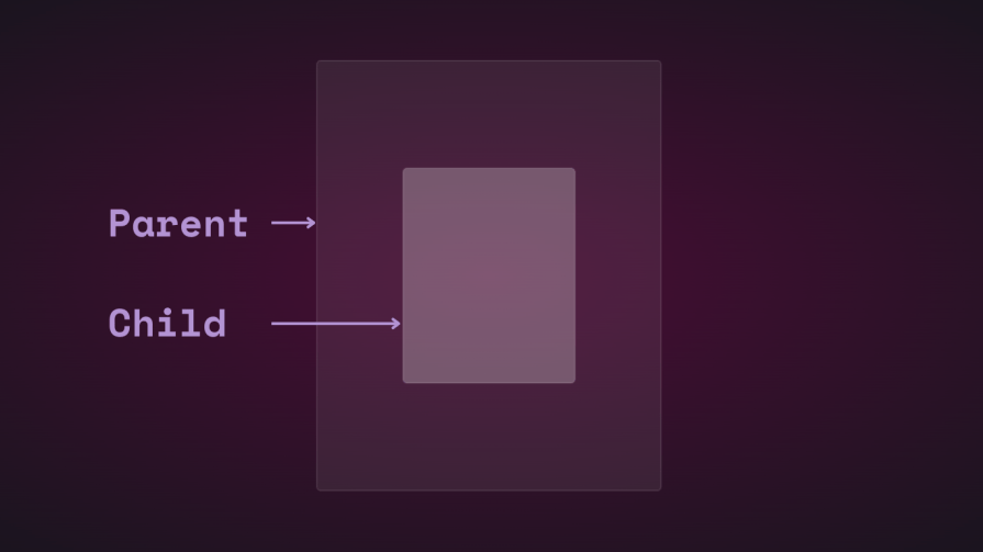
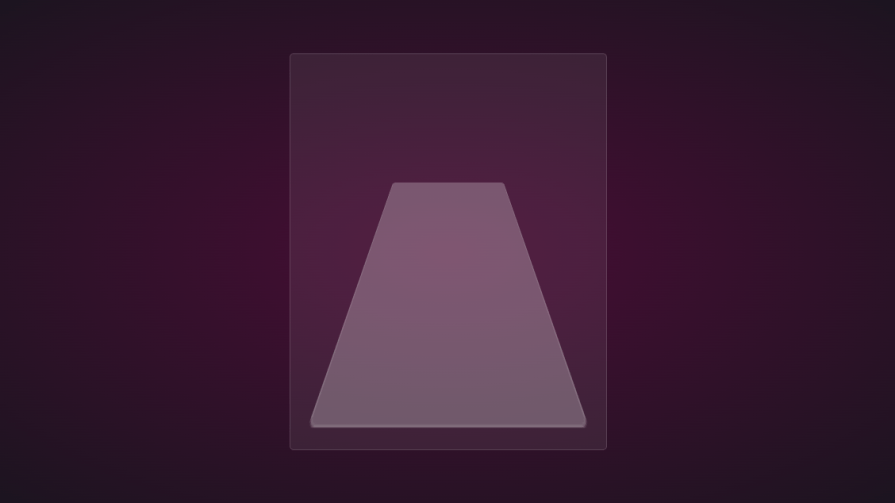
Consider this illustration. We have two rectangular elements — one small and the other large. The small element is the child, and it’s nested in the bigger parent element:
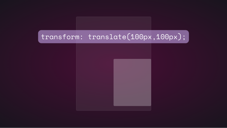
If you change the child element’s position vertically and horizontally using translate, you’ll see it move:
If you attempt to change the child element’s position on the z-axis by adding a translateZ(), nothing will happen. The z-axis is perpendicular to the viewport, so the child element should appear smaller when it moves away from the screen and bigger when it moves closer, right? That’s how it works in the real world when looking at an object from above. However, things don’t work the same virtually because there’s no perspective.
In CSS, the perspective property and perspective() operator are really important to how 3D transforms work. Perspective is your point of view and creates the illusion of depth and height.
The perspective property goes on the parent element, while perspective() works with the transform property on the child element. They do the same thing — most of the time.
Let’s see how the perspective property affects translateZ(). We’ll use a simple animation to demonstrate.
Here are the HTML and CSS for the parent and child elements:
<div class="parent">
    <div class="child">
    </div>
  </div>
.parent {
  display: flex;
  justify-content: center;
  align-items: center;
  background: rgba(255, 255, 255, 0.07);
  width: 400px;
  height: 500px;
  border: 0.5px solid rgba(255, 255, 255, 0.15);
  border-radius: 5px;
  z-index: 0;
}
.child {
  background: rgba(255, 255, 255, 0.25);
  width: 200px;
  height: 250px;
  border: 1px solid rgba(255, 255, 255, 0.15);
  border-radius: 5px;
  z-index: 1;
}
First, add perspective to the parent element, then add the transform animation to the child:
.parent{
  perspective: 1000px;
}
.child{
   animation: transform 5s infinite ease-in-out alternate-reverse;
}
@keyframes transform{
  0%{
    transform: translateZ(-200px)
  }
  100%{
    transform: translateZ(200px)
  }
}
And here’s the result:
You’ll get the same result if you use the perspective() operator. It’s a different story when used with rotate() though.
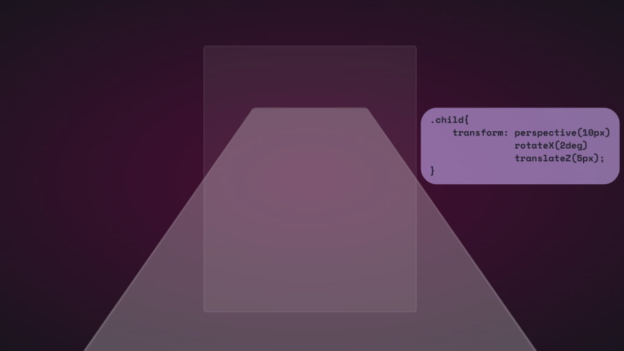
Let’s rotate the child along the x-axis and see what happens:
.child{
  transform: perspective(10px) rotateX(2deg);
}
Here’s a screenshot:
If we add a small amount of translation on the z-axis, here’s what you get:
For fun, here’s how far it stretches:
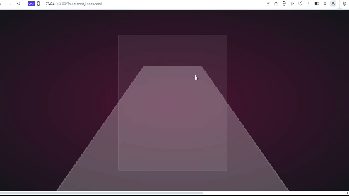
It’s like you’re on the surface of the element. It would be great if you could look at this through a VR headset.
We can also use the standalone property:
.parent {
  perspective: 10px;
}
.child {
  transform: rotateX(2deg) translateZ(5px);
}
The result is the same, but it won’t overflow beyond the viewport. They both have their use cases, and we’ll see them and the rest of the transform operations at work as we move along.
More great articles from LogRocket:
- Don't miss a moment with The Replay, a curated newsletter from LogRocket
- Learn how LogRocket's Galileo cuts through the noise to proactively resolve issues in your app
- Use React's useEffect to optimize your application's performance
- Switch between multiple versions of Node
- Discover how to use the React children prop with TypeScript
- Explore creating a custom mouse cursor with CSS
- Advisory boards aren’t just for executives. Join LogRocket’s Content Advisory Board. You’ll help inform the type of content we create and get access to exclusive meetups, social accreditation, and swag.
Note that the small perspective value used in the example above was to exaggerate the 3D effect so you can see how it works. You’d mostly want to be looking at the element from above, so a much larger value up to 1000px will suffice. Small perspective values make elements appear more 3D.
Here’s a CodePen with some 3D transform animation:
See the Pen
3D transforms: rotate and perspective by Oscar-Jite (@oscar-jite)
on CodePen.
It’s time to get to the fun part and create some 3D effects with CSS!
Reflection and shadow
How objects interact with light is another way to tell they’re in 3D space. We can use the perspective() operator to create reflections and shadows in CSS to generate the illusion that an element is floating in 3D space.
3D text reflection
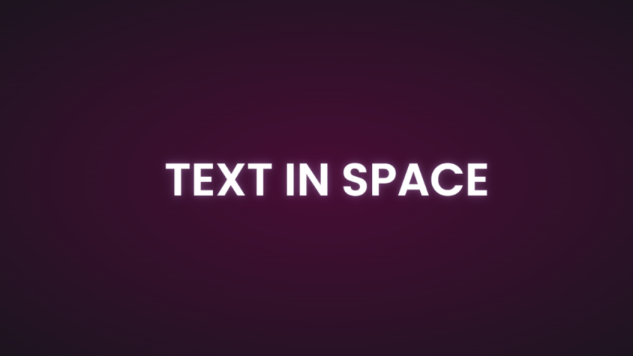
This example will feature text, but you can use other HTML elements:
<div class="content">
    <h1>Text in space</h1>
  </div>
We’re creating a reflection, so we need light. You’ll need the text-shadow property to create this light effect:
.content h1 {
  position: relative;
  font-size: 5rem;
  font-weight: 600;
  color: #fff;
  margin: 3px;
  text-shadow: 0px 0px 10px #b393d350, 0px 0px 20px #b393d350;
  text-transform: uppercase;
}
You should have glowing text at this point:
It’s time to add the reflection using a pseudo-element:
  .content h1::before {
    content: "";
    position: absolute;
    top: 80%;
    left: 0;
    height: 100%;
    width: 100%;
    background: #b393d3;
    transform: perspective(10px) rotateX(10deg) scale(1,0.2);
    filter: blur(1em);
    opacity: 0.5;
  }
First, we give the pseudo-element the same dimensions as the text. Then we add a background with the same color as the text-shadow. Next, we add the transform property with three operations.
We’ve already seen how the first two work, so let’s talk about scale(). Remember how the child element stretches beyond the viewport? This prevents that by resizing the element along the x and y directions.
In this example, the reflection we created with the pseudo-element keeps its original size on the x-axis but is reduced to less than half on the y-axis. The opacity and filter make it look like the light fades the further it moves from the text:

The text looks like it’s floating and reflecting light off the floor.
3D shadow
We can also create shadows using a similar method to the light. Let’s work with an image this time.
Here’s the image we’ll work with for this example:
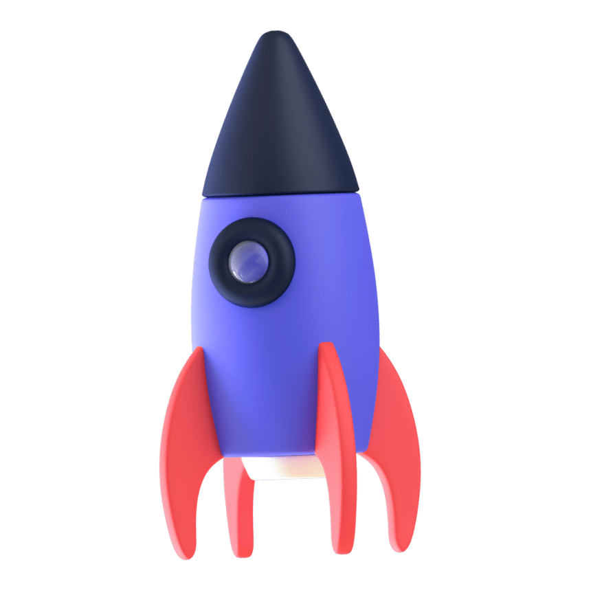
It’s nice to have the shadow match the shape and size of the element. In this case, we have a rocket, and this means our shadow should be round. Consequently, there’s no need for the perspective() operator.
Here’s the HTML:
<div class="content">
    <div class="rocket">
      <img src="rocket.png" alt="">
    </div>
  </div>
In CSS, go ahead and give the image any dimensions you want, then add a pseudo-element below it:
.rocket::before {
  content: "";
  position: absolute;
  bottom: -10%;
  left: 0;
  height: 50px;
  width: 100%;
  border-radius: 50%;
  background: radial-gradient(rgba(0, 0, 0, 0.8), transparent, transparent);
  transition: 0.5s;
}
The border-radius of 50 percent gives it an oval shape. You can add more height or a more specific width if you’d like. Shadows are black most of the time, so the background is a blurry radial-gradient fading from black to transparent.
Here’s a screenshot of how it should look at this point:
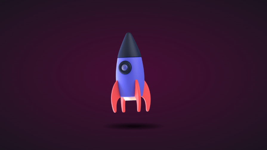
Finally, let’s add some animation:
.rocket:hover img{
  transform: translateY(-40px);
}
.rocket:hover::before {
  opacity: 0.8;
  transform: scale(0.8);
}
This will move the rocket up and down, and the shadow will change as it moves. Hover on the rocket in the CodePen below to see this 3D effect:
See the Pen
3D shadow hover by Oscar-Jite (@oscar-jite)
on CodePen.
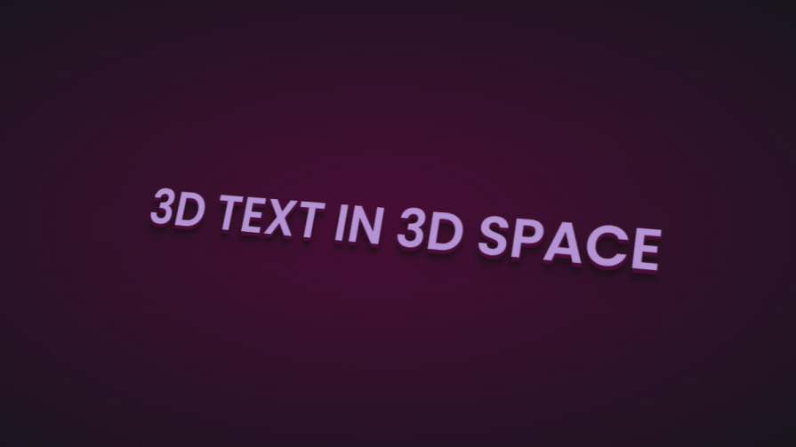
3D text animation
You can create 3D text with the CSS box-shadow property. You’ll need multiple shadow layers to create this effect.
Here’s the HTML:
<div class="content">
    <h1>3D text in 3D space</h1>
  </div>
Next, we need CSS to turn it into 3D text. We’ll use perspective and transform to tilt the text at an angle:
.content {
  position: relative;
  transform: translate(-50%, -50%);
  display: flex;
  align-items: center;
  justify-content: center;
  text-align: center;
  perspective: 1500px;
  transform-style: preserve-3d;
}
.content h1 {
  font-size: 5rem;
  font-weight: 600;
  color: #b393d3;
  text-shadow: 1px 4px 1px #480d35,
               1px 5px 1px #480d35,
               1px 6px 1px #480d35,/* to create the sides*/
               1px 10px 5px rgba(16, 16, 16, 0.5),
               1px 15px 10px rgba(16, 16, 16, 0.4),
               1px 20px 30px rgba(16, 16, 16, 0.3); /* real shadow */
  margin: 3px;
  transform: rotateX(15deg) rotateY(-20deg) rotateZ(10deg);
  text-transform: uppercase;
Here’s how the text should look at this point:
Now let’s add some animation:
.content:hover h1{
  transform: rotateX(2deg) rotateY(0deg) rotateZ(0deg);
  font-size: 4rem;
  transition: 500ms ease-in-out;
}
Here’s a CodePen you can interact with:
See the Pen
3D text plus tilt on hover by Oscar-Jite (@oscar-jite)
on CodePen.
https://codepen.io/oscar-jite/pen/abrPBJR
3D tilt effect
Let’s work with an image this time, and we’ll use the one below:

Here’s the HTML:
<div class="text">
      <h2>Hover on the image</h2>
      <p>It uses a combination of all the rotate operators</p>
      <div class="tilt-img">
        <img src="7.jpg" alt="">
      </div>
    </div>
You could use a background image, but what’s important is that there’s a clear parent and child element.
In the CSS, use the transform property tilt the image at an angle, then reset it on hover:
.tilt-img {
  width: 600px;
  height: auto;
  margin-top: 20px;
  perspective: 1000px;
}
.tilt-img img {
  width: 100%;
  height: 100%;
  object-fit: contain;
  border-radius: 10px;
 transform: rotateX(15deg) rotateY(-5deg) rotateZ(1deg);
  box-shadow: 5px 5px 2px rgba(0, 0, 0, 0.5);
  transition: 2s;
}
.tilt-img:hover img{
  transform: none;
  box-shadow: 0px 2px 3px rgba(0, 0, 0, 0.5);
}
You can reverse it and add the tilt on hover, or change the transform values:
See the Pen
3D image tilt with CSS by Oscar-Jite (@oscar-jite)
on CodePen.
Tilt and mouse tracking
Here, we’re going to make an element tilt and follow the movement of the mouse when you hover over it. We’re going to work with vanilla-tilt.js, a JavaScript library.
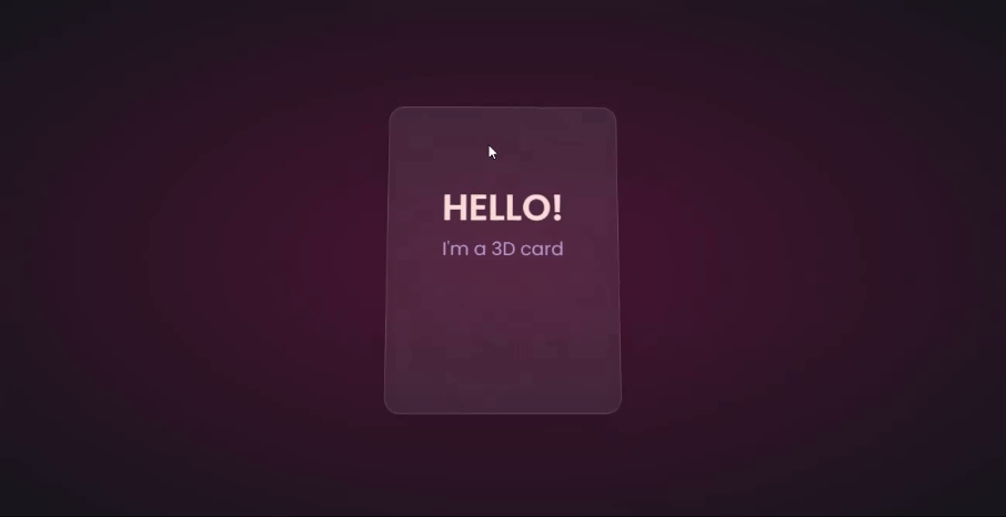
Here’s what we’re aiming for:
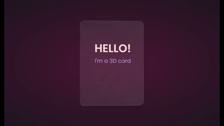
We’ll start with HTML, creating a card and some text:
<div class="box">
    <div class="elements">
      <h2>Hello!</h2>
      <p>I'm a 3D card</p>
    </div>
    <div class="card">
    </div>
  </div>
Next, we’ll style with CSS:
.box {
  position: relative;
  border-radius: 20px;
  transform-style: preserve-3d;
}
.box .card {
  position: relative;
  background: rgba(255, 255, 255, 0.07);
  width: 300px;
  min-height: 400px;
  backdrop-filter: blur(10px);
  border: 0.5px solid rgba(255, 255, 255, 0.15);
  border-radius: 20px;
  box-shadow: 0 25px 45px rgba(0,0,0,0.05);
}
.elements{
  position: absolute;
  top: 100px;
  left: 50px;
  width: 200px;
  height: auto;
  text-align: center;
  background: transparent;
  transform: translateZ(80px);
}
.elements h2{
  font-size: 3rem;
  font-weight: 600;
  color: #f6d8d5;
  text-transform: uppercase;
}
.elements p{
  font-size: 1.5rem;
  color: #b393d3;
}
The two CSS properties directly responsible for creating the 3D effect on the card are transform and transform-style.
First, we have the transform-style, set to preserve-3d, applied to the box. This means the card and any nested element are now in a 3D space. The transform property is applied to the text’s parent element, with the class name .elements. Here, translateZ(80px) moves the text toward the viewer.
These two properties combined create the illusion of depth, and the text will appear to be floating above the card.
Head to cdnjs.com to grab the Vanilla-tilt CDN and link it to your HTML document. Next, go to the main site and copy the VanillaTilt.init JavaScript function that controls the tilt. Add it just before the closing body tag:
<script type="text/javascript">
        VanillaTilt.init(document.querySelector(".your-element"), {
                max: 25,
                speed: 400
        });
</script>
Now all you have to do is replace .your-element with the class name of your element getting the 3D tilt effect, and you’re in business.
By default, the maximum tilt rotation and transition speed are defined by max and speed respectively. You can also add a glare, easing, or tilt direction and angle.
Here’s how to get the exact effect shown in the “HELLO” example above:
<script>
    VanillaTilt.init(document.querySelector(".box"), {
      max: 10,
      speed: 200,
      easing: "cubic-bezier(.03,.98,.52,.99)",
      reverse: true,
      glare: true,
      "max-glare": 0.1,
    });
  </script>
More functions and effects are listed on the main site.
Here’s a CodePen showing the 3D tilt effect:
See the Pen
3D mouse tracking tilt effect by Oscar-Jite (@oscar-jite)
on CodePen.
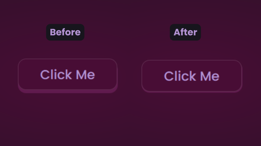
Just to show that the library isn’t doing all the work and how important the transform and transform-style properties are for this 3D effect, here’s what it would look like if they weren’t included:
The text appears flush against the card and you’re left with only the tilting, which is nice, but not as nice as the 3D effect created when those properties are included.
Let’s explore another practical use case of this 3D effect.
Using the same card, we’ll add a background image and caption that’ll appear on hover:
.box .card {
  position: relative;
  background: url(/Captions/8.jpg) center;
  background-size: cover;
  background-repeat: no-repeat;
  width: 300px;
  min-height: 400px;
  border: 1px solid rgba(255, 255, 255, 0.15);
  border-radius: 10px;
  box-shadow: 0 25px 45px rgba(0,0,0,0.05);
  z-index: 0;
}
.elements{
  position: absolute;
  top: 60%;
  left: 30%;
  width: 250px;
  height: auto;
  padding: 10px;
  border-radius: 5px;
  text-align: center;
  background: rgba(255, 255, 255, 0.25);
  transform: translateZ(80px);
  z-index: 2;
  opacity: 0;
  transition: opacity 500ms;
}
.box:hover .elements{
  opacity: 1;
}
Here’s a CodePen with the result:
See the Pen
3D image card with caption appearing on hover by Oscar-Jite (@oscar-jite)
on CodePen.
https://codepen.io/oscar-jite/pen/RwmJWbv
3D buttons
Buttons are common web components with many shapes, sizes, and purposes. No matter the button type, they all have one thing in common: you have to click on them to work. But how many times have you seen them actually “click”?
This will be a little micro-interaction that helps the user know they’ve done something. The main CSS property we’ll use for this 3D effect is the transform property.
Here’s how it should look:
There are two distinct parts of this 3D button — the top with the “Click Me” text and the bottom and sides with a lighter color.
You’ll start with the HTML for the button:
<button class="btn"><span class="txt">Click Me</span></button>
In CSS, we’ll start with the bottom. That’s the button with the class name btn:
.btn {
  position: relative;
  background: #17151d;
  border-radius: 15px;
  border: none;
  cursor: pointer;
}
Next, we have the top of the button:
.text {
  display: block;
  padding: 10px 40px;
  border-radius: 15px;
  border: 1px solid rgba(255, 255, 255, 0.15);
  background: #480d35;
  font-size: 1.5rem;
  font-weight: 500;
  color: #b393d3;
  transform: translateY(-6px);
  transition: transform ease 0.1s;
}
The transform property is what creates the 3D effect of the button clicking. All that’s left is to reverse the transformation by a few pixels when you click on it:
.btn:active .text{
  transform: translateY(-2px);
}
And that’s how to create a 3D click button. Here’s a CodePen you can interact with:
See the Pen
3D clicky button by Oscar-Jite (@oscar-jite)
on CodePen.
Browser support for 3D transforms and final words
The transform property and its operators have excellent support across all the major browsers — unless you still use Internet Explorer. You can check it out yourself on CanIuse:
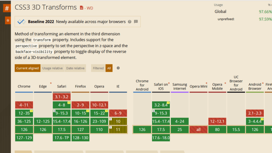
Unfortunately, the borders of the cards do not appear straight during animation on Firefox browsers, but it’s not clear why. Apart from that, the animation runs smoothly. Compare performance across browsers, and try different border thickness.
The web is your canvas, and CSS is your paintbrush. In this post, you’ve learned how to create 3D effects with the transform property. What other effects can you think of?