A couple of months ago, we faced a challenge with the checkout experience for our B2C SaaS app. We noticed it wasn’t performing as expected and decided to fix it. What we learned and how much we were able to improve with a single change exceeded our already high expectations.
Let me tell you how understanding the difference between system one and system two thinkers helped us move the needle.
The challenge: Improving checkout CVR
Our checkout and payment process for the mobile apps at Brainly was quite dated. Although we did a good job moving people to the checkout page, we had problems converting checkout visitors to paying customers. Our conversion rates were below the industry benchmark:

But we weren’t interested in iterating on small improvements that would yield two percent lifts. We felt that our checkout needed a more drastic redesign, so we dedicated an entire sprint to research and better understand what was happening under the hood.
We combined heuristic evaluations with a series of user tests to understand what was happening in users’ heads when visiting our checkout.
The problem: Analysis paralysis
Whether we asked our users directly what their main challenge was or observed them going through the journey, the result was almost always the same — our users were unable to make a decision.
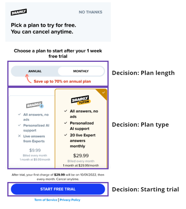
On a single screen, we asked them to make three decisions:
- Choose the subscription type
- Choose the subscription length
- Actually commit to starting a trial or subscription
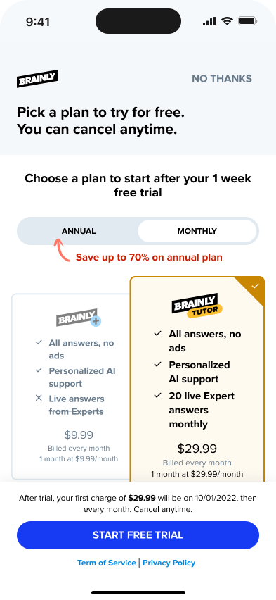
That’s a lot of decisions on a single screen:
We found that the most common path was:
User needs an answer to a question -> they get an answer, but it’s blocked -> they want to unlock it -> they need to subscribe to do so
Users usually went through the journey in a rush. Our students wanted to get the answers to their questions as soon as possible, but the checkout page didn’t reflect that. It was slowing users down by overwhelming them with information and pushing them into a paradox of choice.
System 1 vs system 2 thinking
To understand the challenge and its solution better, let’s take a step back and dive deeper into system one versus system two thinking modes.
Long story short, we tend to have two main modes of thinking:
- System one — Our primal brain; it’s fast, autonomous, often unconscious, and quite lazy
- System two — More developed parts of the brain. It’s deliberate and thoughtful thinking
Throughout the day, we alternate between these two modes; however, our brain always prefers to stay in system one as it consumes significantly less energy than complex system two thinking.
People in system one mode want to go from point A to B smoothly and without needless interruptions. They make decisions fast without much second thought.
On the other hand, people in system two mode take a more deliberate approach. They read your copy (Yes! Some people actually do that!), compare options, and do math in their heads to make the most optimal choice.
As a rule of thumb, you can assume that most of your users naturally think in system one. However, system two thinkers, even though in the minority, tend to care more and convert better, so you can’t ignore them.
The sweet spot?
Optimize your flows for system one thinking while providing an alternative flow to system two thinkers.
The solution: Optimize for system 1 thinkers
The main problem with our sales journey was that our product was optimized for system one thinkers, who are straightforward and intuitive. In contrast, the checkout itself was optimized for system two thinkers, who have many options and details.
We decided to fix that by optimizing the whole user journey for system one thinkers. As for the checkout, we decided to
- Not move users to a separate page to avoid distraction
- Remove the plan length choice altogether
- Preselect the most optimal plan for the user based on where they came from
- Reduce copy to a bare minimum
The final result was as follows:
Results
This change in sales flow helped us increase our conversion rates by more than 30 percent. We didn’t change our value proposition, pricing, or anything else. The mere change in the way the sales flow works allowed us to dramatically boost our sales without harming metrics down the funnel, such as cancellations or refunds.
As expected, the vast majority of our sales came from the simplified checkout flow. However, a sizable segment of users clicked the “see all plans” options and went to the full checkout experience with all plans. If we hadn’t offered that alternative flow, we’d most likely have lost their purchase. Some people simply need more information to make a final decision.
Key takeaways
Let’s recap a few key lessons from this case.
First of all, it’s critical to understand whether your users think in system one or system two during specific touchpoints.
If they primarily use system one thinking, you want to optimize for easiness and speed. If they use system two, give them enough information to satisfy their doubts and needs.
If you want a more universal approach, optimize for system one and give an alternative path for system two thinkers. Even if it’s just a tiny button at the bottom of the page, if someone is in a deliberate thinking mode, then trust me, they’ll notice it anyway.
Featured image source: IconScout