
Hello everyone! In this guide, you’ll learn about the powerful ZenUI Library. It’s a comprehensive, free collection of UI components and templates designed to enhance your development workflow and elevate your projects.
Whether you’re a developer looking to fast-track your UI design or a business that needs sleek, modern templates, ZenUI Library has everything you need to build beautiful websites with minimal effort.
Table of Contents:
Why Use ZenUI?
ZenUI Features
Tailwind CSS Integration and Framework Compatibility
How to Start Using ZenUI
How to Customize ZenUI Components
How to Use ZenUI Website Templates
How to Extract Color from an Image
How to Customize Any Icon in the ZenUI Library
Conclusion
Why Use ZenUI?
ZenUI was born out of the need for clean, customizable, and reusable components that you can easily integrate into various projects.
Unlike other libraries, ZenUI focuses on providing a tailored collection of components, ensuring your projects are unique and highly functional.
You can visit their website to learn more: https://zenui.net.
Key ZenUI Benefits:
Completely Free: No hidden costs. ZenUI Library is and will remain free for all users.
Modern UI Components: Pre-designed, fully responsive components based on modern web standards.
Customizable: You can easily modify the components to match your project’s branding and style.
Developer-Friendly: Built with developers in mind, ZenUI components are well-documented, easy to integrate, and come with clean, semantic code.
Customizable Icons: Access a vast library of icons that you can customize and download as PNG or SVG, or simply copy the icon’s code to use directly in your project. Personalize colors, sizes, and styles effortlessly to suit your needs.
Color Palette Generator: Design stunning color schemes with the built-in color palette generator. You can upload an image and extract its dominant colors, then generate and customize a full-color palette based on your choices. Whether for UI elements or branding, this tool ensures your design’s color harmony.
ZenUI Features
ZenUI has a bunch of features designed to streamline your UI development. Let's dive into each feature and explore how it can benefit you.
1. Pre-Built UI Components
ZenUI provides many pre-built UI components to streamline your development process. Here’s the full list of what you get:
ButtonsNavigation BarsCards,Modals and PopupsForms and InputsAccordionsDropdowns and MenusProgress Bars and LoadersTabsBadges and TooltipsToast NotificationsResponsive Grids and LayoutsPaginationAvatarsBreadcrumbsCheckboxesRadio ButtonsAlertsFootersHeadersSidebarsSearch BarsTimelinesTag ChipsSpinnersSkeleton LoadersImage GalleriesPricing TablesHero Sections
With this extensive collection, ZenUI equips you to build fast, responsive, and visually appealing user interfaces efficiently.
For designers who need precise color inspiration, ZenUI offers an Image Color Extractor tool. It allows you to:
Extract Colors: Upload an image, and the tool will automatically detect and generate a palette of its dominant colors.
Color Picker: Manually select any spot on the image to fine-tune your palette.
This feature helps streamline your design process by providing accurate, vibrant color combinations directly from your images, ensuring your projects have cohesive and impactful color schemes.
3. Template Gallery
For developers and designers looking for a jumpstart, ZenUI includes template collections like:
Business Websites: Build multi-page websites for businesses with a few clicks.
Landing Pages: Clean and modern landing pages optimized for conversions.
Each template is designed with UX best practices in mind, ensuring a seamless user experience across devices.
4. Essential UI Blocks
With ZenUI Blocks, you don’t have to build from scratch. These blocks are pre-made sections designed to help you construct entire web pages quickly and efficiently. Here’s the full list of blocks you can use:
Hero SectionsResponsive NavbarPricing SectionsResponsive FooterNewsletter FormContact FormResponsive Search BarResponsive SidebarCall-to-Action Sections404 Error PagesEmpty Page
All blocks are fully customizable with minimal effort, allowing you to build websites faster while ensuring a polished, professional look.
5. SVG Icons Collection
ZenUI 2.0 comes with a set of beautifully designed, scalable SVG icons. These icons can be used in any project without compromising page load speed or resolution quality. Just grab the icons, and use them wherever you need, from buttons to navigation menus.
Tailwind CSS Integration and Framework Compatibility
ZenUI is built with Tailwind CSS, a utility-first CSS framework that empowers you to customize your designs with minimal code. By leveraging Tailwind's utility classes, you can easily adjust the look and feel of any component without needing to write custom CSS.
Compatibility
ZenUI is designed to be versatile and compatible with various frameworks, making it easy to integrate into your projects. You can seamlessly use ZenUI with:
React: Perfect for building interactive UIs and managing state efficiently.
Next.js: Ideal for server-rendered applications and static site generation.
With ZenUI, you can create visually stunning, responsive web applications quickly and efficiently, regardless of your tech stack.
How to Start Using ZenUI
One of the key advantages of ZenUI is that you don’t need to install anything to start using it. ZenUI provides all the necessary HTML structure and Tailwind CSS classes directly in its documentation, allowing you to copy and paste the code into your projects without any additional setup.
If you're working with frameworks like React or Next.js, all you need is a project that has Tailwind CSS integrated. You can simply copy the component or block code and paste it directly into your JSX, and you’re ready to go. There’s no need to install external dependencies or packages.
ZenUI makes it easy to kickstart your project without any friction—just start a project with React or Next.js, integrate Tailwind CSS, and start building with ZenUI’s pre-built components and blocks.
Here’s a step-by-step guide on how to get started using the ZenUI Library:
1. Visit the ZenUI Library Website
Head over to the ZenUI Library website where you can browse through a wide variety of UI components, templates, essential blocks, and SVG icons. ZenUI Library offers everything from simple buttons to more complex layouts.
2. Browse and Select a Component
Once on the website, explore the different sections for components like:
Buttons
Forms
Modals
Navigation Bars
Cards
Alert, and more.
Each component is showcased with a live preview, making it easier to find exactly what you need for your project.
3. Copy the Component Code
Every component listed in the ZenUI Library has an associated code section.
You don’t need to install any dependencies – simply copy the JSX Code for the selected component.
4. Integrate the Code into Your Project
After selecting a component from the ZenUI Library website and copying the code, integrating it into your project is incredibly simple:
Paste the Code:
React or Next.js Project: Open your desired component file (for example,
App.jsany other component file) and paste the copied code directly into the file where you want to paste it.Tailwind CSS Project: If you’re using plain HTML with Tailwind CSS, paste just the HTML code from ZenUI Library into your HTML file.
Done! You’re all set. You can now see the component on your project without needing to install any dependencies or extra packages.
ZenUI Library components are designed to work out of the box, so after pasting the code, you will immediately see the component functioning on your project.
5. Customize Components
All components and templates in the ZenUI Library are highly customizable. You can change colors, sizes, and layouts using Tailwind or modify the HTML structure to fit your unique needs. Whether you are building a light or dark theme, ZenUI offers complete flexibility.
I’ll walk you through customizing a card component step by step below.
6. Start Building with ZenUI Components
Now that the components are integrated, you can focus on building the rest of your application. The pre-built, responsive, and reusable ZenUI components will speed up your development process without sacrificing design quality.
By following these steps, you can start using ZenUI Library right away in your project. Whether you’re building with React, Next.js, or plain HTML with Tailwind CSS, ZenUI Library offers a simple and effective solution for UI development without the hassle of managing additional dependencies.
How to Customize ZenUI Components
Here's a detailed breakdown of how you can customize a card component in the ZenUI Library using Tailwind CSS. This will cover changing colors, adjusting sizes, and modifying the layout to fit your project's look and feel.
Original Card Component
This is a basic card component using Tailwind CSS:
<div class="bg-white shadow-lg rounded-lg p-6">
  <img src="image.jpg" alt="Image" class="w-full h-48 object-cover rounded-t-lg">
  <h2 class="text-xl font-bold mt-4">Card Title</h2>
  <p class="text-gray-600 mt-2">This is a customizable card component.</p>
  <button class="mt-4 bg-blue-500 text-white px-4 py-2 rounded">Learn More</button>
</div>
1. Customize Colors
You can easily change the background colors, text colors, and button colors by modifying the Tailwind classes.
Changing Background and Text Colors for Dark Mode
To make the card compatible with dark mode, you'll want to adjust the background and text colors. Here’s the code you can use to do that:
<div class="bg-white dark:bg-gray-800 shadow-lg rounded-lg p-6">
  <img src="image.jpg" alt="Image" class="w-full h-48 object-cover rounded-t-lg">
  <h2 class="text-xl font-bold mt-4 text-gray-900 dark:text-white">Card Title</h2>
  <p class="text-gray-600 dark:text-gray-400 mt-2">This is a customizable card component.</p>
  <button class="mt-4 bg-blue-500 dark:bg-yellow-500 text-white dark:text-gray-900 px-4 py-2 rounded">Learn More</button>
</div>
Code breakdown:
dark:bg-gray-800: Changes the background color to dark gray when dark mode is active.dark:text-white: Sets the text color to white in dark mode for the title.dark:text-gray-400: Lightens the paragraph text in dark mode for better readability.dark:bg-yellow-500: Changes the button background to yellow in dark mode.dark:text-gray-900: Changes the button text color to dark gray in dark mode
2. Configure tailwind.config.js to Enable Dark Mode
To enable dark mode in your Tailwind CSS project, you need to configure two main things:
Set up the
tailwind.config.jsfile to enable dark mode.Adjust your HTML to toggle dark mode on and off.
Let’s walk through the process step-by-step.
In the tailwind.config.js file, add the darkMode option. Tailwind CSS supports two strategies for dark mode:
'media': Uses the user's system preference (light or dark mode).'class': Uses adarkclass that you can toggle manually (gives you more control).
Example Configuration Using the 'class' Strategy:
module.exports = {
  darkMode: 'class', // Enable class-based dark mode
  // Other configurations...
  theme: {
    extend: {
      // Customizations...
    },
  },
  variants: {
    extend: {
      // Variants...
    },
  },
  plugins: [],
};
Set Up Your HTML to Toggle Dark Mode
- For Class-Based Dark Mode (
darkMode: 'class'): To control dark mode manually, you need to add or remove thedarkclass on your root HTML element.
Add the dark Class to Enable Dark Mode:
<html class="dark">
  <head>
    <!-- Head content -->
  </head>
  <body>
    <!-- Your content -->
  </body>
</html>
- Toggle Dark Mode with JavaScript: You can also add a button to toggle dark mode dynamically:
<button onclick="toggleDarkMode()">Toggle Dark Mode</button>
<script>
  function toggleDarkMode() {
    document.documentElement.classList.toggle('dark');
  }
</script>
Summary
Step 1: In your
tailwind.config.jsfile setdarkModeto'class'or'media'.Use
'class'if you want to toggle dark mode manually.Use
'media'to automatically follow the user's system preference.
Step 2: If using
'class'mode, add or remove thedarkclass on your<html>or<body>tag to enable or disable dark mode.Step 3: In your HTML, use the
dark:prefix in Tailwind CSS classes to specify styles for dark mode.
3. Customize Sizes and Spacing
You can modify the size of the card and adjust the padding and margins to better fit your layout.
Larger Card with More Padding
If you want a larger card with more padding and a bigger image:
<div class="bg-white shadow-lg rounded-lg p-10">
  <img src="image.jpg" alt="Image" class="w-full h-64 object-cover rounded-t-lg">
  <h2 class="text-xl font-bold mt-8">Card Title</h2>
  <p class="text-gray-600 mt-4">This is a customizable card component.</p>
  <button class="mt-8 bg-blue-500 text-white px-6 py-3 rounded-lg">Learn More</button>
</div>
Code breakdown:
p-10increases the padding inside the card for a more spacious layout.h-64changes the image height to 64 units (16rem), making it taller.mt-8adds more space between elements, like the title and button.px-6 py-3increases the padding inside the button, making it larger.rounded-lgadds larger, more prominent rounded corners to the button.
4. Modify the Layout
You can also adjust the card layout by making it more compact or aligning content differently.
Compact Card with Left-Aligned Content
<div class="bg-white shadow-lg rounded-lg p-4 flex items-start">
  <img src="image.jpg" alt="Image" class="w-24 h-24 object-cover rounded-lg mr-4">
  <div>
    <h2 class="text-xl font-bold">Card Title</h2>
    <p class="text-gray-600 mt-2">This is a customizable card component.</p>
    <button class="mt-4 bg-blue-500 text-white px-4 py-2 rounded">Learn More</button>
  </div>
</div>
Code breakdown:
flex items-startmakes the card a flexible box layout with content aligned to the top.w-24 h-24resizes the image to a smaller, square format.mr-4adds a margin to the right of the image, separating it from the text content.The rest of the content (title, text, and button) is contained in a
divto keep it aligned next to the image.
5. Customize it with Responsive Design
Tailwind makes it easy to customize the card for different screen sizes.
Responsive Card for Mobile and Desktop
<div class="bg-white shadow-lg rounded-lg p-6 md:p-10">
  <img src="image.jpg" alt="Image" class="w-full h-48 md:h-64 object-cover rounded-t-lg">
  <h2 class="text-xl font-bold mt-4 md:mt-8">Card Title</h2>
  <p class="text-gray-600 mt-2 md:mt-4">This is a customizable card component.</p>
  <button class="mt-4 md:mt-8 bg-blue-500 text-white px-4 py-2 md:px-6 md:py-3 rounded-lg">Learn More</button>
</div>
Code breakdown:
md:p-10increases the padding on larger screens (for example, tablets or desktops).md:h-64makes the image taller on larger screens, providing a better visual experience.md:mt-8adds more spacing between elements on larger screens to prevent a cramped look.md:px-6 md:py-3enlarges the button on larger screens, making it easier to interact with.
As you’ve just seen, with Tailwind CSS, you can customize ZenUI Library components in various ways:
Colors: Adjust background, text, and button colors for light and dark themes.
Sizes & Spacing: Modify padding, margins, and dimensions to fit your layout.
Layout: Use a flexbox or grid to alter how content is arranged within the card.
Responsive Design: Tailor your components for different screen sizes using responsive utility classes.
How to Use ZenUI Website Templates
Getting started with ZenUI’s Website Templates is quick and easy. I’ll now walk you through setting up your project using one of ZenUI’s pre-built templates.
Step 1: Choose a Template
Head over to the ZenUI Library website and navigate to the templates section. You’ll find a variety of website templates.
Pick a template that fits your project needs.
Go to the template GitHub repository by clicking the Get Template button.
Step 2: Clone the Repository on Your Desktop
When you go to the GitHub repository by clicking the Get Template button, you will see a button called Code. Click on it you will see an HTTPS URL like the below picture. Copy the URL.
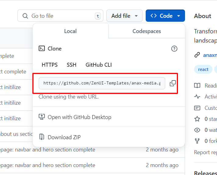
After copying the HTTPS URL just open your computer terminal and type a command like the one below:
git clone project-https-url-here
After processing the command with the correct HTTPS URL, you will get the template on your local computer. Now open the template project on a code editor of your choice.
After opening the project in your code editor, you need to do just 2 things:
Install the npm packages using the command
npm install(packages will be react-icons, react-router-dom, and so on)Run the project on your localhost using the command
npm run dev
Step 3: Customize the Template
You can watch this video on how to use the ZenUI Library template and how to customize it. Or you can play around with:
Modifying Content: Change text, images, or links in the HTML file.
Changing Colors: Update Tailwind CSS utility classes (for example,
bg-blue-500tobg-red-500) to apply your custom branding.Adding New Components: Copy and paste additional components or blocks from the ZenUI Library documentation and integrate them into the template.
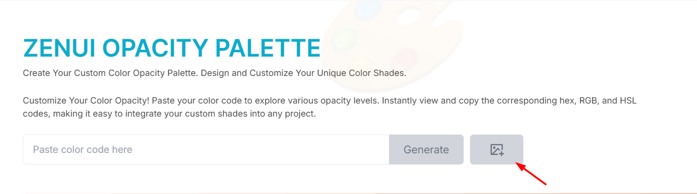
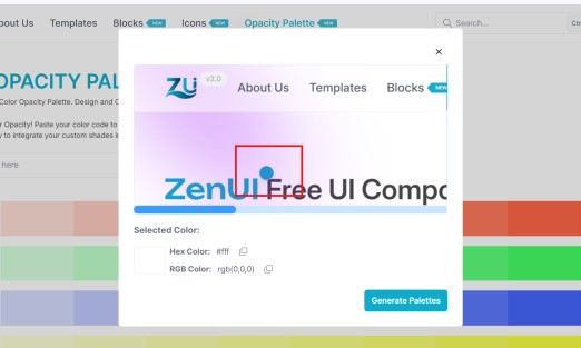
First, go to the ZenUI Library website. Then click on the Opacity Palette button from the top navigation bar. You’ll see some of the palettes that are generated by default from ZenUI. Just click on the image icon button from the icon search bar on the right side, as you can see in the below image:
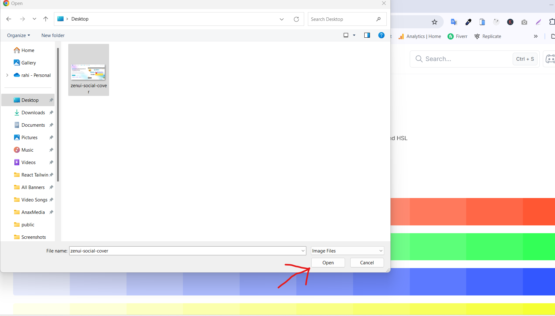
Then you need to select your image from your device. After selecting the image, press the open button like in the below image:
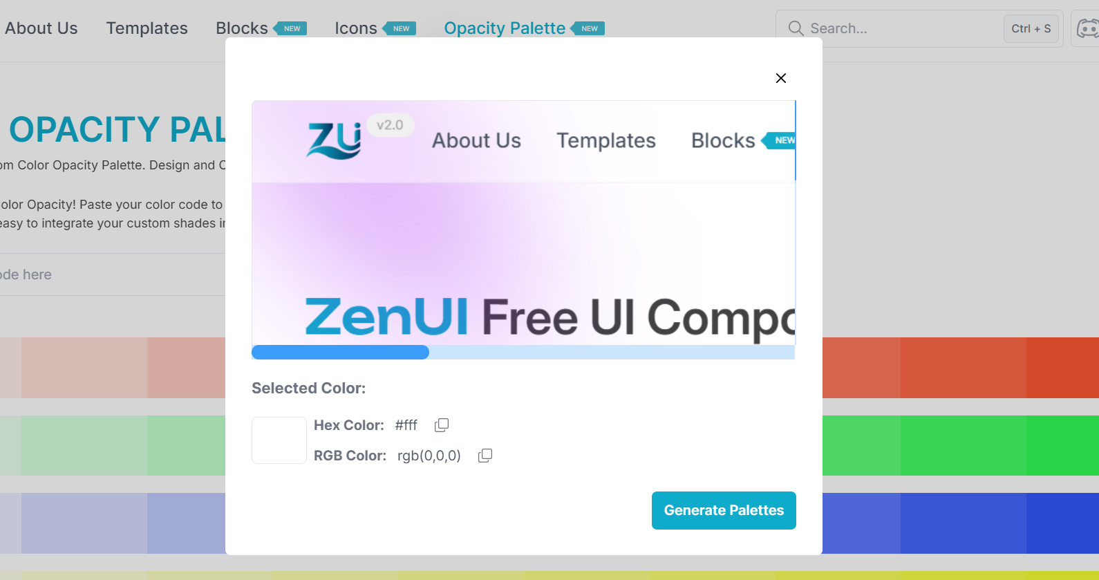
Now you will see a magical tool called “Extract Color From Uploaded Image” like the below image:
Now it’s time to select your color from the image. When you move the cursor on the image, you will see an indicator that lets you see whatever color you’re hovering over right now, as you can see in the image below:
Below that, you will see your selected color in the “Selected Color” section. From there, you can copy your selected color Hex or RGB color code. Also, you can generate the selected color palette by clicking the “Generate Palette” button.
Also, you can generate a color palette by giving the color code. If you have a color code and you want to make the color palette, just paste the color code in the input field reference, as you can see in the below image:
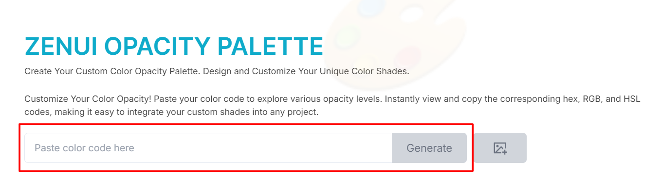
After pasting your color code, just click on the “Generate” button and the color palette will be automatically generated.
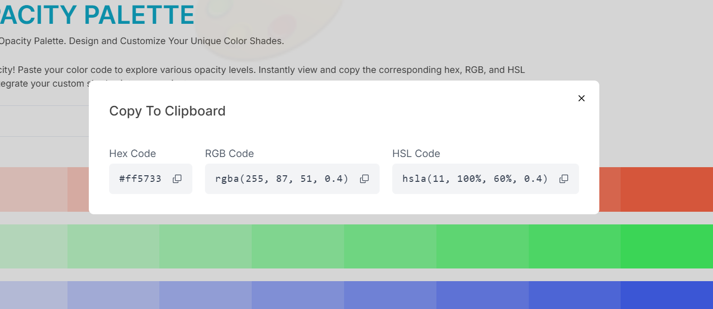
After generating the color palette, you can copy the color code from the generated palette for any part – just click on the palette part. For this, you need to copy the color code. You will see a modal come up with your color code variant like “HEX”, “RGB”, or “HSL” like in the below image:
How to Customize Any Icon in the ZenUI Library
Go to the ZenUI Library website, and click on the icons button from the top navigation bar. This will bring you to the ZenUI icons homepage. Now choose an icon you want to use and click on it. You will see a drawer come out like in the below image:
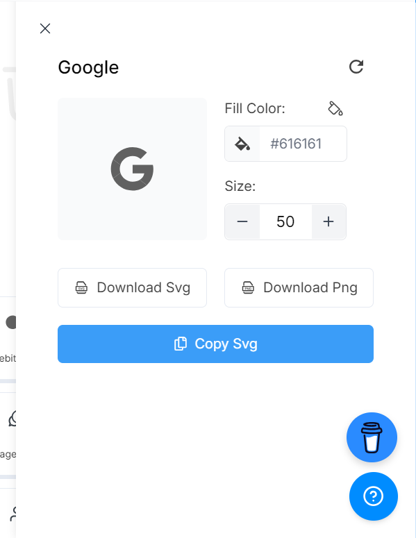
Now you can change the icon Color and Size. After you’ve customized it, you can save the icon multi-variant like PNG, or SVG, or copy the icon SVG code.
ZenUI isn’t just about freely available components. It’s also about fostering a community of developers and designers. Join the ZenUI community so you can share your work, learn from fellow developers, and get early access to new components and templates.
You can contribute to ZenUI by submitting templates, reporting bugs, or suggesting features. You can find the community on platforms like GitHub and Facebook.
Conclusion
Whether building a personal portfolio, an e-commerce site, or a business platform, ZenUI can be your go-to resource for high-quality, customizable UI components and templates. With its simplicity, flexibility, and extensive range of options, ZenUI makes front-end development a breeze.
Feel free to explore the library at https://zenui.net, and don’t hesitate to reach out if you need help or have feedback.
Happy Coding!