While animations may not always be the most exciting aspect for us developers, they’re essential to keep users engaged. In fact, the major aim of animations is engagement and interaction. A light animation could make a user try other components of your website hoping for more of that magic. Animations transform a static experience into a dynamic journey, making the user experience more enjoyable and tolerable.

I want to help you bring some of that magic to your next project.
By the end of this article, you should be able to configure transition animations between routes and see the different implementations of route animations. To get the most out of this article, you must have Angular v17 or v18 installed, and you should already know the fundamentals of how Angular works.
Setting up development for Angular routes
After installation, create the following pages, which we’ll return to later: Home, About, Contact, Meet-and-Greet, and Sign-in. You can use this shortcut to speed this up:
ng g c <The component Name>.
//Do well to take off the test component if you want to.
Your file tree should look like this:
my-angular-app/
└── src/
    └── app/
        ├── home/
        │   ├── home.component.html
        │   ├── home.component.css
        │   ├── home.component.ts
        │   └── home.component.spec.ts
        ├── about/
        │   ├── about.component.html
        │   ├── about.component.css
        │   ├── about.component.ts
        │   └── about.component.spec.ts
        ├── contact/
        │   ├── contact.component.html
        │   ├── contact.component.css
        │   ├── contact.component.ts
        │   └── contact.component.spec.ts
        ├── meet-and-greet/
        │   ├── meet-and-greet.component.html
        │   ├── meet-and-greet.component.css
        │   ├── meet-and-greet.component.ts
        │   └── meet-and-greet.component.spec.ts
        ├── sign-in/
        │   ├── sign-in.component.html
        │   ├── sign-in.component.css
        │   ├── sign-in.component.ts
        │   └── sign-in.component.spec.ts
Creating a route structure
Angular has a very straightforward routing mechanism. At installation it comes with a route provider in the app.config.ts file. We are left with five simple steps needed to create a patterned structure for any route.
The first will be importing Routes from @angular/router in your application’s route file (which is usually app.routes.ts):
import { Routes } from '@angular/router';
The next step will be creating an array of route objects, with each defining a proper path and component that should be displayed when users navigate to it:
import { HomeComponent } from './home/home.component';
import { AboutComponent } from './about/about.component';
import { ContactComponent } from './contact/contact.component';
import { SigninComponent } from './signin/signin.component';
import { MeetAndGreatComponent } from './meet-and-great/meet-and-great.component';
export const routes: Routes = [
  { path: '',
    title: 'home',
    component: HomeComponent,
  },
  { path: 'about',
    title: 'about',
    component: AboutComponent,
  },
  { path: 'contact',
    title: 'contact',
    component: ContactComponent,
  },{
    path: 'signin',
    title: 'signin',
    component: SigninComponent,
  },
  {
    path: 'meet-and-great',
    title: 'meet-and-great',
    component: MeetAndGreatComponent,
  },
];
In AppComponent.ts, we use the RouterOutlet directive to create a spot in the HTML where Angular will show the component for the current route. The constructor includes ActivatedRoute to get information about the active route and ChildrenOutletContexts to manage contexts for nested routes.
We finally complete this setup by adding <router-outlet></router-outlet> in the AppComponent.html, which tells Angular where to display the content for each route as users navigate through the app. Feel free to copy and paste code below:
//app.component.ts
import { CommonModule } from '@angular/common';
import { Component } from '@angular/core';
import { ActivatedRoute, ChildrenOutletContexts, RouterOutlet } from '@angular/router';
@Component({
  selector: 'app-root',
  standalone: true,
  imports: [CommonModule, RouterOutlet],
  templateUrl: './app.component.html',
  styleUrl: './app.component.css',
})
export class AppComponent {
  title = 'routing-app';
  constructor(protected route: ActivatedRoute, private contexts: ChildrenOutletContexts) {}
}
//app.component.html
<router-outlet></router-outlet>
Run this application using ng serve, navigate to any route by using /<the component name> and you should be able to route to the page.
Navigation menu
We will need a navigation to be able to control our routes so it’s easier for users to navigate to other pages in our application. To do this, we need to create a Navbar component. In our Navbar.component.ts we will need to import the RouterLink and RouterLinkActive directives from @angular/router which will help to handle routing within the HTML:
import { Component } from '@angular/core';
import { RouterLink, RouterLinkActive } from '@angular/router';
@Component({
  selector: 'app-navbar',
  standalone: true,
  imports: [RouterLink, RouterLinkActive],
  templateUrl: './navbar.component.html',
  styleUrl: './navbar.component.css'
})
export class NavbarComponent {
}
In the code above, the templateUrl points to the HTML file for the component’s layout, and the styleUrl points to the CSS file for styling.
In our Navbar.component.html, we can now style our navigation bar using the code below:
<header class="text-gray-400 bg-gray-900 body-font">
  <div class="container mx-auto flex flex-wrap p-5 flex-col md:flex-row items-center">
    <a class="flex title-font font-medium items-center text-white mb-4 md:mb-0">
      <img class="w-40 h-10 " src="https://blog.logrocket.com/wp-content/themes/logrocket/assets/logrocket-logo.png" alt="" srcset="">
    </a>
    <nav class="md:ml-auto flex flex-wrap items-center text-base justify-center">
      <a routerLink="/" routerLinkActive="active" [routerLinkActiveOptions]="{exact: true}" ariaCurrentWhenActive="page" class="mr-5 hover:text-white">Home</a>
      <a routerLink="/about" routerLinkActive="active" [routerLinkActiveOptions]="{exact: true}" ariaCurrentWhenActive="page" class="mr-5 hover:text-white">About</a>
      <a routerLink="/contact" routerLinkActive="active" [routerLinkActiveOptions]="{exact: true}" ariaCurrentWhenActive="page" class="mr-5 hover:text-white">Contact</a>
      <a routerLink="/signin" routerLinkActive="active" [routerLinkActiveOptions]="{exact: true}" ariaCurrentWhenActive="page" class="mr-5 hover:text-white">SignIn</a>
      <a routerLink="/meet-and-great" routerLinkActive="active" [routerLinkActiveOptions]="{exact: true}" ariaCurrentWhenActive="page" class="mr-5 hover:text-white">meet-and-great</a>
    </nav>
  </div>
</header>
Don’t forget — in the code above, our navigation menu contains links to different pages of our site: Home, About, Contact, Sign-In, and Meet-and-Greet. Each link uses Angular’s routerLink directive to navigate to the corresponding page and routerLinkActive to apply an “active” class when the link’s route is the current one. This setup ensures that the navigation menu highlights the active page, using this styled border:
./navbar.component.css
.active{
  border-bottom: 2px solid #7c3aed;
  transform: scale(1.1);
  transition: border-bottom 0.3s ease, color 0.3s ease, transform 0.3s ease;
}
We then, have to import this in our app.component.tsand render it above ourrouter-outletinapp.component.html` this way in order to make it consistent across all pages:
<app-navbar></app-navbar>
<router-outlet></router-outlet>
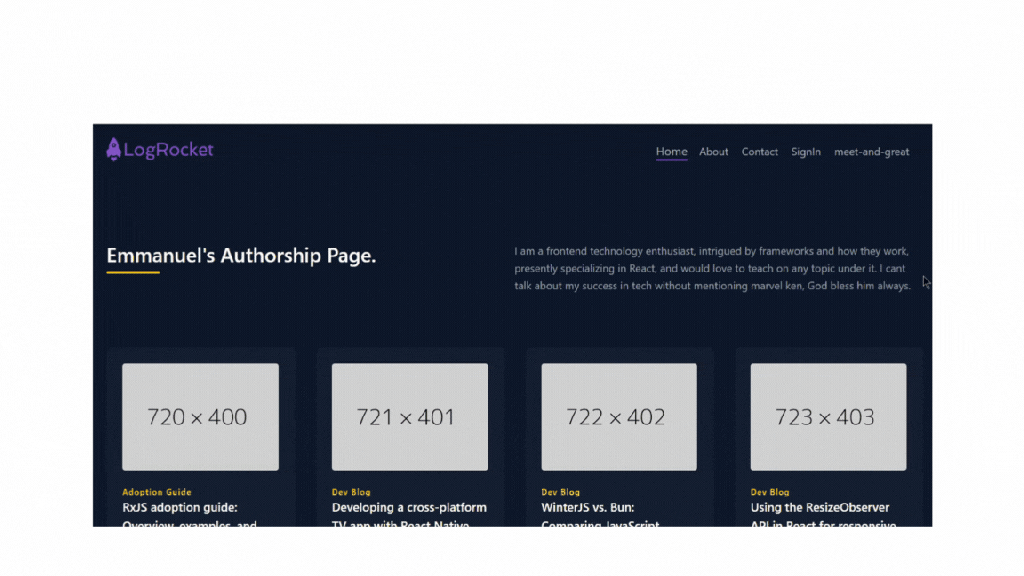
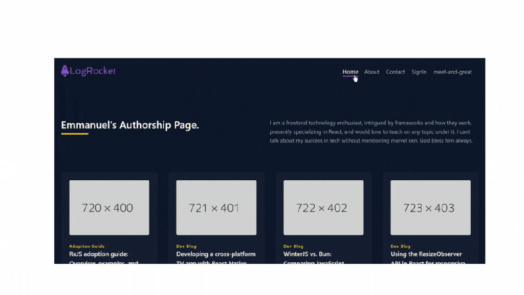
Now we can route to pages:
Angular routes transition animation
Setting up animations with Angular routes is very easy, albeit not straightforward. We need to configure our application to be able to manage animations the way we want them.
This is achieved by importing provideAnimationsAsync in the app.config.ts file, which returns a set of dependency-injection providers that enable animations in an application.
Our app.config.ts file will now look like this:
import { ApplicationConfig, provideZoneChangeDetection } from '@angular/core';
import { provideRouter } from '@angular/router';
import { routes } from './app.routes';
import { provideAnimationsAsync } from '@angular/platform-browser/animations/async';
export const appConfig: ApplicationConfig = {
  providers: [provideZoneChangeDetection({ eventCoalescing: true }), provideRouter(routes),  provideAnimationsAsync()]
};
Route configuration
In our route.ts, the following configuration defines the possible animation for routes in the application:
export const routes: Routes = [
  { path: '',
    title: 'home',
    component: HomeComponent,
    data: {animation: 0}
  },
  { path: 'about',
    title: 'about',
    component: AboutComponent,
    data: {animation: 1}
  },
  { path: 'contact',
    title: 'contact',
    component: ContactComponent,
    data: {animation: 2}
  },{
    path: 'signin',
    title: 'signin',
    component: SigninComponent,
    data: {animation: 3}
  },
  {
    path: 'meet-and-great',
    title: 'meet-and-great',
    component: MeetAndGreatComponent,
    data: {animation: 4}
  },
];
It’s kind of confusing, so let’s break it down a bit.
Each route in the configuration includes an animation property in its data object, with values from 0 to 4 serving as identifiers for specific animations.
During route transitions, these values are used to determine and apply different animations based on the route being entered or exited.
For example, animation: 0 might trigger one animation for the home route, while animation: 1 triggers a different animation for the about route.
The component handling routing retrieves these animation values and uses them to dynamically apply the corresponding animations. Now we have been able to configure our routes properly, so let’s head to our next section where we discuss how we can trigger animations.
Route-triggered animations
In our AppComponent.ts, we will create a method that detects when the view changes. This method updates the animation based on the route’s data. It assigns the animation state using the value from the route’s data property, so each route has its own animation effect. Here’s a simple example of how the method detects and handles route changes:
export class AppComponent {
  title = 'routing-app';
  constructor(protected route: ActivatedRoute, private contexts: ChildrenOutletContexts) {}
getRouteAnimationData() {
  return this.contexts.getContext('primary')?.route?.snapshot?.data?.['animation'];
}
}
In our app.component.html we will use the [@routeAnimations] directive to apply animations based on the current route. The animation is determined by the getRouteAnimationData() method we created before this:
<div [@routeAnimations]="getRouteAnimationData()">
  <router-outlet></router-outlet>
</div>
This method is used in the template with the [@routeAnimations] directive to dynamically apply animations based on the current route, enabling unique animations for each route change.
Define the animation
For the last step, we will need to give life to our animation by telling it what exactly we want it to do. We can do this in a separate file so we can easily reuse it elsewhere. Our file name will be animate.ts. Let’s go ahead and define our route transition animation.
First, we will need to import certain functions from the Angular animation module to enable the use of animation properly:
//animate.ts
import { animate, query, style, transition, trigger, group } from "@angular/animations";
Here’s a breakdown of what each imported function does on its own:
| Animation modules | Functions |
|---|---|
| animate | Defines how a property should transition over time |
| query | Selects and applies styles or animations to elements within inner elements like child elements of a parent component |
| style | Contains CSS style properties, sets the styles of an element at a specific point in the animation |
| transition | Specifies the animation sequence that occurs when the state changes |
| trigger | Creates an animation trigger that can be used to apply animations to an element |
| group | Allows multiple animations to run simultaneously |
The table gives a good sense of each animation module and how it will be very instrumental in creating animation in the next section.
Slide-in animation
For our first animation, we will want our pages to slide in whenever we navigate to another. A simple slide-in animation will use the ease-in-out transition timing function animation between routes, and the code will look like this:
//Ease-in-out
export const slideInAnimation = trigger('routeAnimations', [
  transition('* <=> *', [
    style({ position: 'relative' }),
    query(':enter, :leave', [
      style({
        position: 'absolute',
        top: 0,
        left: 0,
        width: '100%',
      }),
    ], { optional: true }),
    group([
      query(':leave', [
        animate('1s ease-in-out', style({ left: '100%' }))
      ], { optional: true }),
      query(':enter', [
        style({ left: '-100%' }),
        animate('1s ease-in-out', style({ left: '0%' }))
      ], { optional: true }),
    ]),
  ]),
]);
Let’s break down a lot of what is happening up there. Our slideInAnimation defines a routeAnimations. This animation is triggered for any route change.
The transition('* <=> *', [...]) configuration ensures the animation occurs whenever the application navigates between any routes. On a random day when we only want this animation to be seen between selected routes, we will write the transition this way: transition('routeAComponent <=> 'routeAComponent', [...]).
To start, the animation uses style({ position: 'relative' }) to position elements relatively, which is essential for the absolute positioning applied to the entering and leaving pages.
The animation uses the query function to select the components that are entering or leaving the view. The group function then allows these animations to run simultaneously.
More great articles from LogRocket:
- Don't miss a moment with The Replay, a curated newsletter from LogRocket
- Learn how LogRocket's Galileo cuts through the noise to proactively resolve issues in your app
- Use React's useEffect to optimize your application's performance
- Switch between multiple versions of Node
- Discover how to use the React children prop with TypeScript
- Explore creating a custom mouse cursor with CSS
- Advisory boards aren’t just for executives. Join LogRocket’s Content Advisory Board. You’ll help inform the type of content we create and get access to exclusive meetups, social accreditation, and swag.
For the leaving component, it animates to move to the right (left: '100%') over one second with an ease-in-out timing function, and for the entering component, it starts off-screen to the left (left: '-100%') and slides into view over one second, also using the ease-in-out timing function.
Now that you understand that, we can create as many animations as we want. Let’s create a fade in and rotate transition animation for a better use case.
Fade-in scale animation
For a simple fade-in scale animation, let’s use the ease-in and ease-out transition timing functions. Our code will look like this:
//Fade-in scale
export const fadeInScaleAnimation = trigger('routeAnimations', [
  transition('* <=> *', [
    style({ position: 'relative' }),
    query(':enter, :leave', [
      style({
        position: 'absolute',
        top: 0,
        left: 0,
        width: '100%',
      }),
    ], { optional: true }),
    group([
      query(':leave', [
        animate('1s ease-out', style({ opacity: 0, transform: 'scale(0.4)' }))
      ], { optional: true }),
      query(':enter', [
        style({ opacity: 0, transform: 'scale(1.2)' }),
        animate('1s ease-in', style({ opacity: 1, transform: 'scale(1)' }))
      ], { optional: true }),
    ]),
  ]),
]);
The fadeInScaleAnimation defines a routeAnimations that creates a fade-in and scale effect during route transitions.
The group function ensures that the leaving element fades out and scales down to 40% of its size over one second with an ease-out timing function, while the entering element fades in and scales up from 120% to its normal size over one second with an ease-in timing function.
It’s quite an easy animation to look out for. In the other section we didn’t talk about the optional: true flag — all it does is allow the animation to work even if the components are not present.
Rotate fade animation
For this animation, we we’ll use the linear transition timing function, and the code will look like this:
//Rotate Fade
export const rotateFadeAnimation = trigger('routeAnimations', [
  transition('* <=> *', [
    style({ position: 'relative' }),
    query(':enter, :leave', [
      style({
        position: 'absolute',
        top: 0,
        left: 0,
        width: '100%',
      }),
    ], { optional: true }),
    group([
      query(':leave', [
        animate('0.8s linear', style({ opacity: 0, transform: 'rotate(180deg)' }))
      ], { optional: true }),
      query(':enter', [
        style({ opacity: 0, transform: 'rotate(-180deg)' }),
        animate('0.8s linear', style({ opacity: 1, transform: 'rotate(0deg)' }))
      ], { optional: true }),
    ]),
  ]),
]);
The rotateFadeAnimation as usual defines the routeAnimations that create a rotating and fading effect during route transitions.
The group function ensures that the components leaving the user’s view rotate 180 degrees and fades out over 0.8 seconds with a linear timing function, while the entering component rotates from -180 degrees to 0 degrees and fades in over the same duration.
Animation visibility
To make the animation visible in your application, add the <reusable animation> (slideInAnimation, rotateFadeAnimation, fadeInScaleAnimation ) to the animation metadata of the AppComponent:
import {  —>>><reusable animation>} from '../animations';
@Component({
  selector: 'app-root',
  standalone: true,
  imports: [CommonModule, NavbarComponent, RouterOutlet],
  templateUrl: './app.component.html',
  styleUrl: './app.component.css',
  animations: [
   — >>> <reusable animation>
  ]
})
Now you can see your work come to life with some pretty neat animations!
Slide-in animation:
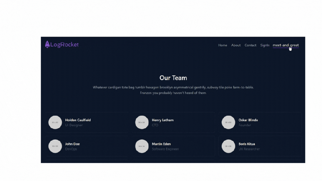
Fade-in scale animation:

Rotate fade animation:
Are animations enough to keep your audience engaged?
Studies on web animations indicate that they can improve user usability, and usability could equal retention in some cases. Why is this research important? Well, you want to keep your users happy and on your website, right? .
But no worries — you can thank me in the comments for giving you another resource to keep your users engaged., However, before you do, please note that too much animation can be distracting and overwhelming.
Sometimes “less is more” truly is the way to go.
If you’re looking for docs on transition animation concepts, hit up Angular here:
For an overview of different projects built in Angular, please take a look at our Angular archive.