The fall of flat design over the last few years has caused many new trends to appear in user interface design. These new design trends have broken away from flat design’s overly simple visuals and shifted to revive realism.
One of these new design trends is neumorphism. This trend mixes the effects of minimalism and realism to create interfaces that are easy to comprehend, but are not overwhelming to the eye. Neumorphic designs appear soft and feather-like due to the use of shadows and highlights that create depth on the interface.
Neumorphism brings a modernized flavor to flat design by maintaining simplicity, but eliminating the flatness. Let’s talk about neumorphism’s origins, how you can use it in your designs, and how it compares to other design trends.
The origin of neumorphism
To better understand neumorphism, we need to go back and review the evolution of interface design.
As personal and home computers became more affordable in the 1980s, the software running on these computers needed to feel familiar to user’s mental models. But did users have mental models for something they’ve never used before? Absolutely.
Humans use their past experiences to take on new ones. Since humans hadn’t encountered a digital experience before, the software’s interface design relied on physical experiences.
Skeuomorphism
How did interfaces first integrate physical experiences? Through skeuomorphism. This design trend inserted familiar elements from the physical world into the digital. Features of skeuomorphic interface design include:
- Three-dimensional appearance from shadows and gradients
- Iconography with literal meaning (like a trash can to represent the “delete” action)
- Imitations of physical objects (like a replica of a notepad on a mobile phone)
A real-world example of skeuomorphic design is the older version of the Notes app on Apple devices:
Skeuomorphism helped users become more comfortable with digital experiences. But the design trend had its share of cons including unappealing visuals that looked cluttered, and poor loading speeds from the interface’s detailed elements.
Flat design
To address the cons of skeuomorphism, flat design emerged in the early 2010s. Flat design minimized the details found in skeuomorphism. No more shadows, textures, and gradients — and no more literal interfaces.
Flat design took a “form follows function” approach by focusing on the usability of the interface. In contrast to skeuomorphism, flat design includes:
- Two-dimensional appearance
- Simple shapes and typography (which improved loading speeds)
- Bold colors to prompt users on actions they can take
Microsoft was among the first to adopt flat design, as you can see in this older version of their homepage:
Though flat design’s approach is directly influenced by skeumorphism’s limitations, it also had its share of cons. For example, it caused some usability issues since users couldn’t always tell what was interactive or not, and it was widely regarded as too simple.
So where is the balance between being too cluttered and literal versus being too simple and unclear?
Neumorphism
Neumorphism (or new-skeuomorphism) was introduced around 2019 once flat design began losing traction. This design trend blends skeuomorphism and flat design. Like the transition from skeuomorphism to flat design, neumorphism is a response to flat design’s limitations.
Instead of moving toward a completely new design era, neumorphism brings back elements from the realism found in skeuomorphic design to balance with the minimalism found in flat design. Features of neumorphism include:
- Three-dimensional appearance from drop shadows, inner shadows, and highlights
- Simple color schemes with minimal color
- Soft, low-contrast interfaces
This design concept by Filip Legierski is a great example of neumorphism:
Think of this trend as a modernized skeuomorphic interface — that’s why it’s called new-skeuomorphism. The reintroduction of shadows, gradients, and textures makes these interfaces feel realistic without being overly cluttered.
Through the evolution of interface design, neumorphism takes the best features from skeuomorphism and flat design by merging them into one trend.
Examples of neumorphism
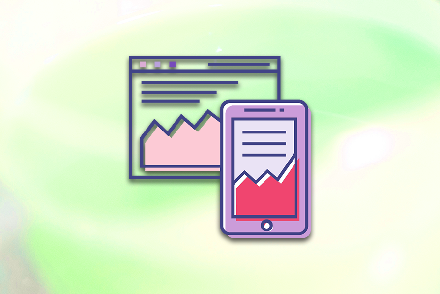
Now that we’ve discussed what neumorphism is and how it came about, let’s review a couple of examples in action. These examples demonstrate neumorphic design in a savings app and login page concept.
Savings app
This first concept of a savings app shows an interface with subtle shadows and minimal use of color. The minimalism helps the interface look modern, and the shadows on each design element bring in a touch of realism:
Visual elements that make up the savings app’s neumorphic design include:
- Subtle gradients from white to light gray
- One bold color (teal) used scarcely
- Drop and inner shadows to give three-dimensionality
- Highlight effects from a white border around components and page sections
- Simple typography with a sans serif font
This concept’s neumorphic design is effective in drawing the eye to the bright, teal color. Strategic use of color helps the user quickly see the most important information on a screen, such as calls to action or data visualizations. Since the remaining interface is grayscale, it prevents the user feeling overwhelmed while looking at the screen.
Login page
This second concept gives us a glimpse of neumorphism in both light and dark modes. The login page shown in this concept uses both drop shadows and inner shadows, includes minimal color, and gives elements a glowing look:
Elements of neumorphism in this login page include:
- Inner shadows used to create a debossed or indented effect
- Drop shadows used on buttons to elevate them from the interface
- One bold color used for the primary action (‘Sign in’)
- A highlight effect used on the opposite side of drop shadows
This concept maintains the minimalism of neumorphism in both light and dark modes. The use of grayscale colors helps the lime green color stand out on the interface. Additionally, the drop and inner shadows give visual cues to the user regarding what is interactive and what isn’t.
These concepts are strong examples of neumorphism to reference. Each concept checks the boxes for the visual effects to include when designing for this trend. Simplicity, minimal color, and use of shadows all create an interface that blends minimalism and realism.
Should you use neumorphism?
Choosing the look and feel of a product’s interface is not an easy decision. Your product’s user groups, competitors, and company-branding should all be factored into the decision-making process. Neumorphism may be a design trend to consider when adopting a visual language, but knowing the benefits and limitations can help the ultimate choice.
Benefits of neumorphism include:
- Simplistic designs that look modern
- Opportunity for creativity in the interface
- Consistent user experiences across different products
Neumorphism provides a way to blend the “form follows function” principle while adding creativity that was lost during the flat design era. These interfaces still look modern, but include more visual styling than the bare bones required.
Additionally, the simplicity of neumorphic design is easily translated across different experiences in one application, as well as across products from the same family. This can help different teams designing for the same company remain consistent with both aesthetics and interactions.
Though creating simple, creative, and consistent user experiences are ideal benefits for any design trend, it comes with some limitations.
Limitations of neumorphism include:
- Accessibility issues from the low-contrast designs
- Usability issues from the minimal color schemes
Neumorphism brings up both accessibility and usability concerns due to the low-contrast and minimal color schemes that define the design trend. However, there are ways to address these concerns while still using elements of neumorphic design.
For example, users with visual impairments like color blindness or low vision may have trouble reading neumorphic interfaces. To meet Web Content Accessibility Guidelines (WCAG), non-decorative elements on an interface must have a three-to-one color contrast ratio against adjacent colors. This includes UI components like buttons or input fields.
Because neumorphism typically uses low-contrast designs, it normally fails this three-to-one color contrast ratio requirement. A simple way to update your design to meet this standard is by adding a gray border to the non-decorative element:
As for usability concerns that can impact any user, interactive elements on neumorphic interfaces may not be distinguishable from non-interactive elements. This can cause users to become stuck or confused on a given webpage. Even worse, it could cause a user to abandon your website or application.
A few ways to address usability issues in neumorphic design is using strategic visual cues, like using your chosen bold color or clear text labels for interactive elements, implementing visual indicators for hover and active states, and more.
Of course, creating accessible experiences is a must in 2024. Traditional neumorphic designs are not accessibility-focused, but that doesn’t mean they can’t be. Ensure text and non-text elements, like UI components, meet the specific WCAG color contrast requirements to create neumorphic designs that are inclusive.
The neumorphic design trend has its pros and cons. If you or your team decide it’s the right approach for your product, make sure to address the accessibility and usability concerns before officially adopting it as your interface’s visual language.
How to design with neumorphism
If you decide you want to incorporate neumorphism into your designs, it is easy to adopt. But if you’re unsure where to start, I will demo how to create a neumorphic segmented control in Figma.
Segmented controls are a UI component that allows a user to swap between views or content on a webpage. The segmented control I’ll demonstrate below will allow the user to swap between different views on the webpage for Week, Month, and Year.
Create the text layers
The segmented control will include three controls to swap between our views. Follow these steps to create the text layers we need:
- Press T to create and name three text layers for Week, Month, and Year
- Update the font styles — I used Helvetica Neue, Medium weight, and size 14 font
- Update the font color — I used #707070 for a legible gray
You should see something like this:
Create the “Selected” control
We need to visually indicate one control that is currently selected and two controls that are not selected:
- Select one text layer to demonstrate a “Selected” state — I chose Week
- Create a frame on the text layer — the keyboard shortcut is
Option+Command+G - Add auto-layout with vertical and horizontal padding — I used 16px
- Add a linear gradient for the frame’s fill — I used #F3F6FC to #FFF
- Add a 1px inner stroke — I used #FFF
- Add a 4px radius to soften the edges
- Add a drop shadow to elevate it — I used 2, 2, 4, 0 with #000 at 25 percent opacity
Here’s the result:
Create the base
Now, we need a base for our segmented control to contain the three Week, Month, and Year controls:
- Create a frame with the two unselected text layers, Month and Year
- Add auto-layout to the frame with vertical and horizontal padding
- For the horizontal padding, add extra space on the left side for the “Selected” control
- Add a background fill — I used #E4E6EC for a blue-gray
- Add a radius of 4px to soften the edges
- Add an inner shadow to the frame — I used -2, 2, 4, 0 with the color #000 at 25 percent opacity
Note that since I added an inner shadow to the frame, I can’t add the “Selected” control frame into the base frame. If I did this, the inner shadow would cover the “Selected” control and I wouldn’t get the debossed effect for the base.
Here’s our design so far:
Combine the base with the “Selected” control
Our base contains space for the “Selected” control, but they haven’t been combined into our single segmented control yet. Here’s how to combine them:
- Create a frame around the base and “Selected” control
- Absolute position the “Selected” control — select the target icon in the design panel
- Readjust the padding on the base, if needed
Here’s the final design concept:
That’s it! Now you have a segmented control that follows the neumorphism trend. The use of drop shadows and inner shadows creates three-dimensionality by elevating the “Selected” control and debossing the base. These visual effects give the realistic effect of neumorphism.
As you can see, neumorphism is simply blending minimalism and realism into the same elements. Keep trying these visual effects on other UI components, like a button, to create a webpage or mobile design.
Neumorphism vs. other design trends
We’ve already discussed skeuomorphism and flat design. So, what other interface designs are trending? Turns out, there are many — and I’m sure there will be more in the future. Let’s talk about a few: glassmorphism, neubrutalism, and dark mode.
Glassmorphism
Similar to neumorphism, glassmorphism began trending around 2020. It also stems from flat design with its minimalist approach. Glassmorphism has been popularized through its use in Apple and Microsoft’s operating systems. Some features to identify glassmorphism include:
- “Frosted glass” or translucent appearance
- Colorful gradients to give the product depth
You can achieve the “frosted glass” appearance by adjusting the opacity and background blur of a design element in the foreground. The translucent appearance distinguishes the foreground element, but doesn’t completely cover the background.
In this way, glassmorphism helps users understand where they are in a product experience when popups or modals appear, since they can still see the primary background.
Apple’s macOS Big Sur release in 2020 introduced glassmorphism into their interface design. The operating system adopted bold, colorful gradients as its background, and the menu toolbar was replaced from a traditional white to the frosted glass effect:
Though glassmorphism is a popular trend today, it can pose accessibility issues. If the background blur or opacity doesn’t produce a high enough contrast with its background, the readability of text elements can become difficult for users with visual impairments.
If you use glassmorphism, your text and non-text elements need to meet their specific color-contrast requirements to make sure users can see the interface’s content.
Neubrutalism
Up next is neubrutalism, which was popularized in 2022. This design trend is also influenced by flat design, but rejects the idea of realistic interfaces found in skeumorphism. Instead of using subtle shadows and gradients to give elements a three-dimensional look, it uses bold colors and dark outlines.
Other features of neubrutalism include:
- Hard shadows through bold outlines and background fills
- High-contrast interfaces with atypical color schemes
- Futuristic typography
A well-known example of neubrutalism is Figma. They check all the boxes of the trend from their use of bright colors for background fills, bold outlines, and futuristic typography (they use a font called Whyte, if you’re curious):
Because neubrutalism uses unusual color schemes and bold colors for background fills, it can be hard to distinguish interactive elements on the webpage.
Color is typically used to draw the user’s eye to certain elements, like CTAs. So, using many colors on a given webpage can be overwhelming and confusing to users. If you use neubrutalism in your designs, make sure users are not confused by an overuse of color.
Dark mode
Dark mode, of course, isn’t a new concept — computers in the 1970s had a dark mode setting by default. However, dark mode didn’t start trending until more recently, around 2017. Once big tech companies like YouTube and Twitter released dark mode for mobile devices, the trend started to grow.
Dark mode can either be a display setting for users to select from or the only color scheme a product supports. In dark mode, the interface adopts a dark color scheme that creates a “nighttime” look. It’s less straining on the user’s eyes and is more sustainable due to the dark colors requiring less energy.
Features of dark mode include:
- Dark background colors (from dark-gray to black)
- Light text and non-text content
- Accent colors that have been desaturated (to lessen eye strain)
Many products support both light and dark modes, but some products only offer dark modes. Netflix only uses dark mode; same with other streaming services like Hulu and Max. Some speculate this is to give the feeling of being in a movie theater:
Most products should support both light and dark modes to allow the user to pick their preferred display setting. However, due to the energy-saving benefits of dark mode, designers might consider only supporting dark mode like Netflix or defaulting to dark mode.
The design trend you select for your product should be based on your users, what your competitors are doing (or not doing), and your company’s branding. For example, if your product needs something edgy and unconventional, choose neubrutalism. If your product emulates big tech companies like Apple, consider neumorphism or glassmorphism.
Whichever route you decide to go, you need to ensure the designs resonate with your users and are inclusive for users with disabilities.
Conclusion
Neumorphism is an exciting design trend you may consider adopting to help modernize and differentiate your product. It takes elements from both skeuomorphism and flat design by balancing realistic, three-dimensional effects with simplicity. Neumorphism’s visual effects allow for more creativity, but its minimalism reduces the risk of overwhelming users.
As with any design trend, neuomorphism has its pros and cons. It allows product designers to create more aesthetically-pleasing interfaces while driving consistency. But it also spurs issues around accessibility and usability. If you use neumorphism in your product design, ensure visual elements pass WCAG standards so your interfaces are high-contrast and inclusive.
When designing neumorphic screens or components, use a minimal color scheme with grayscale colors and one bold color. This not only creates the simplicity required for neumorphism, but draws the user’s eyes to the most important elements on an interface.
Additionally, use a mixture of drop shadows, inner shadows, and highlights to create elevation and debossing effects. This will generate the realism found in neumorphism.
Neumorphism isn’t the only design trending now. Big tech companies such as Apple and Netflix are using trends such as glassmorphism, neubrutalism, and dark mode.
When selecting a design trend to use for your product, compare and contrast the look and feel each trend gives to products and how it drives the brand. Most importantly, make sure the design trend resonates with your user groups.
Let’s continue to watch how neumorphism is applied to interface design, and what comes next as user experience design continues to evolve.