Do you know that, in the time you’ve taken to open this article, you’ve already subconsciously assigned a level of “quality” to this website? In only a few moments, you either think that the website has a pleasant color scheme and is easy on the eyes, or you think the complete opposite.

Colors play an important role in UX design, both in a practical sense and in the way they affect our users subconsciously. In this article, we’ll look at color schemes — specifically, triadic color schemes — to understand the theory, see practical examples, and learn how to apply such a scheme.
Why do color schemes matter?
In the early days of the web, not much time was spent on thinking about color schemes, as best demonstrated by the Yahoo! logo on the web in the 90s:
![]()
If we were to (roughly) plot these colors on a color wheel, including the Yahoo! logo color, we’d get about this result:
![]()
It’s just kind of…all over the place, really. We couldn’t derive a mathematical equation that would give us these positions on the color wheel. Instead, someone has assigned these colors because they probably thought they looked okay together, and that was that.
Since the nascent days of the web, our understanding of colors has come a long way. Things like color theory and color science tell us what colors look good together.
When colors look good together, they form a type of harmony, and that harmony can give our users the impression that our website is high quality before they even use it. In contrast, if the colors look particularly bad or discordant, users may think the app is low-quality — a reputation that has to be disproven by the sheer quality of your app. It’s very important.
But, how do we know what colors are harmonious together? An easy way is to pick colors that are at opposite ends of the color wheel. Depending on how many colors you need, you might choose two, three, or even four points on the color wheel for the theme of your website.
In this article, we’ll look at the triadic color scheme. We’ll define it, get to know the theory, see examples, and demonstrate how to put a triadic color scheme to work.
What is a triadic color scheme?
Put simply, a triadic color scheme uses three points on the color wheel that are evenly spaced apart. Because the colors are evenly spaced across the entire spectrum, it leads to a high-contrast color scheme that is very vibrant and visually appealing.
To visualize this, lets choose three points on the RGB color wheel and see what we get:
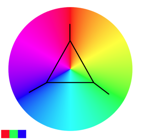
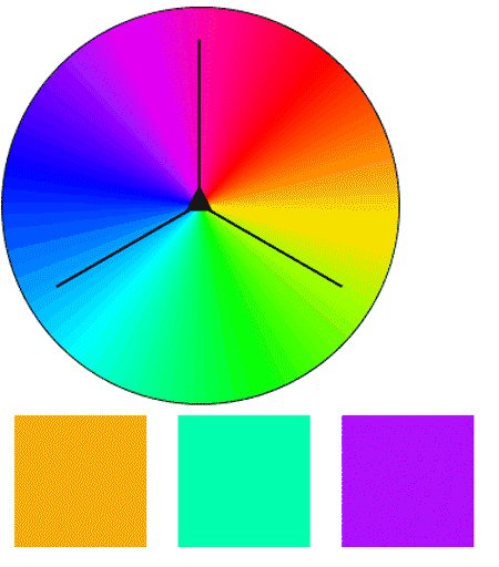
As expected, because we’ve chosen three colors at 0, 120, and 240 degrees, we’ve wound up with a red, green, and blue palette. If we were to continue to spin the color wheel, we’d have three new distinct colors each time:
When choosing colors for a design theme, we should check what our colors mean and whether those meanings align with the message our app is trying to sell. For example, using lots of red — a color that can seem like a warning — in a financial app would probably be a bad idea.
When (and when not) to use the triadic color scheme
So, we know that a triadic color scheme is going to give us great contrast between three main colors. It’s best used in the context of:
- When we really want to grab the viewer’s attention with sharply contrasting colors. If we’re trying to get someone to do something, or draw attention to something, a triadic color scheme is going to get that done
- When we are trying to demonstrate a sense of diversity and energy in our product
- Creating a playful and energetic design
- A high-contrast color scheme also carries certain accessibility benefits as well, as it will give people the best chance of being able to see and interpret our page
A triadic color scheme can be a powerful tool. But much like a tool, used in the wrong place or wrong way, it can create problems. This kind of color scheme would work well in the context of a fundraiser or children’s hospital, but could seem unprofessional or alarming if used in fintech or bigger business.
To boil it down to pros and cons:
| Pros | Cons |
|---|---|
| Balanced color harmony | Can be overwhelming if not used carefully |
| High visual contrast | Requires skill to maintain cohesion |
| Versatile for creative projects | Less subtle, may not suit all brands |
| Effective for playful and energetic designs | Not suitable for formal or serious context |
Now we understand where we should and shouldn’t use triadic color schemes, let’s see where they are in use today.
Examples of triadic color schemes
There’s perhaps no better demonstration of a triadic color scheme than Superman’s outfit. The trademark blue, red, and yellow outfit is a good example of a triadic color scheme:

There’s a small problem with Superman’s color scheme, though: if he’s blue and red, then shouldn’t his chest be green instead of yellow? This difference is because Superman exists in the art design realm, and was designed some time ago when the color wheel was Red-Yellow-Blue, instead of the Red-Green-Blue digital design color wheel we typically use today.
Another example of this color scheme is the cleaning product design below:
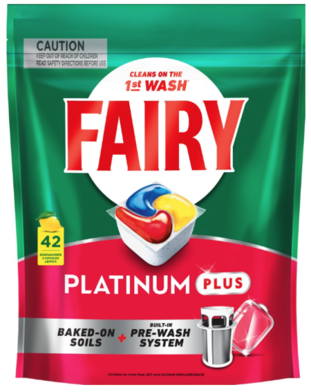
The three primary colors at the centre of the packet, surrounded by a white circle, results in a very distinct, sharp image. The marketing team likely chose this color scheme because it would stand out on shelves as well as give customers the feel that their items would come out sparkling clean.
So, the triadic color scheme is used by anyone from Superman to dishwashing tablet companies. In the coming section, we’ll discuss ways we can use the triadic color scheme in our own work.
Keep in mind that there’s an attention-grabbing element to this color scheme. So, while it would work well for packaging or fundraising, trying to use this color scheme in a more corporate or professional environment might be a bit more difficult. Many companies these days favor neumorphism instead for a more modern, minimalistic design.
Putting the triadic color theme to work
Let’s imagine that we’re designing a website, and we want an attention-grabbing color scheme. We could roll with something like this:

It’s okay. Our content is nicely centered, and we’re using the three primary colors — red, blue, and green.
However, it’s a bit loud. If were were selling children’s toys or this was the website for a daycare, maybe this would be okay. But if we were trying to ship something that would be used in a corporate environment, our users would likely say it looks more like a McDonald’s coloring book — and they wouldn’t be entirely wrong, either.
We can solve this issue by adjusting the saturation of the colors. Here’s the same example, but with the colors toned down a bit:

We approach almost pastel-tones, and more muted colors. Because we’ve done this, we can now add other elements with stronger colors, while maintaining a harmony between colors.
Because the colors are now more subdued, we can direct attention to other elements that use more vibrant colors. Choosing the original blue color and adding an icon with a shadow ties these elements together:

This is important because, within moments of opening the webpage, the user immediately knows that our business is cat related. Thanks to the vibrant blue color, their attention is drawn to the cat logo and the top bar, which has our business name. The second thing they’re likely to look at is the row of three buttons, where they can find out more if they so wish.
Lessons from using a triadic color scheme
Choosing three colors via this method is easy, but figuring out where and how to use them can be hard. If we used all three colors equally, our webpage (or whatever we were designing) will quickly start to look cluttered. Let’s discuss how we can avoid that.
Choose a primary color, a secondary, and an accent
Just because you have three colors doesn’t mean that you have to use each of them exactly 33 percent of the time.
In the example above, we primarily use blue and muted blue for most of the webpage, with the red and green serving as accents. This gives our design a playful feel without making it feel too confusing or overwhelming from a color perspective.
Adopt the 60-30-10 rule
It’s hard to work out how much of the screen should have a certain color, but the 60-30-10 rule can make it easier for us.
The primary color that you choose should occupy most — or about 60 percent — of the screen that it is on. Meanwhile, the second or secondary color should occupy 30 percent, and the last 10 percent should act as an accent color.
Making the primary color the same between pages can give a consistent look and feel to our design.
Don’t be afraid to tweak the colors until they’re just right
It can be a pain to set what you think is a winning color palette, and then later on in the design process, feel like your chosen colors clashing or not right for the purpose you’re after.
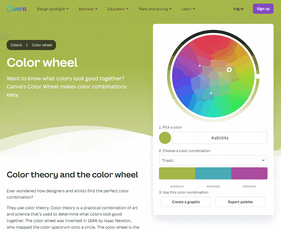
Don’t force it. If you think it looks bad, then it’s likely that the people who use your product will agree. Better still, use a tool like Canva to find colors that work for you and your theme. Canva also allows you to preview the chosen colors so you can get an idea of how they look in real-time:
Consider your target market
Three colors can be a lot, so using a varied color scheme can be very attention-grabbing, which is fine for certain industries. However, if you’re creating something for a corporate environment or other white-collar industries, it may not give your users the confidence they’re looking for. Consider an analogous or complementary color scheme instead.
It’s also important to choose the right primary color. For example, if you were using a banking or financial service, you’d probably choose a relaxing blue color instead of an alarming red.
Conclusion
Choosing a triadic color scheme can help us make a theme that really pops or is very attention-grabbing. Using three colors that are evenly spaced on the color wheel allows us to create high-contrast, visually appealing designs that are great for things like directing user attention, evoking emotional responses in users, and more.
However, keep in mind that with three colors to manage, we do run a risk of the colors clashing or being overused. If we use a good tool to choose a theme, play with other color properties such as saturation, and adopt the 60-30-10 rule, we’ll have a better chance of coming up with a beautiful theme.