
Step into the aisle of a store, and you are bombarded by an array of visuals — there are colors, shapes, and proportions. And it’s the same when you’re online. From corporate websites to social sites, the same array of visuals and principles of design rule how we perceive everything.
But what makes a design successful? How does a design stand out and capture our attention in a dense, crowded forest of visuals?
In this article, I share the core set of principles of design, which you, as a designer, can adhere to and should learn early in your career.
If you use these over time, they’ll become muscle memory and be your constant guide for creating good design. This isn’t an exhaustive list, though. I will focus on those quintessential principles of design you can’t do without.
Let’s get right into it.
1. Visual hierarchy
Visual hierarchy is the arrangement of elements in a design that guides the viewer’s eye. You can use this first of the principles of design to communicate the relative importance of information in a layout visually.
If your users have trouble figuring out where to look on a page, your layout design likely lacks a clear visual hierarchy.
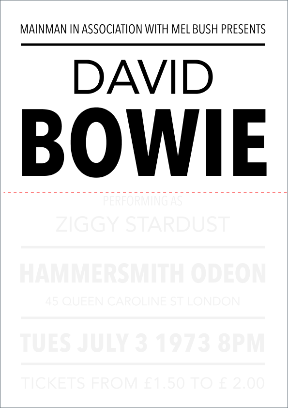
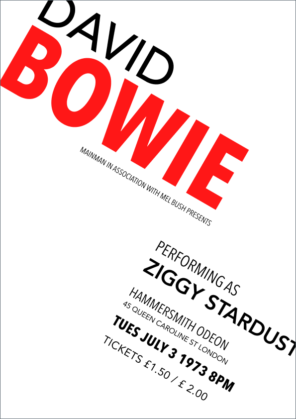
I’ll take this David Bowie concert poster as our example to talk more about visual hierarchy:
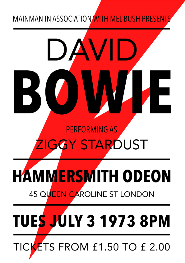
Hierarchy in visual design has four components to it:
Scale hierarchy
Scale hierarchy is about the relative size of elements in relation to each other and the overall design.
Well-proportioned designs feel harmonious — the elements are neither too big nor too small. Scale in visual design also creates emphasis, with larger elements naturally grabbing more attention.
Good use of scale uses size to guide the eye.
In the following example, the word “Bowie” is the largest element, establishing it as the central piece of information. The location and date are presented in smaller font size, making them subordinate to the artist’s name:
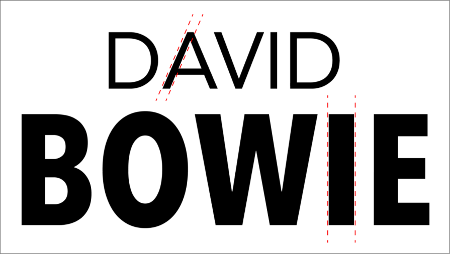
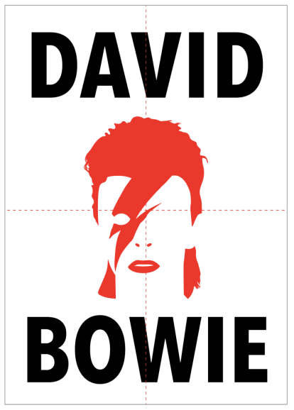
Typographic hierarchy
To demonstrate how typographic hierarchy works, I’ll use another example.
While there is a single sans serif typeface, the bolder weight of the name “Bowie” dominates the composition. The location and date information follow, contributing to the visual hierarchy.
This boldness of the letters adds emphasis and reinforces the artist as the main attraction:
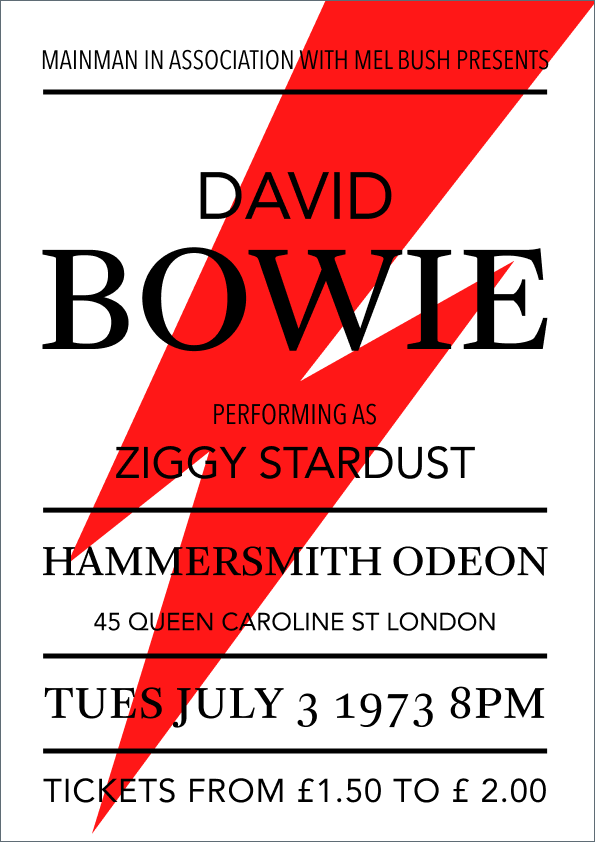
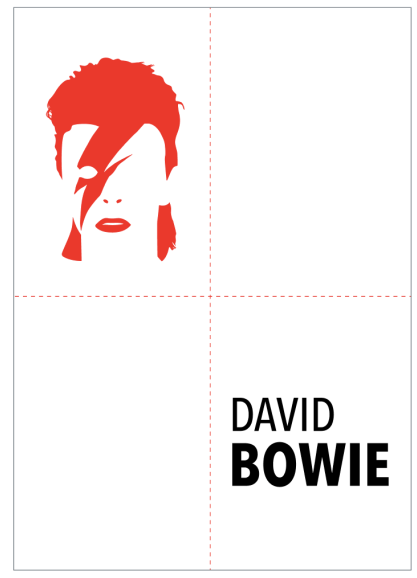
In an alternative design, I’ll show how using contrasting typefaces can create a clear hierarchy of information.
A serif font is used for “Bowie,” location, and date, making them stand out as more prominent elements. The remaining information uses a sans-serif typeface, reinforcing the visual distinction:
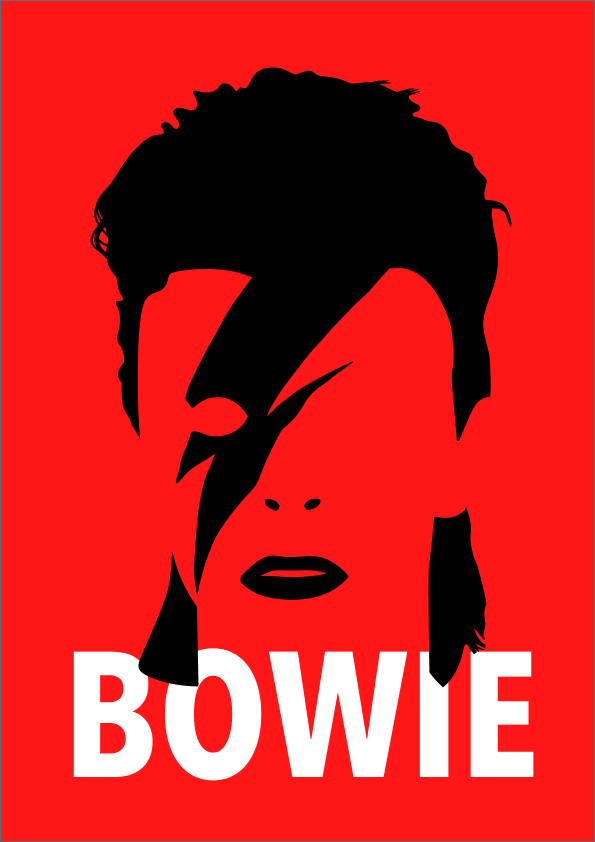
Color hierarchy
In the example I take below, the contrasting red color of “Bowie” emphasizes the text’s importance. You see how using color language, I can make the red pop out from the surrounding black text and reinforce the focus on the artist’s name:

Placement hierarchy
Putting “Bowie” prominently at the top half of the poster really strengthens the visual hierarchy as one of the principles of design.
This placement guarantees it’s the first element viewers encounter, even from a distance, making it ideal for capturing attention on a busy street:
2. Balance
Next in my must-know arsenal of principles of design is balance.
In design, balance is the arrangement of elements in a layout or composition that creates a sense of visual stability and equilibrium. There are two primary types of balance in visual design — symmetrical and asymmetrical:
Symmetrical balance
Symmetrical designs lay out elements of equal weight on either side of an imaginary center line. A balanced design feels stable and pleasing to the eye.
Symmetrical designs are pleasing. But if the symmetry is overdone, it can lead to a boring and less dynamic design. Here’s a good symmetrical balance:
Asymmetrical balance
Asymmetrical balance uses elements of differing weights. The elements on either side can be of different sizes or weights, but they visually balance each other.
In the example I take below, the image in the top corner is balanced with the text in the bottom right corner. Although asymmetrical, this leads to a sense of energy and a more visually interesting composition:
3. Contrast
Contrast, another essential must-know of all principles of design, is the difference between elements that makes them stand out from each other.
Think of a zebra’s stripes — that high contrast between black and white grabs our attention.
In design, the use of contrast as a directional cue can be achieved through:
- Color — bright yellow text on a dark background
- Size — a large image next to smaller text
- Style — a hand-drawn illustration contrasting with a photograph
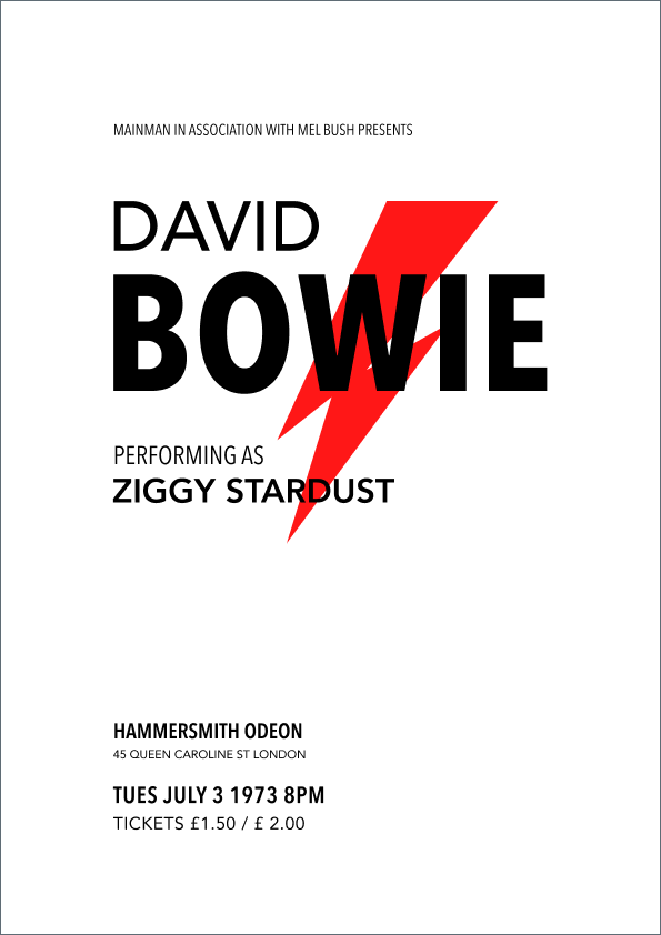
In this simple Bowie example below, the bold contrast of black on red is even more striking with the further pop of white text, posing a powerful statement:
4. Rhythm
Rhythm in visual design is about creating a sense of organized movement or flow for the viewer.
Repeating elements like colors, shapes, or patterns throughout a design creates this sense of organized movement, flow, or predictability for the viewer’s eye. It’s like a visual beat that guides the eye across the composition, so it works in tandem with the other principles of design.
In this example, the diagonal movement from left to right and top to bottom creates a sense of speed and direction, suggesting an element driving off the page. This makes for a dynamic composition.
This rhythm in visual design makes the poster more interesting and appropriate for a Bowie concert than the previous balanced examples I took up:
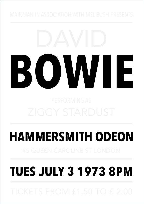
5. White space
White space in visual design, also known as negative space, is the area of a layout or composition left intentionally empty.
Being one of the core principles of design, white space provides breathing room for the design, preventing clutter and allowing elements to stand out. Effective use of white space contributes to a clean and sophisticated aesthetic.
Here, the text is surrounded by a sea of white, leading to a composition that looks refined and very zen:
Bonus: Gestalt principles of design
Gestalt is a group of design principles that differ from the visual principles of design in that they explain how we naturally perceive these design tools, helping us create a unified visual experience.
They are no less important to design, though. They emphasize how our brains organize and interpret visual elements into a unified whole rather than focusing on individual details.
I’ll talk about these Gestalt principles of design next:
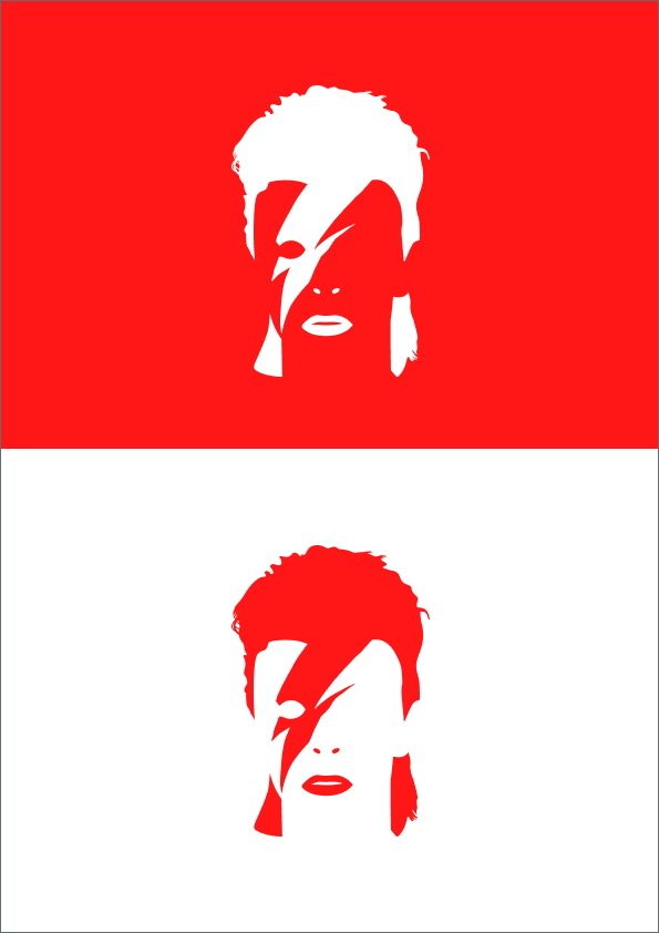
Figure-ground
We distinguish objects or shapes (figures) from their background (ground). And our brains are drawn to the brightest part of the visual.
Just as a face stands out in a crowded picture, figure-ground in design directs our attention to the most important details, filtering out distractions.
Here, the white stands out against the sea of red:
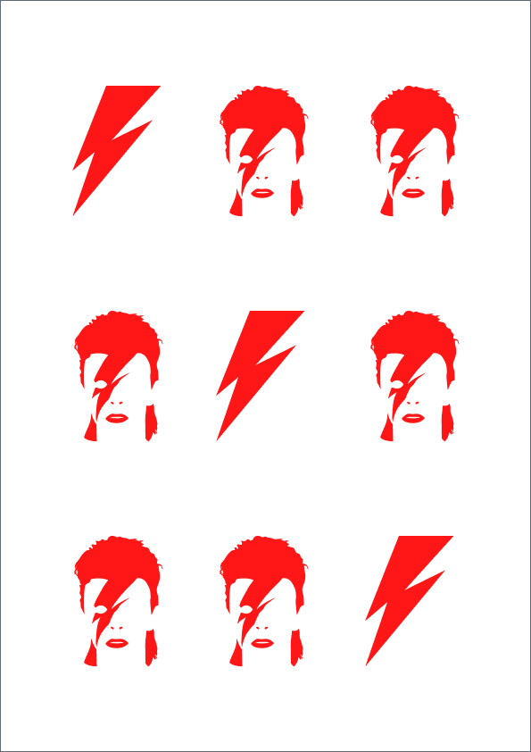
Similarity
We perceive similar elements within a design as a unified whole, even when these elements are physically separated or distinct from each other.
In this example, our brain groups Bowie’s head and lightning bolt, which are two groups with similar visual characteristics together, and thus efficiently identify patterns in the environment:
Proximity
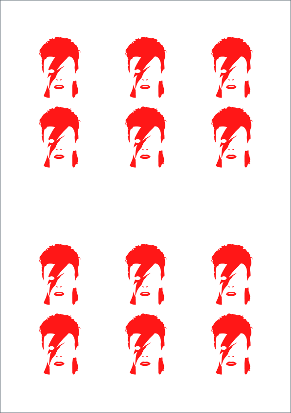
When objects are located in proximity, we perceive them as belonging to the same group or category, right?
In this example, when Bowie’s head is grouped close together, it creates a sense of unity that can be interpreted as a single entity distinct from other groups:
Common fate
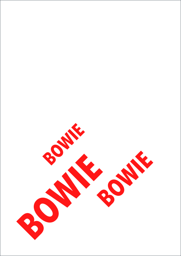
In visual design, we perceive elements that move or share a common direction as being connected and belonging together. Common fate, hence, is another must-know one of the principles of design you must have in your toolkit.
Because the words “Bowie” are so close together in this design, viewers are likely to perceive them as moving as a single unit:
Uniform connectedness
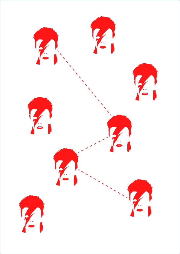
Another overarching guiding tool in my list of principles of design concerns how we interpret elements that are visually connected as more closely related than elements that lack any connection.
Taking this example, the line connecting Bowie’s head creates a visual path, making us perceive them as a single unit:
Last words
By internalizing these principles of design I’ve described, you can build a strong foundation for your career.
Remember, success in visual design is creating visuals that not only grab attention but also guide the viewer’s journey.
So whether it’s a concert poster, a website, or a social media ad, these principles of design, if used unhesitatingly, will prove to be the invisible magic that shapes effective communication through visuals.
gd2md-html: xyzzy Fri Jul 19 2024