Buttons are probably the most critical component of a user interface. Even the simplest of interfaces must have different types of buttons to execute any and every task.
Over the years, the button component of UI has evolved, but its basic shape and functionality remain unchanged. Plus, because buttons are such a dominant element of the UI and guide the user to an action, there is a hierarchy of buttons too.
In this article, I’ll discuss all about the types of buttons, how to use them, and how to design them.
Types of buttons in UI
There are two types of buttons in the user interface — principal buttons and additional buttons:
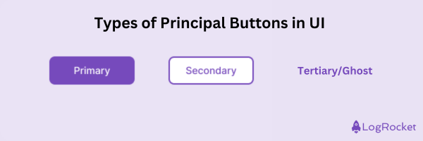
Principal buttons
A UI has three types of principal buttons:
- Primary button — Primary buttons help execute the most important actions, such as paying, submitting a form, or deleting an item. Because they represent the primary action on the screen, the button must appear bold to indicate where to click. You will only see one button of this type on the screen
- Secondary button — A secondary button executes an action that is less important than the primary button but still relevant to the user’s workflow. Say you have two buttons on the screen — one for saving and one for canceling. Since the cancel function is usually the second action, it appears as a secondary button. Its visual design is less bold than the primary button, and it can appear more than once on an interface
- Tertiary or ghost button — These types of buttons are used for tasks the user can perform but aren’t important, so they’re ideally less noticeable. A good example is a button to reset the password on a login page. Generally, they’re minimal in appearance and can appear multiple times on the interface. That’s why they’re called ghosts:
Additional buttons
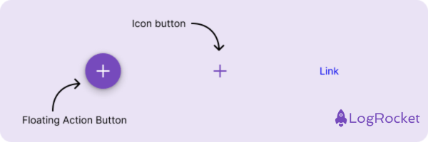
In addition to the principle buttons, it is possible to add, well, additional buttons to an interface. But they’re not found on every interface, and these buttons serve very specific purposes:
- Floating action button (FAB) — A FAB is found mostly on mobile devices. It serves as a shortcut for the user interface’s main actions — a user can click on it to perform an action. The design of this button is eye-catching, usually a circular shape, with an icon inside and shadows to give the impression that it is floating about in the interface. An example is Gmail’s Compose new email button
- Icon button — The icon button is used for interfaces where the user needs to take action, but there is not enough space to include a button with a label. A few examples include a data table, a paper plane icon to represent Send, and a trash bin icon representing Delete
- Link — Links are a type of button, too. Using these, a user can navigate to different sections or pages of the interface. It is a simple textual element typically marked with a different color to indicate that it is clickable:
Creating a button
You can create buttons with different design tools like Figma, Sketch, Framer, etc.
You can also download a ready-made button from the Figma community if you do not want to create it from zero.
Another option is to use ready-made design systems. You can select a button from Google Material Design, Apple UI Interface, or Figma’s general design system.
But if you’re a DIYer, follow these steps:
- Click on T to open the text box
- Write a label
- Color it from the right panel
- Select the label and press Shift + A to add it to a frame
- Set the side padding to 16
- Set the height to 48px
- Change the background color
- Set the border radius in the left panel
- You have a button!
Factors to design effective buttons
Buttons are a historic component of UI design; they’ve been around forever, so designing one isn’t difficult. But by keeping in mind the aspects of button design that I discuss below, you can design a great button that communicates perfectly with the user:
1. Button shape
Most buttons are rectangular. Depending on the interface’s visual design, the corners of the button can have different types of radius. Generally, buttons without corners will have a strict interface, while buttons with a large radius will give the interface a more soft and joyful approach.
When the button has fully rounded corners, it will be very noticeable on the screen. This button type is usually used to mark an important and specific action. The sign-up button on a website’s main page can have this type of button to grab the user’s attention:
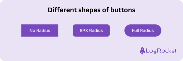
It is also possible for buttons to have a full circle shape like a FAB, or a button might appear with text only, like a ghost button.
2. Button label
The label on the primary, secondary, and tertiary types of buttons explains the action the button will perform when a user clicks it. So, the label must be action-oriented and explain the action well to the user, such as send, buy, or import.
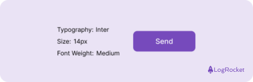
Choose an easy-to-read font, like Roboto or Lato, and select the right size — ideally between 14 and 18 pixels. To make the text more noticeable on the button, use a font-weight heavier than regular, such as Medium.
Moreover, the button label should be consistent so that the entire product communicates in the same language. For example, if you want a user to send information in different forms, always use the label Send on your button:
3. Button background
Choosing a color that stands out in the interface will help the user identify the right button. So don’t use gray for the background; use something more noticeable, like blue or pink.
Additionally, many companies define their button colors according to their brand color, which helps align the interface with the brand.
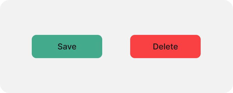
And, of course, for some actions, color plays an important role. A red button on an interface element can indicate the action is important and requires attention, such as a Delete button. Alternatively, if the action is to be approved, you can use green, say, for a Save button:
The primary buttons usually have a full background to emphasize that they are the main action on the screen. For a secondary button, on the contrary, you can use a stroke with a white background or a less prominent color. The tertiary button is commonly used without a background to create a clear hierarchy.
4. Button state
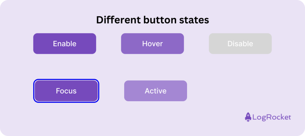
Buttons are not static; five states of the different types of buttons provide feedback and enable communication:
- Enabled — Enabled is the default state for a button. It explains to the user that the button is active and that they can click on it to perform an action
- Hover (highlighted) — A button is in a hover state when once the user moves the mouse over the button, it changes its color or prompts a small interaction. This state explains to the user that they hover over the button with the mouse
- Focus — Focus is a special state that indicates to the user that they are on the button. As opposed to the hover state, the focus state is triggered by keyboard navigation (using the TAB key). The design of a button in this state is essential because some users prefer to navigate using a keyboard, either for accessibility reasons or because they are accustomed to working with a keyboard
- Disabled — A disabled button state indicates to the user that the button does not work. If the user clicks on it, no action will occur. It can be used when the user has not completed all the required information, so they cannot submit the form until all information is added
- Active — Active is a state that appears when the user clicks the button to show interaction:
5. Button size
For most interfaces, such as desktops, tablets, and mobiles, a button size generally ranges between 32px and 56px in height.
As a designer, you can create interface hierarchy by setting around 1-3 different sizes. Small apps can use only one size, while complex apps may have small, medium, and large sizes per the types of buttons.
And, of course, the button height must be taller than the text label. This allows the text to breathe inside the button shape. Depending on the button size, this spacing, or padding, should generally be between 8 and 16 pixels.
Additionally, take into account the space available for mobile phones if that’s what you’re designing for. Although mobile phones are small and one size of button will suffice, it is important to consider the button’s size. Because we touch mobile phones with our fingers, the minimum size of a button must be 44px. If the button is smaller, it will be difficult for the user to interact with it.
Important: Button accessibility
A crucial aspect of designing a button for a good UI is ensuring that all users can easily interact with all types of buttons. There are two factors to consider when talking about button accessibility:
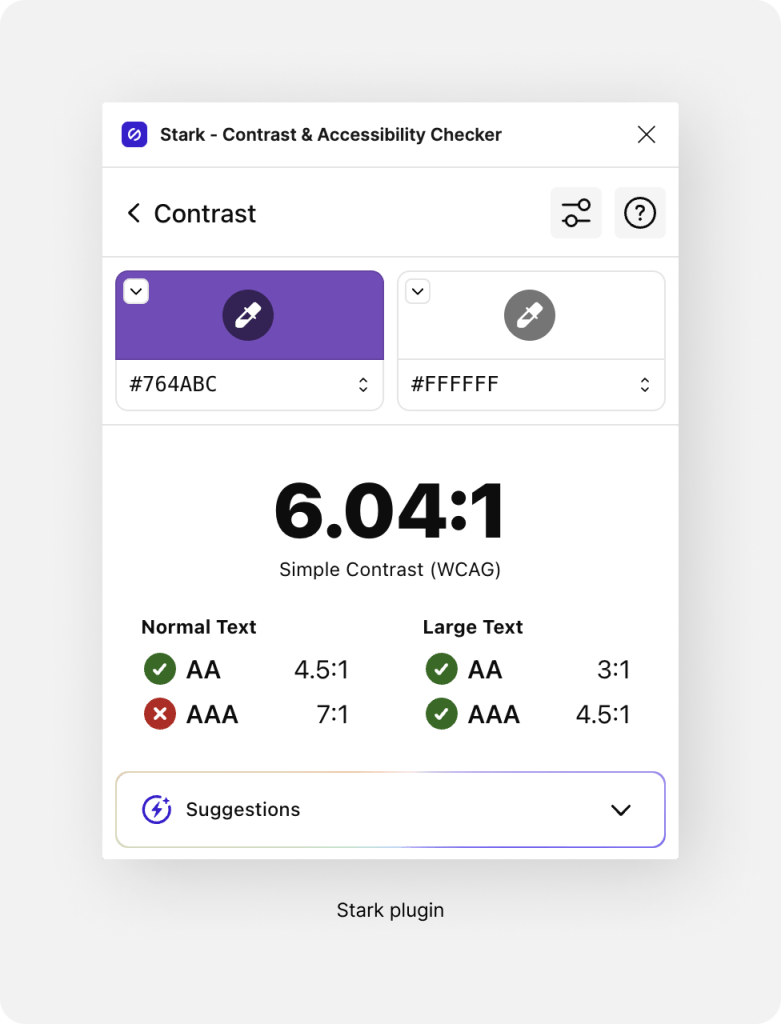
- Contrast — The contrast between the label and the background should be high enough to make the text readable. A contrast of at least 4.5:1 is suggested. The Stark plugin in Figma makes it easy to test the color contrast:
- Focus mode for desktop apps — Desktop apps must support keyboard navigation by implementing a clear focus state for accessibility. This allows users with disabilities to see where the focus is on the screen and navigate efficiently using the keyboard.
Best practices for all types of buttons
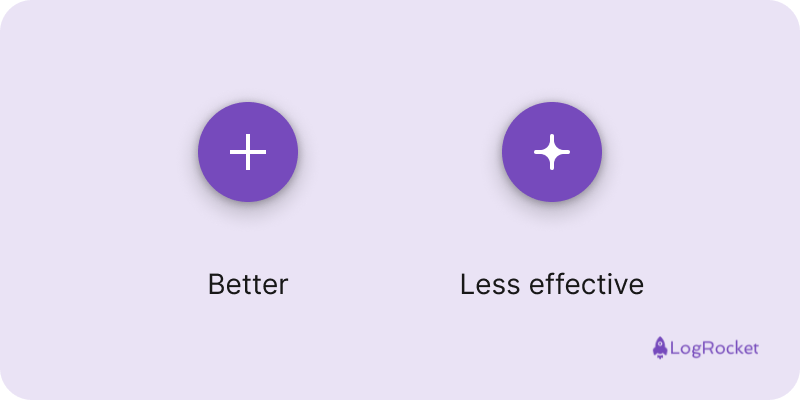
1. Icons should be easy to recognize
If you add icons to buttons, avoid complex shapes. Make sure your icons are simple so that users can quickly understand them:
2. Use icons that users are familiar with
Make sure you use an icon known for the action. For example, if the action is to search, a magnifying glass icon is the correct option. Do not invent the wheel.
3. Use only a few button styles
Don’t add too many button styles to the interface. Build a clear hierarchy inside the interface and use the fewest types of buttons to make it easy for users to navigate. If you need to add four buttons with only two styles, go ahead.
4. Check if all button states work well
Provide the developers with all the button states you designed in a simple way so they can implement them. Ensure developers implement all states to get everything right and work as designed.
5. Group related buttons together
Placing buttons together creates a connection between them so the user can understand they can choose between two actions. If you place them far apart, it can be confusing for your users.
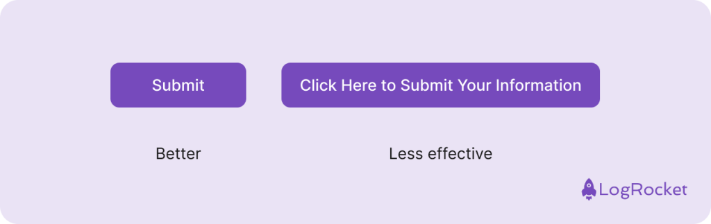
6. Use short labels
Make sure the button label is short and logical. Explain the action in as few words as possible so that the user understands it immediately. Here’s an example:
7. Set a minimum size for the buttons
You can set a minimum width size for the buttons. This ensures that the screen hierarchy won’t be affected if a secondary button is wider than a primary button and the user has enough space to click it.
8. If there is space, use a label
If there is no room on the screen, use an icon button. But always try to use labels for your buttons because they better explain the button’s function to the user. If you use an icon button, define the icon’s function with a tooltip. When the user hovers over it, a tooltip with an explanation appears. For mobile devices, the common interaction is a long click to show the tooltip with the explanation.
Conclusion
Buttons are the components of UI that allow us to do any and all actions. In this article, we discussed the buttons in an interface, their uses, how to design them, and best practices for using them.
Remember the guidelines I shared for designing buttons to improve how you communicate with your users via buttons. Use simple rectangular shapes that users are familiar with, and choose a background color that makes the button stand out.
Plus, try to integrate all button states (normal, hover, active, disabled) into the interface for better interaction. For better accessibility, ensure high contrast between the button label and background and make buttons large enough for easy interaction, especially on mobile devices (at least 44px).
gd2md-html: xyzzy Thu Jul 25 2024