Ecommerce UX is an interesting beast.
On the one hand, there’s hardly room for innovations or big bets. Customers are used to specific patterns, and deviating from them is rarely good.
On the other hand, ecommerce funnels are pretty long, which means that small improvements and details matter. Small lifts in each step conversion rate can significantly impact the company’s bottom line.
Ultimately, ecommerce UX is all about perfecting those tiny details at each step of the journey. In this article, we’ll look at a few tips on how you can employ user experience to nail your next ecommerce product design:
Use big pictures and product thumbnails
Many ecommerce sites cram up as many products as possible on their category pages. The product pictures and descriptions get smaller, and it’s hard to see the details of the products. Here’s an example:

Humans tend to be very visual creatures. Imagine you’re searching for new shoes, and you come across the page above. Do any of the pictures immediately grab you and make you think, “That’s the one?” Probably not. The page is too cluttered, with too little detail, to capture your attention or evoke any emotion.
If we take the same page but simply increase the product thumbnails, the impact on the viewer is significantly different:
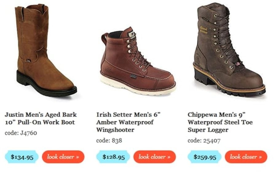
You can easily spot the differences between these three products, and you’ll likely have a clear reaction — either “I love them!” or “They’re not for me.”
While it might take potential customers longer to browse the entire inventory, the chances of them making a purchase are higher. And that’s what we’re targeting.
Declutter category pages
Working on category badges? Make them simple.
The objective of a category page is for potential customers to find the product they want. Don’t distract them from that.
Be careful with advertisements. Although these ads generate extra revenue, they can also distract users and cause sales loss. A/B testing here will come in handy.
E-mail opt-ins should also not occur on category pages. Move them to the end or, alternatively, the beginning of the funnel.
Make every element on category pages fight for its existence. Evaluate every element and ask, “Does this help people find what they like?” If not, test the page without it.
Be smart with product badges
Product badges help the products you want to sell stand out, but most importantly, they help customers make the decision. So, be sure you include them in your designs.
Imagine you are an amateur wine drinker walking into a wine store and seeing two hundred different types of wine. I would already start sweating heavily.
But what if one of them had the “staff pick” or “best value” label on them? Odds are you would pick that one without too much consideration. You simply don’t have the time or expertise to choose the best wine, so you’d happily delegate this decision to someone else.
Ecommerce stores work the same way.
Use product badges like Promotions, Staff’s Choice, Popular, Best Value, Best for Beginners, and New.
But don’t overdo it. If every second product on your category page has some sort of a badge, it not only loses its significance but also introduces distracting clutter.
As a rule of thumb, only one to three badges should be visible to the user at any given moment, and no more than 20% of products should have a product badge.
This is, of course, a rough guideline. If you are running a big promo, then it’s okay to have half of the products with a Discounted badge. Just make sure it doesn’t happen all the time.
Another exception is if the product category is so diverse that you can distinguish sub-categories in it. Let’s take a look at Amazon’s category page for microphones:
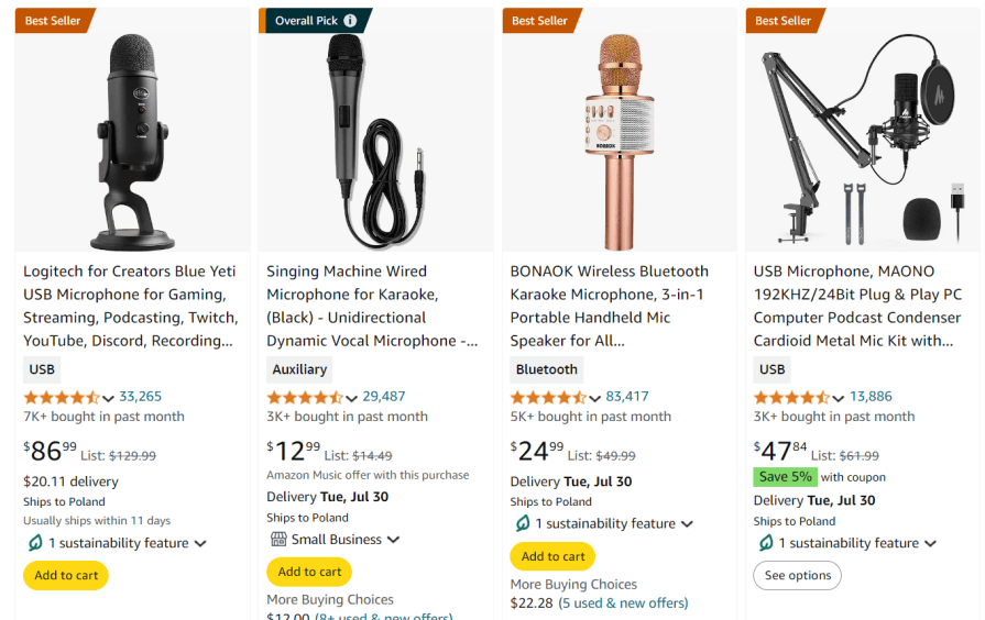
This UX design works because it shows four different types of microphones. If I’m looking for a hand-held microphone, I won’t choose the Blue Yeti one just because it’s a best seller. This view shows four different categories of microphones, so it’s acceptable to have a product badge for each of them.
Take your mobile UX design to the next level
Store experience on mobile devices is completely different than on the web. Remember that.
Don’t just make your mobile UX design responsive. Create a custom design for your mobile application if possible. Ebay.com looks completely different on the web and on mobile. And it’s not just resized elements.
When it comes to ecommerce, it’s not about deciding if you are designing mobile-first or web-first. You are designing mobile “and” web. It will take extra effort, but the return on investment is worth it.
Simplify the checkout process
The checkout process should be as fast and seamless as possible.
First and foremost, don’t require users to register. People come to your store with a transaction in mind, not a relationship. So, try to nail your checkout form design by:
- Minimizing the number of fields
- Prefilling whatever information you can
- Handling objections on the go if needed
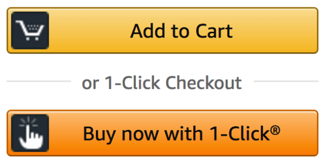
If users are already registered, offer them a 1-click checkout to take the simplicity to the next level:
And don’t spam them with your newsletter lists. Do it after they purchase.
Don’t use big coupon code fields
If you accept offer codes or coupons, don’t shout about it.
Imagine this user journey. I’m just about to purchase a product when I see a big “Enter your discount code” field. Wait, am I less special? Why don’t I have one? I might go to Google to search for some codes online and then get distracted and never return. Or I just decide to wait until there’s some promotion with new codes available — also likely to never return.
So, use simplistic, text-based CTAs. Design B in the following screenshot is more likely to help retain a customer than Design A:
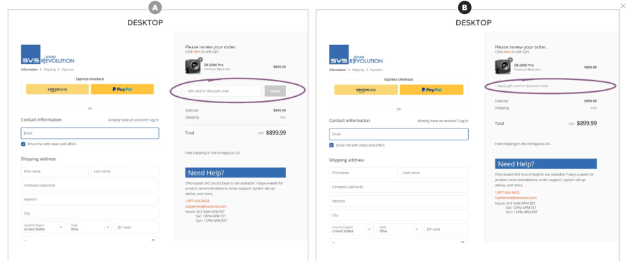
This way, if customers don’t have an offer code, they most likely won’t even notice the field. And for those who do have a code — well, they’ll pay enough attention to find this option.
Test your navigation and search repeatedly
Navigation and search are inarguably the most critical elements of your ecommerce page. Sadly, there are not many best practices here. It heavily depends on the store type, product, and customer.
But I can strongly recommend constantly testing UX aspects. Test your search options and information architecture at least once a quarter. Users’ preferences and products’ popularity change constantly, and you want to be on top of the game.
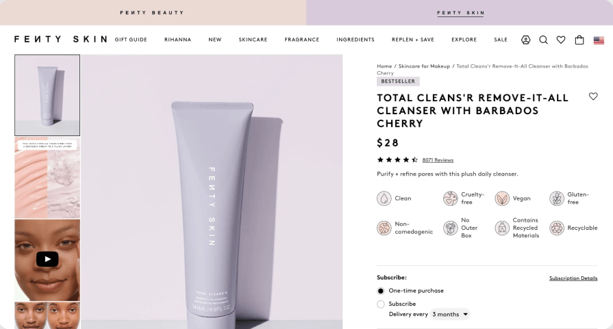
Highlight the most important features on the product page
Research your target audience to understand the factors they consider when purchasing, and prioritize highlighting these on a product page.
Lengthy descriptions and details can come later. If someone wants to read them, they’ll find them. Optimize for system-one thinkers who just need a few key pieces of information to make a decision.
Fenty Beauty does a great job visually highlighting key features, such as “vegan” or “contains recycled material.” This UX design is likely based on the research, and these features are what their customers care about the most:
Master objection handling
We often buy on impulse. It’s a short-term urge to get the dopamine hit from the purchase. As a UX designer, if you want to capture that impulse, don’t let customers stop and overthink at any point. Understand their objections during their purchase journey and ensure you handle them.
You don’t want users to stop the impulse and start wondering about when their order will be delivered or if they can return it. Communicate all those things clearly in relevant touch points.
Are they about to add a product to the cart? Ensure they know about your free return policy before they start to overthink.
Do you deliver in 48 hours? Make it super clear, ideally even telling the customer when exactly they’ll get the product so they don’t need to stop and think about it themselves.
Do your research, understand the most common objections, and handle them well in advance.
Optimize for reviews
There are three important things to consider when it comes to reviews — they have to be easy to add, easy to read, and trustworthy.
Make them easy to add by contacting your customers and incentivizing them to add a review. And don’t ask for multiple answers. If a customer wants to add only a rating, let them. If a customer wants to add a rating, picture, and comment, let them.
Make sure your reviews are spottable and easy to read. Test with customers often.
Establish trustworthiness with relevant badges, such as “recently purchased” or “frequent reviewer.” If possible, verify reviews.
Summary
There’s little to no room for innovation and creativity in ecommerce. People are used to well-established patterns, and breaking these patterns rarely helps. However, there’s still a lot of room for a UX designer to shine.
By nailing every step of the sales funnel, you can greatly impact the company’s sales. There are still hundreds of ecommerce businesses that do a sloppy job in conversion optimization, and that’s where you can differentiate.
Keep in mind that this just a starting point. You will need further user research to better understand what your particular audience cares about and implement SEO tactics to ensure your product pages rank high in search results.
gd2md-html: xyzzy Thu Aug 15 2024