The alphabetic characters of the English language have several synonyms, such as type, letters, symbols, signs, or forms. Yet, to me, the term “character” is almost metaphorical. It reveals a social belief that phonetic symbols possess something akin to biological life, as if they are dramatis personae in a narrative.

In a sense, we believe letters possess aspects of individual personality shaped by certain innate characteristics of the family or class to which the character belongs. For example, Latin-based letters combine to form words (the way some animals gather in distinct groups), but also enjoy complex, interconnected, evolutionary relationships like different species of a genus.
Letters of a typeface family can share components, such as strokes or serifs. Moreover, despite a huge variance in tens of thousands of vastly differing designs, anatomy is what enables a character to retain a basic recognizable shape.
In this article, we’ll discuss typography anatomy in detail to better understand its importance in UX design. We’ll also take a look at how to learn typography anatomy and apply it in practice to create beautiful, easily legible text.
What is typography anatomy?
“There is no ‘official’ nomenclature for the unique structural features of type,” writes Karen Cheng in “Designing Type” (2006). “However, type designers do, in general, use specialized terms.”
There’s no central authority for typographers, and there has never really been an attempt — assuming that it’s even possible — to codify this usage of “specialized terms.” Rather, they’re based on customary usage. As Stephen Coles points out in “The Geometry of Type: The Anatomy of 100 Essential Typefaces” (2013):
“But there are enough constants in roman (upright) letterforms that a standard vocabulary can label its parts. Using terms that are familiar to everyone who knows basic human anatomy, we can describe and compare typefaces. For example, most roman-based typefaces have an uppercase R with a “leg”. Some legs are perfectly straight, some are bowed, some have an undulating curve, and some end with a ‘foot’ (or, serif) on the ground (baseline).”
Like with any specialist jargon, you could consider awareness of this terminology to be part of a type designer’s job. Despite the huge variance between typeface designs, anatomy allows designers to preserve a basic readable skeleton, while experimenting with broader look and feel of the design.
Within an alphabet, calligraphers and typographers classify letters into groups (such as thin, tall or round characters). Based on its anatomical features, a typeface can be classified as humanist, modern, transitional, and so on.
You can think of the anatomical features of letters as the metrics by which a designer classifies, controls, modifies, and varies the designs of a typeface.
Parts of a letter in typography
Let’s define some terms we’ll need to know when discussing typography. Here’s a preview of what we’ll discuss:
We’ll start with the basics:
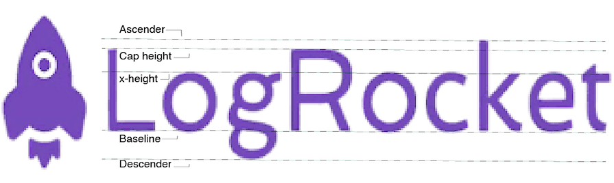
- Baseline — The ground on which the letters sit. Probably the most fundamental term in Latin typography anatomy. This is an invisible feature from which the four other principal variables that help affix the proportions of a typeface are derived
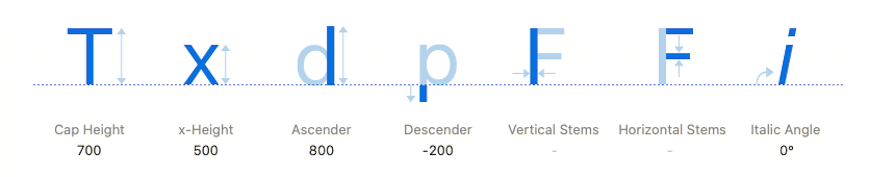
- x-height — The height of lowercase letters like “x” and “o”
- Cap height — The height of uppercase letters
- Ascender — The part of certain lowercase letters that rise above the x-height like “h”, “k” or “l”)
- Descender — The part of certain lowercase letters that descend below the baseline like “g”, “j” or “p”)
In combination, these lines — which originate in calligraphy — constrain the proportions of the letters and are responsible for making letters appear neat, aligned and uniform:
Following this, the next important terms are:
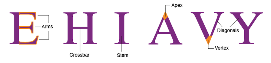
- Stem — The main vertical or diagonal stroke of upright letters
- Crossbar — Also called horizontal stems; a horizontal stroke meant to connect two stems or other parts of a letter
These strokes establish the actual physical morphology of a typeface and determine how thin or thick the design will be:
The above terms are fairly standard and widely used. However, the next few features are more specialized; unlike the above features, they’re not necessary for a typeface to have. Instead, those interested in creating classification systems for typography use the presence or absence of such anatomical features.
For example, the broad division between typefaces is serif or sans serif:
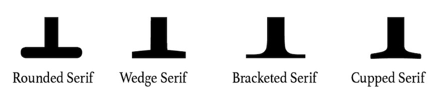
- Serifs — Small, decorative flourishes and strokes at the ends of character strokes in certain typefaces
- Sans serif — Typefaces that don’t contain serifs
Serifs can determine how ornamented or austere a design is. They can be stylized in different ways, including:
Moreover, not every typeface will possess characteristics like:
- Spurs — Small bump-like features used to improve legibility
- Counter — The enclosed or partially enclosed negative space within a letter like “o”, “a”, or “e”
- Bowl — The rounded stroke that forms the body of letters like “b”, “d”, and “o”
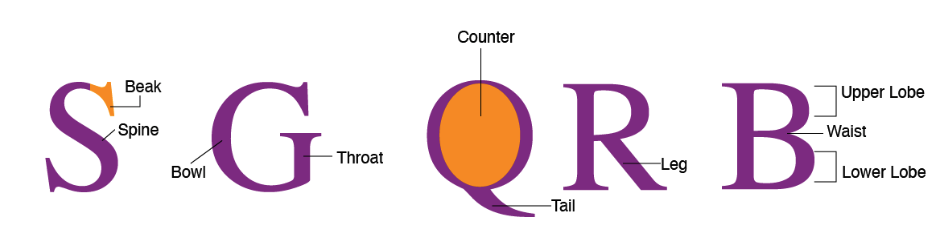
Other terms are tied for use to individual characters. These terms are often restricted to individual letter-forms, and there may be disagreement amongst typographers about the usage. Many letters have highly specific terms that describe their individual features:
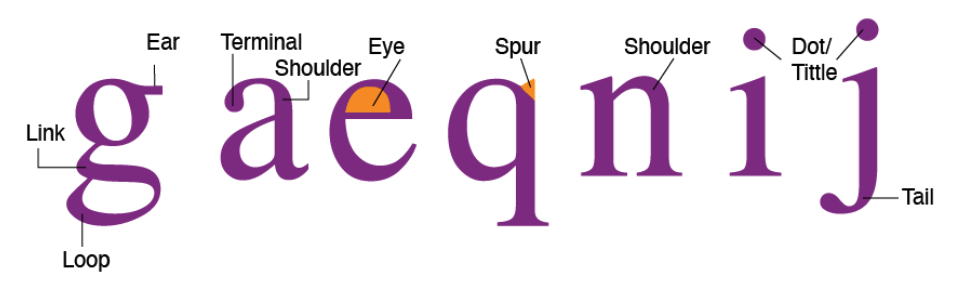
The same feature can be called by different terms, such as in the small “i”: some call it a “dot” and others a “tittle”.
Why is typography anatomy important?
“Just like the human body, the Latin alphabet can take on a surprising range of shapes and proportions,” writes Stephen Coles.
By one estimate, there were 50-60,000 typefaces in existence in 1996. Typography anatomy is what allows typographers to map the differences between these designs.
In other words, typography anatomy is to designers what human anatomy is to a doctor, evolutionary biologist, an artist or an athlete– a quantifiable and observable phenomenon whose analysis can have unlimited applications.
One of the main uses of type anatomy is to help typographers identify designs and quantify the difference between typefaces. As such, being aware of the anatomy of type is, in many ways, the sina qua non — an essential condition — of typographic work.
Acquiring the eye to perceive and vocabulary to describe typeface designs and appreciate their variances is a major skill of a graphic designer or anyone else who uses typefaces for design purposes in their work. This allows designers to fix sizes, vary the thickness or thinness of strokes, play with negative space, or create similar differences in designs.
Anatomy also affects the mood and readability of a typeface. Understanding typography anatomy allows us as designers to make selections around hierarchy, inclusivity, and rhythm. Moreover, understanding how typefaces are constructed and their features helps us judge whether two or more typefaces can be used together.
By being able to break down typefaces into anatomical components, designers can judge whether a typeface is suitable for a project, considering factors like the format for reproduction and legibility. For instance, how big or small does the type need to be? Does it need to be extremely large, like for a billboard, or very small, like for a densely printed brochure?
How to learn typography anatomy
There are many ways you could potentially learn typography anatomy, both from a practical perspective and to simply gain a better appreciation and understanding of it.
Let’s talk about three: type safaris, calligraphy and printing techniques, and building a library of resources or reference materials, which could even include designing your own typeface.
Go on a type safari
I divide my life into two halves: before I went on a type safari and after I went on a type safari.
I was introduced to this exercise as part of a typography course. It vividly demonstrated how education can change visual perception. We were told to walk around the campus and take photos of things that looked like characters from the English alphabet until we had a complete A-Z set. Here’s an example of what a type safari collage could look like:

Two sofas together could look like an E, and the branch of a tree could look like a Y. The group shared discoveries, and it was a good laugh and great fun.
Later, on the way home and the next day onwards, I started seeing all sorts of signs, ones I had never noticed on paths I had walked previously a hundred times. They started jumping out at me.
Today, one particular source of constant pleasure is discovering the “ghost signs” on some of London’s older buildings, something I hadn’t noticed before doing the type safari. I started to see them everywhere.
A type safari is a great way to intuitively start to appreciate the morphology of letters. After all, what better way to experience differing anatomies and the abundance of nature than a safari?
Learn calligraphy and printing techniques
While a type safari is useful in developing an appreciation for the overall appearance of type, there’s no better way to get into the intrinsic nuts-and-bolts of typographic construction than practical experiences like learning calligraphy or printing techniques.
Calligraphy addresses the internal structure of letters and how they have evolved from the strokes of the human wrist and pen. Moreover, learning to tell one hand script from another is an automatic education in the historical evolution of letter-forms.
Calligraphy can seem a bit dated, and it’s not important in today’s age of computer design to have the steady hand of a calligrapher. However, hand-lettering is an age-old practice that aids mindfulness and it continues being evolved by its current practitioners, especially on social media. It could be worthwhile exploring this community.
This brings me to the wide prevalence of educational material on typography, lettering and calligraphy. You can find such material on YouTube, Instagram, or paid-for courses such as Skillshare or Domestika. Many of these resources are either free or cost a fraction of what an education in typography used to cost.
Experimenting with printing techniques, whether it is letterpress, screen-printing, or riso, can also help with seeing type more imaginatively. Many printing houses offer sample courses or open-days, and these can be a good investment.
Compile resources and references (or create your own typeface)
It’s good to build a library of some books on the subject, especially resources that break down and compare various typefaces. Resources that detail anatomical features of various typefaces are especially helpful. You could also collect “morgues”, or samples of interesting types.
Finally, why not design your own custom typeface? It is an undertaking nothing less than writing a novel. However, with free, open source resources like FontForge or cheap starter options in Glyphs Mini, the ability to design a custom typeface has never been more accessible to the general public.
Applications of typography anatomy
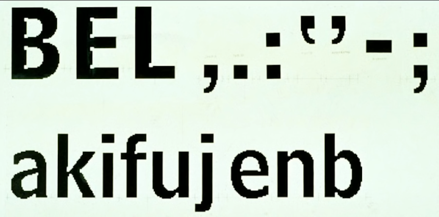
One of the most brilliant examples of how modifying anatomy of a typeface can solve a mechanical problem of legibility is what Matthew Carter did with Bell Centennial in the 1970s.
There was a problem with the AT&T phone book because of the switch from linotype to offset printing. This technology, along with the cheap paper and thinner ink, were causing blotting issues, resulting in the tiny print becoming even more difficult to read.
Carter responded by increasing the width of the letters to prevent the crowding of letters. The genius touch, however, was creating “ink traps” — circular gaps where the strokes of the letter came together. They allowed any overflow of ink to collect and left behind a neat, legible letter:
Typography is an international practice and one that requires a designer to be aware of the needs of varied audiences. For example, one obvious application of typography anatomy is the adaptation of a corporate logo to different languages. Let’s take the example of the FedEx logo in the Devanagari script:
![]()
The Devanagari script is an interesting in-between script when comparing Latin-based languages with other writing systems.
Unlike systems such as Arabic (which is read right to left) or East Asian pictographic systems, Devanagari, too, is read left to right in a horizontal line. The principal difference is that, unlike Latin letters (which rest on the baseline), Devanagari letters “hang” from above:
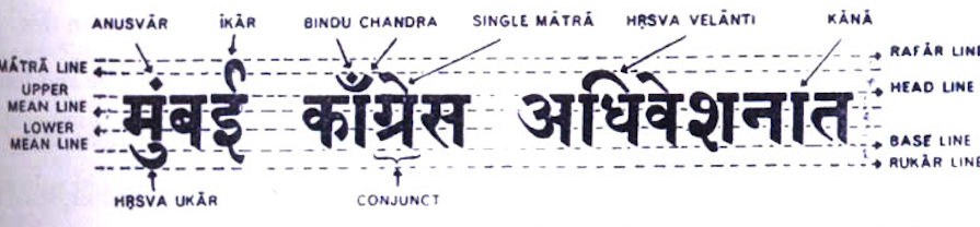
Studying different language systems can help a typographer understand that there can be multiple approaches to anatomical design.
Previously, typographers would ensure that letters with a character set would share features such as vertical stems, cross bars, or bowls. They would try to create uniform counters and eyes, striking a balance between the family set and the individual letter.
Today, however, briefs can include a typeface where character sets need to include more than one language. Typography anatomy can aid universalization where characters from different languages share the same system of features. This can result in interesting outcomes, where non-Latin letters have Latin features and Latin letters feature non-Latin anatomy!
Conclusion and key takeaways
It shouldn’t surprise us that print letters are thought to possess skeletons and morphological features that typographers (inspired by the body parts of humans and animals) describe as “anatomy”. It’s this basic skeleton that allows typographic designs to be altered while leaving the character still instantly recognizable.
The anatomical features of letters are the metrics by which the look and feel of a typeface is varied or controlled.
Some aspects of the anatomy (especially the baseline, heights, ascender, and descender) constrain the proportion of the letters and are responsible for making letters appear neat, aligned, and uniform. Other features of this anatomy are highly subjective and restricted to one type of design.
Anatomy helps typographers identify and quantify the difference between typefaces. It allows designers to fix sizes, vary weight, play with negative space, or adjust the axis for tilts. These manipulations affect the mood and readability of a typeface, and guide a designer around selections concerning pairing, hierarchy, inclusivity, responsiveness, and rhythm.
Increasingly, universalization means that typographers have to know about different language systems, and create hybrid forms of design keeping in mind varied audiences. Knowledge of anatomy is important to create type systems that are internally coherent.
Given free, open source learning resources, self-education in this field has never been more accessible to the general public. For those interested in using type more mindfully, knowledge of typography anatomy can be a good professional investment as well as an experiment in expanding your personal horizons.