Any software product’s usability, user-friendliness, and productivity depend on its design quality.
To this end, modern UI/UX designers strive to design high-quality software products. They use signs, texts, images, sounds, and actual feedback to give cues about available actions in a software system UI. These action indicators — which describe available doable actions — are typically known as signifiers in UX terminology.
You need signifiers to describe, highlight, and optimize affordances, even if your UI design implements perceivable action elements (affordances) by adding generic buttons, scrollable segments, and other interactive elements.
For example, designers use up and down arrow icons as signifiers based on the state of an expandable element or dropdown to describe the click/touch action outcome.
Signifiers are not just fancy signs in UIs — they are mandatory communication devices that hint users about specific actions by enhancing usability factors.
In this article, I’ll share how you can design effective signifiers by exploring theoretical aspects, comparing signifiers with affordances, and implementing practical signifiers in a sample mobile app high-fidelity prototype. I’ll also discuss best practices that you should remember to create effective signifiers that improve the design quality of any software product.
What are signifiers?
A signifier is a perceivable cue that describes a doable action offered by a product. A signifier can be a sign, text, image, sound, or physical feedback from a product.
The concept of a signifier is bound to the affordance concept in product design. Affordances are product properties that reveal a generic way of performing an available action using modern human capabilities and psychology. For example, if there is a vertical door handle (affordance) at a grocery store, we all know the door can be opened by pushing or pulling the door handle.
But how do we know if we need to push or pull the handle? We’ll probably push first and then pull if the door doesn’t move. But if the word Push were written near the door handle, we’d open the door with only one attempt. So, the push notice board works as a signifier to help users open the door by taking the right action using visible affordances (door handle).
In software product UIs, we can use signifiers to improve usability factors by describing actions made doable by affordances. Here’s a quick example:

All in all — signifiers verify, describe, highlight, or optimize affordances to improve usability, productivity, and user-friendliness.
Importance of signifiers in UX design
Signifiers improve the overall quality of your product by improving UX factors. The following benefits prove the importance of using effective signifiers in software designs:
Enhancing usability and user-understanding
Using a software product becomes easy if its interface has self-explanatory elements.
Affordances reveal how to do a specific action (i.e., touching a button element from the touch screen), but affordances alone don’t describe the result or state of the intended action. Signifiers help designers describe the result of the affordance (i.e., touching the button will log out from the app).
Signifiers describe doable actions and present the state, so users don’t need to spend hours learning how to work with new products.
If you introduce signifiers in your software prototypes, even new users can use your software products with higher usability using their basic understanding.
Saving user time with better productivity
Every user would love to boost their productivity by performing actions faster using the UI of your software product. Signifiers reduce or eliminate the time users spend thinking about the uncertainty of their understanding of a UI element. As a result, users can perceive the result of each action faster and do their activities productively.
Using self-explanatory, well-known signifiers is a great way to improve the productivity of new users. Moreover, using a few unique signifiers for frequent actions enhances the productivity of experienced users, i.e., beep sound patterns in a scientific software product.
Reducing the complexity of the screen
Software products typically increase complexity if they render many UI elements on the visible area of an app interface.
But by using signifiers, we can remove secondary visual segments from the app screen and let users bring them to the visible screen region. A good example is the traditional scrollbar. It renders two arrows and a draggable rectangular region as signifiers, showing only the number of elements the screen can display properly.
A way to become friendly with users
When every product uses a common signifier for a long time, it undoubtedly becomes a part of the general computer visual language and a universal standard.
When users see the elements they know, such as copy-paste icons, hamburger menu icons, and familiarcolor themes, they get closer to your product immediately compared to an interface with unique signifiers.
A practical way to win the user’s heart under a zero marketing budget is to match the signifier’s meaning with the user’s understanding.
Using signifiers in UX
In this section, I’ll add signifiers to improve designs by modifying a simple high-fidelity prototype of a movie app created with Figma.
The sample website design has one screen of a high-fidelity prototype created for a movie-watching app like Netflix. It implements the basic UI but misses effective signifiers, as demonstrated in the following preview:

You can copy this Figma design file into your Figma account by accessing this Figma community link. This design hides signifiers by default, so we can toggle the visibility of each and learn how effectively they improve UX.
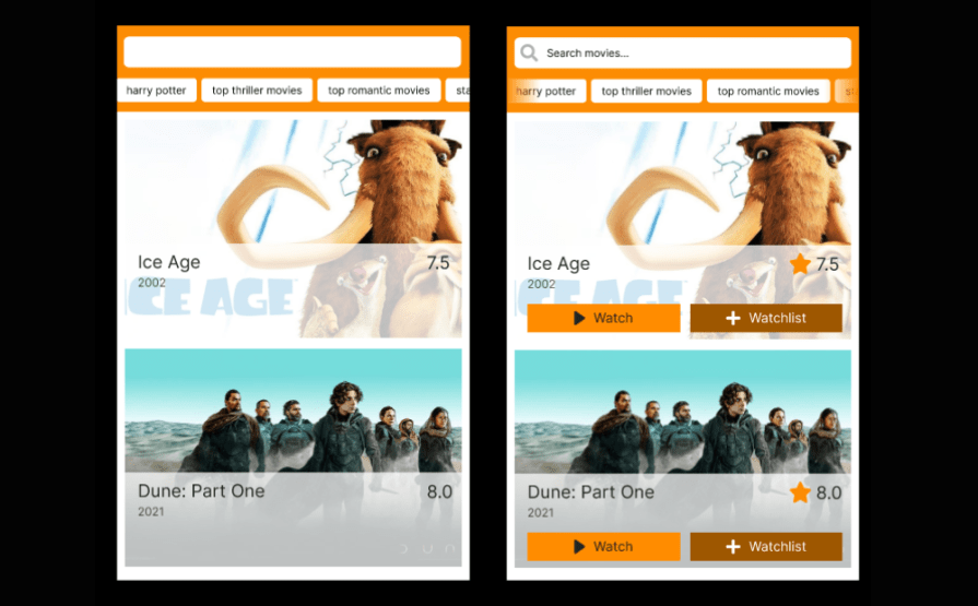
1. Verifying affordances using labels
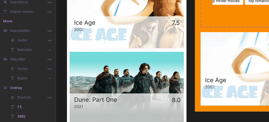
Assume that the current design affords the user to watch or add to the watchlist by clicking a specific movie result item. Such behavior implements a hidden affordance to execute actions on a specific movie item. This way, the movie component doesn’t show available actions clearly, so users will have to find the hidden affordance.
Let’s improve this UX aspect by displaying icons for available movie actions. Browse elements in the component frame and enable the WatchBtn and WatchlistBtn buttons as follows:
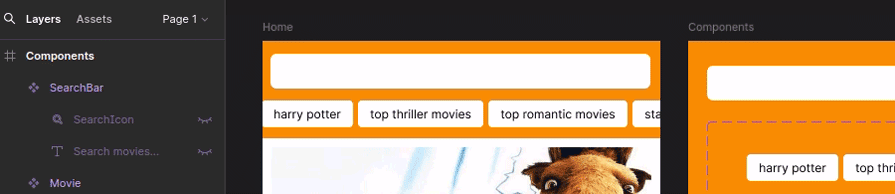
The search box looks like a text input but doesn’t highlight that users can enter any search query to filter available movies. Show its placeholder label label as an effective signifier:
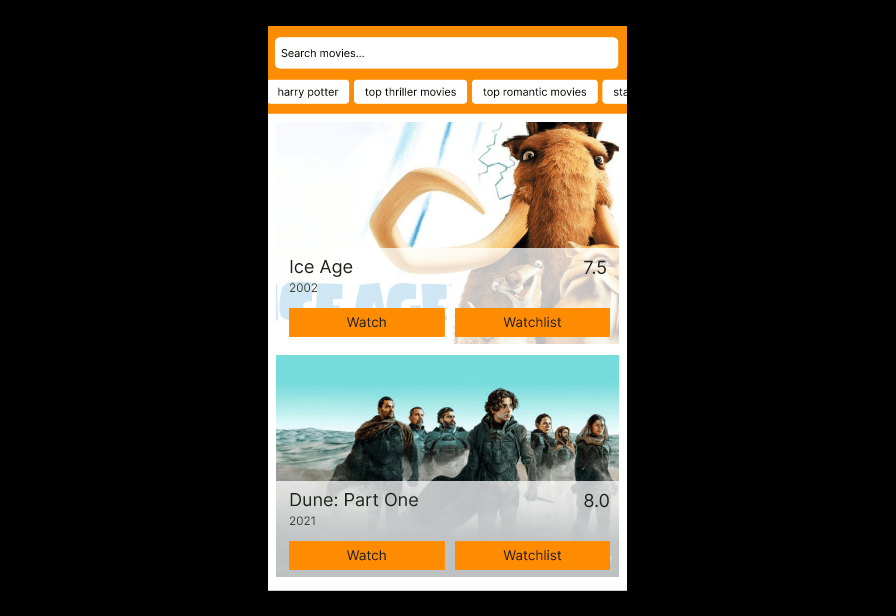
Here’s the final prototype preview. Look at how textual signifiers improve UX by assisting users with visible affordances:
2. Using icons to boost the cognitive process
The human brain can decode visual pictures faster than written language text. Moreover, visual signs are not bound to any specific language, so anyone can easily understand their meanings. For that reason, the government uses road signs instead of written road notice boards.
Similarly, using icons with textual labels boosts the human cognitive process and helps users take the right action immediately.
Activate the SearchIcon element to display a Font Awesome icon that renders a magnifier icon. This way, users know that the search box implements a way to filter movies before even reading the entire placeholder label:
The movie component displays ratings for a specific movie, but the decimal number itself doesn’t clearly reveal that it’s a movie rating value. Moreover, the action buttons don’t reveal their actions visually with non-textual elements. I’ll show button icons to solve these UX issues:
Next, show icons in the action buttons as follows:
3. Highlighting primary actions with colors
Using proper colors is a great way to improve UX factors in any software product. In the sample app prototype, both action buttons of the movie component have the same color, so the button theme colors don’t suggest the primary action.
What if we use a bit of dark color for the watchlist button since it’s the secondary action?
I’ll darken the button color and use white color for the label and icon, as demonstrated in the following preview:
Using a somewhat darkened yellow color for the secondary action button
Now, the user can easily identify which button should be pressed to watch a movie without even reading the label and looking at the icon. Here, I used colors as a signifier to highlight the primary action. You can use colors to show danger, disabled actions, etc.
4. Adding signifiers for exploring more content
Designers usually hide content that doesn’t fit the visible screen region and let users access hidden content using signifiers.
Look at the search tag group section. You can drag it left and right to see more content, but that specific affordance is not well highlighted with a signifier:
Dragging the tag group section
If we use two icons here, the screen may look complex since there will be many icons. So, we can use two gradient faders from both edges to indicate that the tag section is scrollable.
Enable the LeftFader and RightFader elements as follows:
Open the prototype preview window and test the final version that uses effective signifiers to improve usability, productivity, and user-friendliness:
The final prototype version that uses effective signifiers
Compare the sample prototype with and without effective signifiers and see how signifiers help us improve usability, user productivity, and user-friendliness:
Signifiers in software projects
I’ve discussed how signifiers improve the overall quality of software products using a sample Figma design. Here are more signifier examples that you see in modern software products:
- A web app displays the notification count on the notification icon to indicate that the user can click on the icon to read all received notifications
- Some websites display an arrow sign after each hyperlink that redirects users to another web domain so users know that the specific hyperlink is an external link
- When you start swiping list items on your mobile phone, most apps indicate left/right swipe actions using icons, i.e., animated swipe icons in the Gmail Android app
- Highlighting the current page by disabling the hyperlink in a menu component
- Most modern UI library kits implement various component states with suitable colors, i.e., using grey color for disabled action buttons
You can find more generic signifiers by inspecting popular UI kits like Bootstrap that adhere to UI/UX principles or evaluating the UI of popular software products like Twitter, Facebook, and Figma.
Signifiers vs. Affordances
If you are new to the signifier-affordance concepts, you may think that both concepts look the same. Signifier and affordance are very close concepts and bound to each other, but they are not the same.
I’ll summarize the differences between signifiers and affordances to help you understand the two concepts distinctly using the following comparison table:
| Comparison factor | Signifiers | Affordances |
|---|---|---|
| Definition | Signs, labels, sounds, or feedback that verifies, highlights, or describes a perceived affordance i.e., a background color, icon, and label of a button | A product property or cue that hints at a doable action i.e., a button |
| The goal of usage | To improve usability factors | To implement basic user interaction |
| Common elements used in UI/UX design | Texts, icons, and background colors | Primary UI elements such as buttons (clickable regions), text boxes, and scrollable regions |
| Possibility of hiding | Yes, i.e., In the Gmail Android app, swipe action icons appear only if the user starts swiping on a list element | Yes, i.e., in Figma, the right-side element property window section appears only if the user selects an element |
In summary, affordances are product properties that reveal a doable action. A signifier proves the existence of a specific affordance. It indicates the state or the result of the particular action — like the push notice (signifier) written near the door handle (affordance).
Best practices for using signifiers in UX
As a UI/UX designer, you should use effective, clean signifiers that don’t confuse users.
Create better signifiers using the following best practices and avoiding common mistakes that designers often make:
- Match the perceived affordance and the actual affordance by using a clear signifier. i.e., if you underline a text using a blue text color, users perceive it as a hyperlink
- Use signifiers in a place where the user perceives the affordance. Like the push notice is written near the door handle, make sure to add signifiers closer to (or within) affordances
- Maintain consistency for a high-quality, clear product interface. Use the same look and feel for all identical signifiers. Using adaptive signifier sizes is fine, but think thoroughly while using different colors and styles for similar signifiers
- Be careful while implementing unique signifiers. You may introduce a unique icon or element as a signifier, but make sure not to alter and misuse common signifiers that most modern software products use as a standard. i.e., anyone can implement a different icon than the traditional hamburger menu icon, but you need to remember that new users may struggle to find it since they typically expect a hamburger menu to open the main menu in all apps
- Use a descriptive but hidden signifier if you use short signifiers, i.e., if you use a bell icon button without a visible label, make sure to implement a tooltip to clear new users’ doubts about the action behind the bell icon
- Go beyond visual signifiers based on your design requirements to maximize user productivity and offer better accessibility factors. i.e., a mobile app can use vibration and sounds as touch feedback along with visual effects
Conclusion
In this article, I explored the concept of signifiers by talking about core theoretical aspects like the definition of a signifier, its importance, and differences with affordances. I also shared how you can implement signifiers in designs by adding several signifiers to a high-fidelity Figma prototype.
Clear, effective signifiers improve product quality by enhancing usability, user productivity, and user-friendliness. But, the incorrect use of signifiers or implementation of multiple signifiers may affect the learning curve of new users.
So here’s a tip — strive to improve user-friendliness with the help of user familiarity when you design signifiers adhering to signifier creation best practices.