The serial position effect and its concepts are critical for effective UX designs. They help designers understand the limitations of how much a user can remember at one time. Additionally, they improve UI designs by optimizing the user’s ability to recognize elements on the interface and complete their intended tasks.

In this article, we’ll talk about what the serial position effect is, how to use it in UX design, and review a couple of examples. Let’s dive in!
What is the serial position effect?
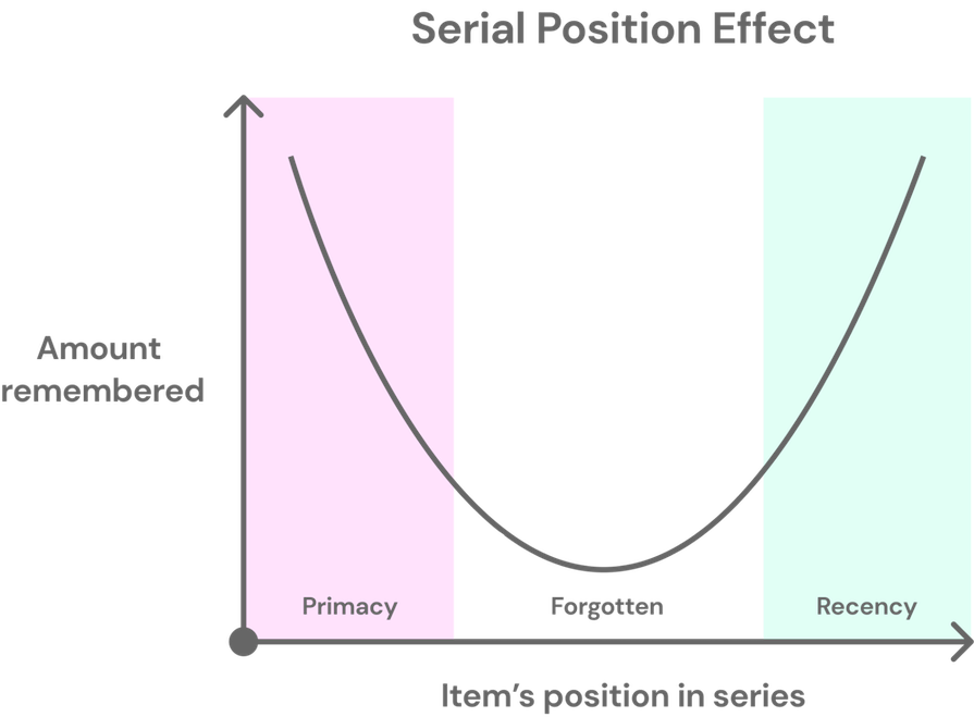
The serial position effect describes the psychological phenomenon of a person being more likely to remember items placed first or last in a series, and less likely to remember items placed in the middle.
Imagine you have a list of grocery items for you to get at the store. Before you leave for the store, you read over the list a few times to see what all is needed. Once you’re at the grocery store, you realize you left the handy list at home. So, you try to remember what all was on the list, but you can only recall some of the items.
After you get back home with your purchased items, you compare what you remembered to the list. Turns out, the only items you remembered were among the first and last few items on the list. But why were you not able to remember any of the items placed in the middle of the list?
This phenomenon is due to the serial position effect. This effect explains the increased likelihood of remembering items found in the beginning or end of a series, compared to items found in the middle:
The serial position effect is an example of cognitive bias that causes the brain to prioritize specific pieces of information when it is handling a lot of data at one time. This effect may be better known for the two concepts it includes — the primacy effect and recency effect:
Both of these concepts help describe the way we process and remember information, and are dependent on the brain’s long-term and short-term memory.
The primacy effect describes how a person better remembers items positioned first in a series. Not only that, a person may even rank the first few items in a series as most important given their position.
The primacy effect is driven by long-term memory, so when a person reads a series multiple times, the first items are most likely to move from short-term to long-term memory. Its influence is weakened by two factors:
- The length of the series — The longer the series, the less likely a person is to remember the first items
- The period of time the series is shown — The shorter the time it’s shown, the less likely a person is to remember the first items
On the other hand, the recency effect describes how a person better remembers items positioned last in a series. This effect is driven by short-term memory, also known as working memory. So, when a person reads a series and is asked to recall any items they can remember, they’re more likely to remember items they read last.
The recency effect’s influence is also weakened by two factors:
- The period of time between reading and recall — The more time passes, the less likely a person is to remember the last items
- Any distractions between reading and recall — The more distractions, the less likely a person is to remember the last items
Also, keep in mind that according to Miller’s Law, our working memories can only hold between 5 to 9 items — sometimes less depending on the data type.
Believe it or not, the serial position effect was discovered in the 1880s! This psychological theory was founded by a German psychologist, Hermann Ebbinghaus:

Ebbinghaus conducted multiple research studies that used his own memory as the test subject. In these studies, he examined if the position of items in a series affected his ability to remember it. Within his testing procedure, Ebbinghaus listened to pre-recorded tapes of random syllables and tried to memorize as many of them as possible.
After completing his research, Ebbinghaus concluded that he was better able to recall syllables that were spoken in the beginning or end of the series. Thus, he coined the terms serial position effect, primacy effect, and recency effect.
Since Ebbinghaus’ research studies, a multitude of psychologists have further proven the serial position effect:
- In 1962, psychologist Bennett Murdock tested the probability of recall for lists containing 10 to 40 words
- In 1966, psychologists Murray Glanzer and Anita Cunitz tested immediate and delayed recall of 20-worded lists
Both of these studies validated the theory of the serial position effect, but brought to light the limitations of the effect when variables such as the length of lists or time-delays were introduced.
The serial position effect is an interesting psychological theory that impacts each of our daily lives. From something insignificant like memorizing a grocery list to something vital like recalling a witness testimony, we all have things to remember.
Thanks to these psychologists who studied memory, we have a better understanding of why we remember certain things better than others. And as designers, we can use this understanding to improve our interface designs to create effective user experiences.
The serial position effect and UX design
Like many other psychological theories, the serial position effect plays a major role in UX design. It helps us understand that users have limited memories, as well as that information recall is made worse when users are presented with lengthy content or distractions such as phone notifications.
By using the serial position effect in your UX designs, you can improve user engagement, enhance the interface’s functionality, and reduce the user’s cognitive load. This all sounds like any designer’s end goal, right? To fulfill this end goal, let’s discuss best practices and what to avoid when applying the serial position effect in UX design.
Best practices for leveraging the serial position effect in UX design
Now that we understand what the serial position effect is and the role it plays in UX design, let’s talk about three ways to effectively leverage it in our work.
1. Position the most important information at the beginning or end of a message
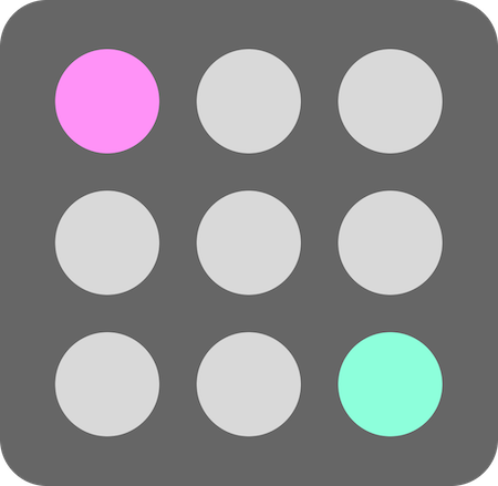
Because of the primacy and recency effects, users benefit when important information is placed first or last within a message, and less significant information is placed in the middle. This supports the user in remembering essential information as they navigate a website or complete a task.
For example, when showing different plans for a product, position information the user needs to make a purchase decision near the beginning or end of the message. This includes information such as the product name, price, and call-to-actions:

Carefully positioning these elements first or last can help the user better remember the information when they compare other options in their purchasing journey.
2. Give users essential information while completing a task
Make sure users have easy access to the information they need to complete a task. This helps reduce the user’s recall and cognitive load. It also eliminates context switching between finding the essential information and returning to the task.
Since users can only store about five items in their working memory at a time, it’s important to keep them engaged in their current task, making it more likely that they’ll complete the task successfully.
One way you can do this is by adding helpful tooltips or visuals to items that users may get stuck or confused on. For example, if you need users to input a security code during payment, but you’re not sure if they know where to find the code, you could add helpful visuals or assistive text next to the item to guide users, like so:
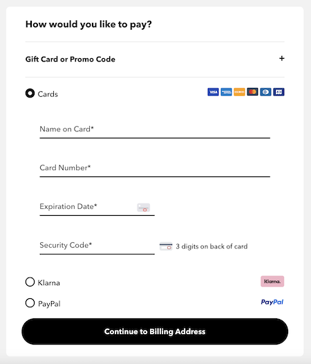
With such information readily available, users are more likely to successfully complete steps in the middle of a task.
3. Use cues and feedback consistently
Cues and feedback bring the user’s attention to the most important elements on the interface. Cues include elements like large typography to indicate a heading for a webpage, while feedback include elements like snack-bars that appear after the user submits a form. By using cues and feedback, the user can easily recognize and recall how to interact with the website.
For example, when a call-to-action button has a bold color, the user is given a cue to select that button for their next action. When the button has a hover effect after the user’s mouse moves over the button, the user is given feedback that the button is interactive. Cues and feedback work hand-in-hand in providing the user an easy-to-remember experience.
What the serial position effect teaches us to avoid in UX design
Beyond what to do, the serial position effect also shows us what not to do when designing user experiences and interfaces. The two biggest “don’ts”: don’t overload the user with information, and don’t use design elements that interfere with the user’s activity. Let’s get into it.
1. Don’t overload the user with too much information
Though users do need some information to complete tasks while on a website, they don’t need it all at once. It’s good to keep in mind that users have a limited short-term memory and can easily be overloaded. To prevent overloading the user, prioritize the information to what is essential to their current task, and use progressive disclosure to show them more.
For example, when designing a webpage, don’t cram everything into one page. Instead, chunk up the information into relevant sections, and place the sections into distinct tabs (with each including significant information at the top or bottom). That way, the user can progressively look through the content on their own terms and avoid feeling overwhelmed.
2. Don’t use obtrusive design elements
When the user is visiting a website for the first time or returning to complete a specific task, they may be exploring content or know what they are there to do. Either way, a design element that appears without the user’s doing can negatively affect the information they are already processing.
For example, if the user is in the middle of filling out a form or adding items to their cart and a popup appears that blocks the form, it will interrupt the user from their task:
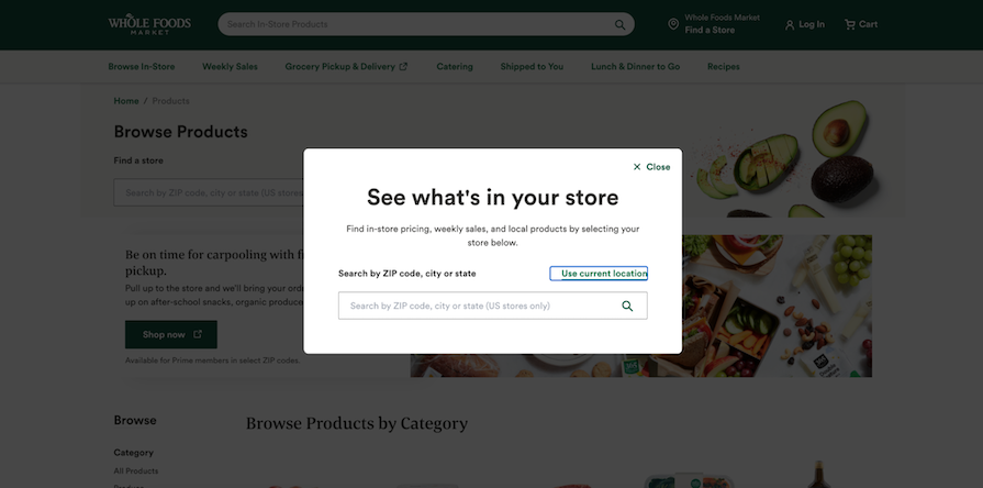
We know how restrictive a user’s working memory is, so it’s best to avoid depleting it with information that doesn’t presently help the user.
Examples of the serial position effect in UX design
Now that we’ve discussed how crucial the serial position effect is in UX design and reviewed some best practices, let’s go through some real-world examples. Here, we’ll look at YouTube’s navigation menu and Zoom’s home page.
YouTube’s navigation menu
When you open YouTube’s navigation menu, which you can do by clicking the hamburger icon button in the top-left corner, a long list of items appear:

If using the serial position effect, the menu should position the most important menu items either first or last.
The first section shown in the menu includes three items: Home, Shorts, and Subscriptions. Any of these three webpages allow me to access content that I have selected or have been customized for me.
Positioning these pages first in the menu makes them most accessible, but helps me better remember where I can find these specific pages. Once I’m an experienced YouTube user, the position of these items may move to my long-term memory due to the primacy effect.
The last section shown in the menu includes four items: Settings, Report history, Help, and Send feedback:

I may not visit these webpages often, but their placement at the end of the list helps me remember where they are in the short-term. If I’m actively using YouTube and need to alter my settings, I’ll remember where to go due to the recency effect
Although I may not remember what menu items are included in the middle sections, I will remember where more important pages are located — all thanks to the serial position effect.
Zoom’s homepage
On Zoom’s current homepage, the first section of the main content includes imagery, large typography, body copy, and two call-to-action buttons. If using the serial position effect, I should be able to discern the message’s most important information from the cues shown in the elements:

First, my eye is drawn to the large typography that says, “Enhance workplace engagement with AI Companion.” I know it’s a heading due to the size, and the bold color on the specific word “engagement” prompts me to read it first and tells me it is important information. I can tell this is one of Zoom’s main selling points to users.
Next, my eye is drawn to the last portion of the message, which are the two call-to-action buttons. The primary button reads Plans & Pricing and the ghost button reads Discover Zoom Workplace. The bold background fill color and rounded corners around the text Plans & Pricing gives me the cue that it’s an interactive button.
Lastly, my eye reads the body copy and skims the imagery of the message. I am less likely to remember the body copy and imagery because it is positioned in the middle of the message. I am more likely to remember the large typography and buttons since they are positioned first and last within the message.
Zoom’s home page is a great example of using the serial position effect to create effective messaging. Users can quickly read the message, discern what is most important, then select one of the call-to-actions positioned last in the message to take their next steps.
Conclusion
In this article, we discussed what the serial position effect is and its importance in UX design. Due to the primary and recency effects, items that are positioned first or last are more likely to be remembered by a user in comparison to items placed in the middle.
The original psychological theory of the serial position effect was founded by psychologist Hermann Ebbinghaus in the 19th century. It has since been further validated by more recent research studies.
The findings of these psychologists have helped us have a greater understanding of the constraints of the human memory. Knowing these constraints helps us optimally position important information within a message so that it’s more likely to be remembered.
In UX design, the serial position effect is significant in shaping a user’s experience. Designers must effectively use the primacy and recency effects to prevent cognitive overload and keep the user engaged in the website’s tasks.
Make sure you follow best practices such as placing the most important pieces of information in the beginning or end of a message or list; users will be more prone to remember that information. Doing this helps users navigate the interface efficiently as well as make decisions and complete tasks without disengaging.
The serial position effect influences our lives on a daily basis. As designers, we can use this principle to inform better UX design. If we intentionally position important information in the beginning or end of messages, lists, or series, we better equip our users to navigate and use our designs efficiently.