As you progress from surface level knowledge of design to more in-depth research into the subject matter, you begin to realize the complex rules behind creating good UI and UX. From learning that users don’t actually read the text on websites but rather scan it, to understanding how to scale things to create a hierarchy in your designs, you need to be able to create great user experiences for all types of people.

Understanding and implementing these principles separates beginners from more seasoned professionals. This article unpacks the Law of Pragnanz, a principle that describes the way the human mind interacts with complexity. Keep reading to learn more about its importance, application, and use in UI.
What is the Law of Pragnanz?
Oftentimes when looking at something, you can tell what looks good or bad, however struggle to verbalize why. While this happens subconsciously, research has shown certain principles that govern what tends to be perceived as visually appealing. In people, for example, concepts such as symmetry and the golden ratio are often used as a measure of good looks. Similarly, UX design also has its own visual design principles, which includes Gestalt psychology and its principles.
Gestalt psychology, founded by Max Wertheimer, Kurt Koffka and Wolfgang Köhler is a school of thought that explains how humans perceive the world around them as a whole rather than splitting up into smaller individual parts. The overall philosophy breaks down into different principles including similarity, proximity, continuity, closure, common region, and pragnanz.
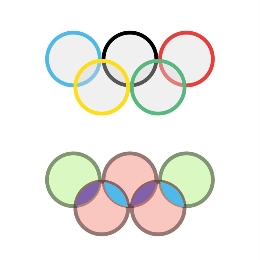
The Law of Pragnanz (good figure in German) – also known as the Principle of Simplicity – indicates that the human mind interprets complex objects in the simplest way possible. Think of the Olympic logo. Most people see five overlapping circles, not a complex assortment of weird shapes:
The importance of the Law of Pragnanz in design
Good UI/UX design allows the user to quickly and comprehensively achieve their goal. Because of this, aim for simplicity. A complicated design can lead to lower user satisfaction and engagement.
You can easily achieve simplicity In UI design by avoiding clutter, using clear fonts, and maintaining organization. Also, remember that with Pragnanz, users will perceive the whole rather than each individual shape. Take these two designs:
Cruise’s 2013 UI had a complicated user interface that was difficult for users to navigate. However, its current UI clearly applies the Law of Pragnanz. The more modern, minimalist design uses empty space to not only increase the aesthetic, but also to improve the usability. Looking at the hero section as a whole you know exactly where to start.
In UX design, simplicity is less visible however equally important. Regardless of what design process you use, understand the user’s goal and create a clear path to achieve it. You might need to remove unnecessary features and elements that slow down the user’s path.
Applying the Law of Pragnanz in UX
To help you implement the Law of Pragnanz in your UX, you can utilize the following steps:
1. Understand what simplicity means for your user
Applying the Law of Pragnanz to your design process requires you to understand the easiest way for your user to achieve their goal. Once you determine this, all other unnecessary actions should be eliminated. You can do this through a myriad of methods involving significant user research, such as user interviews, personas and journey mapping:
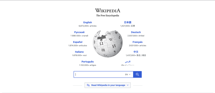
Wikipedia’s UI provides a clear example of this through its language bar feature that enables users to easily search in their preferred language. The UI clearly displays 10 popular languages on the platform so that users can directly select it and continue with their research. This small but effective feature simplifies the research process and showcases a clear understanding of the user’s goal as well as the journey the user has to take to achieve that goal.
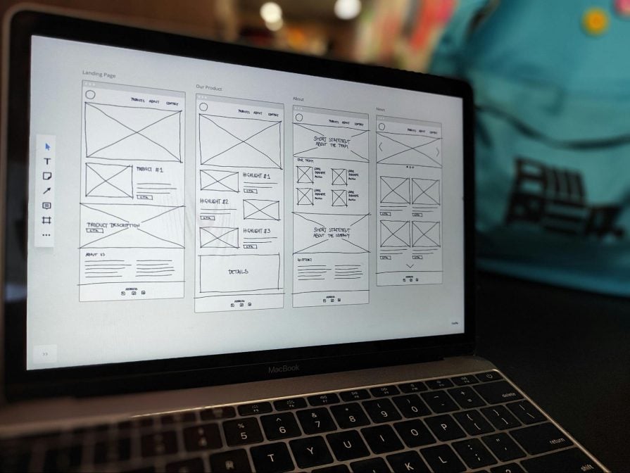
2. Wireframe with Pragnanz in mind
Wireframing allows you to view a design as a whole. Looking at wireframes will show you whether your design lets the user solve their goal in the simplest way, as well as other ways to streamline the process:
3. Simplify according to user feedback
Ultimately, your users know the most about whether a design will help them achieve their goals. Because of this, make sure to keep user feedback in mind when iterating, and implement changes that they want to see. You can use methods like usability testing, surveys and interviews to gather intel.
Case studies of the Law of Pragnanz
Now that you know how to implement the Law of Pragnanz, let’s turn our attention to real-world examples where companies have used the principle to optimize the UX:
1. Airbnb
Airbnb’s clear but simple layout makes it easy for users to navigate the website and showcases the Law of Pragnanz in practice. Using simple shapes such as circles, squares, and rectangles with rounded corners, makes it easier for users to understand.
Furthermore, putting images in these shapes and creating a repetitive page layout creates uniformity across the UX as related elements live together. Airbnb prioritizes images over written information, driving users to the event or experience, instead of the copy:
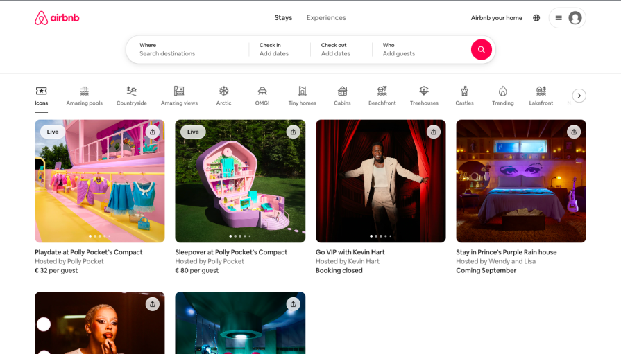
In the top navigation, Airbnb reserves color for its logo and search function, which gives the user visual cues as to where the most important information lives. Fonts and Icons are also used similarly with a slight size increase and a darker shade of color to differentiate active and resting states.
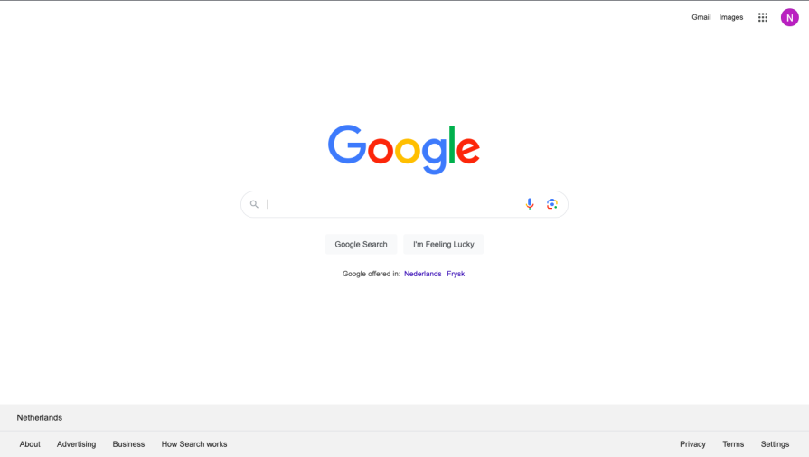
2. Google
Google displays the Law of Pragnanz in practice with its effective use of negative space and the overall simplicity of its design. The webpage centers the search function and sections off additional information in the top right corner. By removing unnecessary or superfluous information, the user reaches their goal as fast and as easily as possible:
Key takeaways
To review one last time, the Law of Pragnanz states that individuals simplify complex structures to ensure understanding. By using this to your advantage, you can elevate your designs and improve user engagement. Moreover, it can increase accessibility by making sure that a wide variety of users can achieve their goals in the simplest manner possible.
Get started today by asking yourself what you could simplify about your product. Think back on the examples of how Airbnb and Google offer experiences that make it easy for users to perform tasks on the sites. Good luck, and feel free to comment with any questions!