Some icons have become essential features of any interface. Take the save icon — it represents a floppy disk that most people under thirty wouldn’t recognize. The same goes for the three horizontal bars that reveal hidden options — the hamburger menu.
The hamburger is an ingenious representation of stacked elements representing a menu. While a “menu” button could serve the same purpose, using an icon for UI feels more intuitive.
The invention of a hamburger menu is not recent, but its use has become widespread with the invention of mobile interfaces. In this blog, I dig into the history of the hamburger menu, the pros and cons of using it, and the best practices for you, as a UX designer, to implement when you’re working with a hamburger menu.
History of the hamburger menu
The hamburger menu is an old concept that took a long time to get off the ground.
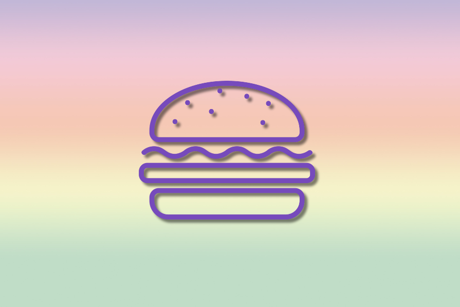
Norm Cox, the inventor of the hamburger icon, began his career at Xerox Parc as a visual designer when the company needed icons to represent various machines on its graphical interface. It was 1981, and graphic interfaces were a recent innovation. Cox came up with the hamburger menu icon because of the pixel constraints of the time, aiming for something as intuitive as road signage. The Big Mac was his prime inspiration if we believe this mockumentary by McDonald’s.
Though the hamburger menu might have appeared in the first version of Windows in 1985, it was largely forgotten until 2009, when smartphones emerged, and space conservation became a priority.
Benefits of using a hamburger menu
Why use a hamburger menu?
Here’s a quick answer — to save space and simplify the interface.
Apple’s motto, “less is more,” quickly spread to the West and became the norm. The aim is always to display only what’s relevant to the user at any given moment, leaving no room for the superfluous.
The hamburger menu is an elegant way of hiding what the user doesn’t need to see or access all the time. This is typically the case with general settings found at the bottom of menus or the list of pages within an app. If there’s no reason to show all navigable pages, it’s better to tuck them away behind a menu.
By using a hamburger menu, you make your interfaces cleaner and simpler, thus limiting the cognitive load on users.
But be careful to think of what the developers or designers consider important and what they consider secondary. Theoretically, you can hide everything behind a burger menu, but the aim isn’t to create a list of dozens of options either. You must put in careful thought when defining what users truly need upfront and what can be considered secondary.
Drawbacks of the hamburger menu
The hamburger menu icon isn’t a magic solution, and like any design choice, it has its drawbacks — discoverability and usability.
As for the discoverability of the icon, it doesn’t represent a burger, of course, but a list of items. While it has become a standard, and many users now recognize the three bars, less tech-savvy users might struggle to make the connection between the bars and a menu. One way to address this is by labeling the icon with the word “menu,” but then why not just use a “menu” button to begin with? Designers face tough decisions here.
If users don’t notice the menu or think to look for it, certain features may go undiscovered. Since the menu’s contents are hidden behind an icon, users might not immediately realize that additional navigation options exist. This can cause key features or pages to be overlooked, particularly by first-time users.
In terms of usability, hidden menus increase the interaction cost. Users must first remember that an option is hidden, click to reveal it, and perhaps scroll to find what they’re looking for. In some cases, one extra click can make a difference. A bottom navigation bar may clutter the interface slightly but provides immediate access to important options in a single click.
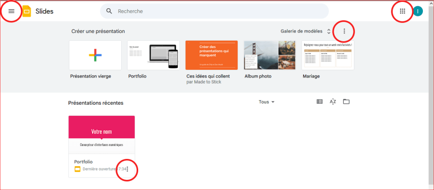
Above all, the consistency of the menu can be a problem. Some applications overuse hidden menus, making it difficult to remember which burger an option is in. That’s the case for Google Drive and its associated applications Slide, Sheet, and Docs — on a PC, hidden options appear at every level on the page, making navigation confusing:
Guide to building a hamburger menu
1. Ask if the hamburger menu is the right option
The first question to ask yourself is — “Is it the right tool?”
Designers must define if the navigation and options should be hidden in a single menu, or always visible. A good way to determine this is by assessing the frequency of page changes. If the pages are indirectly related, a menu is appropriate.
For instance, Google Docs allows access to Sheets, Drive, and Slides, but users rarely switch between them frequently.
Also, consider the device you are designing for. Burger menus are often used for mobiles as they are a gain of space, the size is coherent for the screen, and it’s easily accessible with the finger.
On desktops, the hamburger icon will appear smaller, and it’ll be harder to find. Plus, Fitt’s law suggests that on desktops, the hamburger menu will require more time to be clicked with the mouse than the finger. So, for desktops — opt for a classical navigation menu always present on the side or up in the header.
2. Determine what goes in the menu
The next thing you need to figure out is what will be on the menu. Since other types of hidden menus exist, a hamburger menu generally hides access to specific pages. Hidden actions are often placed in a “meatballs” (three-dot) menu attached to a specific element.
Figma has some templates for you to get inspiration from — the humburger menu, this icon animation, and this all-in-one page. WordPress, too, has a ton of plug-ins like WP mobile or the WP responsive menu that can help you build a nice burger menu when it’s not already present in the theme used.
3. Organize the menu
When creating a hidden menu, it’s best practice to organize it by the frequency of page visits, with the exception of settings, which are conventionally placed at the bottom.
Organizing alphabetically is only useful for very long menus, such as the Windows start menu, which lists all installed programs.
Note a difference between iOS and Android devices — iOS prioritizes tab bars for primary navigation, with burger menus used only for secondary actions, while Android uses burger menus more widely as navigation drawers.
On Android, hence, a hamburger menu will be used more often and contain more elements. Designing for iOS means less burger menu and more direct access to navigation or options via the tab bars.
Both platforms typically place the burger menu in the top left corner of the screen.
4. Decide how your users will access the menu
Usability testing is crucial here. The menu can be accessed via clicking, swiping, hovering, or shortcuts:
- Shortcuts — These can be implemented as a secondary option for expert users, typically found in professional software where users receive training
- Hovering — This option can only be viably implemented on PCs. This option is often paired with a partially closed menu that displays icons, reducing clicks but risking menu closure if the cursor moves away. Windows uses this approach in its start menu
- Clicking or swiping — This is the default method. It’s better suited for menus that don’t require frequent access. On mobile, since the hamburger is usually placed at the top, it requires more effort to reach. Swiping is preferred for menus that will be accessed regularly on mobile, alleviating the difficulty of reaching a top-placed menu
5. Use icons after careful thought
It’s best to pair icons with text in a row container. This allows users to quickly identify options even without reading the text, reducing cognitive overload and making the interface more intuitive.
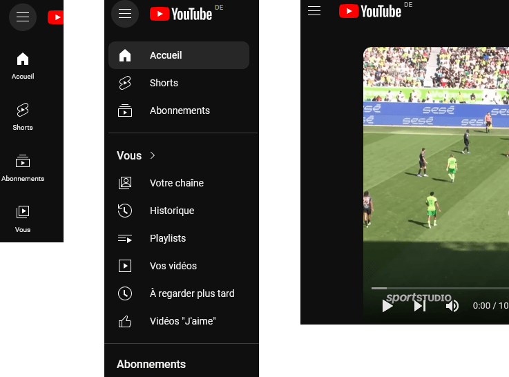
Example: YouTube’s hamburger menu
YouTube is a good example of effectively built hamburger menus.
On the desktop home page, a small icon menu on the left offers quick access to frequently visited pages. Clicking the hamburger reveals a full set of navigation options, filters, subscriptions, etc. Users can choose to hide or keep the menu open, depending on their preferences. On individual video pages, the hamburger menu acts as an overlay that closes automatically when the user clicks outside of it.
On mobile, however, YouTube opts for a navigation bar instead of a hamburger menu due to the different use cases. A long hidden menu wouldn’t be practical, so the navigation bar provides quick access to commonly used features.
Alternatives to the hamburger menu
Since its inception in the 1980s, the hamburger icon has undergone significant evolution, particularly since 2009. Modern versions of the icon are typically larger, with the bars placed closer together, making it appear less like a simple list and more like a symbol of grouped items.
To improve discoverability, some designers add the label “menu” beneath the icon, making its purpose clearer to users. However, the more interesting developments in hamburger icon design come from global-inspired alternatives, each offering a unique approach to UI design:
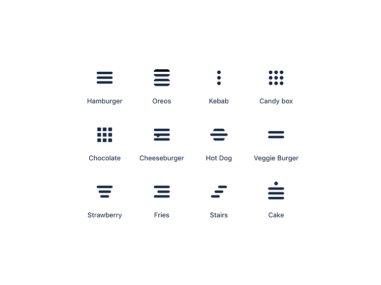
- Veggie burger icon — with two bars instead of three is ideal for minimalist UIs, where simplicity is key. This stripped-down version of the hamburger icon works well in apps with a clean, modern aesthetic, reducing visual clutter while still indicating the presence of a menu
- Brochette and meatball icons — These three vertical or horizontal dots are commonly used to signify additional options or settings rather than a full menu. These icons are action-oriented and often applied next to specific elements on the page. Instagram uses this type of menu next to every post on a user’s feed
- Kebab menu icon — featuring descending lines, is frequently used for filtering options or contextual menus, offering users more control over what content is displayed. This is especially useful in e-commerce apps or dashboards where users need to refine their view or apply filters
- Bento or chocolate box icon — representing a grid, is preferred for UIs where the menu leads to a grid of options. This is commonly seen in gallery apps or project management tools. Google uses the bento icon across its services to showcase its entire ecosystem
These variants of the hamburger menu can be chosen based on both visual identity and functionality. For example, if the menu organizes content into a grid, the bento icon is more intuitive; if it involves filtering, the kebab icon may be more suitable.
By selecting the right icon variant, designers can complement the traditional hamburger menu and enhance usability, aligning the interface with user expectations and the application’s purpose.
Conclusion
The hamburger menu has become a cornerstone of modern UI design, particularly on mobile devices, where space-saving and simplicity are essential.
However, its evolution, along with the introduction of alternatives like the veggie burger, kebab, and bento icons, underscores the need for thoughtful design choices.
Designers must carefully assess the context and user needs. They need to balance minimalism with discoverability and ensure that essential functions remain easily accessible. By applying best practices and selecting the right navigation tools, designers can create interfaces that are both visually appealing and intuitive for the user.