Every software UI implements various user flows to let customers accomplish their goals. These user flows may require one or many user interaction points, starting with a specific action. Typically, user flows guide the customer toward achieving a planned objective, like logging into an app via a login flow. However, UIs also need to implement flows that allow customers to exit ongoing activities, activated features, or even the entire application—these are known as exit flows in UI/UX design.
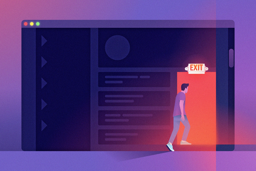
Most apps have a basic exit flow, such as the logout action. Besides, most apps nowadays include flows for subscription cancellation, feature deactivation, and even account deletion. While these exit flows lead the customer away from a product or feature, designing them properly and ethically is essential to avoid confusion and frustration.
In this article, we’ll study the concept of exit flows in UI/UX design, exploring theoretical aspects and practical designs to learn how to build seamless, user-friendly exit flows that create positive user impressions.
What is an exit in UX?
An “exit” in UX can refer to when the user stops an ongoing activity or leaves the website or digital product. Besides exit flows, other aspects of exit in UX could include:
- Exit rate — The percentage of users who leave a page or step within a customer journey. This metric is similar to bounce rate, but bounce rate specifically refers to users who leave almost immediately, indicating their needs or expectations were not met, while exit rate usually refers to users who leave after some interaction
- Exit point — Sometimes called drop-off points, these are the points where users typically abandon tasks. High exit rates at exit points typically indicate user friction. Identifying these points can help inform optimization efforts and improve retention
- Exit intent — Refers to signals and behaviors that suggest a customer is about to leave — for example, moving the cursor toward the Close button
- Exit intent pop-up — An intervention deployed when exit intent is detected. For example, if a customer is about to navigate away from a checkout flow, you could display a pop-up that reads “Are you sure? Don’t lose your cart!”
In the remainder of this article, we’ll take a closer look at exit flows and how to design them for a smooth UX.
What is an exit flow?
In UI/UX design, an exit flow refers to a user flow that directs the customer to a specific exit point that takes them away from an ongoing user flow, activated feature, enabled service, or even the entire app.
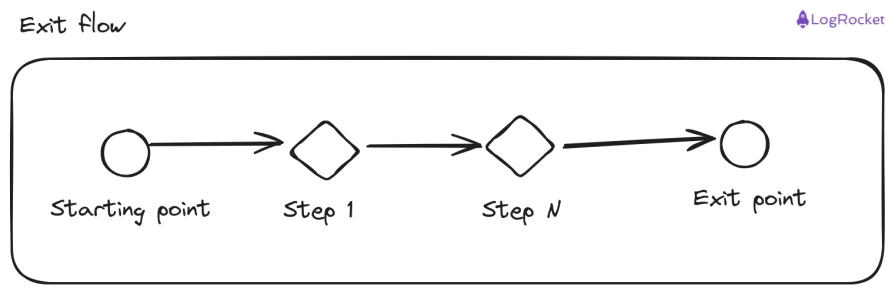
Here is a generic graphical view of an exit flow, exit point, and start of the exit flow:
Exit flows are important and mandatory in all software UIs — they allow customers to leave contexts they no longer wish to engage with. Exiting an activated feature or a situation is a fundamental user right, so every designer should create intuitive, simple, seamless, and ethical exit flows that don’t waste users’ time.
A well-designed exit flow invites customers to return to a specific flow or the app itself, enhancing the overall user experience.
Common exit points in digital products
Software products implement various exit points in their user flows with various UI components to allow customers to exit specific contexts. But there are some common exit points shared by all digital products:
- Popups and message boxes — Appear when customers try to exit from an app or website
- Logout actions — Take customers from an app back to a public, general homepage
- Subscription cancellation flows — Let customers unsubscribe from a paid feature or service
- Account deletion flows — Allow customers to delete their account permanently if they no longer use the app
- Account deactivation flows — Let customers temporarily disable their account until they log in again
Beyond these common exit points, digital products can implement other exit flows, such as:
- Canceling or completing a purchase order on an e-commerce site
- Exiting an ongoing flight reservation on a travel website to start a new one
- Canceling new customers registration and returning to the login screen in social media apps
Best practices for designing flows for exit in UX
As much as we strive to improve all user flows, designing an exit flow demands careful thoughts to avoid user frustration. And adhering to a few of my well-tested practices can help you create a user-friendly, simple exit flow for any situation:
Don’t hide the start of the exit flow
Even if a specific exit flow is simple, it becomes painful for the customer if the starting point is hard to find. For example, burying the logout action inside a submenu is poor UI/UX practice.
Place the starting point where customers expect it to save them time.
Display a confirmation if needed
Most exit flows, like generic action flows, are not easily reversible — so it’s crucial to ask for user confirmation.
And even if the exit flow is easily reversible, asking for user confirmations helps designers prevent user errors. For example, a logout confirmation ensures customers don’t accidentally log out by tapping the button unintentionally.
Beware of some dark patterns in confirmation messages, though. Confirmshaming is a real UX issue!
Maintain consistency and adhere to standards
The secret of implementing user-friendly, self-explanatory, and easy-to-learn UI is maintaining consistency and using design elements/flows that most apps generally use as a standard. An exit flow can be special and irreversible, but don’t use inconsistent, unique user flows or styles to highlight it.
Stick to standard design elements that most apps use. Avoid inconsistent or unique flows for exit points, and use modern UI standards, such as placing the logout action in the user menu.
Use icons and colors properly
Using proper, self-explanatory icons helps customers find and understand the starting point of exit flows. For example, standard logout or close icons are more intuitive than plain text.
Moreover, using proper colors to show the irreversibility and danger of specific exit flows is also a good UI design practice.
Don’t complicate the flow
I see that some modern digital product designers deliberately complicate user exit processes to make them painful for customers. This may be a business strategy to keep customers on a service, but it may affect the popularity and reputation of a digital product.
Always design exit flows that are user-friendly and ethical, allowing customers to leave without unnecessary friction.
Case studies: Good vs. bad exit flows
Now that we know what exit flows are and the best practices designers should follow while designing them, let’s evaluate some software products and how they implement them for customers.
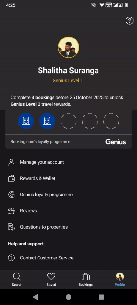
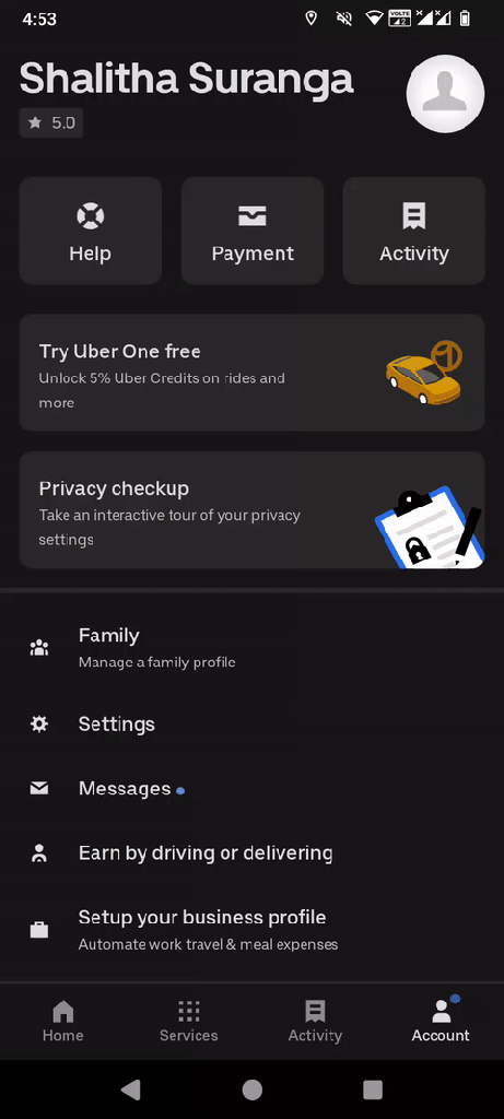
Log out exit flow: Booking.com vs. Uber
The Booking.com Android app places the logout action under the user menu and displays a clear confirmation message before a customers continues with the logout process:
Meanwhile, the Uber Android app places the logout action button inside the settings page:
Account deletion flow design: Quora vs. LinkedIn
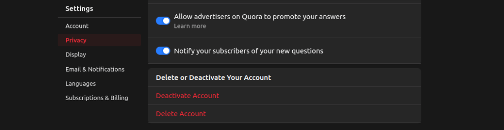
The Quora website displays the account deletion action under the privacy settings tab of the settings page using a variant of the color red:
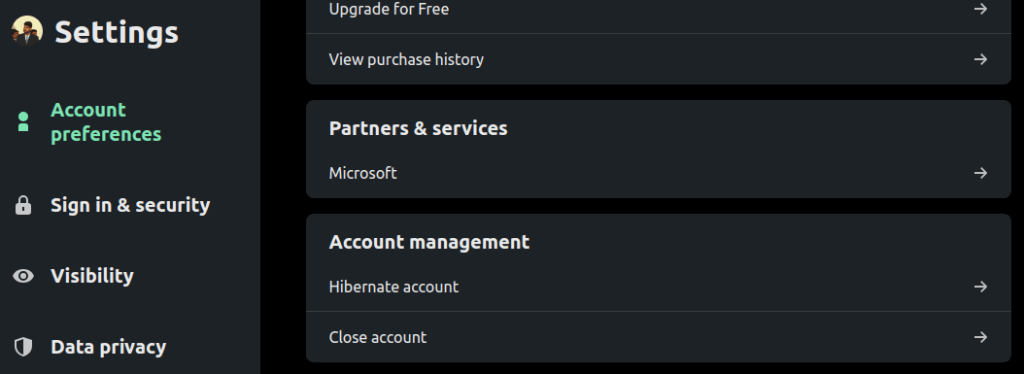
The LinkedIn website, on the other hand, displays account deletion action under the account preferences tab of the settings page as a normal menu item:
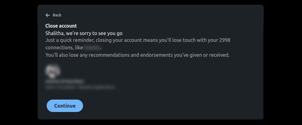
Moreover, within the account deletion flow, Quora simply asks for password verification for security purposes. LinkedIn, though, becomes personal and appeals to a customer’s emotions by mentioning that they’ll lose touch with a special corporate network connection if they close their LinkedIn account:
Presenting mode exit: Figma vs. Google Slides
Software UIs use exit flows to allow users to turn specific activated software UI modes off and switch to previous modes.
Figma implements a tiny menu item to return to the visual editor from the presenting mode (prototype mode). This exit takes some time since the editor web page is loaded from the start. There are several discussions on the Figma forum and social media regarding this UI/UX issue. For example, see this Figma forum thread.
Google Slides, on the other hand, lets a user exit from the presenting mode instantly using the standard “escape” key:

A well-designed UI implements clear, intuitive exit flows between modes using standard symbols and keyboard support.
There are many other common dark patterns in UX design that you need to be aware of to learn how to avoid bad user interaction designs while implementing exit flows.
How does an exit flow affect your brand?
The way you implement exit flows affects customer productivity and influences their impression and behavior with the specific exit process. Good exit flows offer better productivity, and customers find the software UI to be more friendly when the flow guides them to reach their goals without wasting their time.
A complicated, badly designed exit flow, on the other hand, wastes customers’ time and risks generating user frustration. This will, most certainly, affect the product’s or brand’s reputation.
So, as a designer, you must carefully implement exit flows. And to do that well, understanding the psychology behind the exiting process will come in handy.
Remember that customers may experience various emotions during exit flows, such as:
- Neutral when logging out or closing the app — A customers will happily exit if they can easily find the logout flow initiator (logout button), but they may get frustrated if the logout button is hidden somewhere within the app pages
- Disappointed or neutral when canceling a feature or unsubscribing from a service — Customers may blame a specific product if the product strives to prevent the user from leaving with a complicated exit flow
- Frustrated or neutral when deleting an account — Same as above; customers may blame a specific product
- Happy when completing a purchase — Customers may blame the product search screen design if an ecommerce app suggests purchasing a similar product after the purchasing process if the customer assumes the suggested product is better than the purchased one
Designers must understand and respect these emotions, guiding customers through exit processes without negatively altering their moods. A simple design flaw can frustrate customers, leading them to abandon the product altogether.
Humans can naturally wait to enter something, but their minds urge them to speed up when they quit something, so offering a smooth exit process is a must.
Conclusion
In this article, we explored the concept of exit flows and the importance of designing user-friendly, ethical flows in UI/UX. We also reviewed case studies of exit flows in popular apps to highlight good and bad design practices.
Exit flows take customers out of a product or service, either temporarily or permanently. While their purpose is to help customers leave, they must be designed carefully. Poor designs can lead to user frustration, which may damage a product’s reputation.
Always aim to create simple, consistent exit flows that leave a positive impression and encourage customers to return to your product in the future!