We’ve all been there. Staring at endless rows of numbers in a spreadsheet, trying to make sense of it all. Not fun. But here’s the thing — data doesn’t have to be boring. Especially in the world of UX/UI design, where making sense of user data is key to delivering great experiences.
But if you’re still relying on spreadsheets to figure out where users are dropping off or why engagement is low, you’re probably missing out on a clearer, quicker way to understand the story your data is telling.
Enter data visualization tools.
These tools are like a lifeline for designers, allowing you to transform that endless stream of numbers into beautiful, easy-to-digest visuals that actually help you make smarter design decisions. No more squinting at columns and rows — just actionable insights laid out in a way that makes sense. Your data should be more than just a spreadsheet.
In this blog, I will tell you all that you, as a UX/UI designer, need to know about data visualization tools. Let’s rocket in.
At their core, data visualization tools take raw data and transform it into something visual — something that allows you, your team, and your stakeholders to “see” the trends and insights. Think of them as your go-to for creating interactive charts, graphs, and even heatmaps that are easy to digest and take action on.
These tools become invaluable when you need to:
- Present user journey maps visually
- Show click paths or interaction heatmaps
- Display A/B testing outcomes in a clear, understandable way
- Analyze engagement patterns and how design tweaks affect user behavior
Benefits for UX/UI designers
Data visualization tools are a game-changer for UX/UI designers — and, honestly, for anyone who has to communicate design impact using behavioral and attitudinal data. These tools don’t just make your work look good. They help you translate complex data into insights that are easy to understand and act on. Whether it’s showcasing user flows or tracking conversion rates, you’ll finally have a way to back up your design decisions with solid data — something your C-suite and stakeholders will love.
Plus, visualizing user behavior helps you spot patterns and pain points faster, leading to quicker design iterations and smoother user journeys.
In short — better data, better decisions, better designs.

1. LogRocket
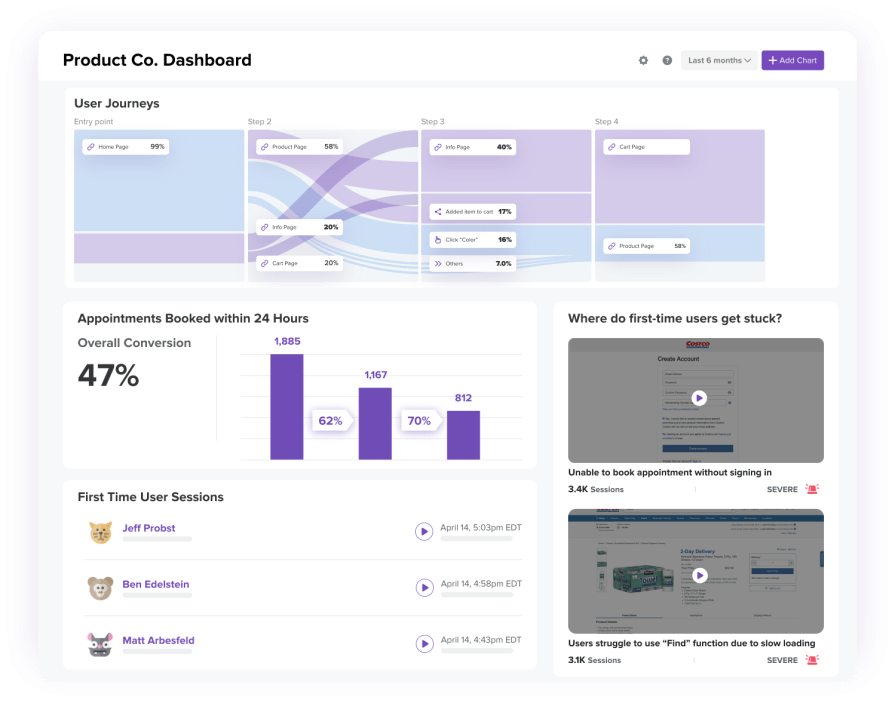
I know I’m writing on the LogRocket blog, but it’d be super ignorant of me not to say this — LogRocket’s really your best bet if you want a front-row seat to how users actually experience your product. Imagine watching every click, scroll, and interaction unfold in real time.
For UX/UI designers, this means you can spot usability issues, track feature adoption, and even monitor performance — all while sipping your morning coffee.
And LogRocket also has Galileo AI. This feature takes things to a whole new level by using machine learning to automatically detect anomalies in user behavior and performance. It’s like having an extra set of eyes on your product, catching those hard-to-spot issues before they turn into real problems. Personally, I love how it simplifies the process of finding those subtle performance hiccups that might otherwise slip through the cracks.
Key features:
- Session replays that let you “watch” users interact with your app
- Heatmaps that highlight where users are most active (or where they’re lost)
- Performance tracking to keep tabs on load times and errors
- Galileo AI for automated anomaly detection, so you never miss a beat
How you can use LogRocket as a data visualization tool
LogRocket lets you monitor how users really experience your product. It’s like having X-ray vision to spot usability issues and track user behavior in real-time.
- Set up session replays — Start recording user sessions to identify friction points in your UX
- Analyze heatmaps — Use heatmaps to visualize where users are clicking most. Adjust your design to focus on those high-traffic areas
- Track performance — Regularly check load times and errors to ensure smooth user experiences
- Leverage Galileo AI — Use the AI feature to automatically detect anomalies and proactively address potential UX issues before they impact users
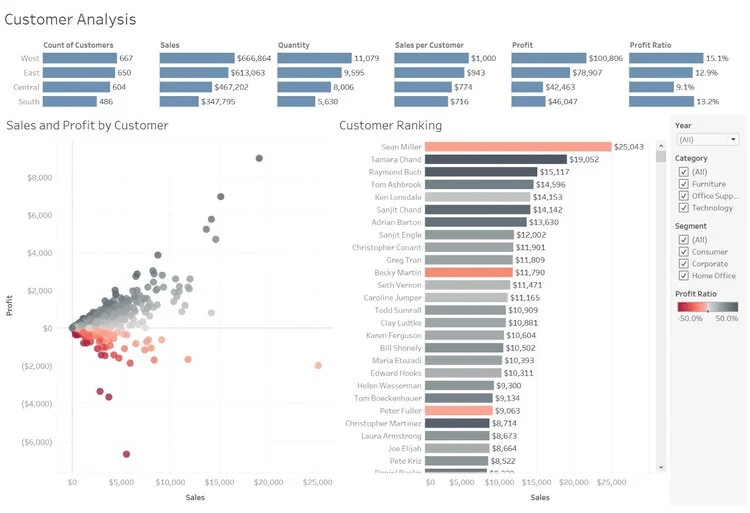
2. Tableau
Tableau is like the heavyweight champion of data visualization — it’s powerful, customizable, and perfect for handling large data sets. Want to create interactive dashboards that make your user journey data pop? Tableau has got you covered.
Key features
- Drag-and-drop interface for easy visual creation
- Integration with a wide range of data sources (like Google Analytics)
- Collaboration features for sharing insights with your team
How you can use Tableau as a data visualization tool
Tableau turns your data into a story — perfect for tracking user journeys and showing stakeholders why design decisions are making an impact.
- Start with Tableau Public — Try the free version and build your first dashboard using real user data
- Connect data sources — Pull in data from Google Analytics or other sources and start creating visualizations that tell a story
- Build a heatmap — Use heatmaps to understand user interaction patterns and optimize key areas
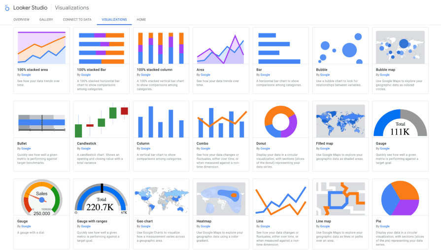
3. Looker Studio
Looker Studio, or Google Data Studio, is the lightweight champion — it’s free, easy to use, and perfect for visualizing web metrics in real-time. Think of it as your personal dashboard builder that syncs up with all your favorite Google tools.
Key features
- Real-time integration with Google Analytics and other Google services
- Customizable templates for easy reporting
- Free
How you can use Looker Studio as a data visualization tool
Looker Studio keeps everything in real-time. It’s your dashboard for tracking key UX metrics and showing off A/B test results.
- Link to Google Analytics — Pull in your website’s data and start building custom dashboards in minutes
- Create A/B test dashboards — Visualize your test results to show which design is winning
- Set up custom reports — Automate reporting so you (and your stakeholders) always stay in the loop
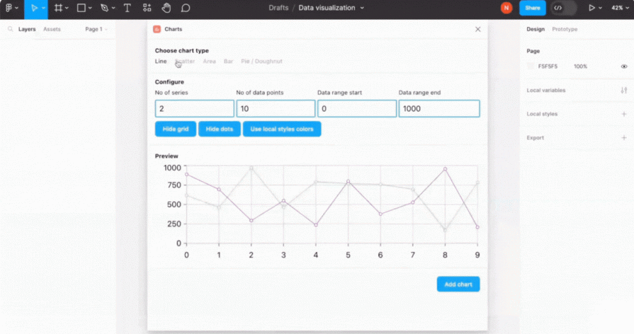
4. Figma (with plugins)
Figma’s not just a UI design tool — it’s a collaborative workspace where you can also visualize user interactions. With the right plugins, Figma can help you map user flows and visualize click paths, keeping everything neatly in one place.
Key features
- Real-time collaboration for team-based design sprints
- Plugin support for data visualizations like user flows and heatmaps
- Seamless integration with your design projects
How you can use Figma as a data visualization tool
Figma’s plugins turn your user flows into visual maps without leaving your design tool. Keep everything flowing while tracking navigation paths.
- Install visualization plugins — Add plugins like ‘Chart’ or ‘User Flow’ to visualize your data directly within Figma
- Create user flow maps — Design user journey maps to identify where your users might be getting lost or confused
- Collaborate and iterate — Work with your team in real-time to refine designs based on user interaction data
Picking the perfect data visualization tool depends on what you need it to do (and how fancy you want to get).
If you’re drowning in massive data sets and need something powerful to crunch the numbers, Tableau is your heavyweight.
But if you’re more interested in watching how users interact with your design in real-time, LogRocket is your sidekick, offering session replays and heatmaps.
Looking for something lightweight and free? Looker Studio is your no-frills choice for quick, clean web metrics.
And if you’re already knee-deep in Figma designs, just add some plugins and keep everything in one smooth workflow.
The trick is finding what you need, how complex your project is, and how well the tool fits into your existing process — because who has time for extra headaches?
Conclusion
Data is powerful — but only if you can turn it into actionable insights and data-driven conversions. As UX/UI designers, we’re not just crafting pretty interfaces; we’re backing up decisions with data — because let’s face it, the C-suite always wants hard numbers.
I love tools that give me the big picture without drowning in details, like tracking user journeys in Figma or diving into Tableau dashboards. The right tool helps you deliver the data that matters. Once you’ve got that, you’re ready to turn raw numbers into meaningful insights that drive both design and business decisions.