Editor’s note: This article was last updated on 5 September 2024 by Oyinkansola Awosan to reflect the latest updates in persistent bottom navigation bar packages and custom animation options.

Mobile applications often have various categories of content to offer. The Google Play Store app, for example, presents its content in categories such as games, apps, movies, and books. In Flutter apps, the BottomNavigationBar widget enables users to see any one category as the app starts and quickly look at the others with just the tap of a finger.
In this tutorial, we’ll tell you everything you need to know about BottomNavigationBar in Flutter. We’ll demonstrate how it works, walk through some use cases, and show you how to customize the BottomNavigationBar widget in your Flutter app.
What is BottomNavigationBar in Flutter?
BottomNavigationBar is a widget that displays a row of small widgets at the bottom of a Flutter app. Usually, it’s used to show around three to five items. Each item must have a label and an icon. BottomNavigationBar allows you to select one item at a time and quickly navigate to a given page.
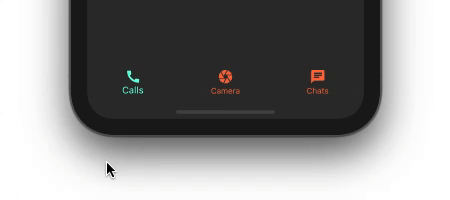
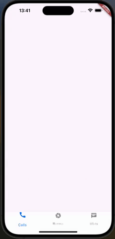
Now let’s walk through the process of creating a simple BottomNavigationBar step by step. The finished product will look as follows:
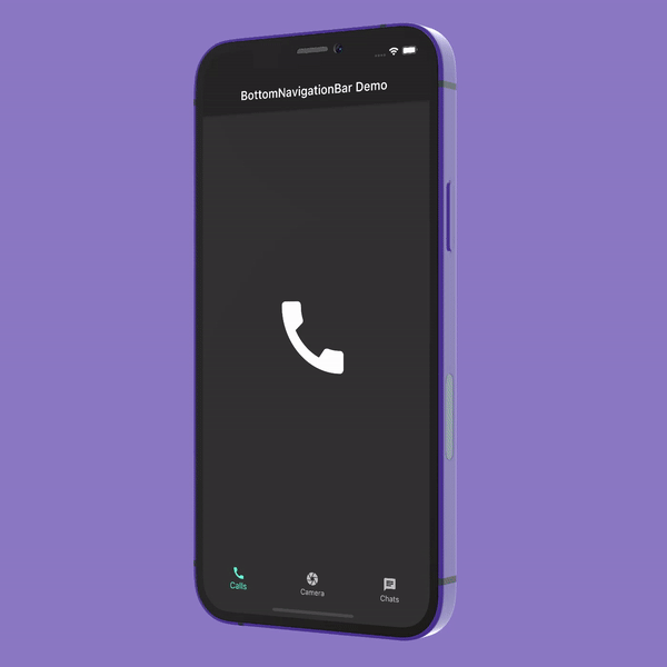
Showing BottomNavigationBar
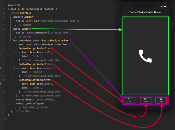
The BottomNavigationBar widget is given to the bottomNavigationBarproperty of Scaffold:
Scaffold(
  appBar: AppBar(
    title: const Text('BottomNavigationBar Demo'),
  ),
  bottomNavigationBar: BottomNavigationBar(
    items: const <BottomNavigationBarItem>[
      BottomNavigationBarItem(
        icon: Icon(Icons.call),
        label: 'Calls',
      ),
      BottomNavigationBarItem(
        icon: Icon(Icons.camera),
        label: 'Camera',
      ),
      BottomNavigationBarItem(
        icon: Icon(Icons.chat),
        label: 'Chats',
      ),
    ],
  ),
);
BottomNavigationBar has a required property called items. items accept a widget of a type BottomNavigationBarItem. BottomNavigationBarItem is simply used to show the actual item inside BottomNavigationBar.
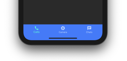
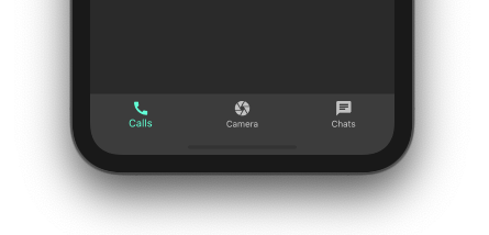
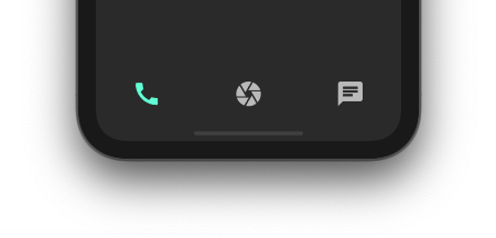
The above code just displays the BottomNavigationBar with the first item selected as the default. It does not change the selection yet as we click on the other items:
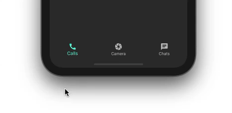
Showing a selection of items
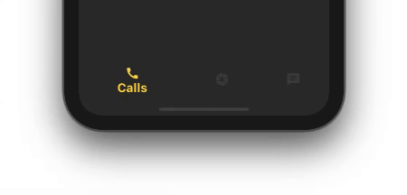
To show the selection of other items, we’ll use two properties: onTap and currentIndex.
int _selectedIndex = 0; //New
BottomNavigationBar(
  items: const <BottomNavigationBarItem>[
    ...
  currentIndex: _selectedIndex, //New
  onTap: _onItemTapped,         //New
)
//New
void _onItemTapped(int index) {
  setState(() {
    _selectedIndex = index;
  });
}
The _selectedIndex variable holds the value of the currently selected item. _selectedIndex is given to the currentIndex property.
The _onItemTapped() callback is assigned to onTap of BottomNavigationBar, which returns the index when the item is tapped. Simply assigning a currently selected item index to _selectedIndex and doing setState will show the item as selected in BottomNavigationBar.
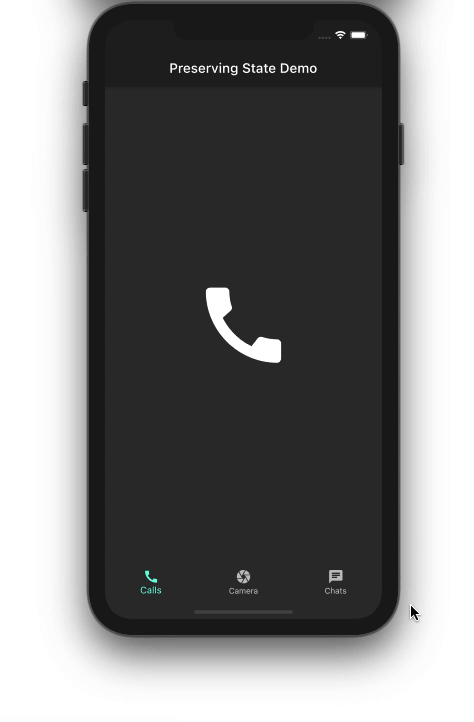
Displaying the page of the selected item
As of now, we don’t have any page to show based on the selected item. So let’s go ahead and create it:
//New
static const List<Widget> _pages = <Widget>[
  Icon(
    Icons.call,
    size: 150,
  ),
  Icon(
    Icons.camera,
    size: 150,
  ),
  Icon(
    Icons.chat,
    size: 150,
  ),
];
Scaffold(
  appBar: AppBar(
    title: const Text('BottomNavigationBar Demo'),
  ),
  body: Center(
    child: _pages.elementAt(_selectedIndex), //New
  ),
  bottomNavigationBar: BottomNavigationBar(
    ...
  ),
);
_pages hold a list of widgets. For simplicity, we’re just showing a big icon of the item itself.
Showing one page in the center of the screen from _pages based on the _selectedIndex of the item will do the rest of the magic.
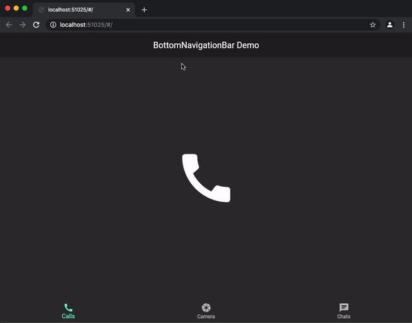
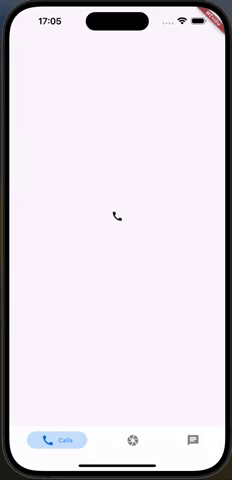
Now we have BottomNavigationBar up and running:
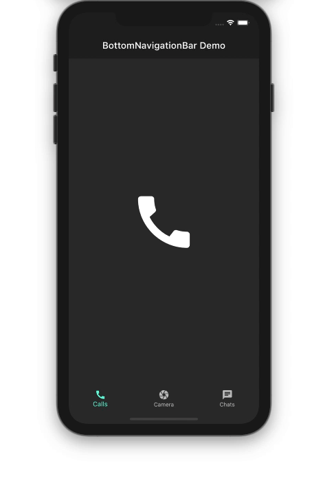
The illustration below shows how the code translates into the design:
Customizing the BottomNavigationBar
BottomNavigationBar has a lot of options to customize it per your need. Let’s zoom in on some of the properties you can customize.
Background color
You may want to change the background color of the BottomNavigationBar to match your brand. You do that simply by using the backgroundColor property.
BottomNavigationBar(
  backgroundColor: Colors.blueAccent,
  items: const <BottomNavigationBarItem>[
    ...
  ],
)
Elevation
By default, the BottomNavigationBar is set to elevate 8 points from the surface so that it appears on top of pages. You can set this property to any value:
BottomNavigationBar(
  backgroundColor: Colors.white10,
  elevation: 0,
  items: const <BottomNavigationBarItem>[
   ...
  ],
)
Icon size
You can shrink or magnify the size of all the icons at once using iconSize property:
BottomNavigationBar(
  iconSize: 40,
  items: const <BottomNavigationBarItem>[
    ...
  ],
)
Mouse cursor
When running on the web, you can customize the mouse cursor when it hovers over an item on the BottomNavigationBar:
BottomNavigationBar(
  mouseCursor: SystemMouseCursors.grab,
  items: const <BottomNavigationBarItem>[
    ...
  ],
)
Selected item
You can make the selected item appear different from an unselected one using the several selected properties of BottomNavigationBar:
BottomNavigationBar(
  selectedFontSize: 20,
  selectedIconTheme: IconThemeData(color: Colors.amberAccent, size: 40),
  selectedItemColor: Colors.amberAccent,
  selectedLabelStyle: TextStyle(fontWeight: FontWeight.bold),
  items: const <BottomNavigationBarItem>[
    ...
  ],
)
Unselected items
You may also want to change the look and feels of unselected items. BottomNavigationBar has a few unselected properties that you can use:
BottomNavigationBar(
  unselectedIconTheme: IconThemeData(
    color: Colors.deepOrangeAccent,
  ),
  unselectedItemColor: Colors.deepOrangeAccent,
  items: const <BottomNavigationBarItem>[
    ...
  ],
)
Removing labels
If you want to get rid of the labels entirely, you can use showSelectedLabels and showUnselectedLabels:
BottomNavigationBar(
  iconSize: 40,
  showSelectedLabels: false,
  showUnselectedLabels: false,
  items: const <BottomNavigationBarItem>[
    ...
  ],
)
Highlighting the selected item
You can emphasize the selected item by setting the BottomNavigationBar type to BottomNavigationBarType.shifting:
BottomNavigationBar(
  type: BottomNavigationBarType.shifting,
  selectedFontSize: 20,
  selectedIconTheme: IconThemeData(color: Colors.amberAccent),
  selectedItemColor: Colors.amberAccent,
  selectedLabelStyle: TextStyle(fontWeight: FontWeight.bold),
  items: const <BottomNavigationBarItem>[
    ...
  ],
)
How to preserve the state of pages
Although the basic version of BottomNavigationBar is working well, we have one problem: whatever action — e.g., searching, filtering, entering text, scrolling through a list, filling out a contact form, etc. — is being performed on the page will be lost upon selecting another item from the BottomNavigationBar:

In the demo above, we’re trying to find a contact. When we switch to the camera section before we finish our search and then return to the chat section, the previously entered text is completely gone.
Fear not — the solution is pretty simple. Simply replace the existing widget with IndexedStack. The IndexedStack widget holds a stack of widgets but shows only one at a time. Since all the widgets stay in the stack, the state is preserved.
//Before
Center(
  child: _pages.elementAt(_selectedIndex),
)
//After
IndexedStack(
  index: _selectedIndex,
  children: _pages,
)
The index property is used to show one page from the _pages, which is given to the children property.
Persistent Bottom Nav Bar Package
The persistent bottom nav bar package supports maintaining state across tabs, reducing the need for manual implementations like IndexStacked.
To implement it, add the persistentbottomnav_bar to your pubspec yaml. Ensure to use the version available on pub.dev and compatible with your project. See here.
persistent_bottom_nav_bar: ^6.2.1
Return a persistent tab view in your build method as opposed to what we had previously.
Widget build(BuildContext context) {
    return PersistentTabView(
      context,
      screens: _buildScreens(),
      items: _navBarsItems(),
      navBarStyle: NavBarStyle.style6,
    );
  }
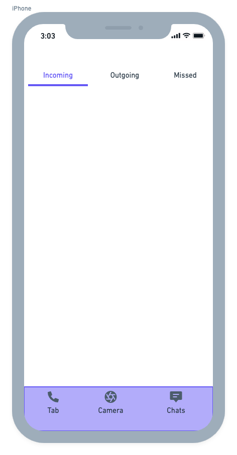
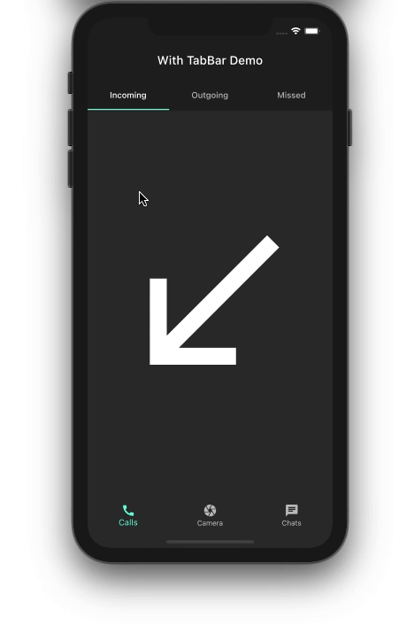
How to include TabBar with BottomNavigationBar
Sometimes a single page is not enough to cover a wide range of subcategories within a parent category inside BottomNavigationBar. For example, the Google Play Store app has subcategories labeled For you, Top charts, Kids, etc. A scenario like this calls for the Flutter TabBar widget.
For demonstration purposes, let’s try to add TabBar for incoming, outgoing, and missed calls inside the calls section, as shown below:
The overall structure of BottomNavigationBar remains the same. You may need to create a separate class for the page in which you want to include a TabBar. For that purpose, the CallsPage is created and added to the list of pages.
static const List<Widget> _pages = <Widget>[
  CallsPage(),
  // Camera page
  // Chats page
];
The CallsPage looks like this:
DefaultTabController(
  length: 3,
  child: Scaffold(
    appBar: AppBar(
      flexibleSpace: Column(
        mainAxisAlignment: MainAxisAlignment.end,
        children: [
          TabBar(
            tabs: [
              Tab(
                text: 'Incoming',
              ),
              Tab(
                text: 'Outgoing',
              ),
              Tab(
                text: 'Missed',
              ),
            ],
          )
        ],
      ),
    ),
    body: TabBarView(
      children: [
        IncomingPage(),
        OutgoingPage(),
        MissedPage(),
      ],
    ),
  ),
);
Here’s the output:
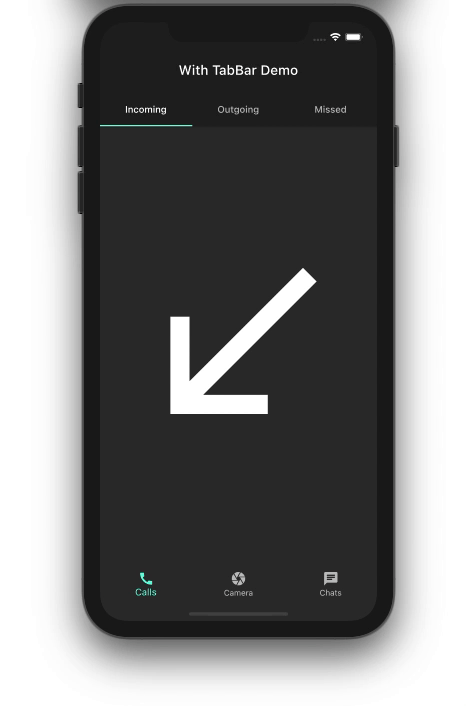
Custom animations and styles
For custom animations and styles, consider using the Persistent Bottom Nav Bar package. It allows for advanced customizations such as slide and fade animations, which provide a smoother and more visually appealing transition between tabs.
return PersistentTabView(
      context,
      screens: _buildScreens(),
      items: _navBarsItems(),
      confineToSafeArea: true,
      backgroundColor: Colors.white,
      handleAndroidBackButtonPress: true,
      resizeToAvoidBottomInset: true,
      stateManagement: true,
      hideNavigationBarWhenKeyboardAppears: true,
      decoration: NavBarDecoration(
        borderRadius: BorderRadius.circular(10.0),
        colorBehindNavBar: Colors.white,
      ),
      popBehaviorOnSelectedNavBarItemPress: PopBehavior.all,
      animationSettings: const NavBarAnimationSettings(
        navBarItemAnimation: ItemAnimationSettings(
          duration: Duration(milliseconds: 400),
          curve: Curves.ease,
        ),
        screenTransitionAnimation: ScreenTransitionAnimationSettings(
          animateTabTransition: true,
          duration: Duration(milliseconds: 800),
          screenTransitionAnimationType: ScreenTransitionAnimationType.slide,
        ),
      ),
      navBarStyle: NavBarStyle.style1,
    );
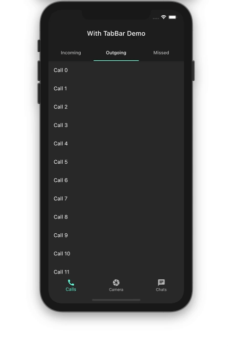
When building a Flutter app, you always want to utilize the screen space as efficiently as possible. When a user is scrolling through a long list of items on one of the pages in your app, you can hide the BottomNavigationBar smoothly. This behavior improves the user experience because you’re showing only content that is required at that moment.
As of now, the BottomNavigationBar stays as it is while scrolling through the list of outgoing calls:
Let’s walk through the process of hiding the BottomNavigationBar step by step.
First, wrap your list view inside the NotificationListener widget. NotificationListener listens to the scroll notification happening on the ListView.
NotificationListener<ScrollNotification>(
  onNotification: _handleScrollNotification,
  child: Scaffold(
    body: Center(
      child: ListView.builder(
        itemCount: items.length,
        itemBuilder: (context, index) {
          return ListTile(
            title: Text('${items[index]}'),
          );
        },
      ),
    ),
  ),
);
Next, implement the _handleScrollNotification method to determine the scroll direction. Notify the page that hosts the BottomNavigationBar to hide it when the user scrolls down.
bool _handleScrollNotification(ScrollNotification notification) {
  if (notification.depth == 0) {
    if (notification is UserScrollNotification) {
      final UserScrollNotification userScroll = notification;
      switch (userScroll.direction) {
        case ScrollDirection.forward:
          widget.isHideBottomNavBar(true);
          break;
        case ScrollDirection.reverse:
          widget.isHideBottomNavBar(false);
          break;
        case ScrollDirection.idle:
          break;
      }
    }
  }
  return false;
}
Wrap the BottomNavigationBar inside the SizeTransition widget. SizeTransition animates the size of BottomNavigationBar.
AnimationController animationController =
    AnimationController(vsync: this, duration: Duration(milliseconds: 300));
SizeTransition(
  sizeFactor: animationController,
  axisAlignment: -1.0,
  child: BottomNavigationBar(
    items: const <BottomNavigationBarItem>[
      ...
    ],
  ),
)
Start hiding animation on receiving the callback from the page that has the ListView.
CallsPage(
  isHideBottomNavBar: (isHideBottomNavBar) {
    isHideBottomNavBar
        ? animationController.forward()
        : animationController.reverse();
  },
)
Here is the result:
That’s it! The full code for this Flutter BottomNavigationBar example can be found on GitHub.
Conclusion
In this tutorial, we showed how to integrate BottomNavigationBar and customize it. We also learned various use cases with examples that you’ll likely encounter while developing a full-fledged Flutter app. I hope the practical examples we examined in this article helped you understand these important concepts.