When using React, we strive to create reusable components as much as we can to limit the number of components and repetition. This keeps your code “DRY”.
DRY is a concept you may have come across—it means “Don’t Repeat Yourself”. DRY is a coding principle that encourages you to minimize code duplication by using abstractions like functions or modules.
It's important because it reduces redundancy, makes code easier to maintain, improves readability, and decreases the risk of errors during updates.
What Will This Article Cover?
In this article, you’ll learn:
How to build a modal using React and CSS.
How to ensure that the modal can be reused in multiple scenarios, content and styling.
How to integrate state and callback functions into the modal.
Table of Contents
What Will This Article Cover?
The Core Modal Component
Props Interface
The Markup
React useEffect
When Do We Use useEffect?
How to Use the Reusable Modal
Additional Improvements
Conclusion
The Core Modal Component
In this section, we'll use React to build a component library. There are multiple patterns that you can follow to do this, but one of my favorite is the atomic design pattern.
import React, {useEffect} from 'react';
import './Modal.css'
interface Props {
    open: boolean;
    cancelFn?: () => void;
    primaryFn?: () => void;
    closeIcon?: string;
    content?: React.ReactNode;
    titleContent?: React.ReactNode;
    className?: string;
}
export const Modal: React.FC<Props> = (props) => {
    const {open, cancelFn, primaryFn, closeIcon, titleContent, content} = props;
    // simple useEffect to capture ESC key to close the modal
    useEffect(() => {
        const handleKeyDown = (e: KeyboardEvent) => {
            if (e.key === 'Escape' && open) {
                if (cancelFn) {
                    cancelFn();
                }
            }
        };
        document.addEventListener('keydown', handleKeyDown);
        return () => document.removeEventListener('keydown', handleKeyDown);
    }, [open, cancelFn]);
    if (!open) return null;
    return (
        <div className="modalBackground">
            <div className="modalContainer">
                {titleContent && (<div className="title">
                        {titleContent}
                        <div className="titleCloseBtn">
                            <button onClick={cancelFn}>{closeIcon ?? 'X'}</button>
                        </div>
                    </div>
                )}
                <div className="body">
                    {content}
                </div>
                <div className="footer">
                    {secondaryFn && (
                        <button onClick={secondaryFn} id="cancelBtn">
                            Cancel
                        </button>
                    )}
                    {primaryFn && (
                        <button onClick={primaryFn}>Continue</button>
                    )}
                </div>
            </div>
        </div>
    );
};
.modalBackground {
    width: 100vw;
    height: 100vh;
    background-color: rgb(33, 33, 33, 0.9);
    position: fixed;
    display: flex;
    justify-content: center;
    align-items: center;
}
.modalContainer {
    display: flex;
    flex-direction: column;
    border-radius: 20px;
    background-color: white;
    box-shadow: rgba(0, 0, 0, 0.35) 0px 5px 15px;
}
.modalContainer .title {
    display: flex;
    flex-direction: row;
    text-align: center;
    align-items: center;
    justify-content: space-between;
    padding: 8px;
    border-top-right-radius: 20px;
    border-top-left-radius: 20px;
    background-color: #FFE936;
}
.titleCloseBtn {
    display: flex;
    justify-content: flex-end;
}
.titleCloseBtn button {
    font-size: 0.3rem;
}
.titleCloseBtn button {
    background-color: transparent;
    border: none;
    font-size: 25px;
    cursor: pointer;
}
.modalContainer .body {
    flex: 1;
    padding: 16px;
    display: flex;
    flex-direction: column;
    justify-content: center;
    align-items: center;
    font-size: 1rem;
    text-align: center;
}
.modalContainer .footer {
    display: flex;
    justify-content: center;
    align-items: center;
}
.modalContainer .footer button {
    width: 150px;
    height: 45px;
    margin: 10px;
    border: none;
    background-color: cornflowerblue;
    color: white;
    border-radius: 8px;
    font-size: 20px;
    cursor: pointer;
}
#cancelBtn {
    background-color: crimson;
}
The code above is the core modal component. Let’s break it down.
Props Interface
interface Props {
    open: boolean;
    cancelFn?: () => void;
    primaryFn?: () => void;
    closeIcon?: string | React.ReactNode;
    content?: React.ReactNode;
    titleContent?: React.ReactNode;
}
In this interface (which we’re passing to the Modal component) we have:
open: A boolean value that signifies whether the modal should be shown or not. A common way of toggling the modal on or off.cancelFn: An optional parameter (denoted by?) that provides a call back function for when the secondary button is being pressed. For example, thecancelfunctionality to close the modal, or undo an action.primaryFn: An optional parameter that provides a call back function for when the primary button is being pressed. For example,ok,confirm, orsubmitfunctionality.closeIcon: An optional parameter that provides an icon to be used as the top right close button for the modal. For example, you could use a circle with an X in it, or another form of a button.content: An optional parameter that provides the inner content for the modal. This could be as simple as a<p/>tag to a fully fledged<form/>element.titleContent: An optional parameter that provides content to be situated within the title section of the modal. This could be anything from text, to a logo image, anything you want.
The Markup
The markup is pretty straightforward, there are divs for each section (title, content, and actions) along with some conditional rendering logic.
That is:
{titleContent && (
    <div className="title">
        {titleContent}
        <div className="titleCloseBtn">
            <button onClick={secondaryFn}>{closeIcon ?? 'X'}</button>
         </div>
    </div>
)}
We used the short-circuit evaluation syntax to check if the titleContent property is defined by the developer. If it is, the modal’s title is rendered; if not, the title section is omitted.
This approach allows flexible configuration of the modal, letting you easily include or exclude sections like title, content, or actions.
For example, a confirmation modal might only need a title like 'Are you sure?' and action buttons like 'Yes' or 'No', without any additional content.
React useEffect
If you’re not familiar with useEffect and plan on using React more, l’d highly recommend reading about it here, as it is one of the backbones of React’s ecosystem.
In essence, useEffect is like a helper that makes sure you do things at the right time in your app.
When Do We Use useEffect?
When you want something to happen right after your app is ready:
- Example: When the app opens, and you want to fetch some data from the internet (like loading recipes for your dinner).
When something a state variable or input prop changes, and you want to do something after that change.
When your app closes or cleans up.
In our React App, we’ve created a useEffect Hook that runs after our modal component has loaded. The useEffect will simply attach a keydown event handler to the document (the page/DOM), which will listen to all keys that are pressed on the screen, and then check if it is the ESC key.
If it is the ESC key, it will call the secondaryFn function passed into the modal. In our case, this is the function that closes the modal. The return statement removes the event handler on unmount (when modalOpen is false).
import './App.css'
import {useState} from "react";
import {Modal} from "./components/molecules/Modal";
function App() {
    const [modalOpen, setModalOpen] = useState(false);
    return (
        <div className="App">
            <h1>Hey, click on the button to open the modal.</h1>
            <button className="openModalBtn" onClick={() => setModalOpen(true)}>
                Open
            </button>
            <Modal
                open={modalOpen}
                titleContent={<h1> Close </h1>}
                secondaryFn={() => setModalOpen(false)}
                content={
                   <>
                     <h2>This is a modal</h2>
                     <p>You can close it by pressing Escape key, pressing close, or clicking outside the modal.</p>
                  </>
               }
           />
        </div>
    );
}
export default App
Breaking It Down
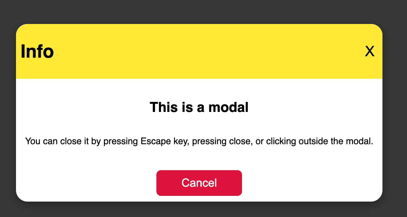
In the above code, we have a button component that triggers the modal to be displayed. This is done by updating the useState variable modalOpen. Setting this to true will cause the Modal component to be seen.
Further down the code, we implemented the Modal component and passed in the relevant properties within the modal: a title, body content, and a secondary button (we didn't pass a primary function). This renders the following modal:
Using the same component, we can also mix it up and build a confirmation modal like so:
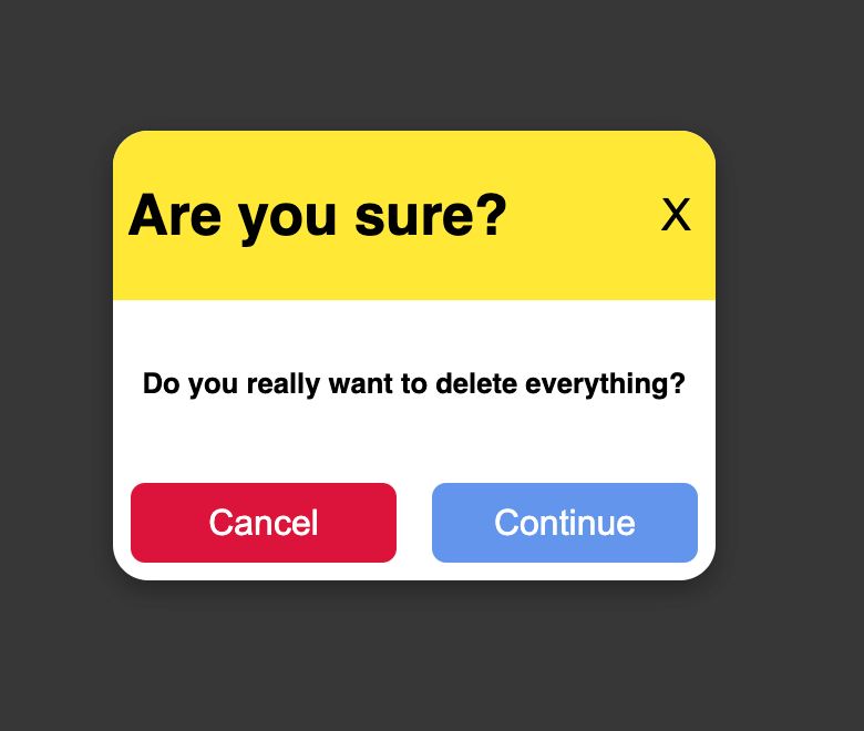
Replacing the previous modal implementation with:
<Modal
    open={modalOpen}
    titleContent={<h1> Are you sure? </h1>}
    cancelFn={() => setModalOpen(false)}
    primaryFn={() => {
        alert(" You deleted everything everything");
        setModalOpen(false);
    }}
    content={
        <>
            <h4>Do you really want to delete everything?</h4>
        </>
    }
/>
There you have it, you have a Modal component with endless possibilities and configurations, depending on what content you pass to each area of the modal.
Additional Improvements
There are some additional improvements
Replacing the Cancel and Primary Buttons
Instead of passing the cancelFn and primaryFn properties, you can pass a full component containing the buttons, or any other footer components.
The updated code should look like this:
import React, { useEffect } from 'react';
import './Modal.css';
interface Props {
    open: boolean;
    escFn: () => void;
    closeIcon?: string;
    content?: React.ReactNode;
    titleContent?: React.ReactNode;
    className?: string;
    actions?: React.ReactNode; // This will be used to pass buttons or other actions as children
}
export const Modal: React.FC<Props> = (props) => {
    const { open, closeIcon, titleContent, content, actions } = props;
    useEffect(() => {
        const handleKeyDown = (e: KeyboardEvent) => {
            if (e.key === 'Escape' && open) {
            }
        };
        document.addEventListener('keydown', handleKeyDown);
        return () => document.removeEventListener('keydown', handleKeyDown);
    }, [open]);
    if (!open) return null;
    return (
        <div className="modalBackground">
            <div className="modalContainer">
                {titleContent && (
                    <div className="title">
                        {titleContent}
                        <div className="titleCloseBtn">
                            <button>{closeIcon ?? 'X'}</button>
                        </div>
                    </div>
                )}
                <div className="body">
                    {content}
                </div>
                <div className="footer">
                    {actions && actions}
                </div>
            </div>
        </div>
    );
};
Usage:
const handleCancel = () => {
    setIsOpen(false);
};
const handleContinue = () => {
    console.log('Continue action');
};
 <Modal
    open={isOpen}
    titleContent={<h2>Confirm Action</h2>}
    content={<p>Are you sure you want to proceed?</p>}
    closeIcon="X"
    actions={
        <div className="custom-actions">
           <button onClick={handleCancel}>Cancel</button>
           <button onClick={handleContinue}>Continue</button>
        </div>
    }
/>
Here, we’re now passing the buttons as a property. You can also design the modal to pass the content as a child component, but this can get messy, as developers may see this at first glance as passing the modal content, rather than just footer elements.
There are pros and cons of doing it this way though:
Pros:
More flexibility: Allows you to pass all kinds of elements to the footer section. For example, multiple CTA (Call To Action) buttons, links, or anything you’d like, with custom styling.
Separation of concerns: The modal is now only responsible for rendering the container (layout, title, content, and so on). The logic of what actions (buttons) to display and their behaviours are handled by the parent component that renders the modal, which makes the modal component cleaner and more reusable.
Improved reusability: You can pass any JSX as the actions, making it usable for a variety of cases (for example, a modal with form submission buttons or multiple options). This approach is useful when you have modals that need different sets of buttons or interactions dependent on other logic within the parent/modal component. The logic can be handled by a builder function, or within another wrapper component which houses the buttons.
Cons:
More responsibility on the parent component: You now have to handle the buttons in each instance where you use the
Modal. This might result in repetition of the button logic (likehandleCancelandhandleContinue) in different places if you're not careful.Slightly more complex usage: The previous approach allowed you to pass in
cancelFnandprimaryFndirectly (optionally), which might be easier for the majority/simple use cases. Passing actions as children may require more setup.Inconsistent action layout: If you're not mindful of your code, you could end up with inconsistent button placement or styles across different instances of the modal. This can be managed by ensuring you always pass consistent markup or styles when passing actions as children, but again, it may become difficult to manage.
Conclusion
Building a reusable modal component in React offers great flexibility and reusability across your application. You can easily adapt the modal to various scenarios, whether it’s a simple confirmation modal or a more complex form submission modal.
However, it’s essential to balance between flexibility and simplicity—too much complexity might overburden the parent components with unnecessary repetition.
Overall, this approach keeps your code DRY, improves maintainability, and empowers you to create scalable UI components. By applying these practices and enhancements, you can build highly adaptable modals that cater to diverse requirements, improving both the developer experience and the final product's quality.
As always, feel free to drop me a follow or reach out on Twitter/X.