For a few years now, my #1 favourite tool for managing CSS in React apps has been 💅 styled-components.
It's a wonderful tool. In many ways, it's changed how I think about CSS architecture, and has helped me keep my codebase clean and modular, just like React!
It shares something else in common with React: developers often dislike the idea at first 😅. “Every style is a component” can be a hard pill to swallow, just like “your views are now written in an XML/JS hybrid”.
Maybe as a result, I've discovered that a lot of developers never really fully embrace styled-components. They pop it into their project without updating their mental models around styling. One foot in, and one foot out. As a result, they miss out on some of the best parts of the tool!
If you work with styled-components, or a similar tool like Emotion, my hope is that this article will help you get the most out of it. I've distilled years of experimentation and practice into a few practical tips and techniques. If you apply these ideas, I genuinely believe you'll be a happier React developer ✨
Link to this headingCSS Variables
Let's start with a fun little tip.
Say we have a Backdrop component, and it takes props for opacity and color:
function Backdrop({ opacity, color, children }) {
  return (
    <Wrapper>
      {children}
    </Wrapper>
  );
}

const Wrapper = styled.div`
  /* ?? */
`;
How do you apply those properties to the Wrapper?
One way would be to use an interpolation function(opens in new tab):
function Backdrop({ opacity, color, children }) {
  return (
    <Wrapper
      opacity={opacity}
      color={color}
    >
      {children}
    </Wrapper>
  );
}

const Wrapper = styled.div`
  opacity: ${p => p.opacity};
  background-color: ${p => p.color};
`;
This works alright, but it's fairly high-friction. It also means that whenever these values change, styled-components will need to re-generate the class and re-inject it into the document's <head>, which can be a performance liability in certain cases (eg. doing JS animations).
Here's another way to solve the problem, using CSS variables:
function Backdrop({ opacity, color, children }) {
  return (
    <Wrapper
      style={{
        '--color': color,
        '--opacity': opacity,
      }}
    >
      {children}
    </Wrapper>
  );
}

const Wrapper = styled.div`
  opacity: var(--opacity);
  background-color: var(--color);
`;
CSS variables are the gift that keeps on giving. If you're not sure what's going on here, my CSS Variables in React tutorial will help you make sense of it (plus you'll learn a few other neat tricks!).
We can also use CSS variables to specify default values:
function Backdrop({ opacity, color, children }) {
  return (
    <Wrapper
      style={{
        '--color': color,
        '--opacity': opacity,
      }}
    >
      {children}
    </Wrapper>
  )
}

const Wrapper = styled.div`
  opacity: var(--opacity, 0.75);
  background-color: var(--color, var(--color-gray-900));
`;
If we call <Backdrop> without specifying an opacity or color, we'll default to 75% opaque, and our color theme's dark gray color.
It just feels nice. It isn't game-changing, but it brings me a little bit of joy.
But that's just the beginning. Let's look at something meatier.
Link to this headingSingle source of styles
If you only take one thing away from this blog post, make it this tip. This is the mother lode.
On this blog, I have a CodeSnippet component, used to render static code snippets like this:
function addNums(a, b) {
  return a + b;
}

addNums(1, 2); // 3
Also on this blog, I have a component called Aside, used to provide bonus little bits of information:
Now, suppose I want to render a CodeSnippet within an Aside. In that case, some of the styles get tweaked:
Specifically, I match the background color to the Aside, depending on its variant (success / info / warning / error). I also reduce its font-size, and make some changes to its spacing.
This is what I'd call a “contextual style”. The same component changes appearances depending on its context. When you pop a CodeSnippet into an Aside, some styles are added/replaced.
How would you solve for this situation? I often see stuff like this:
// Aside.js
function Aside({ children }) {
  return (
    <Wrapper>
      {children}
    </Wrapper>
  );
}

const Wrapper = styled.aside`
  /* Base styles */

  pre {
    font-size: 0.875rem;
    background-color: var(--color-variant-300);
  }
`;

export default Aside;
In my opinion, this is a five-alarm-fire situation. We've made it so much harder to reason about the styles in our application!
Imagine you’re trying to understand the full range of possible styles for the CodeSnippet component. How on earth would you discover that Aside, a random component, overrides some of its styles? Unless you happen to notice this in-browser, you’d never know that these styles exist.
So OK, what's the right approach? Another option is to use composition, to import the styled-component created within CodeSnippet :
// Aside.js
import { Wrapper as CodeSnippetWrapper } from '../CodeSnippet'

function Aside({ children }) {
  return (
    <Wrapper>
      {children}
    </Wrapper>
  );
}

const Wrapper = styled.aside`
  /* Base styles */

  ${CodeSnippetWrapper} {
    font-size: 0.875rem;
    background-color: var(--color-variant-300);
  }
`;

export default Aside;
styled-components allows us to “embed” one component in another like this. When the component is rendered, it pops in the appropriate selector, a class that matches the Wrapper styled-component.
This is definitely an improvement, since we can now do a project-wide search to find all of the CodeSnippet styles. But I'm not a happy camper yet. We can do even better.
Let's take a step back and talk about encapsulation.
The thing that made me love React is that it gives you a way to pack logic (state, effects) and UI (JSX) into a reusable box. A lot of folks focus on the "reusable" aspect, but in my opinion, the cooler thing is that it's a box.
A React component sets a strict boundary along its perimeter. When you write some JSX in a component, you can trust that the HTML will only be modified from within that component; you don't have to worry about some other component on the other side of the app "reaching in" and tampering with the HTML.
Take another look at that solution. The Aside is reaching in and meddling with CodeSnippet's styles! If any component can overwrite any other component's styles, we don't really have encapsulation at all.
Imagine how much nicer it would be if you knew, with complete confidence, that all of the styles for a given component were defined in 1 place, in the main component file?
Here's how we can do that:
// Aside.js
function Aside({ children }) {
  return (
    <Wrapper>
      {children}
    </Wrapper>
  );
}

// Export this wrapper
export const Wrapper = styled.aside`
  /* styles */
`;

export default Aside;
// CodeSnippet.js
import { Wrapper as AsideWrapper } from '../Aside';
function CodeSnippet() {
// ✂️ Omitted for brevity
}
const Wrapper = styled.pre`
/* Base styles */
${AsideWrapper} & {
font-size: 0.875rem;
background-color: var(--color-variant-300);
}
`;With this little trick, we've inverted the control. We're saying “Here are my base CodeSnippet styles, and here are the CodeSnippet styles when I'm wrapped in AsideWrapper”. All in 1 place!
When new developers are trying to make sense of the CodeSnippet component, they don't have to jump all over the codebase. They can see all of the styles that can possibly apply, in all contexts, in 1 file. This is really powerful.
Doing it this way is seriously so much nicer. Give it a shot the next time you run into this situation!
Link to this headingIsolated CSS
Alright, I have one more big idea to share.
Let's say that we want that Aside component to have some space around it, so that it isn't stuck right up against its sibling paragraphs and headings.
Here's one way to do that:
// Aside.js
function Aside({ children }) {
  return (
    <Wrapper>
      {children}
    </Wrapper>
  );
}

const Wrapper = styled.aside`
  margin-top: 32px;
  margin-bottom: 48px;
`;

export default Aside;
This'll solve our problem, but it also feels a bit pre-emptive to me. We've locked ourselves in; what happens when we decide to use this component in another situation, one with different spacing requirements?
There's also the fact that margin is weird. It collapses in surprising and counterintuitive ways that can break encapsulation; if we put our <Aside> inside a <MainContent>, for example, that top margin will push the entire group down, as if MainContent had margin.
(Hover or focus this visualization to see what I mean!)
I recently wrote about the Rules of Margin Collapse. If you're surprised to learn that margins behave in this way, I think you'll find it super valuable!
There's a growing movement of developers choosing not to use margin at all(opens in new tab). I haven't yet given up the habit entirely, but I think avoiding "leaky margin" like this is a great compromise, a great place to start.
How do we do spacing without margin? There are a few options!
When using Flexbox or CSS Grid, the
gapproperty works wonders, adding space between each child.
Ultimately, the goal is to avoid painting ourselves into a corner. I believe it's fine to be pragmatic and use margin occasionally, so long as we're intentional about it, and we understand the trade-offs.
Finally, we need to chat about stacking contexts.
Take a critical look at this code:
// Flourish.js
const Flourish = styled.div`
  position: relative;
  z-index: 2;
  /* Omitted decorative properties */
`;

export default Flourish;
See the problem? Similar to before, we've pre-emptively given our component a z-index. We better hope that 2 is the right value in all future usecases!
A handy property to know about is isolation; it allows us to flatten all z-index values within a container. It's beyond the scope of this tutorial, but we cover it in depth in my comprehensive CSS course, CSS for JavaScript Developers(opens in new tab).
Link to this headingMisc tips and tricks
Phew! We've covered the high-level “big ideas” I wanted to share, but before I wrap up, I have a few smaller tidbits I think are worthwhile. Let's go through them.
Link to this headingThe 'as' prop
React developers have a reputation for being ignorant of semantic HTML, using <div> as a catch-all.
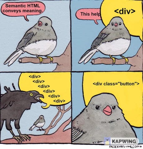
A fair criticism of styled-components is that it adds a layer of indirection between the JSX and the HTML tags being produced. We need to be aware of that fact, so that we can account for it!
Every styled-component you create accepts an as prop which'll change which HTML element gets used. This can be really handy for headings, where the exact heading level will depend on the circumstance:
// `level` is a number from 1 to 6, mapping to h1-h6
function Heading({ level, children }) {
  const tag = `h${level}`;

  return (
    <Wrapper as={tag}>
      {children}
    </Wrapper>
  );
}

// The `h2` down here doesn't really matter,
// since it'll always get overwritten!
const Wrapper = styled.h2`
  /* Stuff */
`;
It can also come in handy for components that can either render as buttons or links, depending on the circumstance:
function LinkButton({ href, children, ...delegated }) {
  const tag = typeof href === 'string'
    ? 'a'
    : 'button';

  return (
    <Wrapper as={tag} href={href} {...delegated}>
      {children}
    </Wrapper>
  );
}
Semantic HTML is very important, and the as prop is a crucial bit of knowledge for all developers building with styled-components.
Link to this headingIncreasing specificity
In most CSS methodologies, you'll occasionally run into situations where a declaration you write has no effect because another style is overwriting it. This is known as a specificity issue, since the undesirable style is "more specific" and wins.
For the most part, if you follow the techniques laid out in this article, I promise that you won't have specificity issues, except possibly when dealing with third-party CSS. This blog has ~1700 styled-components, and I've never had specificity problems.
I am hesitant to share this trick, because it's an escape hatch for a situation that should really be avoided… But I also want to be realistic. We all work in codebases that are not always ideal, and it never hurts to have an extra tool in your toolbelt.
Here it is:
const Wrapper = styled.div`
  p {
    color: blue;
  }
`
const Paragraph = styled.p`
  color: red;

  && {
    color: green;
  }
`;

// Somewhere:
<Wrapper>
  <Paragraph>I'm green!</Paragraph>
</Wrapper>
In this situation, we have three separate color declarations, targeting the same paragraph.
At the base level, our Paragraph is given red text using the standard styled-components syntax. Unfortunately, the Wrapper has used a descendent selector and has overwritten that red text with blue text.
To solve this problem, we can use a double-ampersand to flip it to green text.
As we saw earlier, the & character is a placeholder for the generated class name. Putting it twice repeats that class: Instead of .paragraph, it'll be .paragraph.paragraph.
By ”doubling down” on the class, its specificity increases. .paragraph.paragraph is more specific than .wrapper p.
This trick can be useful for increasing specificity without reaching for the nuclear option, !important. But there's a bit of a pandora's box here: once you start going down the specificity-tricks road, you're on the path towards mutually-assured destruction.
Link to this headingThe babel plugin
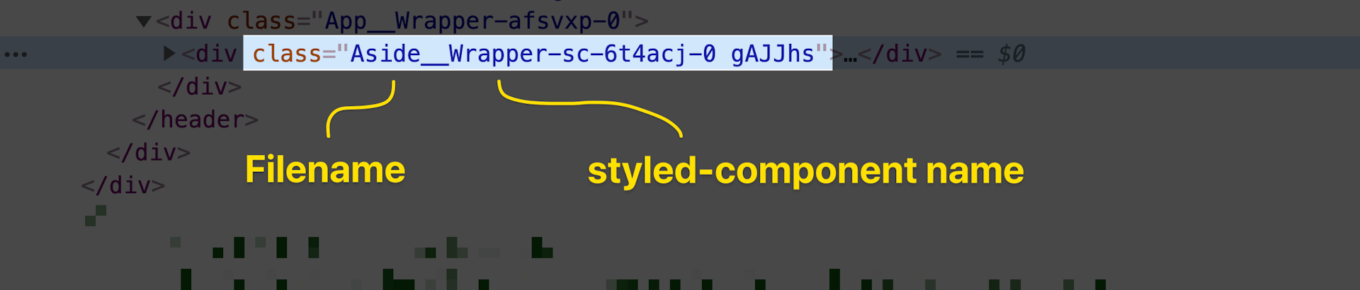
In production, styled-components will generate unique hashes for each styled-component you create, like .hNN0ug or .gAJJhs. These terse names are beneficial, since they won't take up much space in our server-rendered HTML, but they're completely opaque to us as developers.
Thankfully, a babel plugin(opens in new tab) exists! In development, it uses semantic class names, to help us trace an element/style back to its source:
If you use Next.js, you’ll be glad to know that the Babel plugin has been ported to SWC(opens in new tab), so you don't have to opt out of the Next.js compiler.
And if you use create-react-app, you can benefit from this plugin without needing to eject by changing all your imports:
import styled from 'styled-components/macro';A quick find-and-replace in your project will dramatically improve your developer experience!
For other types of projects, you can follow the official documentation(opens in new tab).
Link to this headingMental models
In this article, we've looked at some styled-components-specific APIs, but really the ideas I hope to convey are bigger than any specific tool or library.
When we extend the component mindset to our CSS, we gain all sorts of new superpowers:
The ability to know, with confidence, whether it's safe to remove a CSS declaration (no possibility of it affecting some totally-separate part of the application!).
A complete lack of specificity issues, no more trying to find tricks to bump up specificity.
A neat and trim mental model that fits in your head and helps you understand exactly what your pages will look like, without needing to do a bunch of manual testing.
styled-components is relatively unopinionated, and so there are a lot of different ways to use it… I have to admit, though, it makes me a bit sad when I see developers treat it as a fancy class-name generator, or “Sass 2.0”. If you lean in to the idea that styled-components are components, first and foremost, you'll get so much more out of the tool.
These are, of course, only my opinions, but I was happy to learn that they're in-line with recommended practices. I sent an early draft of this post to Max Stoiber(opens in new tab), creator of styled-components, and here's how he responded:
A lot of this stuff has faded into view for me, becoming crisp only after a few years of experimentation. I hope that this post saves you some time and energy.
Also! I’ve created a course called CSS for JavaScript Developers(opens in new tab). It's a CSS fundamentals course for folks who have learned enough CSS to get by, but not enough to feel comfortable. It's specifically tailored for JS developers, devs who use React / Vue / Angular / etc. More than 18,000 developers have taken the course, and I’ve heard from so so many people who have said the course dramatically improved their relationship with CSS.
Last updated on
September 24th, 2024