The golden ratio occupies a special place in the history of mathematics, geometry, art, architecture, and the allied disciplines. It has been described as a “magic number woven into the fabric of the universe and consciousness.”
Some of the most beautiful buildings in the world — the Basilica of the Santa Maria Novella in Florence or the Taj Mahal in India — are said to have been built using this concept. And the paintings of Renaissance masters like Francesca della Piero and Leonardo da Vinci are outstanding examples of the application of this concept to painting.
The golden ratio, at its core, offers the ability to craft a design system that is endlessly adaptable, subdividable, or expandable to a proportion that is inherently pleasing to the human eye. It’s not just a mathematical concept but a source of beauty and harmony in design.
And this makes it an invaluable tool in the arsenal of UX designers. Using the golden ratio can help solve many common design problems. Think of when you have to develop a visual hierarchy of actionable information. This can be hard, but the golden ratio provides a system to divide spaces, devise typographical relations, place buttons, and even crop images. It makes everything fit together.
Initially, the underlying math of the golden ratio may seem complex or advanced. However, with a bit of effort, anyone can grasp the concept of geometric proportions. The most remarkable thing about the golden ratio is how it can enhance the understanding of even those who are not strong in math.
In this blog, I’ll talk all about the golden ratio — the history, the importance, applying it to UX, some pro tips, and much more.
What is the golden ratio?
Initially, the underlying math of the golden ratio may seem complex or advanced. But with a bit of effort, anyone can grasp the concept of geometric proportions. In fact, the most remarkable thing about the golden ratio is how it can enhance the understanding of even those who are not strong in math.
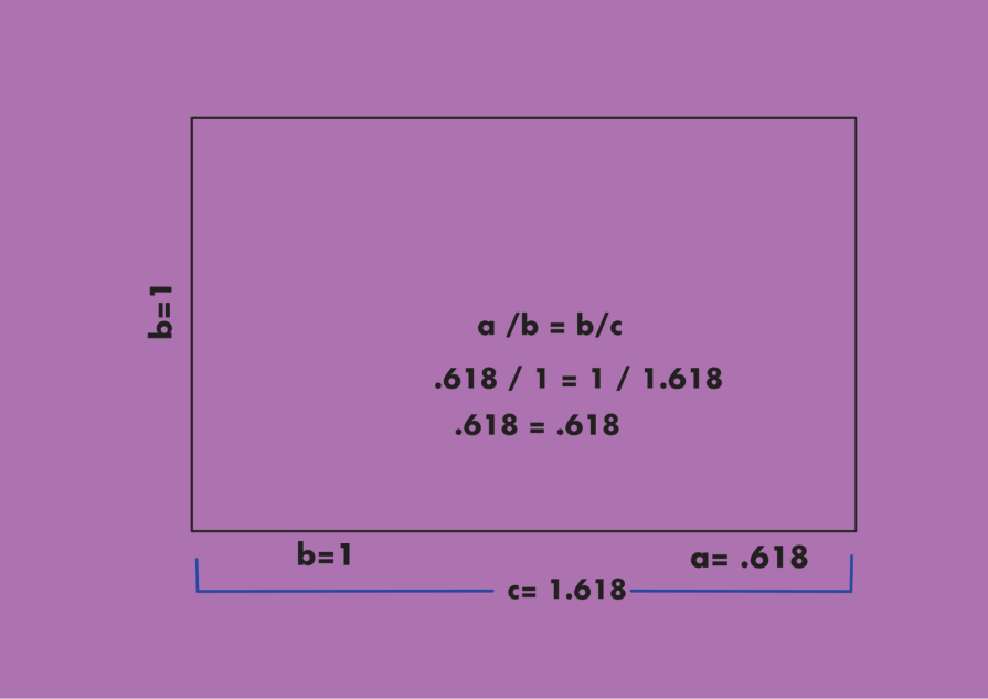
At its simplest, the golden ratio refers to a value approximately “1.618…”.
Mathematicians have been enthralled by numbers like the golden ratio for what they describe as the strange and sublime nature of the universe that these ratios reveal.
One unique aspect of the golden ratio is that its decimal expansion, which goes on to infinity, shows the remarkable lack of repetition in digits. It has also been described as the most irrational of irrational numbers. In art, we like to see the golden ratio as a concept that demonstrates the application of incommensurability and infinity.
You might’ve heard of the Fibonacci numbers.
Well, there is a special relationship between the golden ratio and Fibonacci numbers. Sometimes, the two are used interchangeably, but a subtle difference between them — one is a ratio, and the other is a sequence.
The Fibonacci sequence is a series of numbers, where each is the sum of the two preceding numbers. For example, 0, 1, 1, 2, 3, 5, 8, 13, 21, 34, 55, 89, 144, 233, 377, 610 and so on.
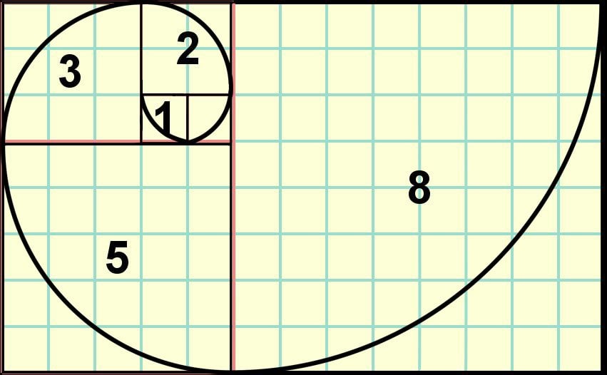
As the Fibonacci numbers increase, their ratio starts to approach the golden ratio. So, the two are not identical. Initially, when the numbers are small, the two ratios are way off. For example, between 2 and 3 the ratio is 1.5. Between 3 and 5, the ratio becomes 1.6, which stays consistent with the decimal points approaching ϕ as the numbers get bigger and bigger.
So basically, the golden ratio demonstrates the utility of mathematics in artistic composition. In UX, designers have to solve complex problems where maintaining proportions is fundamental. The golden ratio can make the structuring of information much simpler, more organized, geometric, and aesthetically pleasing.
History of the golden ratio in art and design
Between about 400 A.D. and the 15th century, after the fall of the Roman empire, many classical ideas of mathematics, art, and architecture fell into disuse or were forgotten in Europe. Over the 15th century and beyond, however, the Renaissance came into full bloom, and slowly, these ideas were dusted off and recovered.
It is important to mention that the golden ratio wasn’t invented or restricted to the masters of the Renaissance.
The Renaissance was an intellectual and artistic movement characterized by the enthusiasm to recover the lost classical knowledge of antiquity. It eventually progressed into the Age of Enlightenment and the Industrial Revolution.
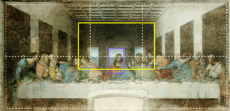
What eventually put the golden spiral at the center of Renaissance art was the 15th-century book_ Divina Proportione _by Luca Pacioli (illustrated by Leonardo da Vinci). Pacioli and da Vinci helped simplify and popularize the importance of balanced composition beyond mathematical circles by imbuing the concept of proportions with divinity.
This knowledge suffused Leonardo da Vinci’s body of work with mathematical and geometric ideas. Da Vinci, of course, is acknowledged to be an absolute master of ratio, proportion, and perspective in his art and design. Here’s a quick example:
Importance of the golden ratio in UX design
The rectangle is one of the most significant shapes of our era. This is because screens, whether computers, phones, or large displays, are rectangular.
According to Renaissance artist and architect Leon Battista Alberti, harmony of proportions should be achieved in such a manner that “nothing could be added, diminished, or altered except for the worse.” Alberti advocated simplicity in composition, especially using halves or the rule of thirds.
From this classical idea about composition, it is now well established that a good design should adhere to the following three canons:
- Repetition – some patterns should repeat continuously
- Harmony – parts should fit together
- Variety – the design should be non-monotonous (not completely predictable)
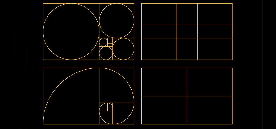
Every rectangle’s essential character is defined by its verticality’s relationship to its horizontality. And a ratio can express this relationship — a rectangle with a 1:1 ratio is square and feels solid and stable; a rectangle with a ratio of 1:2 feels expansive and panoramic.
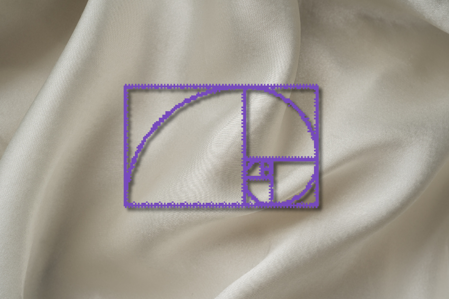
The use of the golden ratio, 1.618, results in the golden rectangle. The advantage of using the golden rectangle as a foundation for design is that it automatically results in a system that is proportionate but also slightly random. So, it results in a design where there is repetition and harmony but also variety:
In addition to the spiral (see above), another important Fibonacci sequence-based shape is the pentagram. These shapes make excellent foundational wire-frames for contemporary design.
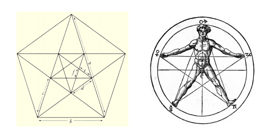
Right: The use of the pentagram for symbol construction in medieval times by Agrippa.
How to apply the golden ratio in modern design
Here are a few applications of the golden ratio in design:
1. Golden spiral in layouts

The examples above show how the Golden Spiral has been used by designers to leverage a few prominent outcomes:
- It allows the eye a path to cover the surface of a screen and take in the composition via a gentle trajectory
- The picture plane is broken up into areas of image and text in a pleasing and balanced way (this technique can also be used to define a hierarchy of information)
- At important junctures where the spiral meets the rectangle, the designers have placed either buttons or other important, actionable information
Thus, using the golden ratio, the user’s attention is drawn to what matters the most and provides a path to explore.
Most apps have built-in features that allow support for design incorporating the golden ratio. Figma has plug-ins that assist selection, automatic alignment, or resizing to golden ratio proportions, as well as rounding all sizes or position changes by a multiplier of 8. Adobe, too, allows plug-ins that allow dynamic grids to be generated in the golden ratio.
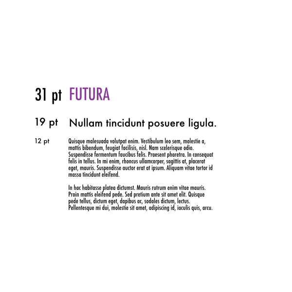
2. Golden ratio in typography
On digital systems, it is good to use a binary progression, especially the number 8. This allows for using a system of halves to develop the relationship between different type sizes for headers and body copy on a website, landing page, a blog post. Analogous rules apply in graphic design for a print campaign.
For instance, hypothetically, one can use a progressive system such as 8 for body copy, 16 for a subtitle, and 32 for headings.
But that isn’t a very good composition. In proportion, 8 is too small for 16 and 16, in turn, too small in comparison to 32. In Google Docs, the preset is Arial — it has a body copy size of 11, a sub-heading size of about 16, and a header size of 26.
Using a Fibonacci sequence, you can get much closer to this preset. If the body copy is 12px, and you multiply by 1.618, you’ll get 19.416, suggesting a header text size of 19px or 20px. This would follow the golden ratio and balance the 12px body font size. If you want to figure out how big your body text size should be, you could do the opposite. If your header text is 25px, you can divide it by 1.618 to find the body text (15 or 16 px). This results in a more harmonious composition.
You can play around with online tools like the golden ratio typography (GRT) calculator and see what results you get.
3. Golden spiral for sizing images
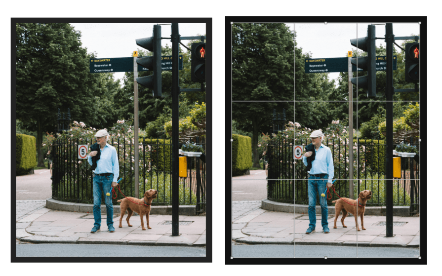
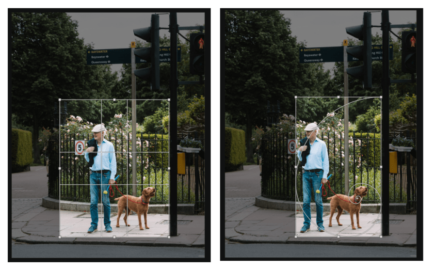

Just like the golden spiral is used in layouts, it can be used to compose and crop images. You can find a compelling, off-center focal point by overlaying the golden spiral on an image.
Additionally, by studying how Renaissance artists composed, the picture plane can be broken up into a hierarchy of information. Adobe Photoshop offers a golden spiral overlay function.
Today, most standard smartphone cameras come with a setting that allows a golden ratio viewfinder grid. Look for it!
4. Golden spiral for logo designs
Of the applications of the golden ratio, its use for construction in logo design – though widespread – has attracted some conversation. Many popular logos, like the former logo X/Twitter, Apple, Pepsi, and National Geographic, were designed using the golden ratio.
The push-back about the golden ratio, though, is that it is the “biggest fraud in the history of design.” It is argued that the golden ratio’s efficacy is exaggerated, that designers have confused the Fibonacci sequence with the golden ratio, and that the wireframe features that boast the golden ratio are arbitrary. Critics also point out that human perception is riddled with optical quirks, enjoys imperfection, and isn’t precisely mathematical at all.
This criticism, though, makes light of the importance of balance and harmony but has something to teach. A designer shouldn’t use the ratio like a robot. One needs to be careful when claiming a design adheres to the golden ratio, and when they do, they shouldn’t pretend that the design is automatically better.
Best practices for using the golden ratio
It is fair to ask if this golden ratio is really that special. Why should a designer care about decimal points and square roots to the nth degree?
I believe that there is certainly something awe-inspiring about the surface coverage via a spiral generated by the golden ratio. But it is not the only way to divide a space or generate a spiral. There are other kinds of spirals, such as the Archimedean spiral (which is rounder and squarer). Common examples of round spirals in design are dashboard elements, gauges or in data visualization.
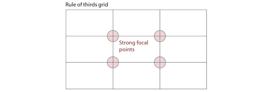
The rule of thirds can often be just as effective as a golden rectangle. It results in a more uniform design and something to be considered when looking for a more balanced design.
The advantage of the golden ratio is that it allows asymmetric proportionality or focus points. The rule of thirds makes things simpler and generates strong focal points. It is best to eyeball results and decide what works in a specific situation:
It is entirely possible to create a poor UX design that still conforms to the golden ratio. After all, aesthetics and design don’t adhere to strict mathematical laws.
Moreover, one of the most common pitfalls is to use the golden ratio completely out of context. Simply using the ratio mechanically will not automatically result in good design. Instead, it should serve as a reminder to have a harmonious and balanced composition with an element of eccentricity built into the design.
The golden ratio should only be used as a guideline — a reminder to ensure that things are nicely spaced out and well composed and to be unafraid to use mathematics or geometry to organize space. It should never be used to fool clients or the public.
Conclusion
Whether a designer is aware of it or not, creating a digital image requires intimate knowledge of coordinate geometry, linear algebra, and even projective and differential geometry (especially when working with proportional expansion or generating curves or spirals).
The pleasures of drawing serve to motivate a great deal of mathematics that many students otherwise find difficult to become interested in.
I would back this up.
The most magical thing about the golden spiral is what it has taught me about how artists and architects have considered the problem of proportion in history. These approaches offer practical techniques by which mathematics and geometry can be applied to improve design — whether or not I actually use the ratio. It has also taught me to be skeptical about using an industry practice as gospel.