When designers create layouts in their mockups, everything including the content typically looks perfectly aligned and consistent.
But in the real world, user-generated content varies wildly. For example, one testimonial card might have a brief sentence, while another has an entire paragraph. This makes it challenging to maintain a perfect alignment.
CSS Subgrid can easily handle these web layout inconsistencies. It allows nested elements to align with their parent grid, ensuring a consistent look regardless of the content.
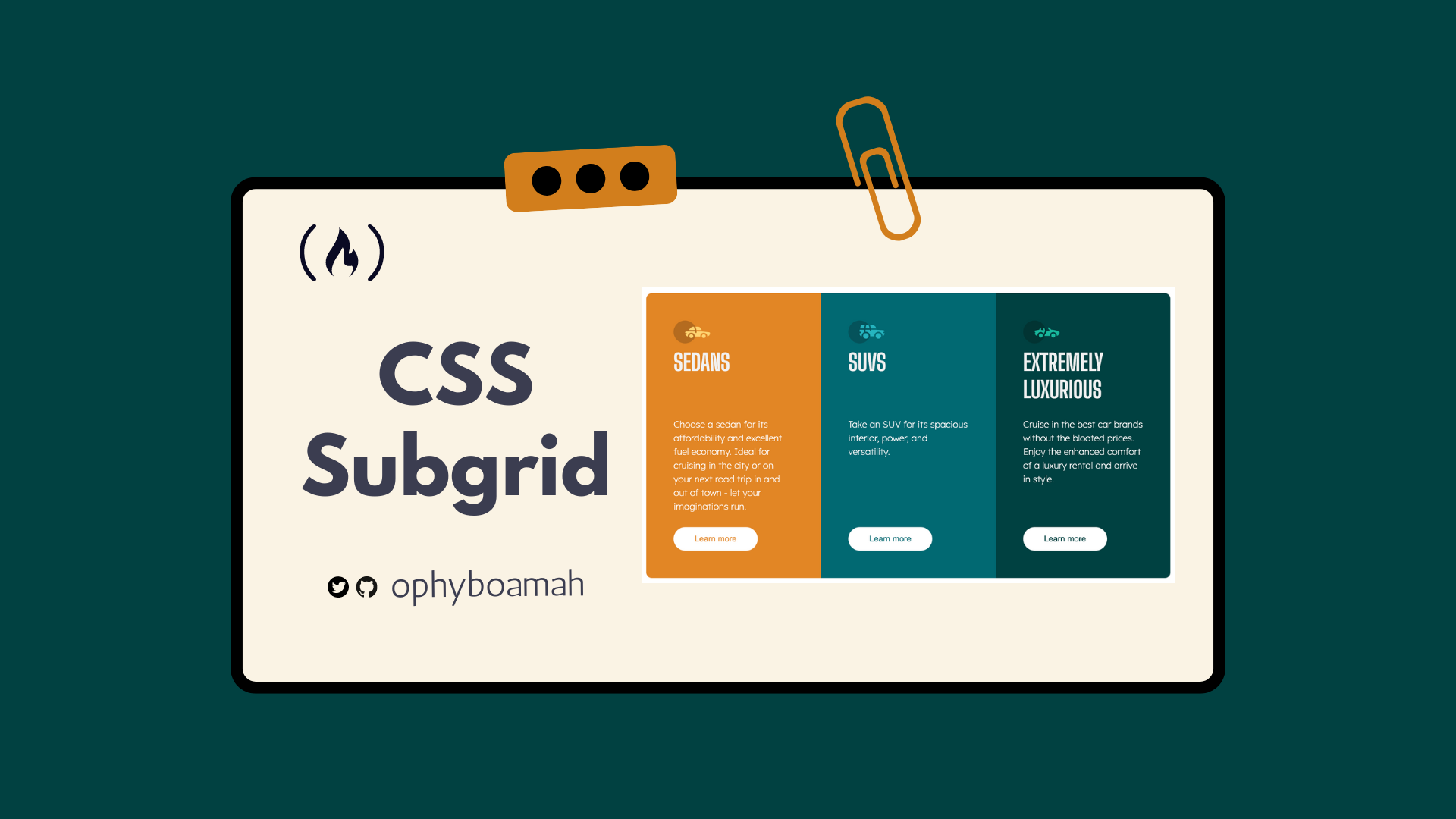
In this tutorial, we’ll explore how to use CSS Subgrid to create a products section that stays flexible and looks great. You can move along to see what we'll build here.
Table of Contents
Limitations of CSS Grid
How to Build a Products Section with Subgrid
How Does Subgrid Work?
How to Use Subgrid
Subgrid in Browser DevTools
Conclusion
Limitations of CSS Grid
Adding a display of Grid to a container means that only the direct children become grids. If these direct children also have children, they are not a part of the main grid – so they display in their normal flow.
This is problematic because without a direct link to one another, each will take up the space it needs and not care about its siblings. This leads to misaligned content you can see on the left of the image below.
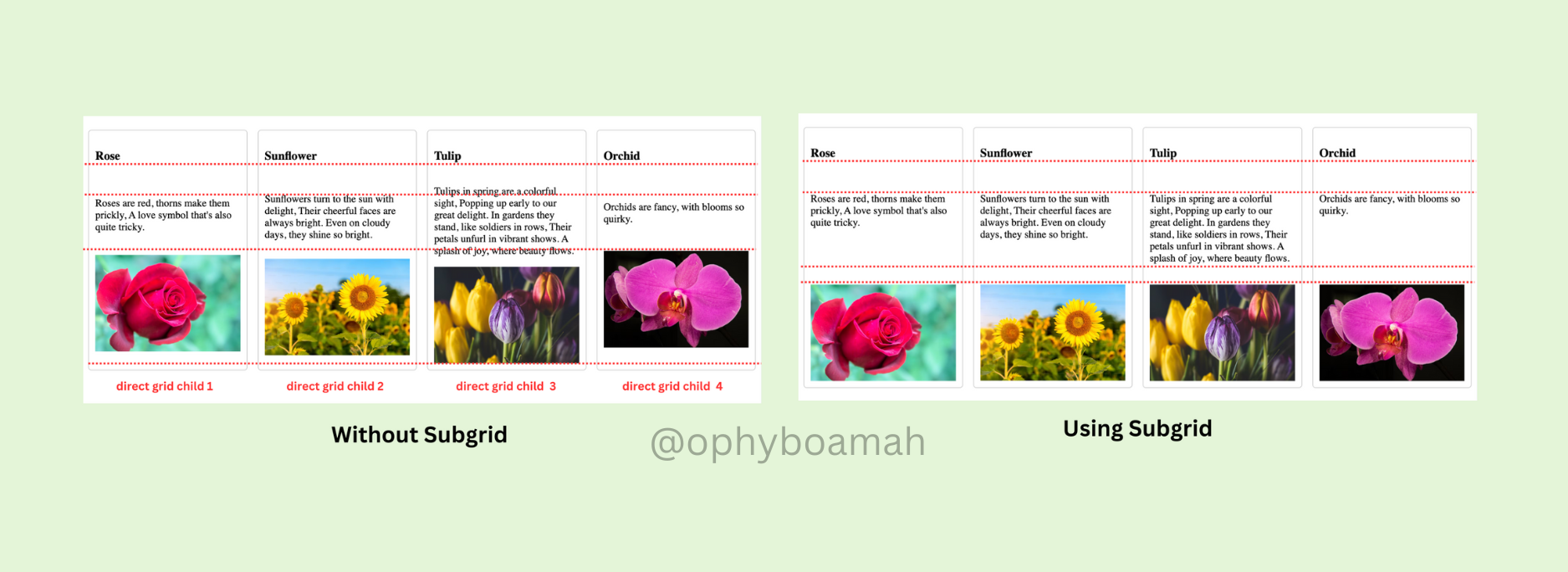
The project we'll build explores a Subgrid solution in a few lines of CSS code that will help us achieve the desired alignment seen on the right of the image above.
How to Build a Products Section with Subgrid
What We’re Going to Build
Check it out on Codepen.
Prerequisites
Basic knowledge of HTML and CSS (For a refresher on how CSS Grid works, check out my previous article on Web Layouts)
An IDE (text editor)
A web browser
💡
Since the focus of this article is Subgrid, we won't place a lot of emphasis on the starting HTML and CSS code. We'll just go through quickly first so you can set up. Then we'll dive into learning how to add Subgrid.
HTML Code:
In our index.html file, we'll create the basic structure of the project which includes linking our CSS file and Google Fonts – all within the <head> tag. Within the <body> tag, we'll create a main container to house all the cards. Next, we'll create three individual cards as articles – each with an icon, title, text and button.
<!DOCTYPE html>
<html lang="en">
<head>
  <meta charset="UTF-8">
  <meta name="viewport" content="width=device-width, initial-scale=1.0">
  <link rel="icon" type="image/png" sizes="32x32" href="./images/favicon-32x32.png">
  <link rel="preconnect" href="https://fonts.googleapis.com">
  <link rel="preconnect" href="https://fonts.gstatic.com" crossorigin>
  <link
    href="https://fonts.googleapis.com/css2?family=Inter:wght@100..900&family=Lexend+Deca:wght@100..900&display=swap"
    rel="stylesheet">
  <link
    href="https://fonts.googleapis.com/css2?family=Big+Shoulders+Display:wght@100..900&family=Inter:wght@100..900&family=Lexend+Deca:wght@100..900&display=swap"
    rel="stylesheet">
  <link rel="stylesheet" href="style.css">
  <title>Ophy's Subgrid Products Cards</title>
</head>
<body>
  <div class="cards-container">
    <article class="sedans">
      <img src="./assets/icon-sedans.svg" alt="an icon showing a sedan vehicle">
      <h3>Sedans</h3>
      <p>
        Choose a sedan for its affordability and excellent fuel economy. Ideal for cruising in the city
        or on your next road trip in and out of town - let your imaginations run.
      </p>
      <button>
        Learn more
      </button>
    </article>
    <article class="suvs">
      <img src="./assets/icon-suvs.svg" alt="an icon showing an suv vehicle">
      <h3>SUVs</h3>
      <p>
        Take an SUV for its spacious interior, power, and versatility.
      </p>
      <button>
        Learn more
      </button>
    </article>
    <article class="luxury">
      <img src="./assets/icon-luxury.svg" alt="an icon showing a luxury vehicle">
      <h3>
        Extremely Luxurious
      </h3>
      <p>
        Cruise in the best car brands without the bloated prices. Enjoy the enhanced comfort of a luxury
        rental and arrive in style.
      </p>
      <button>
        Learn more
      </button>
    </article>
  </div>
<footer>
      Ophy's Subgrid Products Cards | <a href="https://www.frontendmentor.io/">Design from Frontend Mentor </a>
</footer>
</body>
</html>
CSS Code:
In our style.css file, we'll first set our global and base styles:
/* Global Resets */
* {
  margin: 0;
  padding: 0;
  box-sizing: border-box;
}
/* Root Variables */
:root {
  --primary-font: "Lexend Deca", sans-serif;
  --secondary-font: "Big Shoulders Display", sans-serif;
  --heading-color: #F2F2F2;
  --font-color: #FFF;
  --sedans-background: #E28625;
  --suv-background: #006971;
  --luxury-background: #004140;
  --heading-font-size: 2.5rem;
  --button-font-size: 0.9rem;
  --default-padding: 1rem 0;
}
/* Base Styles */
html {
  font-size: 16px;
}
body {
  font-family: var(--primary-font);
  margin: 0 auto;
  max-width: 920px;
}
/* Heading Styles */
h3 {
  font-family: var(--secondary-font);
  color: var(--heading-color);
  font-size: var(--heading-font-size);
}
/* Paragraph Styles */
p {
  font-family: var(--primary-font);
  font-optical-sizing: auto;
  font-weight: 200;
  color: var(--font-color);
  padding: var(--default-padding);
  line-height: 1.5;
}
/*  Footer  */
  footer {
    text-align: center;
    margin-top: 1.5rem;
    a {
      text-decoration: none;
    }
  }
Next, we'll style the main cards container and button. Note that we've specified columns and rows for the cards container using grid-template-columns and grid-template-rows, respectively.
/* Container */
.cards-container {
  display: grid;
  grid-template-columns: repeat(auto-fit, minmax(300px, 1fr));
  grid-template-rows: repeat(4, auto);
  min-height: 31.25rem;
  margin-top: 10.688rem;
  button {
    font-size: var(--button-font-size);
    background: var(--font-color);
    border: none;
    padding: 0.5rem 1.5rem;
    border-radius: 25px;
    width: 70%;
    &:hover {
      cursor: pointer;
      background: none;
      color: var(--font-color);
      border: 1px solid var(--font-color);
    }
}
Then we'll create general card styles as well as individual card styles.
/* All */
.suvs,
.sedans,
.luxury {
  padding: 3rem;
  h3 {
    font-size: var(--heading-font-size);
    text-transform: uppercase;
  }
}
/* Sedans */
.sedans {
  background-color: var(--sedans-background);
  border-radius: 10px 0 0 10px;
  button {
    color: var(--sedans-background);
  }
}
/* SUV */
.suvs {
  background-color: var(--suv-background);
  button {
    color: var(--suv-background);
  }
}
/* Luxury */
.luxury {
  background-color: var(--luxury-background);
  border-radius: 0 10px 10px 0;
  button {
    color: var(--luxury-background);
  }
}
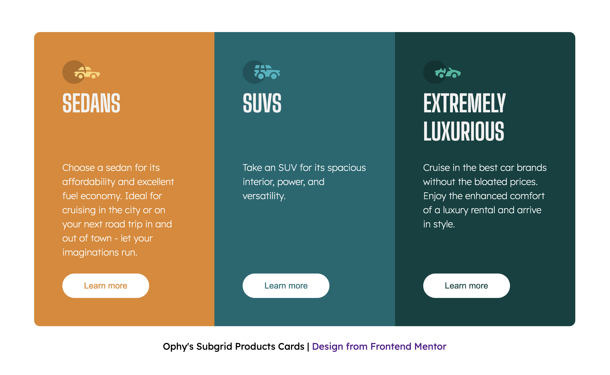
The image below will be the result after running the above starter code. The cards have been created as grid columns but the rows within the individual cards are not aligning properly due to the difference in content length.
How Does Subgrid Work?
The display above will be a nightmare for designers and stakeholders until it's fixed. In the past, to fix this, developers needed to make these cards into nested grids. But that code will eventually become messy and difficult to maintain.
CSS Subgrid allows a grid item to inherit the grid tracks (rows or columns) of its parent grid, rather than defining its own. This is particularly useful for maintaining consistent alignment between nested grids and their parent grids.
In our project, instead of defining a row for the icons, titles, text and buttons, we can make them inherit the same from their parent grid (the cards container).
How to Use Subgrid
To create a subgrid, assign the keyword as a value to either a grid-template-columns or a grid-template-rows of a nested grid.
To implement this in our project, we'll first turn the article element into a grid container in order to place its children in a structured grid. Next, grid-template-rows is given a value of subgrid. This inherits the row structure from the cards container grid.
Setting grid-row to span 4 basically means the element should occupy a space that covers 4 rows of the parent grid.
  article {
    display: grid;
    grid-template-rows: subgrid;
    grid-row: span 4;
}
Optional Code
The code below for positioning elements with grid-row is not necessary in this project since we're using Subgrid correctly. But it may come in handy for more complex layouts when you want explicit control over the placement of each element within the grid.
    img {
      grid-row: 1/2;
    }
    h3 {
      grid-row: 2/3;
    }
    p {
      grid-row: 3/4;
    }
    button {
      grid-row: 4/5;
    }
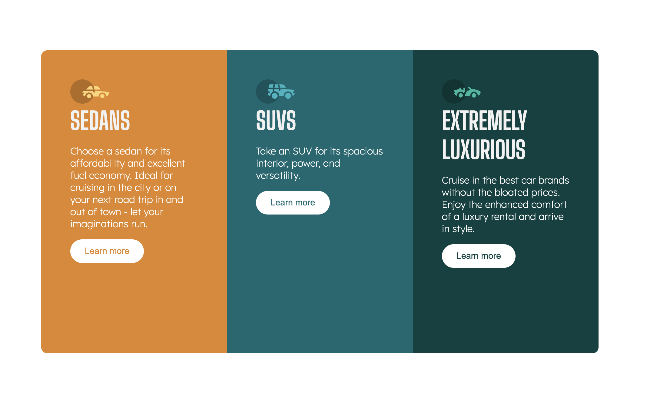
Once subgrid is applied, our cards should be perfectly aligned as shown in the image below. This alignment occurs because the child elements within each card (like titles, paragraphs, and buttons) now share the same grid structure, inherited from the parent. They are "aware" of each other and automatically adjust their positions to stay in sync.
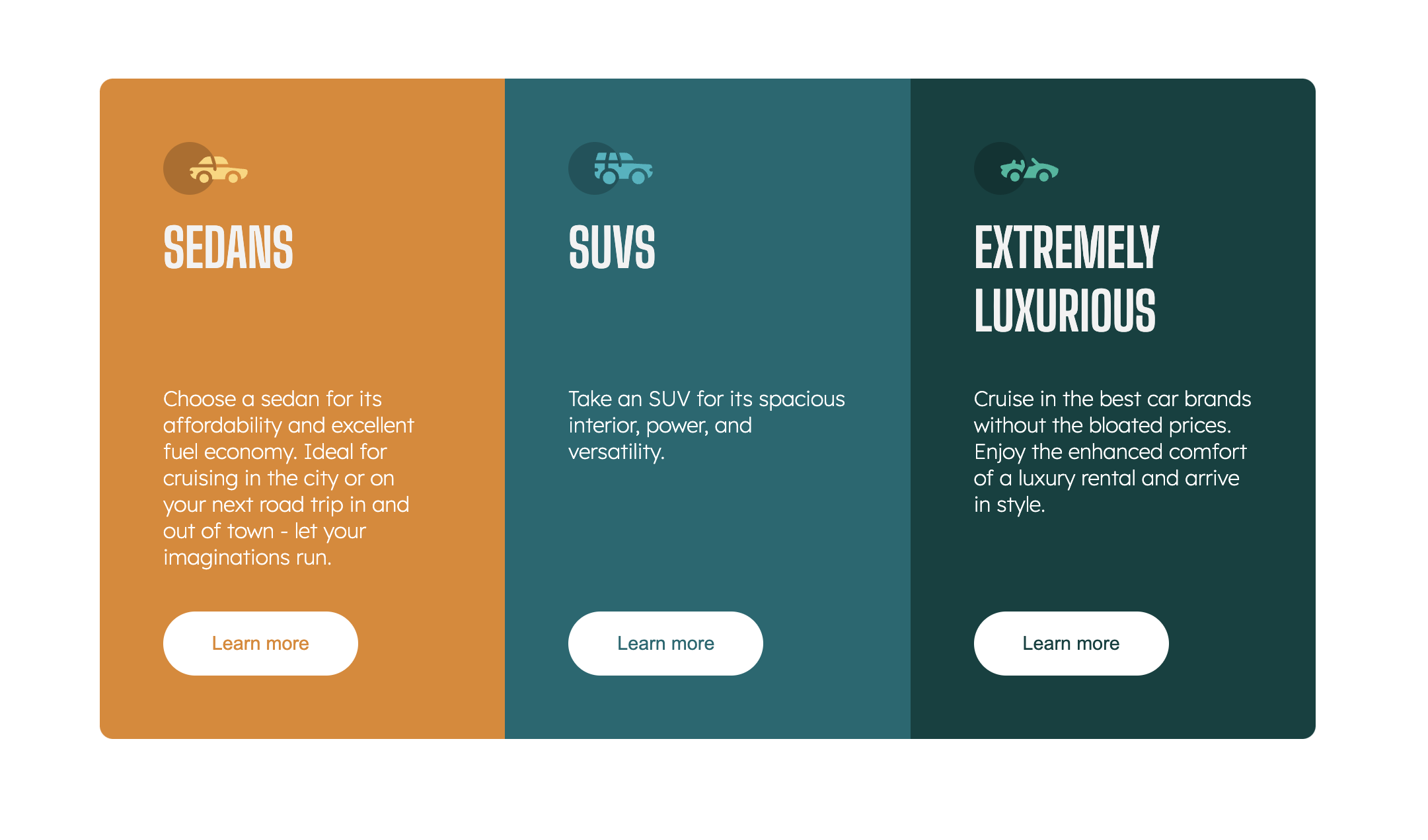
For example, even if the titles for Sedans and SUVs are shorter, the grid ensures that their paragraphs and buttons start in the same rows, maintaining consistency across all cards. This leads to a cleaner, more organized layout, where each element is aligned regardless of varying content lengths.
In any modern browser, right-click on the project webpage and select inspect from the list of options. Or use the shortcut (command + option + I on Mac or control + shift + I on Windows) to open the Elements tab of DevTools.
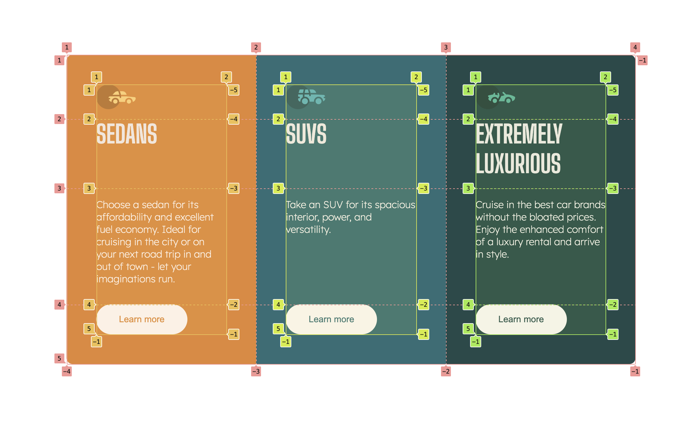
As you can see in the image above, just like we have for grid, Subgrid also has a badge. Toggle it to inspect or debug a Subgrid. It toggles an overlay that shows columns, rows, and their numbers on top of the element in the viewport.
Conclusion
Subgrid is a helpful tool for aligning layouts – something you had to do manually in the past. Now, nested grids can inherit properties such as rows and columns from their parent grids. This extends the abilities of CSS Grid to create consistent and perfectly aligned designs.
If you're ever tempted to create an unending loop of CSS grids just to get a design with differently sized content to align perfectly – instead, reach for CSS Subgrid to make your code cleaner and easier to manage.
Here are some helpful resources: