Toast notifications are messages that appear on the screen to provide feedback to users. When users interact with the user interface and perform certain actions, these operations may succeed, fail, or time out. Incidentally, we want to notify users of the status of these operations by using toast notifications.
Toast notifications don’t interfere with the user’s experience, so they’re a great way to notify users of such information. In this article, we will learn how to create toast notifications using Solid Toast.
What is Solid Toast
Solid Toast is a lightweight library for creating beautiful and customizable toasts in Solid.js. It provides a simple API to create, customize, and manage toast notifications.
Solid Toast is generally lightweight, easily customizable, and accessible. It also uses the Promise API and has support for SSR (server side rendering).
Creating toast notifications
To create toast notifications with Solid Toast, we have to install the library first. Run any of the commands below in your root folder to install solid-toast library in your application:
npm install solid-toast
yarn add solid-toast
After installation is complete, replace the code in your App.js file with the code below:
import toast, { Toaster } from 'solid-toast';
const notify = () => toast('Here is your toast!');
const App = () => {
  return (
    <div>
      <button onClick={notify}>Notify Me</button>
      <Toaster />
    </div>
  );
};
This is a simple example of how to use solid-toast in your Solid.js application. When you click the button, the toast notification with the message “Here is your toast!” is displayed.
Also, notice we rendered the Toaster component in the code above. This container renders all of our toasts:

Customizing toast notifications
solid-toast offers various options to customize your toast notifications. These options include toast types, toast positioning, duration, and styles. Let’s look at some of these options:
Toast Types
solid-toast provides different types of toasts or variants for various scenarios. This means that you can specify the toasts to show what kind of information is being displayed, i.e., a success toast will be different from an error toast notification.
This technique uses different stylings for each toast type to make it easier to understand the information and its intent. For instance, a toast type with a red checkmark icon typically implies a warning or error message, just as a toast message with a green checkmark icon typically implies a successful response.
You can use specific toast functions for the different toast message variants. To specify the variants or types, here are the different ways:
Blank
toast('Code syntax for blank toast');
The default toast is a blank toast. This means that the toast notification doesn’t come with any icon:

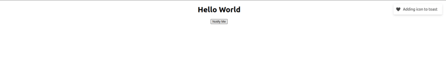
Although, you can set custom icons to the blank toast by using the icon option:
const notify = () =>
    toast("Adding icon to toast", {
      icon: "🖤",
});
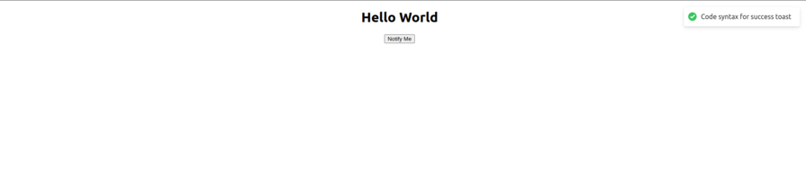
Success
toast.success('Code syntax for success toast');
The success toast is used for success notifications. Unlike the blank toast, it comes with a green animated checkmark icon:
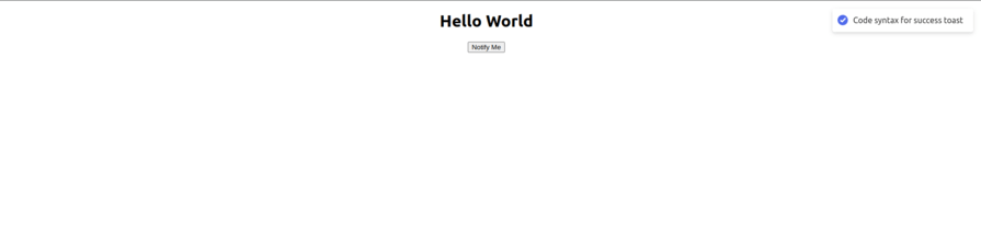
The toast() function has an iconTheme options that allows you to style the icons as you see fit:
const notify = () =>
    toast.success("Code syntax for success toast", {
      iconTheme: {
        primary: "#516beb",
        secondary: "#fff",
      },
    });
The result of the code becomes the following:
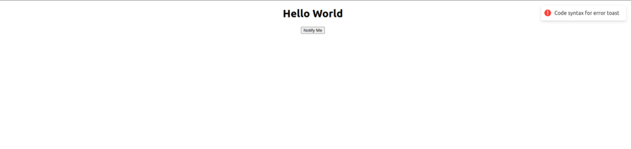
Error
toast.error('Code syntax for error toast');
This toast type is used for error or warning notifications. The toast has an animated red icon to show users that the information didn’t succeed as expected. It could also be used for network issues:
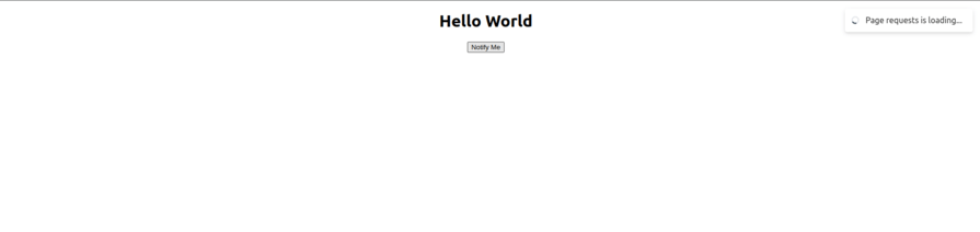
Loading
toast.loading('Page requests is loading...');
The loading toast variant is used to show a process or an operation is running or in process. The content can later be updated with either an error or success icon:
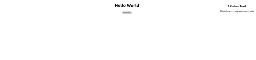
Custom
Solid Toast also provides the ability to create custom toasts, i.e., you can customize the appearance of your toast with different font styles and so on:
const notify = () =>
    toast.custom(() => (
      <div>
        <h3>Custom Toast</h3>
        <p>This is how to create custom toasts</p>
      </div>
    ));
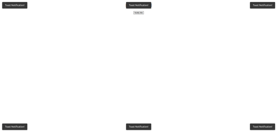
Toast position
As seen in our screenshots above, all toasts are positioned at the top-right corner of the page by default. However, you can change the position of your toast notifications in the options. Solid Toast allows for six positions:
- top-right
- top-left
- top-center
- bottom-right
- bottom-left
- bottom-center
Depending on where you want to position your toast notifications, you can set its position like this:
const notify = () => {
    toast("Toast Notification!", {
      position: "top-left",
    });
    toast("Toast Notification!", {
      position: "top-right",
    });
    toast("Toast Notification!", {
      position: "top-center",
    });
    toast("Toast Notification!", {
      position: "bottom-left",
    });
    toast("Toast Notification!", {
      position: "bottom-right",
    });
    toast("Toast Notification!", {
      position: "bottom-center",
    });
  };
Clicking the button will display all toasts with the different positions:
Styling toast notifications
The beauty of the solid-toast library is that we can style any and all of our toast notifications to fit the theme of our webpage. This means that we can not only style our custom toasts but also style the different variants or types.
There are two ways we can style our toast notifications.
Applying the styles to the toast() function
We can apply our styles to the toast function options. To do this, we can either apply the style directly or assign a className and then style the toast in our CSS modules. We can also change and style the icon as we see fit.
This is great because we can style our toast for a better user experience. We can have a green background for success toasts and a red background for error toast notifications. Let’s look at the code below:
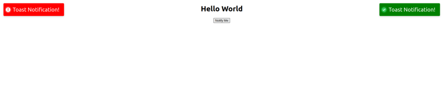
const notify = () => {
    toast.success("Toast Notification!", {
      position: "top-right",
      style: {
        "background-color": "green",
        "font-size": "24px",
      },
    });
    toast.error("Toast Notification!", {
      position: "top-left",
      style: {
        "background-color": "red",
        "font-size": "24px",
      },
      iconTheme: {
        primary: "#fff",
        secondary: "red",
      },
    });
  };
In the code above, we are also styling the icon in the error toast. This is because we want our icon to have a similar theme to the toast notification. The primary icon theme styles the body or background of the icon, while secondary icon theme styles the icon itself:
Applying the styles to the <Toast /> component
Another way to style your toast notifications is to apply the style directly to the <Toast /> component. This gives you more control over your toast notifications. The difference is that when we apply the style to our <Toast /> component, all toasts inherently accept or inherit the styles until we explicitly apply a different style to the toast() function.
The Toast component accepts options like position, containerStyle, containerClassName, gutter, and toastOptions. Inside the toastOptions option, we can apply our styles directly or we can assign a className that we can style in our CSS file. See the code below:
<Toaster
  position="top-center"
  gutter={8}
  containerClassName=""
  containerStyle={{}}
  toastOptions={{
    className: '',
    duration: 5000,
    style: {
      background: '#363636',
      color: '#fff',
    },
  }}
/>
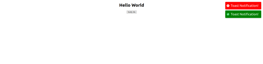
The gutter option is the space between individual toast notifications. This is so that when you have multiple toasts in the same corner, they are separated and don’t look clustered. See the code example below:
import styles from "./App.module.css";
import toast, { Toaster } from "solid-toast";
function App() {
  const notify = () => {
    toast.success("Toast Notification!", {
      style: {
        "background-color": "green",
        "font-size": "24px",
      },
    });
    toast.error("Toast Notification!", {
      style: {
        "background-color": "red",
        "font-size": "24px",
      },
      iconTheme: {
        primary: "#fff",
        secondary: "red",
      },
    });
  };
  return (
    <div class={styles.App}>
      <Toaster
        gutter={8}
        toastOptions={{
          duration: 5000,
          style: {
            background: "#363636",
            color: "#fff",
          },
        }}
      />
      <h1>Hello World</h1>
      <button onClick={notify}>Notify Me</button>
    </div>
  );
}
export default App;
We gave our gutter an 8px margin. See the result below:
Promise Toast() function in Solid Toast
solid-toast allows us to handle promises by providing a toast() function that helps us display notifications when performing async operations such as network or fetch requests.
Let’s look at the code below:
const notify = () => {
    const myPromise = new Promise((resolve) =>
      fetch("https://jsonplaceholder.typicode.com/posts/1")
        .then((response) => response.json())
        .then((json) => setTimeout(() => resolve(json), 3000))
    );
    toast.promise(myPromise, {
      loading: "Loading",
      success: Got the data,
      error: "An error occurred 😔",
    });
  };
When our fetch begins, the toast() loading variant is rendered to tell the user that the operation is ongoing. When the fetch completes, the success variant is shown with our success message. However, if an error occurs, the error variant is shown instead:

Comparing creating toasts in Solid vs React
Creating toast notifications in Solid.js and React.js involves similar concepts, but the syntax and some implementations differ. In this section, we will look at some of the similarities and differences between creating toast notifications in Solid.js and React.js.
If you’re unfamiliar with creating toasts in React, this article, using React-Toastify to style your toast messages is a good place to get started. It teaches everything you need to know to create toast notifications in React using react-toastify.
Similarities
[solid-toast](https://github.com/ardeora/solid-toast) is a popular library for creating toast notifications in Solid.js. Similarly, [react-toastify](https://www.npmjs.com/package/react-toastify) is a great library for creating toast notifications in React.js.
Both libraries have similar setup and installation processes. The two libraries have component wrappers and accept options. Although, when in Solid.js, the component wrapper is <Toaster />, while the component wrapper is <ToastContainer /> in React.js.
Solid Toast and React Toastify libraries allow you to style toast notifications either individually in the toast() functions or generally in the component wrappers. Additionally, both libraries have different toast variants or types and allow six positions.
Finally, both Solid Toast and React Toastify libraries have promise toast functions for handling promises use cases.
Differences
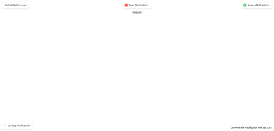
Even though Solid Toast and React Toastify allow toast notifications to be positioned in six different positions, their method of implementation differs.
In Solid.js, you can assign a position this way:
const notify = () => {
    toast("Default Notification!", {
      position: "top-left",
    });
    toast.success("Success Notification!", {
      position: "top-right",
    });
    toast.error("Error Notification!", {
      position: "top-center",
    });
    toast.loading("Loading Notification!", {
      position: "bottom-left",
    });
    toast.custom("Custom Style Notification with css class!", {
      position: "bottom-right",
      className: "toast-message",
    });
  };
While in React.js, assigning toast positions is done this way:
const notify = () => {
    toast.success("Success Notification!", {
      position: toast.POSITION.TOP_RIGHT,
    });
    toast.success("Success Notification!", {
      position: toast.POSITION.TOP_CENTER,
    });
    toast.success("Success Notification!", {
      position: toast.POSITION.TOP_LEFT,
    });
    toast.success("Success Notification!", {
      position: toast.POSITION.BOTTOM_RIGHT,
    });
    toast.success("Success Notification!", {
      position: toast.POSITION.BOTTOM_LEFT,
    });
    toast.success("Success Notification!", {
      position: toast.POSITION.BOTTOM_CENTER,
    });
  };
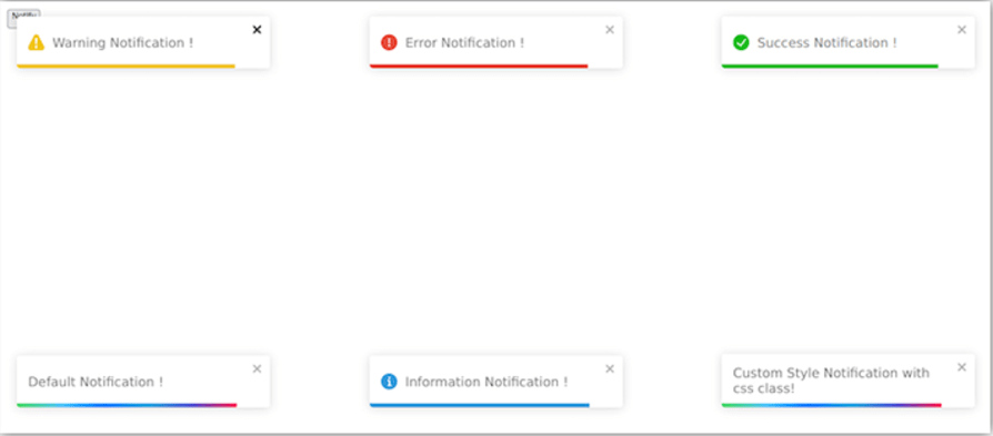
Additionally, in React Toastify, variants have default background styles, while in Solid Toast, all toasts are blank by default. Only the icon themes are animated and styled in Solid Toast.
Furthermore, Solid Toast has only five variants: default, success, error, loading, and custom. React Toastify has six: default, success, error, warning, info, and custom.
See images below:
Finally, React Toastify has a hook called useNotificationCenter. This hook allows you to build a notification center where you can handle a series of toast notifications and perform certain methods and functions on them, like mapping, sorting, and so on. Solid Toast doesn’t have this feature.
Conclusion
Solid Toast provides a simple yet powerful way to add toast notifications to your Solid.js applications. With its easy-to-use API and customizable options, you can create sleek notifications that fit seamlessly into your application’s design and enhance the user experience.
In this article, we looked at the different variants or toast types that Solid Toast has. We also looked at how to style our toast notifications and assign different positions to the toasts. By following this article, you can quickly install and begin to use Solid Toast in your Solid.js application.