
Individuals who spend as much time on the internet as I do will likely encounter dark patterns in UX designs at least once in their web surfing careers.
Before even knowing the term dark patterns, I would often find myself frustrated by pop-ups on websites that would trick me into making decisions I did not plan on making. While trying to make a one-time purchase on a website, a pop-up would appear asking me whether I wanted to pay for a subscription. Rather than being clearly given the option to decline, a large button would prompt me to continue the subscription, while the option to skip would be in small, hard-to-read text underneath.
If I wasn’t paying attention, I would begin the subscription process before stopping and returning to the original page. I later found out that this was called misdirection.
Dark patterns are user interface designs that trick users into making decisions they originally did not intend to make, such as signing up for something or buying something they didn’t plan.
Dark patterns in UX designs come in many forms, including but not limited to:
- Hard to cancel or roach motel — It’s easy to sign up for a service but nearly impossible to cancel
- Disguised ads — You think you’re clicking on a UI element, but it redirects you to an ad
- Hidden subscriptions — You’re charged for recurring services without being made fully aware
The dark patterns list is extensive — there are more than 16 types, and they can all be applied in various ways, all to trick the user into an otherwise unappealing act.
Why does the issue of dark patterns in UX matter?
Some dark patterns may seem minor inconveniences, but others have more serious implications and are less than positive in shaping user experiences and customer journeys.
A 2022 study by the EU’s Consumer Protection Cooperation Network found that nearly 40% of 399 retail websites assessed used dark patterns to trick users into purchasing. This is just one example, but it highlights how common dark UX patterns are in everyday digital interactions.
As UX designers, we have the ethical responsibility to respect user autonomy. We aim to create positive, engaging experiences that meet user needs and build trust and satisfaction.
Many designers like myself start by learning UI design. Making things aesthetic and pleasing to the eye can be very fun. But, while showcasing designs I’d made to friends and family, similar comments started to appear:
- Navigating this website is difficult.
- These fonts are hard to read.
- Where am I meant to go to achieve my goal on this design?
That’s when I realized designers have responsibilities beyond the look and feel. With the rise of technology, users are faced with infinite choices, and ensuring they can make choices most easily and comfortably possible has become an integral part of my design philosophy.
Dark patterns in UX do the opposite — they manipulate human psychology, leading users to act against their best interests. This not only harms user trust but also puts businesses at legal risk.
Is it OK if everyone else is doing it?
Many businesses justify using dark patterns by claiming that “everyone else is doing it” or that these tactics are industry standard. The pressure to remain competitive can lead companies to adopt dark patterns because they see them as the only way to stay on par with industry rivals
But dark patterns, especially those that trick users into buying items they didn’t originally want, are considered fraudulent. In fact, over time, many statutes have incorporated dark patterns into their legislation to deal with such issues:
- EU’s Digital Service Act (DSA), which specifically prohibits dark patterns
- The US Consumer Financial Protection Act (CFPA) prohibits unfair, deceptive, and abusive acts when selling goods or providing services to consumers
- General Data Protection Regulation (GDPR), which, despite not having a direct provision on dark patterns, is the EU authority on protecting individuals’ personal data, as well as various other international and national statutes on the subject
How do dark patterns in UX work?
Early in my tenure as a UX designer, I worked on the information architecture of a B2B platform. This included listing and organizing all pages and features as well as clearly outlining user journeys. This platform included a subscription mechanism with many calls to action across the platform, making it easy for users to upgrade if they wanted to. The issue came when allowing users to opt out of the subscription, as deeming it less important, I relegated those functions to the account settings rather than the page where the subscription was managed.
This created an unintentional dark pattern called the hidden cancellation option, making it easy for users to subscribe but difficult to cancel.
Supervisors quickly rectified this during the feedback process. A valuable lesson for me, though.
Dark patterns aren’t always intentional. Sometimes, they can happen simply because of flaws in the user journey. And the best way to avoid these dark patterns is to understand the psychological tactics behind them and keep them in mind while sticking to more ethical design concepts.
As easy as it should be for users to access your options, it should be equally simple to withdraw from unwanted functions.
Root of dark patterns: Cognitive bias
Dark patterns manipulate human psychology by exploiting cognitive biases. A cognitive bias is an error in human thinking caused by too little information. The human brain has to process and prioritize large amounts of information daily, so mistakes can happen when the brain tries to fill in information it doesn’t have.
There are many different types of cognitive biases, and when exploited by designers, they result in dark patterns:
- Loss aversion — Users fear losing out and make decisions to avoid perceived loss. For instance, buying something on sale to avoid missing out, even if it wasn’t a planned purchase
- Anchoring — Users tend to rely heavily on the first piece of information they encounter, such as a discounted price that makes a deal seem better than it is
- Scarcity and urgency — When users fear missing out on something (e.g., a countdown timer or limited availability message), they’re more likely to make hasty decisions
Manipulation vs. persuasion
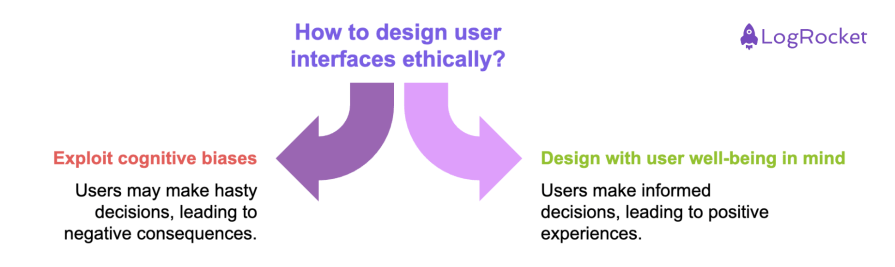
There’s a fine line between persuasion and manipulation in design. Persuasion is about guiding users toward a decision that benefits them — like encouraging a patient to get the necessary treatment. Conversely, manipulation tricks users into making decisions they wouldn’t otherwise make, often leading to negative consequences.
As UX designers, we should aim to persuade, not manipulate. The key is to respect the user’s autonomy while guiding them toward genuinely beneficial decisions.
The user-first doctrine isn’t only about choosing manipulation over persuasion but rather making decisions that benefit the user. In some cases, knowing how to effectively use certain dark patterns can also positively benefit the user and create ethical gray areas.
Are dark patterns any good?
After reading about my very negative takes on dark patterns, you might think — What is this man talking about? Sometimes, UX design is about breaking conventional design principles when it benefits the user. At the start of any project, I always ask myself two questions:
- What benefits will this app, website, or other design medium bring the user?
- What does my design need to include to achieve this?
And when researching to answer these questions, I’ve found some very specific areas where dark patterns can be used positively:
Healthcare and wellness
A common problem we as individuals have is fostering good habits for ourselves. It can be as simple as regularly taking your medication or attempting to quit a decade-long nicotine addiction.
In developing apps for such users, allowing them to opt out of certain features would be more detrimental to the user.
Therefore, if I were to design an application to help someone quit smoking or to remind them to take their medication, I would create regular reminders that would be complicated to turn off or skip and would take up the entire screen for a short while. The benefits of such a feature would, therefore, outweigh the frustration and annoyance of these patterns because they would ultimately benefit the user.
Public health and safety
The COVID-19 pandemic greatly affected everyone, practically bringing the world to its knees. The World Health Organization advised people to get vaccinated to stay safe and keep their loved ones safe.
As a result, many applications related to vaccines have come out to book appointments and have proof of vaccination that can be easily checked.
In creating such applications, I would make it hard to ignore vaccination reminders by momentarily blocking other activities on your phone and having the reminder take up the whole screen.
Additionally, I would make it frustrating to cancel or reschedule appointments by creating a lengthy and complicated justification process where the user must clearly explain their reasons. While this could cause user frustration, the public health benefits of preventing the spread of a pandemic would justify the design choice and ultimately benefit the user.
Financial responsibility
Discipline is an important skill that can be difficult to master, and I find it challenging sometimes. An area where discipline can sometimes be the deciding factor in whether you’ll be able to eat or live with a roof over your head is finances. Knowing how and when to spend is important, resulting in many applications being created on the subject, from banking apps to budgeting apps.
But, an area where more forceful measures can be taken to limit spending would be for users with gambling addictions. In designing apps for such users, I would make it difficult to increase spending limits and remove spending caps, create hard-to-ignore or turn off notifications prompting users to make good financial decisions or warn them against making risky ones, and, while this would be frustrating for the user, it would ultimately benefit them and help them avoid financial disrepair.
However, a UX designer must balance ethical considerations and user-centric design even for such features.
The best way to do this would be to remain transparent with the user about why these features are necessary. The feature should be proportional to the user’s needs, and there should still be some level of choice for the user (the notifications have to end at some point and can’t be every hour unless the users want it that way).
Recent cases of dark patterns
While there are certain gray areas where dark patterns could have positive effects, they still pose serious ethical and legal issues. But despite this, dark patterns are still widely used.
In June 2023, for example, the FTC took enforcement action against Amazon for using dark patterns in its Prime subscription services. The case highlighted tactics like “roach motel” designs, non-consensual enrollment, and sneaky interface interference.
Another high-profile case occurred in September 2023 when TikTok was fined €345 million by the EU’s Data Protection Commission (DPC) for nudging children toward privacy-intrusive settings, violating GDPR regulations.
These examples show that dark patterns damage user trust and can result in significant legal and financial penalties for companies.
Ethical alternatives to dark patterns in UX
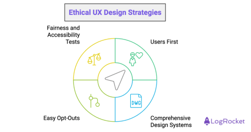
Understanding dark patterns and their consequences is just the beginning. Designers must learn how to avoid them and promote ethical, user-centric design instead. Here are some strategies to create transparent and consent-driven designs:
- Users first — Making sure to prioritize users first in all design decisions will result in user trust and loyalty. Keeping users in mind and putting them first for all design (and business) decisions can result in identifying and eliminating potential dark patterns early
- Comprehensive design systems — A well-thought-out design system takes into account all the features of an application or website and should also include guidelines for avoiding dark patterns
- Easy to understand opt-outs — Make it simple for users to opt out of services they don’t want. Avoid creating roadblocks or hiding these options within complex navigation
- Fairness and accessibility tests — Include fairness and accessibility as part of your UX testing. Ensure users of all types can easily navigate your interface, understand your options, and make decisions in their best interest
Conclusion
Dark patterns are unethical and go against the core values of UX design. They exploit cognitive biases, manipulating users rather than persuading them. This can lead to damaged reputations, legal consequences, and a loss of user trust.
As the legal landscape around dark patterns tightens, it’s more important than ever for designers to prioritize ethical practices. By creating transparent, user-centric designs—free from manipulation — UX designers can foster trust and deliver better, more engaging user experiences. However, a large part of being a good UX designer is making choices that benefit users, which includes knowing when and where to use certain dark patterns positively.
By focusing on user-first design, adopting comprehensive systems, and offering clear, accessible options, designers can avoid the pitfalls of dark patterns and gain a competitive edge in an increasingly aware marketplace.