Earlier this year, I became really interested in learning about Astro, so I completely rebuilt my blog using it. The results have been amazing since then: I can easily handle automatic sitemap generation and SEO, and integrating other tools became a breeze. Because of these benefits, I was inspired to publish an article every single week.
Astro is incredible for content-driven websites – so much so that since then, I've been cracking a joke: it should be a crime to build a blog and documentation site with any frontend framework other than Astro.
Another notable thing I was able to do on my blog was build a callout component. This is the little tangential boxes you see on documentation sites and some advanced developer blogs.
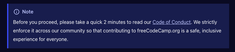
This is an example of one in the freeCodeCamp docs:
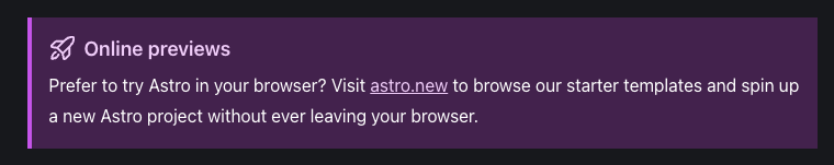
And here’s one in the Astro docs:
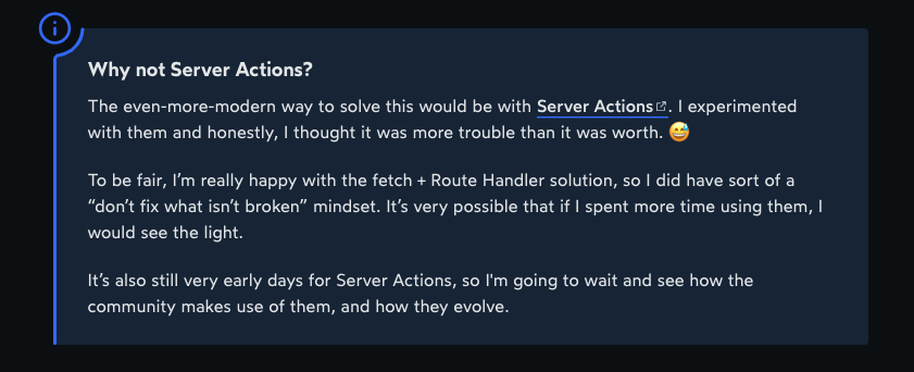
A bit unique, this is one on Josh Comeau's blog:
Keep reading, so I can show you how to build a callout component for your Astro blog.
You can also use the same technique to create one for a blog built with any other frontend framework.
Prerequisites
To get the most out of this article, you need the following:
basic knowledge of Astro
a knowledge of Astro slots and fragments
familiarity with JSX and prop-drilling
understanding of component-based architecture
Astro slots and fragments might sound a bit strange. If that's the case, don't worry, I’l do my best to make things as clear as possible for you.
The approach we are going to use is to have a parent component that will handle all the rendering for the callout box: the type, icon, text, and the styling.
What will follow are respective components that indicate a note, tip, caution, error callout boxes, and more.
Here's a diagram that simplifies the approach:
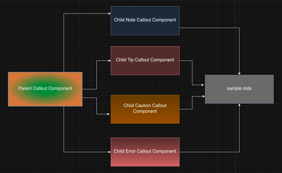
Each of the child components is what you'll bring in any time you want to display a callout related to them.
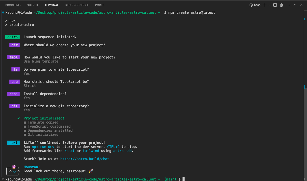
To get started, create a folder, name it what you want (I call it astro-callout on my end), and install Astro.
What follows is a series of prompts. Here are the choices I made during the prompts:
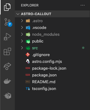
Here's what the project folder structure looks like after installing Astro and choosing the blog template:
How to Build the Parent Callout Component.
Head over to the src/component directory and create a folder named callout. Then inside the folder, create a Callout.astro file.
The callout component is an aside element that will take in the following props:
type: the callout type (note, caution, error, tip, and others)icon: the icon that will signify the callout type. This could be an emoji or an icon from an icon library.backgroundColor: the different background color of each callout typeborderLeftColor: the border-left color of each callout type
Destructure those props from Astro.props in the code fence of the Callout.astro component:
const { icon, type, backgroundColor, borderLeftColor } = Astro.props
Don't forget the aside element has to have some text content, too. Astro has a way to handle this using the <slot /> element.
<slot /> lets you insert child content written between opening and closing tags into any component.
Here's how I filled everything into the aside element:
<aside
 class="callout-box"
 style={{backgroundColor, borderLeftColor}}
 >
 <div class="callout-icon-and-type">
   {icon}
   {type}
 </div>
 <div class="callout-content">
  <slot />
 </div>
</aside>
The icon prop fills in for any icon you would like to use, be it an emoji or an icon library like Ionicons or Font Awesome.
The problem is that not all emojis will be rendered in a presentable way, as different operating systems render emojis their own ways. So, you must find a way to accept both emojis and an icon library.
The icon library I chose for this project is ionicons. Go into the layout file (in this case layouts/BlogPost.astro) and insert the following scripts just before the closing body tag:
<script type="module" src="https://unpkg.com/ionicons@7.1.0/dist/ionicons/ionicons.esm.js"></script>
<script nomodule src="https://unpkg.com/ionicons@7.1.0/dist/ionicons/ionicons.js"></script>
Here's the function that will let you render an icon, whether it’s an emoji or an ionicons icon:
function renderIcon(icon:any) {
 if (typeof icon === 'string') {
   return icon;
 } else if (typeof icon === 'object' && icon.name) {
   return `<ion-icon name="${icon.name}"></ion-icon>`;
 }
 return '';
}
This function checks if the icon you pass in is an emoji or an icon from the Ionicons library.
An emoji corresponds to a string. So if you pass in an emoji, the icon is returned. If you pass in an icon from the Ionicons library, the function will look out for the icon name and display that icon.
You need to modify the content of the aside element a bit so the icon will be rendered the correct way:
<aside
 class="callout-box"
 style={{backgroundColor, borderLeftColor}}
 >
 <div class="callout-icon-and-type">
   <!-- New icon renderer -->
   <Fragment set:html={renderIcon(icon)} />
   {type}
 </div>
 <div class="callout-content">
  <slot />
 </div>
</aside>
If you're wondering what set:html is, it's an Astro template directory similar to the JavaScript element.innerHTML.
The Fragment component itself is a component you can use with the set:* directives to render HTML content.
Here's the CSS for the Callout component:
<style>
 .callout-box {
   color: #fff;
   flex-direction: column;
   padding: 1rem;
   border-left-width: 4px;
   border-left-style: solid;
   margin: 1.5rem 0;
   border-top-right-radius: 4px;
   border-bottom-right-radius: 4px;
 }
 .callout-icon-and-type {
   font-size: 1.5rem;
   display: flex;
   gap: 0.4rem;
 }
 .icon {
   margin-right: 4rem;
 }
 .callout-content {
   font-size: 1.2rem;
 }
</style>
This will make more sense when we start using the parent Callout component in the child callout components.
How to Build the Child Callout Components
Let's demonstrate how to do this with a sample note callout box.
Create a NoteCallout.astro file inside the components/callout directory.
Import the parent Callout component inside the code fence of the NoteCallout.astro file:
import CallOutBox from "./Callout.astro";
To make things less confusing, you can rename CalloutBox to NoteCalloutBox:
import NoteCallOutBox from "./Callout.astro";
After that, use the NoteCalloutBox as a tag and pass ion all the props the parent Callout component accepts:
<NoteCallOutBox
 icon='<ion-icon style="color: #3347ff;" size="large" name="information-circle"></ion-icon>'
 type="Note"
 backgroundColor="#171d4f"
 borderLeftColor="#3347ff"
>
</NoteCallOutBox>
To account for the content of the NoteCalloutBox to be passed in when it's finally used, pass in <slot /> as the content of the NoteCallOutBox:
<NoteCallOutBox
 icon='<ion-icon style="color: #3347ff;" size="large" name="information-circle"></ion-icon>'
 type="Note"
 backgroundColor="#171d4f"
 borderLeftColor="#3347ff"
>
 <slot />
</NoteCallOutBox>
You can follow this process to create an error, caution, warning, and tip callout child components. All you need to do is to fill in the appropriate prop values.
How to Use the Callout Child Components
To use the child callout components in an MDX file for example, import the NoteCallout:
import NoteCallout from '../../components/callout/NoteCallout.astro';
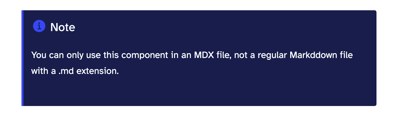
Then use it as a tag and pass in the note you want to communicate to the user:
<NoteCallout>
 You can only use this component in an MDX file, not a regular Markddown file
 with a .md extension.
</NoteCallout>
Here's the result in the browser:
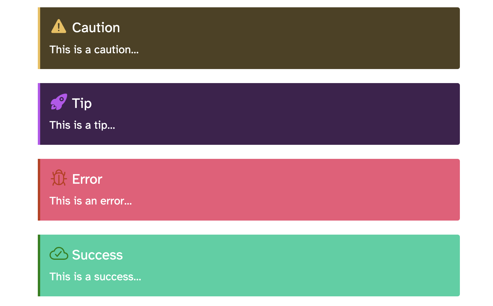
Here are other child components I created using the same approach:
Conclusion
I hope this article showed you everything you need to build a callout component for your blog.
Don’t forget that you can use the same technique to build a callout for a blog built with any other frontend framework.
If you find the article helpful, you can read more articles like it on my blog. I also have articles on PHP, JavaScript, React, Python, and more.
Keep coding…