
Having a properly designed and comprehensive documentation site is important for any project. But creating good documentation can be challenging, and problems like poor user onboarding experience and increased support tickets can become daily hassles for a team.
This is why documentation tools like Docusaurus are great for helping you create visually stunning documentation sites in abo 5 minutes.
In this tutorial, I'll show you how to build a documentation site using React and Docusaurus.
If you are new to Docusaurus, you are probably wondering, “why React?, why not any other framework like Next.js?”, Don’t worry – I’ll also answer this question in this guide.
Table of Contents
Prerequisites
What is Docusaurus?
Getting Started and Installation
- Project structure
How to Start Your Docusaurus Website
How to Create Documentation (Overview)
MDX and React Components
Tabs
Alerts or Admonitions
Code blocks
Docusaurus Blog
Custom Pages
Styling in Docusaurus
Deployment
Conclusion
Prerequisites
To follow along with this guide, you should have:
Node.js version 18.0 or above installed
Basic knowledge of React and Markdown
IDE (preferably VSCode)
What is Docusaurus?
Docusaurus was released by the Meta Open Source team in 2017 to help devs build, deploy, and maintain documentation websites easily and quickly. The project’s other goal was to improve the speed of both developers and end users using the PRPL pattern.
Some of its cool features include search and localization, powered by Algolia (search) and Crowdin (language support and internationalization).
Now, let’s talk about why we’re using React for this tutorial. Well, Docusaurus is built on top of React, which makes it easy to customize the website. Also, Docusaurus supports Markdown and MDX (which lets you use React JSX in your markdown content).
As a technical writer myself, I love that this tool supports Markdown, which I'm quite familiar with. It allows me to focus on creating helpful documentation without worrying about converting the text to other text formats.
Getting Started and Installation
Getting started with Docusaraus is pretty straightforward. The first thing you need to do is head over to your terminal and run the command below:
npx create-docusaurus@latest my-website classic
Note: The Docusaurus team recommends the classic template because it is easier to get started with fast. It also contains @docusaurus/preset-classic – which includes standard documentation, a blog, custom pages, and a CSS framework (with dark mode support).
Project structure
After installation, this is what your newly created Docusaurus project structure should look like:
📦my-website
┣ 📂blog
┃ ┣ 📂2021-08-26-welcome
┃ ┃ ┣ 📜docusaurus-plushie-banner.jpeg
┃ ┃ ┗ 📜index.md
┃ ┣ 📜2019-05-28-first-blog-post.md
┃ ┣ 📜2019-05-29-long-blog-post.md
┃ ┣ 📜2021-08-01-mdx-blog-post.mdx
┃ ┣ 📜authors.yml
┃ ┗ 📜tags.yml
┣ 📂docs
┃ ┣ 📂tutorial-basics
┃ ┃ ┣ 📜congratulations.md
┃ ┃ ┣ 📜create-a-blog-post.md
┃ ┃ ┣ 📜create-a-document.md
┃ ┃ ┣ 📜create-a-page.md
┃ ┃ ┣ 📜deploy-your-site.md
┃ ┃ ┣ 📜markdown-features.mdx
┃ ┃ ┗ 📜_category_.json
┃ ┣ 📂tutorial-extras
┃ ┃ ┣ 📂img
┃ ┃ ┃ ┣ 📜docsVersionDropdown.png
┃ ┃ ┃ ┗ 📜localeDropdown.png
┃ ┃ ┣ 📜manage-docs-versions.md
┃ ┃ ┣ 📜translate-your-site.md
┃ ┃ ┗ 📜_category_.json
┃ ┗ 📜intro.md
┣ 📂src
┃ ┣ 📂components
┃ ┃ ┗ 📂HomepageFeatures
┃ ┃ ┃ ┣ 📜index.js
┃ ┃ ┃ ┗ 📜styles.module.css
┃ ┣ 📂css
┃ ┃ ┗ 📜custom.css
┃ ┗ 📂pages
┃ ┃ ┣ 📜index.js
┃ ┃ ┣ 📜index.module.css
┃ ┃ ┗ 📜markdown-page.md
┣ 📂static
┃ ┣ 📂img
┃ ┃ ┣ 📜docusaurus-social-card.jpg
┃ ┃ ┣ 📜docusaurus.png
┃ ┃ ┣ 📜favicon.ico
┃ ┃ ┣ 📜logo.svg
┃ ┃ ┣ 📜undraw_docusaurus_mountain.svg
┃ ┃ ┣ 📜undraw_docusaurus_react.svg
┃ ┃ ┗ 📜undraw_docusaurus_tree.svg
┃ ┗ 📜.nojekyll
┣ 📜.gitignore
┣ 📜babel.config.js
┣ 📜docusaurus.config.js
┣ 📜package.json
┣ 📜README.md
┗ 📜sidebars.js
Now, let’s explore some of the main directories:
blog/: This is where you store your blog postsdocs/: As the name implies, this is where your documentation projects are keptsrc/: This directory allows you to customize your website further using React code.static: Here, you store static files like images, logos, favicons, and so on.
A very important file is the docusaurus.config.js file, which acts as the main configuration file for your website.
How to Start Your Docusaurus Website
To run your website locally, first open a new terminal on your IDE and run the following command below to start the development server:
cd my-website
npm i
npx docusaurus start
After running the above command, the browser compiles the React and Markdown files and starts a local development server at http://localhost:3000/. Docusaurus enables hot reload, so you can see changes made to your React, Markdown, and MDX files automatically – without reloading your entire app.
Here is what the site looks like on your browser:
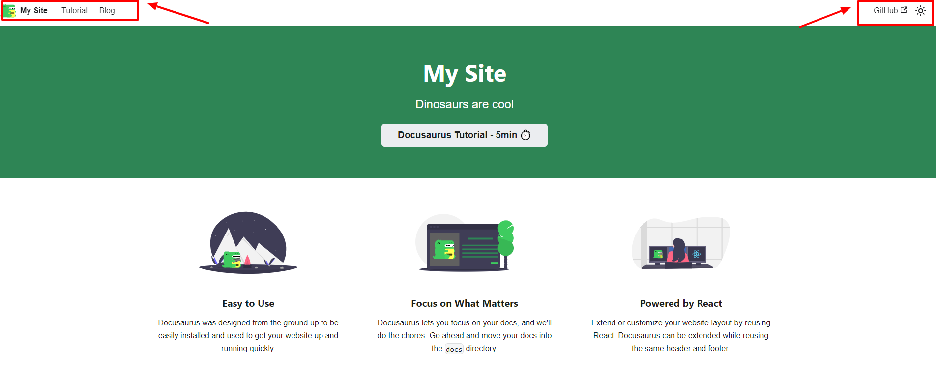
In the image above, you are first welcomed to an intuitive and easily navigable website. At the top left corner of the website, you will see the “Tutorial” and “Blog” sections.
Tutorial: This is where users can see the live version of your documentation.
Blog: This is where users can see the live version of your blog.
The link to the Docusaurus Open Source GitHub repo and the icon for toggling your website between light and dark modes are at the top-right corner of the site.
Alternatively, you can use docusaurus.new to test Docusaurus quickly in a playground without having to go through the installation process. Here, you have an option to choose between CodeSandbox and StackBlitz.
How to Create Documentation (Overview)
Let’s take a closer look at our docs folder. If we head back to our local site and click on “Tutorial,” we will see some pre-built doc pages, as shown below:
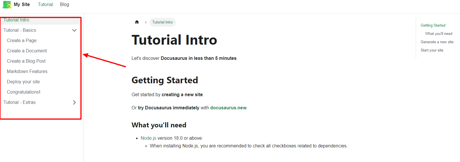
These documentation pages are reflected in the docs folder located in your IDE. When we open the category.json page, we can adjust the name or position of each page. This means you don’t have to name the folders the same as the page name, since the name of the file will be the URL of the page.
To create our new documentation, let’s use the following steps:
Delete all the files in the docs folder. Your browser and terminal will typically display an error after this.
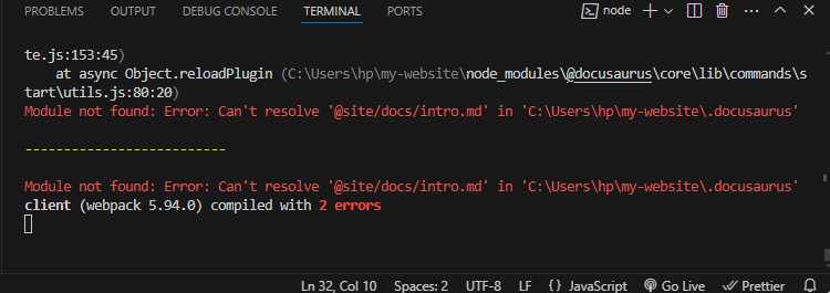
This is because we need at least one page in the docs folder.
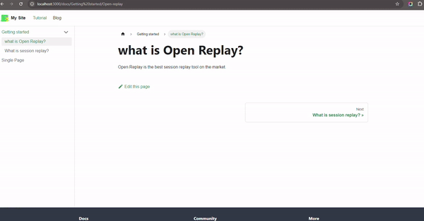
Create a new file inside the docs folder, which can be named anything you prefer, but in our case, I named it single-page.md. You should see this change immediately reflected when you go to your local website. This is what you will see in the documentation pages section:
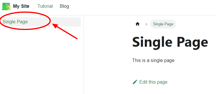
Inside this newly created file, you can create your documentation seamlessly. The image above shows the little Markdown content I created saying “Single Page” in an H1 and “This is a single page” in plain text.
Let’s say you want to create a more organized content structure, but you don’t know how to get started. Here are a few simple steps on how to do that:
Create a new folder inside the
docsfolder, named “Getting Started”Create new Markdown files inside the “Getting started” folder, and name them whatever you like. For the sake of this tutorial, let’s name it
API-docs.mdandSession-replay.md.Write your documentation in Markdown
This is how the file structure should look like on your IDE:
📦docs
┣ 📂Getting started
┃ ┣ 📜Open-replay.md
┃ ┗ 📜Session-replay.md
┗ 📜single-page.md
Here is a simple GIF to demonstrate how this works on the local documentation website.
Now, let’s try to create a separate page in the doc folder. To do this, let’s create a category.json page in the Getting started folder. Inside the category.json file, we will include the following JSON text:
{
  "label": "Custom Title",
  "position": 2,
  "link": {
    "type": "generated-index",
    "description": "This is a custom description"
  }
}
The
linkobject creates a separate page for the folder.The
typeproperty is set to generated-index, which means it will generate the pages with all the sub-pages.The
descriptionproperty is a description of the page that will show up beneath the title.
When you check out your local hosted documentation site, you will see that the label has changed, and a separate page has been created for the folder.
In this section, I will show you an example of how headings and tables of content work in Docusaurus.
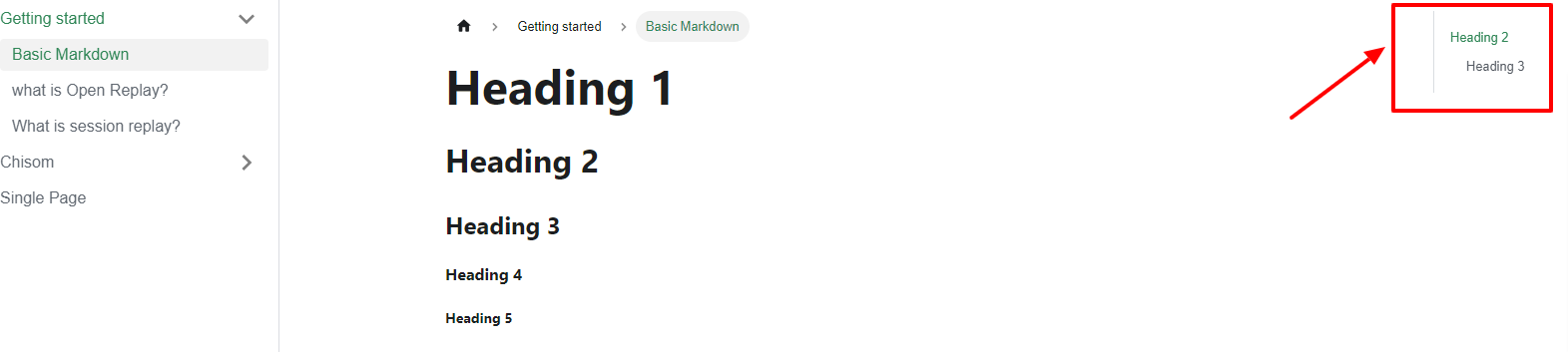
The first thing I did was create a markdown.md file. Then I pasted a couple of headings in Markdown text format right inside the file, like this:
---
title: Basic Markdown
sidebar_position: 1
---
# Heading 1
## Heading 2
### Heading 3
#### Heading 4
##### Heading 5
###### Heading 6
When we head back to our website, we can see that only headings level 2 and 3 are automatically added, just as shown below:
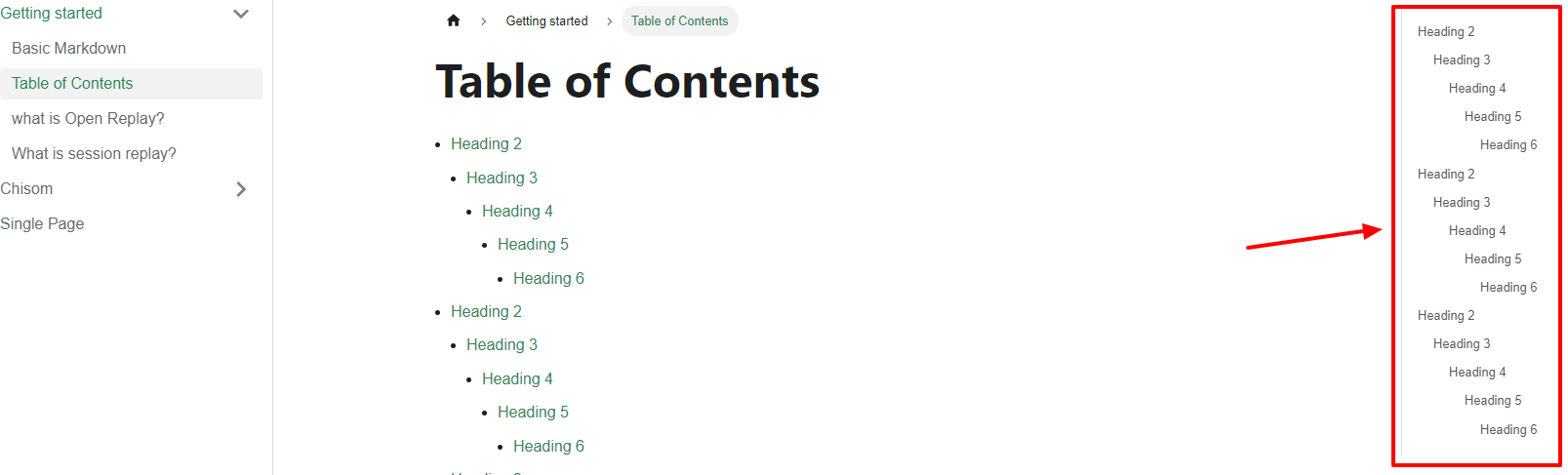
We can edit to ensure that all the headings show up. To do this, first create a table-of-contents.md, then paste in the following Markdown:
---
title: Table of Contents
sidebar_position: 2
toc_min_heading_level: 2
toc_max_heading_level: 6
---
import TOCInline from '@theme/TOCInline';
<TOCInline toc={toc} minHeadingLevel={2} maxHeadingLevel={6} />
## Heading 2
Lorem ipsum dolor sit amet, consectetur adipiscing elit. Sed non risus. Suspendisse lectus tortor, dignissim sit amet, adipiscing nec, ultricies sed, dolor.
### Heading 3
Some content here.
#### Heading 4
Some content here.
##### Heading 5
Some content here.
###### Heading 6
Some content here.
I added a TOC property and set the minimum and maximum heading levels with toc_min_heading_level: 2 and toc_max_heading_level: 6. We also added an inline table of contents by first importing TOCInline from @theme/TOCInline. Then, we created a TOCInline component (which can be put anywhere you want your TOC to show up).
Now, all the headings show up in the table of contents part of the website:
Beautiful right?
MDX and React Components
Now, let’s talk about one of the most exciting features of Docusaurus: MDX and React components.
You might ask – how can Docusaurus use TOC or import in the Markdown file? Well, that’s because Docusaurus uses MDX, which is basically Markdown with JSX.
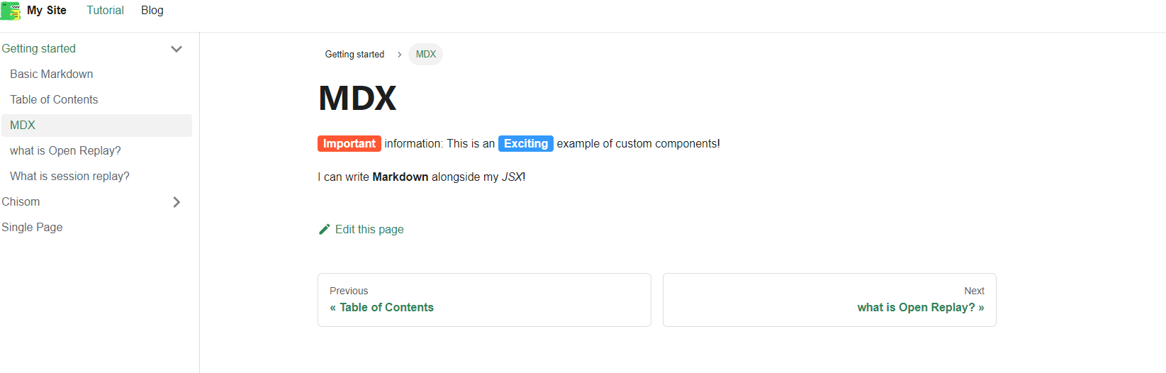
To demonstrate this, let’s create a new Markdown file inside our Getting started folder titled MDX.md , then we create a separate file inside the src > components folder and name the file Tag.js . Then we paste in the following code:
import React from 'react';
export default function Tag({ children, color }) {
  return (
    <span
      style={{
        backgroundColor: color,
        borderRadius: '4px',
        color: '#fff',
        padding: '0.2rem 0.5rem',
        fontWeight: 'bold',
      }}
    >
      {children}
    </span>
  );
}
Here, we first imported the core React library, and then we defined a functional component called Tag, which takes in two props as input: children and color. In our return statement, we included our CSS styles for the span element.
Inside the MDX.md file, paste in the below code:
---
title: MDX
sidebar_position: 3
---
import Tag from '@site/src/components/Tag';
<Tag color="#FF5733">Important</Tag> information: This is an <Tag color="#3399FF">Exciting</Tag> example of custom components!
I can write **Markdown** alongside my _JSX_!
Here, we import Tag from our components folder. This is what it looks like:
Note: Because we use MDX, Docusaurus comes with pre-built components like Tabs, alerts, code blocks, and more. Let’s check them out in the following subsections.
Tabs
In this subsection, we’ll talk about tabs as a pre-built component in Docusaurus. Let’s dive right in!
For a start, let’s create a new Markdown file called tabs.md and paste in the following code:
---
title: Tabs in Markdown
sidebar_position: 4
---
import Tabs from '@theme/Tabs';
import TabItem from '@theme/TabItem';
<Tabs>
  <TabItem value="book" label="Book" default>
    Dive into the world of knowledge with a captivating book 📚
  </TabItem>
  <TabItem value="painting" label="Painting">
    Admire the strokes of artistry on a beautiful painting 🖼️
  </TabItem>
  <TabItem value="music" label="Music">
    Let the soothing melodies of music transport you 🎶
  </TabItem>
</Tabs>
I'm a text that doesn't belong to any tab. So I'm always visible.
We imported Tabs from @theme/Tabs and TabItem from @theme/TabItem. Then, we created a Tabs component, which is the container, and the TabItem component is the tab itself. The value property is the value of the tab, while the label property is the label of the tab. The default property defines which tab is open by default – in this case, the “Book” tab.
This is how it looks:
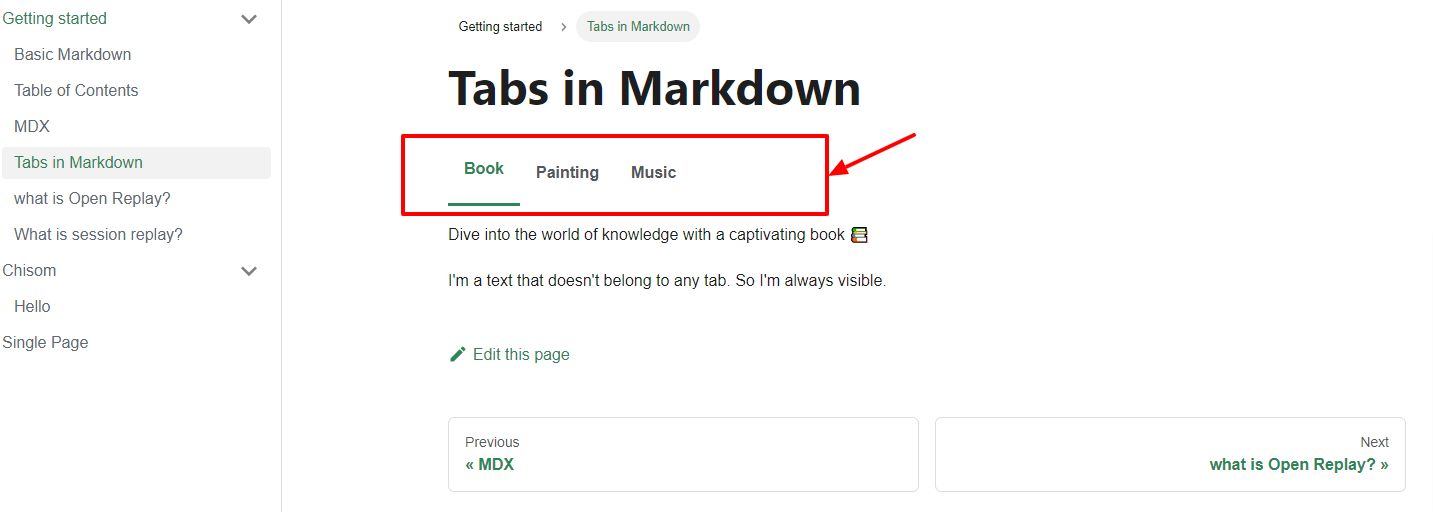
Each tab is clickable and transitions smoothly.
Alerts or Admonitions
Docusaurus comes with pre-built alerts or admonitions. To create an alert, you simply wrap the text with three colons and follow it with the type of alert you want the reader to have in mind.
Let’s create a new Markdown file called alerts.md and paste in the following Markdown:
---
title: Alerts or Admonitions
sidebar_position: 5
---
:::note
Here's some **information** with _Markdown_ styling.
:::
:::tip
Here's a **helpful tip** with _formatted text_.
:::
:::info
Here's some **useful info** presented in a clear way.
:::
:::caution
Please take **extra caution** with this important note.
:::
:::danger
This is a **dangerous situation** you need to be aware of.
:::
:::note This is a _custom title_
And you can add images as well.

:::
The various types of alerts, as shown in the Markdown above, are:
notetipinfocautiondanger
Here’s what it looks like on the website:
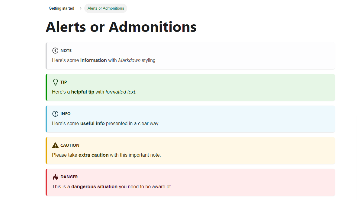
Alerts and admonitions are pretty common in documentation sites. So, if you have ever wondered how it’s been done, well, this is it! It’s quite straightforward.
Code blocks
As we already know by now, Docusaurus supports MDX, which allows us to include code blocks in our files. Code blocks are text blocks wrapped around by strings of three backticks. You can add the name of the language after the last of the three backticks.
Let’s create a codeblocks.md file and paste the following JSX code:
---
title: Codeblocks
sidebar_position: 6
---
```jsx title="Codeblock"
function Greeting(props) {
  return <p>Welcome, {props.userName}!</p>;
}
export default Greeting;
```
```jsx title="Highlight Lines"
function HighlightText(highlight) {
  if (highlight) {
    // highlight-next-line
    return 'This text is highlighted!';
  }
  return 'Nothing highlighted';
}
function HighlightMoreText(highlight) {
  // highlight-start
  if (highlight) {
    return 'This range is highlighted!';
  }
  // highlight-end
  return 'Nothing highlighted';
}
```
```jsx title="Line Numbers" showLineNumbers
import React from 'react';
function UserProfile(props) {
  const { username, email, isAdmin } = props;
  return (
    <div>
      <h1>User Profile</h1>
      <p>Username: {username}</p>
      <p>Email: {email}</p>
      {isAdmin && <p>Admin User</p>}
    </div>
  );
}
export default UserProfile;
```
```jsx title="Line Numbers with Highlight" {4,9-11} showLineNumbers
import React from 'react';
function UserProfile(props) {
  const { username, email, isAdmin } = props;
  return (
    <div>
      <h1>User Profile</h1>
      <p>Username: {username}</p>
      <p>Email: {email}</p>
      {isAdmin && <p>Admin User</p>}
    </div>
  );
}
export default UserProfile;
This is what the code blocks look like:
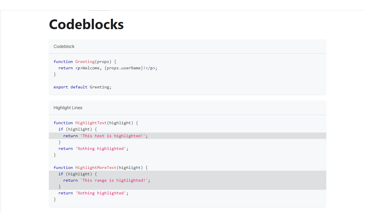
You can easily copy the code by hovering your cursor over the code blocks and clicking on the copy icon on the top-right side of the code block.
Note: By default, Docusaurus uses Prism for syntax highlighting.
If you also want to highlight some lines of code, you can do that by adding a comment like this:
    // highlight-next-line
    return 'This text is highlighted!';
  }
  return 'Nothing highlighted';
}
function HighlightMoreText(highlight) {
  // highlight-start
  if (highlight) {
    return 'This range is highlighted!';
  }
  // highlight-end
highlight-next-line: allows you to highlight a single line of codehighlight-start and highlight-end: allows you to highlight a range of lines
Docusaurus Blog
The Docusaurus blog also comes by default with the classic template. If you don’t have a blog, you can add the following lines to your docusaurus.config.js file:
{
  label: 'Blog',
  to: '/blog',
}
Usually, this line should already be in your config file after installing Docusaurus for the first time.
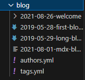
The Docusaurus blog is very simple to understand. Navigate to the blog folder in the project explorer, and you’ll see all the blog posts, which are MDX files. The blog post date should be included on the file name as shown below:
When you open one of the blog posts, you see something like this:
---
slug: long-blog-post
title: Long Blog Post
authors: yangshun
tags: [hello, docusaurus]
---
This is the summary of a very long blog post,
Use a `<!--` `truncate` `-->` comment to limit blog post size in the list view.
<!-- truncate -->
Lorem ipsum dolor sit amet, consectetur adipiscing elit. Pellentesque elementum dignissim ultricies. Fusce rhoncus ipsum tempor eros aliquam consequat. Lorem ipsum dolor sit amet
slug: You can add a slug to the URL of the blog posttitle: Title of the blog postauthors: The authors of the blog posttags: Tags related to the blog post
In the blog post, we can also use all the Markdown features plus JSX as we have seen before.
Custom Pages
Technically, Docusaurus isn’t just a fancy documentation site generator with a blog. It’s a standard static site generator – which means you can create any page you want.
To see how creating a custom page in Docusaurus works, let’s create an about.js file in the src \> pages folder and include the following code:
import React from 'react';
import Layout from '@theme/Layout';
import Head from '@docusaurus/Head';
export default function About() {
  return (
    <Layout>
      <Head>
        <title>About</title>
        <meta name="description" content="This is the about page" />
      </Head>
      <div>
        <h1 className="red-text">About</h1>
        <p>This is the about page.</p>
      </div>
    </Layout>
  );
}
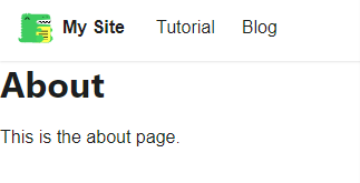
When you go to http://localhost:3000/about, you should see something like this:
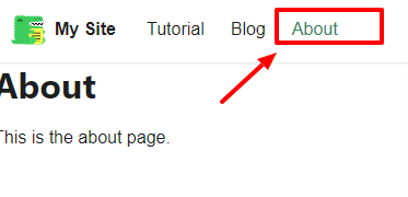
We can also add the page to the navbar by going to the docusaurus.config.js file and adding a new item to the navbar array. The item looks like this:
{to: 'about', label: 'About', position: 'left'},
It then appears on the homepage nav menu like this:
You can now style and customize the about.js file any way you’d prefer using React.
Styling in Docusaurus
Let’s look at how you can style your site in Docusaurus. The easiest way is to customize the custom.css file inside the css \> custom.css file. This is what the file looks like:
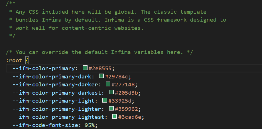
Here, you can change the whole color schema of the site and different styling to this file.
You can read more about this in the Docusaurus styling and layout docs.
SEO in Docusaurus
Docusaurus takes SEO very seriously. By default, Docusaurus automatically adds a description title, canonical URL links, and other useful metadata to each page. This can be configured as shown below:
---
title: Our First Page
sidebar_position: 1
description: A short description of this page
image: ../static/img/docusaurus-social-card.jpg
keywords: [keywords, describing, the main topics]
---
# Single Page
This is a single page.
You can read more about this in the Docusaurus SEO docs.
Deployment
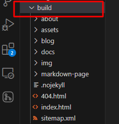
Deployment is pretty easy with Docusaurus. Since it’s a static site, you can deploy it to any static site hosting service. To do this, run the npm run build command on your CLI. This creates a build folder like the one below:
Then, you can upload the contents of the build folder to your hosting service.
Conclusion
In this article, we covered how to build documentation from scratch, how to create, customize, and style pages, and the awesome SEO power of Docusaurus.
Docusaurus is friendly to both developers and technical writers. As a developer, you can focus on customizing the site, while as a technical writer, you can focus on writing the documentation.
I will highly recommend this tool for both startups and established enterprises looking to build stunning documentation sites.
This guide is not exhaustive, but covers everything you need to know about the basics of building a documentation site with React and Docusaurus.
I hope you found it helpful :)
Here’s the link to my GitHub code for follow-up purposes.
And here’s the main Docusaurus documentation if you’d like to dive in deeper.