To produce clean, high-quality websites, you need to understand typography. Typography forms the base of the visual hierarchy, makes your content readable and accessible, and guides your users through your website. A clear message with readable and stylish fonts can influence users’ decision-making and improve the user experience.
Typography is also a great way to express your brand identity, as different fonts have different moods, and can create recognition for your brand. This article unpacks the main types of fonts, the best tools for selecting font pairings, accessibility considerations, and more.
4 main types of fonts and how to use them
Fonts are important for visual design, as they define how the audience perceives your message. Different fonts evoke different emotions. For example, bold fonts demonstrate strength, rounded fonts express friendliness, and calligraphic typefaces are usually associated with elegance and sophistication. When picking the font, you need to think about your goals, your product, and the brand message you want to bring to your audience.
Although there are thousands of different font styles, all of them can be divided into four main groups of fonts: serif, sans-serif, script, and display:
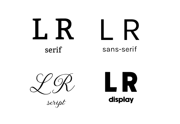
Let’s explore the key characteristics of each group alongside examples of how companies have used them to improve the UX:
Serif fonts
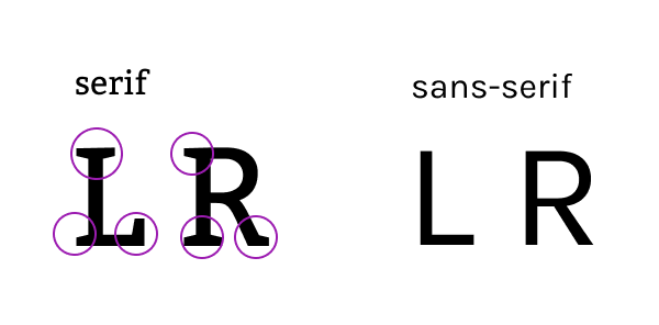
Serfs are the little lines at the top, bottom, and edges of letters that give them a unique look. These lines are the main distinguishing characteristics of the serif fonts. Serif fonts are typically associated with experience, history, and timeless elegance. Because of this, they’re often used in books, newspapers, posters, or cafe signs:
There’s a common misconception that serif fonts shouldn’t be used in UX because of their poor readability, especially on smaller screens. However serif fonts have transformed and modernized over the years — many new readable and stylish fonts have appeared, and screen resolutions have improved. Skilled designers prove that combining different font groups can help to balance style and readability.
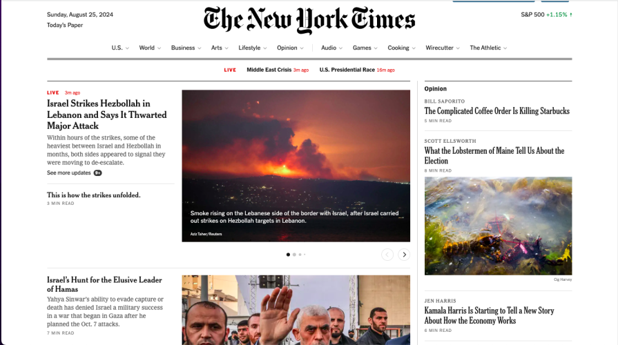
The New York Times uses a serif font for its website to emphasize decades of experience and trustworthiness. It uses serif fonts for headings and paragraphs to create an atmosphere of reading an old newspaper:
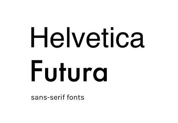
Sans-serif fonts
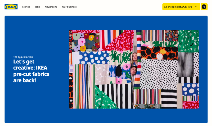
Sans-serif fonts traditionally stand opposite serif fonts because of their simplicity and readability. They were developed by German designers in the middle of the 20th century The most popular of them are Futura and Helvetica:
They adapt easily to different screen sizes and resolutions, which makes them valuable for UX design. Sans serif fonts can be used for headings, text bodies, and informational blocks. For example, Ikea uses sans-serif fonts to create a clear, minimal brand identity and smooth experience for their customers:
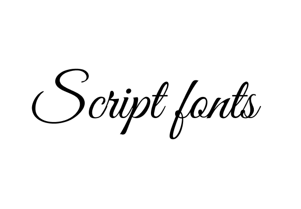
Script fonts
Script fonts are calligraphy-style fonts that imitate handwriting. These fonts are traditionally associated with femininity, craft, and creativity. There are a variety of script fonts, such as brush, modern, and fancy, all bringing creativity and unique style to the design:
These are often used for creative projects, quotes, and logos but rarely for UX design due to readability issues. However, they can be successfully used for branding and adding personality to your website if properly balanced with more readable fonts. For example, Marshall uses script font to create a vintage rock-n-roll vibe on their website, combining it with the serif font for good readability:

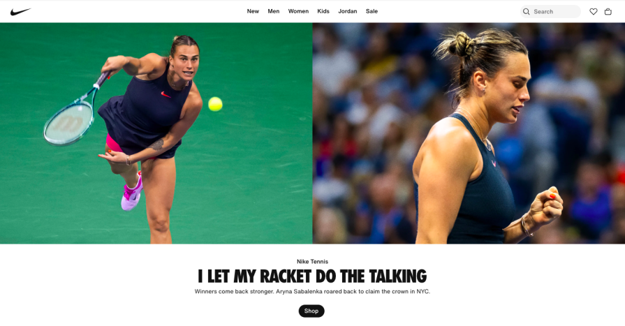
Display fonts
Display fonts are designed for large sizes. These fonts appeared with the development of poster design. They’re big and bold and create a particular mood and aesthetic, which makes them perfect for headings and banners.
Display fonts come in different shapes and designs, and can be used in UX design in hero sections to draw attention and convey a message. For instance, Nike uses a display font in headings and banners to communicate bold, spotty statements:
Tips for selecting fonts for your next project.
When choosing the font, it’s crucial to consider hierarchy, contrast, font size, and other important aspects. You should spend a lot of time selecting the right font for your projects, as you need to find a balance between aesthetics and usability, complement the product, and reflect the brand’s mission.
To help with this, try the following tips:
- Your font should be seamless — If users don’t notice the font but get the message, you’ve made the right choice. Remember, the number one goal of a font should be to communicate a message, not to be creative
- Don’t choose more than two fonts, as it can be overwhelming and confusing for users — Two fonts work well — One for headings and the other for paragraphs and informational blocks. This keeps your style consistent and makes the information easy to read
- Choose the appropriate font weight — A semi-bold title and regular weight for paragraph text tend to work best for most sites
- Use a font designed for reading — For paragraphs and informational blocks, always use clean, easy-to-read fonts
These simple rules can significantly improve your website’s readability. As a final step, ask yourself:
- How many fonts did you choose for your project?
- Do the chosen fonts match the brand message?
- Which font size and weight did you choose?
- Do the chosen fonts help you build a visual hierarchy?
- Is each font used to emphasize or inform?
Considerations for readability and accessibility
Checking your website for accessibility benefits not only users with visual and cognitive disabilities but can also improve the overall user experience for everyone. Good readability means your fonts are optimized to let users easily follow and understand your content. Readability includes font size and weight, letter and line spacing, text color, and contrast.
You can find international standards for accessible font sizes on this website: Web accessibility standards guidelines.
The base font sizes designers typically use on websites are between 12 and 18 pixels for regular text and not smaller than 24 pixels for large text. Large text (headings) are usually divided into 3 sizes: Heading 1 (H1), Heading 2 (H2), and Heading 3 (H3), where H1 is the largest and H3 is the smallest.
These numbers aren’t strict and depend on the particular font, user needs, and design goals. For better results, it’s better to test the readability and accessibility of each particular website.
According to the World Health Organization, more than 2.2 billion people worldwide experience color blindness or visual issues. If you don’t follow accessibility standards, you make it impossible for this huge group of people to use your digital product. When choosing the font color, it’s always better to check the contrast with special tools like contrast checker or accessible colors.
Guidelines for effective font pairing
Finding aesthetically pleasing and user-friendly font pairings can be a challenge. Luckily, you can use these five guidelines to ease your decision-making process:
1. Create contrast
Contrast helps easily distinguish different parts of the text, such as headings, subheadings, and paragraphs. It makes text more readable for the users and allows them to quickly scan information. Additionally, the contrast makes the text look more engaging, drawing attention to key points.
When creating a contrast, avoid conflict between fonts. If you choose fonts that are too different in style and mood, they can confuse users. To look harmonically, the fonts should have similarities like letter shape and proportions.
2. Use fonts from the same font family
If you don’t have much experience in typography, it’s a good idea to combine fonts from the same family as they were designed to work together. You can create the contrast by playing with weight (bold, regular, light), case (uppercase, lowercase), and sizes. Predetermined selections will make your life easier and help to simplify your design process.
3. Analyze successful design
Each designer needs to see as many successful examples as possible. Analyze the websites of the top companies, explore design trends, and find inspiration from award-winning websites.
4. Experiment with fonts
Don’t be afraid to combine different fonts. You need to experiment a lot to study typography. Play around with the weight and size, and try to create a particular mood. For example, a playful design for the youngest audience, a minimal design for a tech company, or a vintage vibe for a product.
5. Test what your users think
After you choose your fonts, test them on your users. Ask how they feel about your design, whether they understand the message, and whether the website is easy to read and comprehend.
When it comes to choosing fonts, several tools exist to take out some of the guesswork. These can be especially useful if you’re just starting out with typography. Some of the best include:
WhatFont
Start here to identify a font from any website. Simply hover the text, and this great Chrome extension identifies the font used on the webpage:
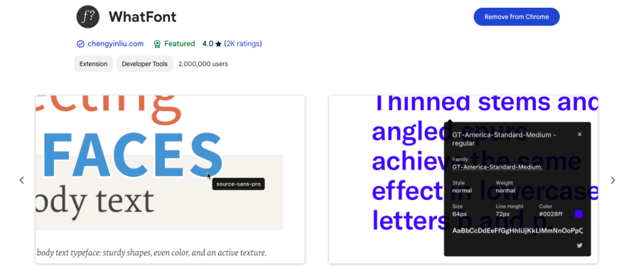
When you see one you like you can make a note to yourself. This tends to be a great place for inspiration.
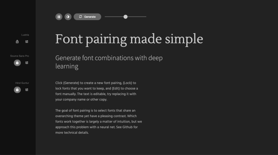
Fontjoy
Fontjoy is an incredibly user-friendly font pairing tool. It’s accessible to designers of all levels — simply click the “generate” button, and Fontjoy will provide you with a harmonious font pairing in seconds. You can also adjust fonts manually to achieve the desired result:
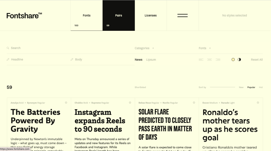
Fontshare
Fontshare is my favorite tool for finding fonts and font pairings. It provides you with lots of examples of pairing that you might use:
Key takeaways
Typography plays an important role in UX design. The right fonts can make your website user-friendly and enjoyable, while poor readability and contrast can ruin not only your design but also your website engagement. When choosing fonts for your site, you need to think about usability and your brand’s mission.
Use design tools (Fontshare, Fontjoy) and browser extensions (WhatFont), analyze the typography of the most successful brands (Nike, Apple, Spotify), and constantly practice. Don’t be afraid to try different font combinations and always test your choice on your users.