Conversion design, or CRO-driven design, is becoming increasingly popular in the realm of UX design. After the VC bubble burst around 2022, companies realized that a great value proposition isn’t enough — products also need to learn money.

While monetization models might seem like something only the C-suite should worry about, designers can significantly influence revenue by integrating CRO principles into their work. And trust me, it’s worth the effort.
In this article, I’ll break down what CRO is, how designers can build a UX/UI design for conversion, and how to become a CRO-oriented designer.
What is CRO?
CRO, which expands as conversion rate optimization, is the process of optimizing the design, copy, and marketing funnel as a whole to maximize the chance that the user will perform desired actions.
For example, if only 5 percent of visitors to a landing page purchase the marketed product, a UX/UI design for conversion would need to be on improving design elements like the header, visuals, call to action, and layout to move this 5 percent conversion metric as high as possible. In the end, this would result in more sales without changing the product itself.
CRO lies in the realm of “optimizations” and not “new opportunities,” but these little improvements can add up enough to double or triple a company’s revenue.
Why should UX designers care about CRO?
CRO is often considered a marketing function, but designers not only have a great influence on conversions but can benefit greatly from focusing on it. I’ll tell you why and how to design a website that converts:
Design drives CRO
It is very important for us not to associate CRO with only copywriting, advertising assets, and communication channels — design itself plays a critical role in shouldering CRO. The clarity of your UI design, the message it delivers, how it makes people feel, and whether or not it sparks credibility are all critical components of CRO.
In one of my projects, a simple UI redesign of one of the content blockers resulted in a 30% lift in conversions.
Design matters.
CRO = More money = More impact
I’ll say it out loud — one of the most common challenges of being a designer is how organizations tend to treat one. UI/UX designers rarely get a seat at the table; their opinions, although heard, are not always taken into consideration. They often just get pre-defined and pre-decided requirements to, well, paint in Figma.
But tie your design decisions to revenue, and you’ll quickly find yourself earning more respect and influence within the organization.
And I’ve learned that from experience. I was working with two designers who had competing opinions about designing the checkout page for a project. One proposed making the discount field on the checkout more prominent, while the other wanted to make it minimalistic. The first mentioned various UX principles and why they are better for the user. The second brought in data and showed how a similar change before boosted conversions on the checkout page.
Who do you think we listened to?
How to design a website that converts
We have now established that designers have a big impact on products’ and websites’ conversions and can benefit greatly from focusing on conversion.
Let’s talk about a few strategies that’ll help you incorporate CRO principles into your design process and use your UX/UI design for conversion:
Design the funnel, not just pages
Great designers are funnel designers, not just screen designers.
Whenever you work on any UI element or page, always review what happens before and after that screen. Make sure any changes you make improve not only the screen but the funnel as a whole.
One time, we were working on a new post-registration offer screen. We spent a lot of time perfecting it and almost fell in love with it. But then, when we put everything together, we realized it didn’t fit in the flow. The key messaging we included on the screen was too repetitive, especially regarding what happens in the next steps. Instead of adding more credibility and USP, we just added more repetition. We ended up back at the drawing board.
Looking at UX design from a funnel perspective is critical because each step either adds or takes from the visitor’s willingness to convert. People rarely make the final decision on a single screen. It’s always a combination of steps that moves the user from the starting point to the desired outcome, a purchase.
Incorporate CRO fundamentals in your designs
To get high conversion rates, your product or website must:
- Be relevant — People must immediately understand that the product is for them
- Build trust — Users must trust that it’s safe and credible
- Be well-oriented — They must understand what they are expected to do next
- Enable stimulus — There must be some motivational push for users to purchase/convert
- Be security — Visitors must feel safe making a purchase
- Be convenient — The whole process, from landing to conversion, should be easy and convenient
- Give a strong confirmation — After a purchase has been made, users must believe they made a great choice
The order of these elements in the conversion funnel map matters, too. No matter how much credibility signals and testimonials you put into establishing trust, if people don’t find the product relevant, convenience won’t do anything if users aren’t motivated to convert. The motivation alone is insufficient if users don’t know what to do next.
Go through the above list on every single step of your funnel. Visit a page, and ask yourself if the page signals relevancy to visitors. If not, fix it. If yes, ask whether the user has a reason to trust the statements made.
And, of course, conduct user tests to ask such questions. Auditing your funnel and pages for those seven aspects can already reveal numerous areas for improvement.
Evoke the right emotions
People often make decisions emotionally and then justify them with logic. Your funnel should do the same — sell with emotion and then back it up with facts.
Start by figuring out what emotions are most important to your target group. Bring in emotional design to your drawing board.
Once you’ve discovered the emotions most relevant to your key buyer persona, ensure your design targets these. The colors you use, the pictures you add, and what the header says all contribute to emotional perception.
But — the farther you are in the funnel, the less you should focus on emotions (hopefully, users have made the initial decision by then). At this point, shift your focus to addressing anxieties and providing relevant facts. Help the buyer justify the decision they made.
Design for the way your users think
Users think in two ways:
- In system 1 thinking, which is fast and intuitive, users just want to move to the next step
- In system 2 thinking, which is slow and deliberate, they are significantly more considerate and pay more attention to what’s going on
Designs that win system 1 thinkers are minimalistic, to the point, and with only the absolutely necessary amount of copy, distractions, and steps.
Designs that win system 2 thinkers are more elaborate, explain the value proposition in more detail, and addresses concerns at every step.
And you can’t design for both.
The best way to discover what thinking system to focus on is to research and understand the decision-making process of your visitors. But if you don’t have that yet, there’s a rule of thumb:
- If you are asking for a small commitment, say, $5/mo subscription — Design for system 1
- If you are asking for a significant commitment, say, a $40,000 yearly contract — Design for system 2
Understand visitors’ awareness levels
There are four main awareness levels a visitor or user can have:
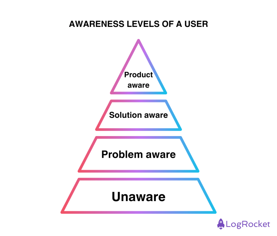
- Unaware — They don’t know they have a problem
- Problem aware — They know they have a problem but aren’t aware of potential solution(s)
- Solution aware — They understand the type of solution they are seeking for their problem but don’t have any specific product in mind
- Product aware — They are aware of your product and how it solves their problem
Designing and writing copy differs for each category. If most of your visitors are unaware that they have a problem, you need to start by explaining what it is and move to the next steps. If they are solution-aware, you need to explain how your product is the best solution. And if they are product-aware, you just need to let them finish the purchase ASAP while addressing any anxieties on the go.
Add CRO focus to your research
User research might not be something new to you, but CRO is a slightly different beast. Key principles are the same, but CRO-oriented research requires some specific methods:
1. Send a post-purchase survey
One of the quickest CRO research wins is to ask customers one question after the purchase — Is there anything that almost stopped you from buying today?
By asking this after a successful purchase (rather than on dropoff), you will gather insights from your most valuable customers — those actually willing to pay. You can learn a lot about their worries and anxieties.
You can use these survey results to improve your funnel pages and address those concerns.
2. Do an on-site survey
On-site surveys are automatic surveys that show on-page visits that typically have just one question. These are an excellent tool for discovering your visitor’s awareness levels.
Just ask a simple “What’s bringing you here today?” question, and you’ll understand if they are exploring solutions, trying to understand the problem, or just popped in incidentally.
You can also invite a few of them to an interview to dig deeper with qualitative methods.
3. Run five-second tests
Five-second tests are my favorite tool when it comes to CRO research. A clear website optimized for conversion tells you immediately what it’s all about and evokes the right emotions.
If users can’t grasp key concepts in five seconds or can’t name the emotion the site evokes, you have some improvements to make.
Don’t underestimate details
At the end of the day, changing a single word or design element can triple your conversion.
And I’m not exaggerating. A few years ago, we were building a live tutoring service where users could connect with a tutor for a few minutes to get their academic doubts answered. We changed the CTA from “Talk to tutor” (action-oriented) to “Get an expert answer” (outcome-oriented), and our conversions increased by more than tenfold.
Key takeaways
Even though CRO is often associated with marketing, designers significantly impact conversion, too. They can build their standing within the organization by showcasing the CRO (thus, money) focus in their process.
The odds are that you’ll notice plenty of opportunities to improve the conversions of your product or website, and who knows, maybe you’ll even fall in love with UX conversion optimization.
There’s always a place for revenue-oriented designers on the market!