Technology adoption in businesses and households has been on a rapid rise since the 1980s when home computers first became accessible. Over time, computers have changed dramatically in shape, size, and capabilities to meet market demands. In fact, according to W3schools, screen resolution in the 2000s was typically 1024×768, while in 2024, the standard has risen to 1920×1080 — that’s an impressive 163.7 percent increase.

The same evolution applies to mobile devices. The first iPhone, launched in 2007, had a screen size of 3.5 inches, while the iPhone 15 boasts a 6.1-inch screen, a 74.29 percent increase.
This constant evolution in screen sizes highlights the importance of having a scalable design for the success of any digital product.
In the specific context of UX design, scaling refers to adjusting the size of components within a frame or viewport to ensure a balanced and functional user experience across devices.
Why is scalable design important?
Scalable UI is more than just resizing from mobile to desktop; it’s about crafting dynamic styles and components that flexibly respond to different screen viewports while preserving the same UX.
There are three listable components of a scalable design:
- Consistency — Ensuring that the look and the “feel” of a design remain harmonious across multiple devices, whether on a mobile phone or a desktop
- Usability — Adapting UIs based on device capacities. For instance, a desktop button click translates into a tap on a mobile
- Accessibility — Making content accessible across devices by adjusting text sizes, buttons, and interactions based on the input method, whether it’s a finger, cursor, or even eye-tracking in the more futuristic interfaces
Responsive design systems
Responsive UI design is documented in a design system — a collection of principles that ensure consistent, usable, and accessible design across devices. And design systems are typically made for multiple platforms, ranging from smartwatches to smart TVs. These systems usually feature two basic scales:
- Mobile scale — Up to 1023px, with phone sizes up to 430px and tablets up to 1024px.
- Desktop scale — 1024px and beyond
Some design teams go further, creating four scales: mobile, tablet, small desktop, and large desktop. But the differences between mobile/tablet and small/large desktop scales are often minimal.
Differences between mobile and desktop scales
- Size — Elements need to resize proportionally to the screen size. Particular attention should be paid to fonts to maintain readability
- Interactions — Mobile is a touch experience, whereas desktops use clicks and have more screen real estate
- Location — Mobile is typically used on the go, while desktops are more stationary
Responsive design vs. scalable design
A responsive design changes the layout at every breakpoint to ensure elements fit within new setups. Designers use grids and columns to distribute elements evenly across the canvas, ensuring consistency and visual appeal.
A scalable design, on the other hand, adjusts the size of visual elements proportionally to maintain aesthetics and functionality across devices. Instead of rearranging components, scalable design creates rules that allow elements to grow or shrink depending on the viewport.
Principles of a responsive design system
To help you better understand how a responsive design works, I’ll discuss its fundamentals. There are two baseline elements:
Columns
Any UX design layout consists of columns, gutters, and margins.
- Columns are the area where our content is distributed. In a responsive design, the number and size of columns adjust depending on the viewport.
- Gutters are the spaces between columns. The gutter size is typically fixed and updated at every breakpoint. They’re narrower on mobiles and wider on desktops to better use available space.
- Margins are the spaces on the left and right of the screen. Like gutters, the margin grows as screen size increases. And beyond a certain width, the layout stays centered while margins expand.
The number of columns can scale depending on the breakpoint — but the standard numbers are:
- 4 columns for mobiles
- 8 columns for tablets, and
- 12 for desktops
Popular CSS frameworks, like Bootstrap and Tailwind, can help designers and developers standardize responsive and scalable designs.
You should start designing with a mobile-first approach to ensure consistency across platforms. And, of course, you can create layouts in Figma based on your product’s needs.
Grids
An 8px grid remains the standard practice for mobile and desktop devices — it offers a consistent structure to organize content on a canvas. Plus, the grid system allows the creation of horizontal and vertical rhythms between components.
The term “padding” describes the space between two elements. It’s important to set it in increments of 8px for consistency. For small spaces, though, you can use 4px.
What makes a scalable design?
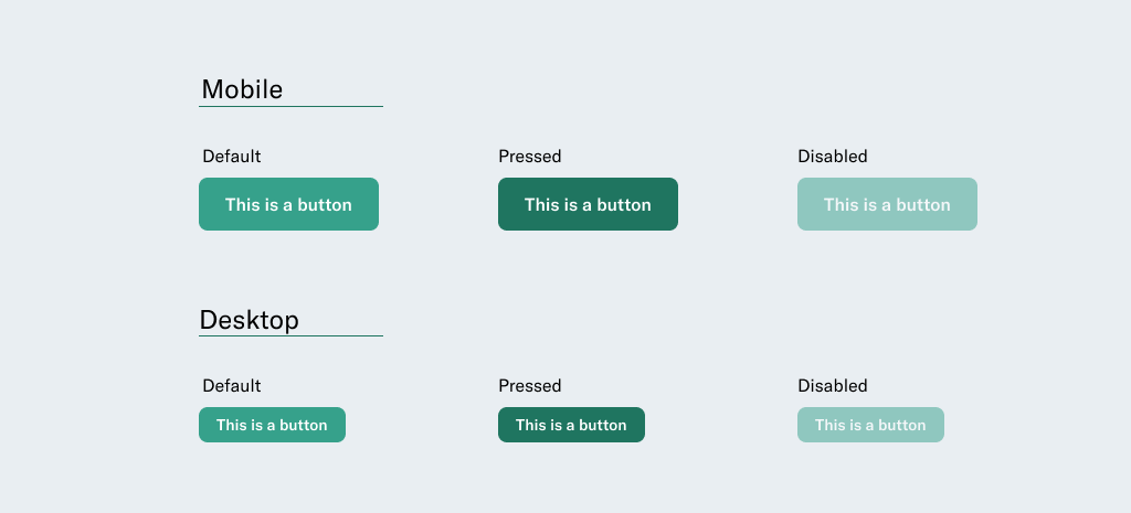
Component scaling
The dimensions of components may change depending on user interaction.
Desktop components tend to be smaller because they are used with a cursor, while mobile components are larger to accommodate finger taps.
A common scale ratio is 1:1.20 or 1:1.25, meaning a mobile button might be 20 percent or 25 percent larger than its desktop counterpart.
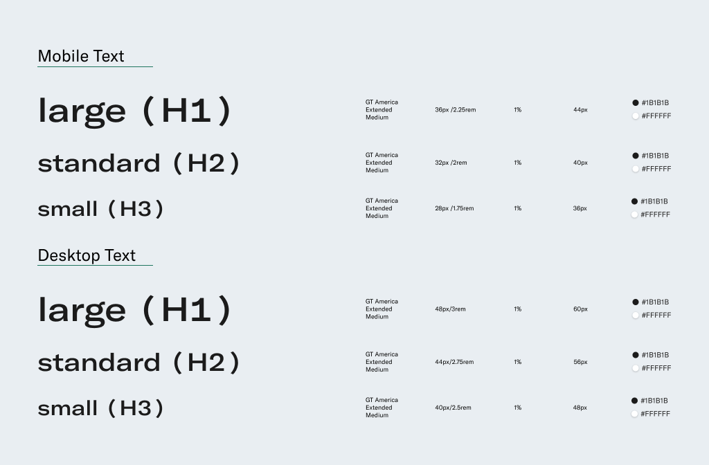
Typography
Like components, the typography can scale depending on breakpoints, too. Popular scales include the Minor Third (1:1.20) and Major Third (1:1.25). With these, every time the font grows, it increases by 20 or 25 percent from the original size.
Pro tip — To maintain consistency when developing the styles, I recommend always rounding font sizes to whole numbers.
Also, keep line heights to a multiple of 4px or 8px for alignment with the grids.
For example, 24*1.20 = 28.8; round it to 28px.
Try using tools like Typescale to create a perfect typography scale for an app or website.
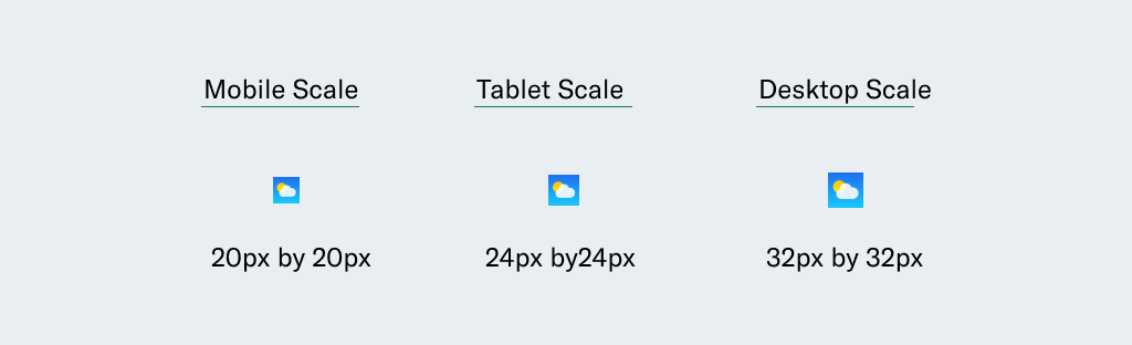
Icons and small visual elements
Icon designs are typically created with non-scalable pixels or scalable vectors. I recommend using SVG formats that scale easily, don’t lose quality, and adapt nicely to all screens.
A good practice is to design different sets of icons for each usage, which generally will be enough to create separate sets for small screens and bigger displays.
And you can use the same rule for raster images — visuals made with pixels. Use images with high pixel density for large screens or create sets of images with different densities for various devices.
Borders
The borders for all the components can be fixed across breakpoints or scaled to improve the aesthetics while enhancing UI.
For example, an input field border might be 1px on mobile, 2px on tablets, and 4px on desktops.
Corner radius
Radius refers to the rounding of UI elements like buttons or cards. It goes from 2px for a sharp edge style to 99px for a rounded and smooth style.
As components scale, so can their corner radius, ensuring visual consistency. A small card radius on mobile might be 16px, while on desktop, it could increase to 20px.
Benefits of building a scalable design system
- For users — A scalable design system ensures that users experience a consistent and familiar interface, no matter the device, which increases engagement and adoption
- For businesses — A scalable system reduces development and design effort by reusing components, leading to long-term cost savings and easier maintenance
- For designers — With a structured system in place, designers can focus more on improving the user experience and less on the nitty-gritty of UI elements
A well-structured design system is typically documented in a tool like Figma, where designers can create a standardized library of styles and components. Developers can build a corresponding storybook to ensure everything is documented and reusable.
Last words
Not every team or project requires a scalable design system from the start.
Scaling a product too early can slow delivery, and scaling too late can stall growth. So, scale designs should be done only when the product is ready to transition to larger screens, and alignment should be ensured with stakeholders and developers before proceeding.
Here’s my last piece of advice — spend time reading about this subject. Learn more about scalable design best practices with major players — Adobe’s Platform Scale, learn how Material Design scales typographies with a precise builder, and deepen your knowledge about scalable accessibility with Wise.