
Mobile devices? They’re everywhere. People are glued to their mobile screens way more than their tablets or desktops. And to a UX designer, this should signal the importance of adopting a mobile-first design approach.
Wondering why? Because if you design for mobile first, you’re creating a smooth experience for the majority of users. And that will help you reach more people and bring in higher user engagement.
In this blog, I’ll discuss the mobile-first design approach and how it improves UX by prioritizing the mobile user experience before scaling up to larger screens.
What is mobile-first design?
In 2020, Google made a major impact on mobile-first design when it announced its shift to adopting mobile-first indexing for the entire web. This shift meant Google prioritized the mobile version of websites for indexing and ranking. This made businesses focus more on mobile-friendly designs to maintain SEO performance and meet the needs of a growing mobile user base.
A mobile-first design means starting your design approach with mobile users in mind. You design for the small screens first and then expand your design to fit tablets, desktops, or whatever else users might be browsing on.
So essentially, you make sure everything works perfectly on a smaller device before worrying about the bigger screens.
But mobile-first design isn’t just about scaling up design from the mobile breakpoint up to the desktop breakpoint — there’s more to it than that. It involves rethinking the entire user experience from the perspective of mobile users. They’re faced with limited screen space and potentially slower internet speeds. So, with a mobile-first design, you’re creating design solutions that address these challenges.
How mobile-first design improves UX
A business that develops its digital product using mobile-first design has an advantage over one that does not. Because if your digital product works flawlessly on mobile, you’re targeting the majority. And more users on your site mean more potential customers.
I’ll discuss three major benefits you can derive from this design approach:
1. Simplifies content
Simpler content improves UX by making the interface clearer and easier to navigate. When users aren’t overwhelmed by unnecessary elements, they stay focused and engaged, leading to higher return rates.
However, simplicity doesn’t mean leaving out important details. It’s about finding the right balance. Focus on delivering the necessary information at each stage of the user journey.
A tool like a collapsed menu, for example, can keep the interface clean while still offering access to additional content when needed.
2. Improves performance
Even though mobile devices are catching up in processing power and internet speeds, thanks to advancements like 5G technology, there are still many mobile users with older mobile devices that lack these good processing power and internet speeds. A mobile-first approach pushes developers to prioritize efficiency across all types of connections and devices by optimizing load times, minimizing resource usage, and compressing images for faster delivery.
By focusing on these, you create a lightweight, fast-loading experience that performs well on any connection — whether users are on 5G or slower networks.
3. Guarantees accessibility
A mobile-first design inherently promotes accessibility. It adheres to recognized guidelines, such as the Web Content Accessibility Guidelines (WCAG), which ensure that websites and apps are accessible to everyone.
Focusing on building for mobile first means you check the box on WCAG recommendations like:
- Larger touch targets — WCAG 2.1, Success Criterion 2.5.5 (Target Size) recommends a minimum target size of 44×44 pixels for touch targets to improve accessibility in mobile-first design by ensuring that interactive elements are large enough to be easily tapped by users, including those with mobility impairments, limited dexterity, or larger fingers
- Simple navigation — WCAG 2.1, Success Criterion 2.4.3 (Focus Order) ensures that the focus order, or the sequence in which information and interactive elements are navigated, is consistent with the meaning of the content. In a mobile context, where space is limited, a clear focus sequence prevents confusion, reduces the risk of accidental skips, and improves usability for all users
- Streamlined interfaces — WCAG 2.1, Success Criterion 1.4.3 (Contrast) ensures that the user can distinguish the user interface from the text, with a minimum contrast ratio of 4.5:1, making content accessible to people with visual impairments
Prioritizing accessibility from the start ensures that these improvements scale easily to larger screens, benefiting all users with legible text, clear visuals, and intuitive buttons.
When to use a mobile-first design
Even though mobile-first design is often a winner, it’s not a universal solution. Some products aren’t a perfect match for mobile-first design.
Here are three questions to ask yourself before you jump into building a mobile-first design:
1. Do I know my primary users?
Are you designing for graphic designers who live on large screens? Or are you targeting younger, mobile-savvy shoppers? Know your audience and how they interact with digital products in your industry.
If your users work with big screens and detailed tools, mobile-first design might not make sense. But if you’re building a retail website for mobile-first millennials, go for it.
2. What level of complexity does my product require?
Highly complex products like financial trading and investment platforms rely on real-time data, rapid user interactions, and very detailed charts. These details are tough to fit into a mobile screen, so a mobile-first design might not cut it.
More great articles from LogRocket:
- Don't miss a moment with The Replay, a curated newsletter from LogRocket
- Learn how LogRocket's Galileo cuts through the noise to proactively resolve issues in your app
- Use React's useEffect to optimize your application's performance
- Switch between multiple versions of Node
- Discover how to use the React children prop with TypeScript
- Explore creating a custom mouse cursor with CSS
- Advisory boards aren’t just for executives. Join LogRocket’s Content Advisory Board. You’ll help inform the type of content we create and get access to exclusive meetups, social accreditation, and swag.
But for products that are not so complex and can follow the mobile-first design approach?
Think of blogs or content-driven websites. These types of platforms typically focus on delivering articles, videos, or other content in a straightforward format. Users mostly engage with the content by scrolling through posts, reading articles, and possibly leaving comments or sharing content on social media. A mobile-first design will work well.
3. How resource-intensive are the operations within my product?
Resource-intensive digital products require significant processing power to function smoothly. If your product requires heavy multimedia usage, such as high-end video editing, 3D modeling, or high-performance gaming, mobile devices may struggle with performance.
For these cases, a desktop-first design approach may deliver a smoother and more powerful experience.
Best practices for building a mobile-first design
Now that you know why you should get into mobile-first designs, here are some best practices to keep in mind:
1. Prioritize content for mobile
Because of the limited screen space, it’s best to give mobile users the most important info upfront. Use techniques like:
- Progressive disclosure — Show essential information first, revealing additional details as needed to reduce cognitive load
- Accordion menus — Use these to hide and reveal content sections, keeping the interface clean while providing access to more information
- Tabs — Organize related content into manageable sections, allowing users to navigate quickly without feeling overwhelmed
By utilizing these techniques, you can create a streamlined mobile experience that gives mobile users the most important info upfront.
2. Ensure a consistent UX across devices
Even though mobile comes first, the experience should stay consistent across all devices. To maintain this consistency, consider using industry-standard design tools like Figma, Adobe XD, or Sketch. These platforms allow you to create responsive designs that can easily adapt to various screen sizes.
Make sure colors, fonts, and branding are the same, whether users are on a phone or desktop.
3. Bring in ease of navigation
Mobile screens are small, so navigation needs to be easy and intuitive. To keep things streamlined, use simple labels, recognizable icons, and drop-down menus.
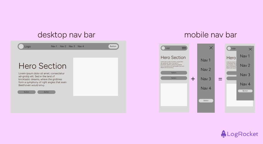
Keep the primary actions front and center, and use hamburger menus for secondary options. Sticky navigation bars guarantee that crucial links remain visible as visitors scroll.
4. Focus on a responsive design
Responsive design guarantees your website appears fantastic across all devices. It helps your site adjust fluidly, giving an excellent viewing UX whether customers are on a smartphone, tablet, or desktop. And this versatility guarantees that your material is accessible and visually appealing on any device.
To achieve an effective, responsive design, consider the following UX elements:
- Fluid typography — Use relative units like
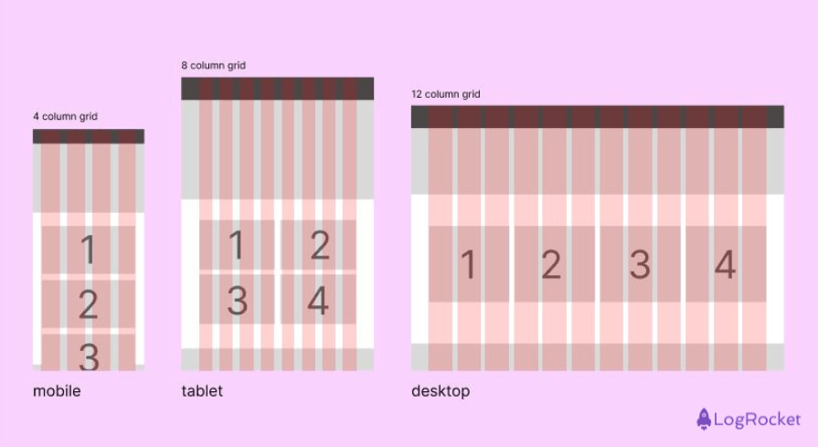
emorremto ensure text scales smoothly and remains legible across different screen sizes - Flexible grids — Implement grid layouts that adapt based on screen size, keeping content organized and visually pleasing. The best-recommended grid layout for mobile is 4-column, tablet is 8-column, and desktop is 12-column:
- Scalable media assets — Choose images and videos that adjust without losing quality, enhancing the visual experience
5. Test and iterate
User testing is crucial. Conduct usability tests with your prototypes to observe how people interact with your design and gather feedback. This process helps you identify pain points and areas that need refinement.
Watch how people interact with your design and get feedback. Early testing with wireframes can also give you insights into layout effectiveness and user flow before committing to high-fidelity designs.
This helps you identify pain points and areas that need tweaking. Iterating after testing ensures you’re constantly improving, leading to a more user-centered final product.
Successful mobile-first design: Case studies
X (formerly Twitter)
X was launched with the name Twttr in 2006 as a web-based platform. Its major focus then was desktop users.
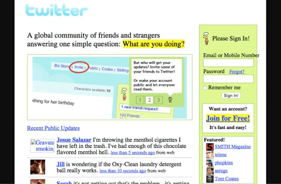
But by 2010, it recognized the mobile shift and launched its first mobile app:
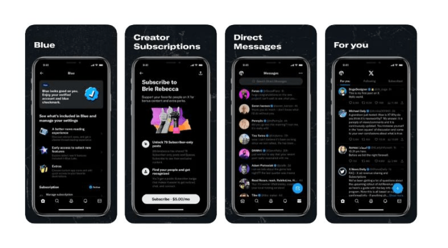
The mobile-first design offered features, including real-time updates and notifications, which made it easier for users to browse. And as time went on, the use of the mobile app increased.
This didn’t just extend X’s user base. It converted the platform into a key tool for real-time communication, especially during events or emergencies. They could now easily like, share, or comment on posts with a tap. And they could stay connected to what matters most to them, with real-time updates about relevant trends or accounts they follow.
X had a lot to gain from the mobile-first design:
- X experienced significant growth as more people began to access X through mobile
- It boosted engagement as notifications and real-time updates kept users more connected to the platform, which increased the time users spent on X
- It gave X greater ad revenue opportunities as the shift to mobile gave Twitter more ways to introduce targeted advertising formats optimized for mobile users
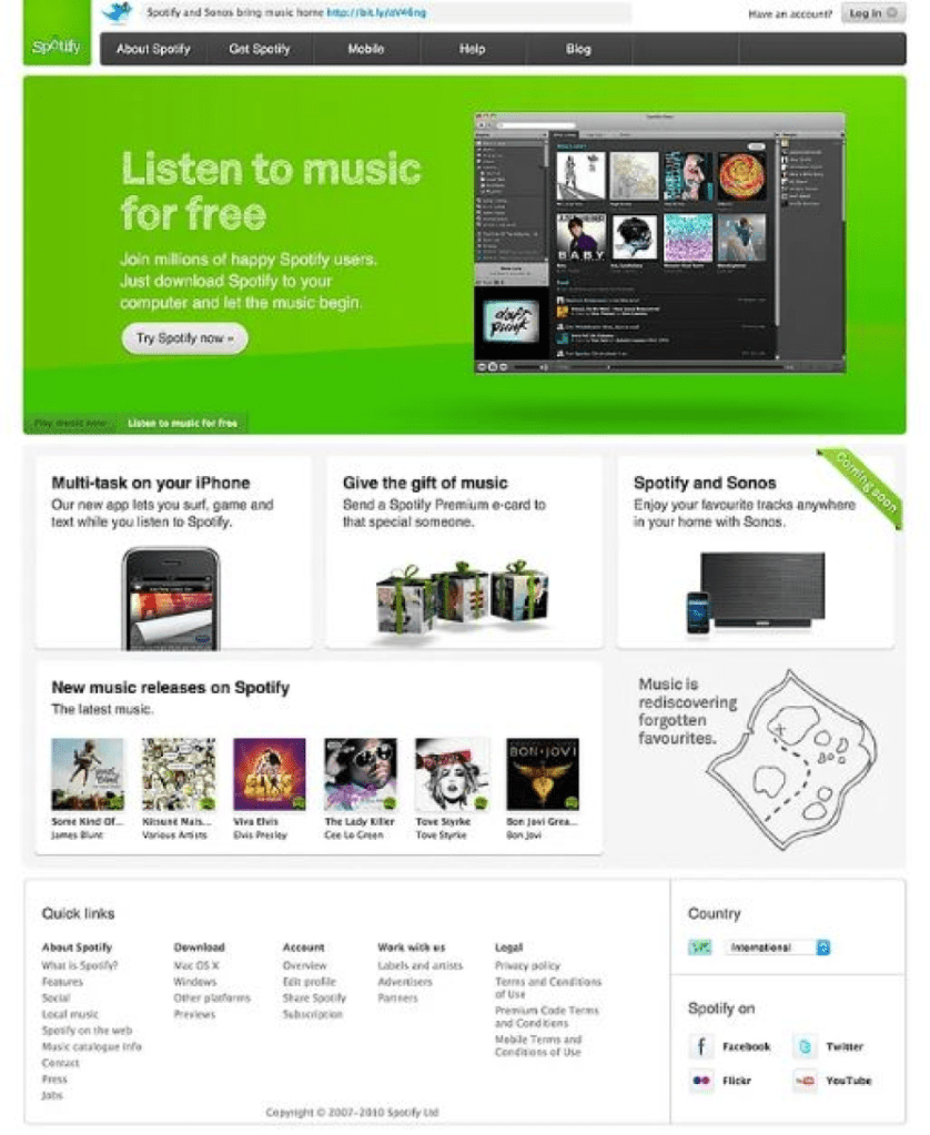
Spotify
Spotify started as a desktop app in 2008. It provided users with access to a vast library of music:
But by 2011, Spotify jumped into the mobile space with an incredibly well UX-focused mobile-first design:
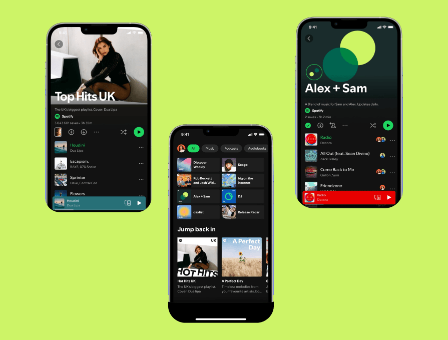
Now, users could stream music on their smartphones with a much more customized, downloadable, and easy listening experience. Spotify also emphasized features like playlists, offline listening, and personalized recommendations — all tailored to mobile users in a well-packed mobile-first design.
Spotify gained plenty from mobile-first design:
- It entered and won in the emerging markets where smartphones were the primary access point to the internet, broadening its user base
- It boosted user retention and led to more premium subscriptions, which translated into recurring revenue
- It created more opportunities for Spotify to incorporate targeted ads between songs and in the app’s interface, driving up its advertising revenue
Closing thoughts
A mobile-first design is not the ultimate solution to designing across different breakpoints, but it’s a powerful tool when used well.
Designers looking to get into building a mobile-first design for their next project need to first consider the users, the complexity, and the resource demands of their product.
As I explained before, a mobile-first design is a smart choice for simpler, content-driven products. But for more complex, resource-heavy applications, a desktop-first strategy is better.