A homepage design for ecommerce is often the most overlooked aspect of the website. While it’s true that many users land directly on product or category pages (from search results or paid ads), that doesn’t mean you can ignore your homepage entirely.
Your homepage serves as:
- A path to category/product page for people who got lost
- An entry point for wanderers
- A critical SEO element
- Your business card
And homepages for big e-commerce sites such as Amazon.com might get a tiny fraction of traffic. But for more niche ecommerce shops selling fewer products, the homepage design for ecommerce essentially acts as a category page — it is one of the most important pages on the site.
In short, a well-designed e-commerce homepage will not hurt and, in many cases, might contribute significantly to the overall store’s performance.
In this blog, I’ll examine and share a few core principles so you can build the best ecommerce homepage design for your next project.
1. Clearly list out key benefits
What are the biggest benefits of shopping with you rather than with competition? List these out and make sure they are always visible when a user browses your website — including the homepage.
For example, Zalando, a leading fashion e-commerce, promotes its 100-day return policy as a key benefit. You’ll notice this highlighted across the site, including the homepage, with clear promotional banners showing:
- Free delivery
- Free returns
- 100-day return policy
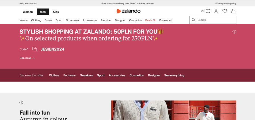
If a key benefit like this is what sets you apart, be sure to market it well on your homepage design for ecommerce. Don’t bury it in the FAQ or wait until checkout to mention it.
2. Show recommended products
If someone visits your homepage, they are either looking for something specific or just browsing.
Catering for the first group doesn’t make much sense — they already have a specific goal in mind. The browsers, on the other hand, are those who are:
- Interested in your brand but don’t have a specific product in mind
- Just bored and are browsing
- Looking for inspiration or new items for their Christmas list
Don’t leave them hanging. For these browsers, the homepage design for ecommerce websites should act like a curated category page, offering easy access to the latest and best products.
Take Nike, for example.
When you land on their homepage, you’ll see it’s designed not only to show the newest releases and categories — they make it easy for you to see their top sellers and latest products. Homepage or not, you are still two clicks away from the checkout:
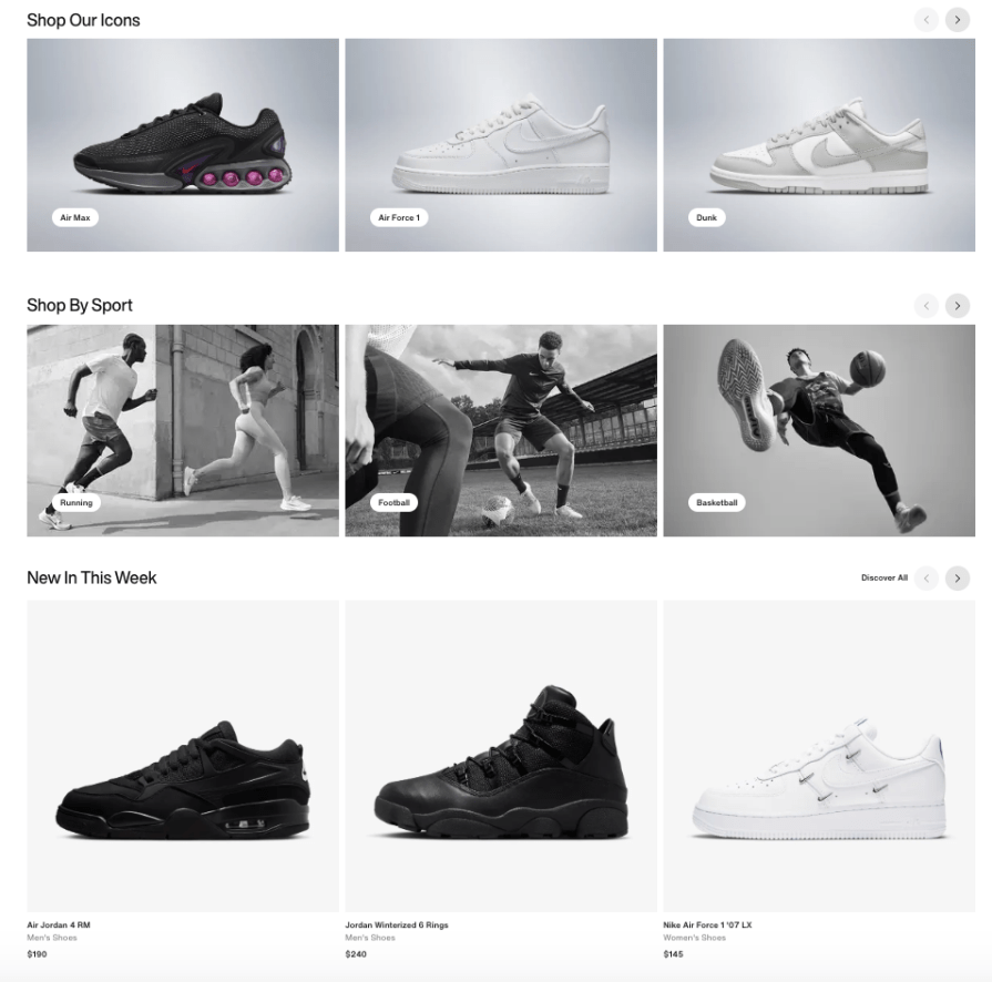
In other words, your homepage is also the category page for your best products. Make use of it.
Pro tip — be extremely selective about what you put on the homepage. Ensure that the products you list have great photos and descriptions and, most importantly, are in stock. If you fail to showcase quality on your homepage, why would people trust there’s quality on other, lower-priority pages? Your homepage is your chance to build trust and credibility with your customers.
3. Consider a product-oriented hero section
There are two approaches to homepage design for ecommerce — with or without a hero section.
Hero sections usually don’t work for e-commerce sites that sell a wide variety of products for different user personas. Let’s take a look at Amazon.com:
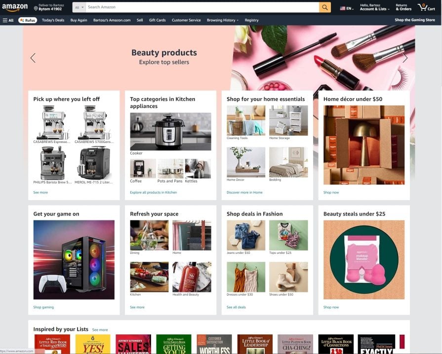
You land on a page listing various categories and products — none truly shines. That makes sense because finding the best product to promote to Amazon.com customers is hard. Their customer base is just too diverse.
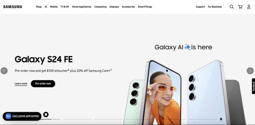
It’s a different story for Samsung, though.
If you visit Samsung’s homepage directly, you will most likely know what they are all about and will be looking for the newest and shiniest. In this case, it makes sense for Samsung to have a carousel with a few flagship products as a hero section.
Odds are that most of their visitors look for one of these anyway, so why not make it flashy? Why not make buyers feel special?
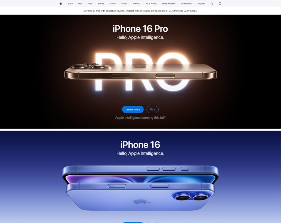
It’s the same story with Apple. You don’t visit their homepage to look for a three-year-old model. You want to feel special when buying the newest product directly from Apple, right?
You don’t have to have your products to use this approach. You just need to promote something that will resonate with a large percentage of your visitors.
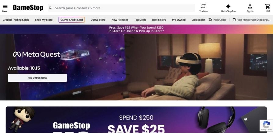
For example, who visits GameStop? Gamers. What are most gamers interested in? Either the latest game release or gaming hardware release.
It makes sense for GameStop to promote the latest Meta Quest 3S release.
As a rule of thumb, if you can find a product that will resonate with most of your visitors, create a hero section on the homepage. If your customers are too diverse to like the same thing, ditch the hero section.
4. Nail the navigation
Make it easy and intuitive to land on the right category pages for people who won’t buy directly from your homepage.
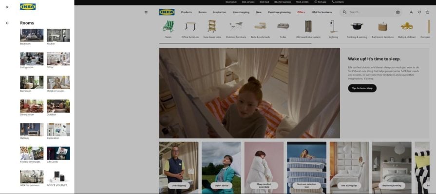
IKEA, a European furniture store, does this really well.
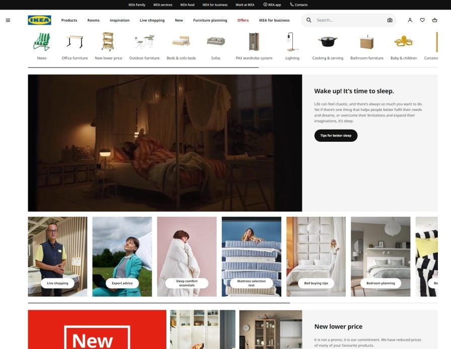
When you land on the homepage, you can immediately see their most commonly visited categories at the top of the page. The pictures make navigation on e-commerce sites easier too.
But the magic happens for people looking for something specific. What’s the most natural framing you use to decide what to buy furniture? Where does the furniture piece go, right? Is it a bedroom item? Kitchen item? Office item?
IKEA taps into that pattern and organizes its category pages by room, making it very intuitive to land on the appropriate subpage.
What if you’re looking for something particular, though? No problem, IKEA also nailed nested menus.
You start by choosing a high-level category, say, “Children’s room products,” and then you can define if you are looking for textiles, lighting, toys, or beds. Let’s say you’re looking for general furniture, and there is yet another layer of sub-categories:
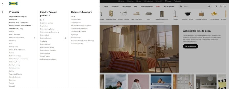
From the homepage, people can directly access a detailed sub-category, such as “toy storage” or “children’s tools. ”
As complex as it might seem, it’s ultimately better UX — it doesn’t force users to click through three different sub-pages to get where they want. And if someone’s in the mood to explore, they can always choose from the room categories I showed earlier.
5. Add social proof
Another type of homepage visitor is the cautious buyer who wants to understand better who they transact with. This is especially relevant for small e-commerce websites that sell their own brand.
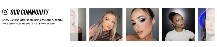
BeautyBay, for example, uses Instagram photos on its homepage design for ecommerce to showcase real customers using their products, offering immediate validation for first-time buyers.
The smaller and more niche your inventory, the more social proof you need. People generally don’t like to “feel alone” doing something, like purchasing a specific product.
6. Create FOMO
Although fear of missing out (FOMO) is a psychological principle most UX designers don’t like to use, let’s face it — at the end of the day, we run online e-commerce to earn money, and FOMO usually prompts users to make that purchase.
The good news is that you don’t have to go all-in with flashy headers, big counters, and top banners telling people to buy within 60 seconds.
Sometimes, more subtle FOMO prompts, such as “2 days only!” on some product placements, are enough. Walgreens does just that:
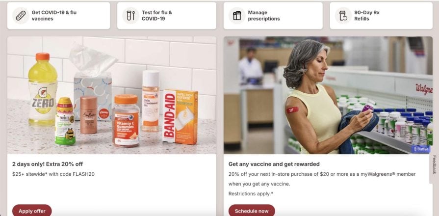
Nothing boosts e-commerce results more than multiple time-limited promotions, but don’t go overboard. Too much FOMO will scare people away.
7. Pop-ups work when used right
As much as pop-ups are an intrusive UI element, they work — that is if they come with a discount.
I’ve yet to come across an A/B test in which a discount doesn’t significantly boost conversions and sales.
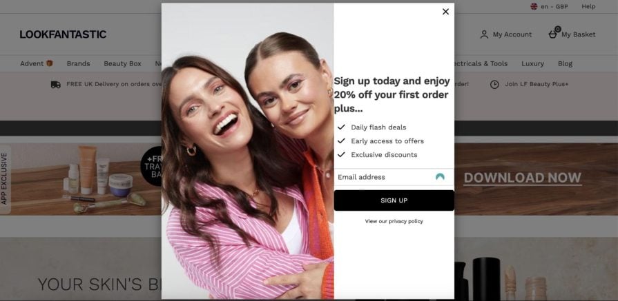
Surprisingly, when tested with just the FOMO discount itself (e.g., get 20% off on your first order, only for the next 24 hours), those pop-ups didn’t perform that much worse, and if you had both at the same time, the cumulative ROI was always the winner.
My theory? There is something about “earning” your discount (e.g., by subscribing to a newsletter) rather than just getting it like everyone else.
Just be sure your pop-ups offer real value (like a discount or exclusive offer), and avoid using them too frequently.
8. Optimize for SEO
SEO likes cross-page links. The catch? Users don’t.
You must decide whether your homepage is primarily SEO-friendly or user-friendly.
If many users visit your homepage, for example, as a starting point of exploration (like Zalando or Apple), focus on the user — all UX principles will apply here. And you can still optimize it — combine SEO and UX by adding hyperlinks here and there, but try to do it in a way that’s not too invasive.
On the other hand, if people rarely use your homepage, you can go all-in with hyperlinks. Just take a look at how Amazon does this:
And this is just a section of their ecommerce homepage design. There are more than a hundred links to products of different categories.
But we already established that no one goes to Amazon’s homepage directly, and if some people do, they are too diverse a group to properly target anyway, so why bother?
If your potential customers don’t visit your homepage anyway, you might as well derive SEO ranking from it, right?
Closing thoughts: The problem with e-commerce best-case practices
I’ll put it simply — you can’t just “best practice” your way to a successful e-commerce homepage design.
Differences in the markets you serve, products you offer, and customers you sell demand that you make your e-commerce business — and your ecommerce homepage design — unique. That’s why designers in ecommerce love A/B testing — we love scientifically discovering what works in our particular context.
So keep that in mind when implementing best practices of any kind. They say best practices don’t work everywhere, and this is even more true for ecommerce.
Use the practices from my list as inspiration and a starting point to design your first experiments. If you are starting from scratch or have a bad homepage, implementing these practices will help.
But once you have some fundamentals in place, you are on your own. Focus on research and testing, and if your learnings contradict some of the practices listed here, go ahead and don’t look back.
You won’t win in e-commerce just by copying others!