Matcha, a famous green tea, is known for its stress-reducing benefits. I wouldn’t claim that this tea necessarily inspired the library name I’ll be discussing with you, but the similar naming is a little coincidental as the library also saves us developers from some unnecessary stress.
So let’s shine a light on the benefits, concepts, and components of matcha.css to see how developers can introduce it to their projects.
If you want HTML elements to go from this:
To this:
Without having to write a line of CSS, then stick around.
A brief overview of matcha.css
matcha.css is a pure CSS library designed to style HTML elements similarly to a default browser stylesheet. This means it applies basic styling to elements, so instead of having just this:
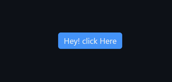
You can save yourself the stress of styling something so easy as a button by just linking Matcha’s stylesheet and having this:

(Not to mention a bonus hover effect):
matcha.css doesn’t take away your freedom to uniquely style anything. For example, I can simply add this line of code:
button{
    border-radius: 0;
    background-color: #fff;
}
And get this:

Now that we have seen the simplicity it brings, let’s explore when exactly we should use this time-saving library.
Use cases
According to the library creators, the following are good times to use matcha.css:
- Fast prototyping
- Static HTML pages
- Markdown-generated documents
Let’s move on to learn more about other matcha.css benefits:
Technical benefits
We know matcha.css saves time and effort, but how exactly does it do this?
Here’s a list of how the library works:
matcha.csshelps developers streamline their workflow without having to dive into CSS intricaciesmatcha.csshas huge support for a full range of HTML elements, so there is a chance every element you will use in your project is already styled- The library has no build steps
- It has no dependencies
- It does not need JavaScript
- It needs no extra configuration or refactoring
- It is lightweight and only takes up 8.8kB of your project size; there are plans to reduce this size even further
Key features of matcha.css
In addition to matcha.css being open source under the MIT License, it has several other key features.
Responsiveness
Elements are styled to be responsive no matter the screen size.
Agnostic
The library works well with any type of document and covers more HTML elements than similar libraries. It stays out of the way of the existing structure of your HTML elements by using CSS pseudo-elements.
Reversible
You can start using it just by adding a simple <link rel="stylesheet"> tag, and it can easily be done away with at any time without having to change or clean up your document.
Semantic
The library styles elements based on how they are structured, offering helpful behaviors like showing submenus when <menu> elements are nested or adding a required field indicator (*) when a <label> is linked to a required <input>.
Customizable
matcha.css gives developers the liberty to build or pick only the features they need, making the final file smaller and tailored to your project. To do this, navigate to the build page, play around with the long list of styling scopes, features, customization, and miscellaneous, and when done, preview and get your brewed matcha.css stylesheet.
For more deep-level customization, you may consider forking and directly patching it yourself. It’s nice to know that matcha.css never uses !important rules, ensuring ease of style overriding if necessary.
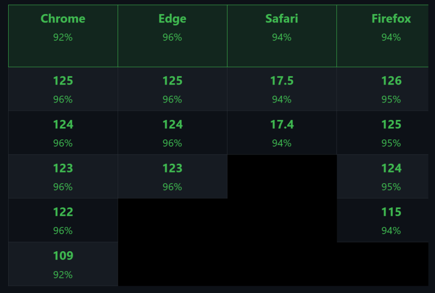
Browser support
Matcha was built to ensure compatibility with browsers, and below is the result of this compatibility:
Getting started
To integrate matcha.css into your project, you only have to add this:
<link rel="stylesheet" href="https://matcha.mizu.sh/matcha.css" />
Add it to the head of your HTML, and you are good to go. It is important to note that the default background color is black (#000000).
Basic core components
Various CSS component libraries have minor differences in looks. In matcha.css, those looks are determined by the elements or pseudo-class. matcha.css has a wide range of highly customizable components we can utilize in our day-to-day development.
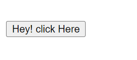
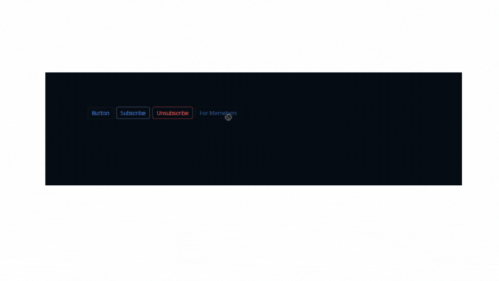
Buttons
Buttons are designed to have rounded corners and borders. These buttons can be styled using both states (like :disabled and :hover) and classes (like .default, .variant, .active, etc.):
- States — These are pseudo-classes such as
:disabledand:hoverthat apply styles based on the button’s interaction state. For example,:disabledmakes the button appear semi-transparent and changes the cursor to not-allowed, while:hovermodifies the button’s background when the user hovers over it - Classes — These are specific names given to buttons (
.default,.variant,.active, etc.) to apply different color schemes or styles, representing different themes or states like success, attention, danger, etc.
<!-- Button styles -->
<button type="button">Button</button>
<button type="submit">Subscribe</button>
<button type="reset">Unsubscribe</button>
<button disabled="disabled" type="button">For Members</button>
</ul>
This is what it looks like:
Forms
You will probably find a form on any website, so it is important not to always style one from scratch. matcha.css has been able to assist with this as well. Its forms have rounded corners, a background, and an automatic overflow. Let’s create a Contact form using matcha.css. If you take the code below:
<!-- Forms styles -->
<h2>Contact Us</h2>
<form method="get" onsubmit="event.preventDefault()">
    <!-- Name Field -->
    <label for="name">Name:</label><br>
    <input type="text" id="name" name="name" required><br><br>
    <!-- Email Field -->
    <label for="email">Email:</label><br>
    <input type="email" id="email" name="email" required><br><br>
    <!-- Phone Number Field -->
    <label for="phone">Phone Number:</label><br>
    <input type="tel" id="phone" name="phone"><br><br>
    <!-- Message Field -->
    <label for="message">Message:</label><br>
    <textarea id="message" name="message" rows="4" cols="50"></textarea><br><br>
    <!-- Select Field -->
    <label for="inquiry">Type of Inquiry:</label><br>
    <select id="inquiry" name="inquiry">
        <option value="general">General Inquiry</option>
        <option value="support">Support</option>
        <option value="sales">Sales</option>
    </select><br><br>
    <!-- Checkbox Field -->
    <input type="checkbox" id="subscribe" name="subscribe">
    <label for="subscribe">Subscribe to our newsletter</label><br><br>
    <!-- Submit Button -->
    <input type="submit" value="Submit">
</form>
And paste it into your HTML file where matcha.css has been linked, you will have this:
Menu
A menu is another reusable component we get to see more often.
Navigation menu
So if we take the code below and paste it:
<nav>
  <menu>
    <li>
      <li class="selected"><a href="#">logrocket</a></li>
      <li><a href="#">logrocket</a></li>
      <li><a href="#">logrocket</a></li>
    </li>
  </menu>
</nav>
We get this image below:
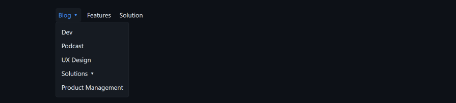
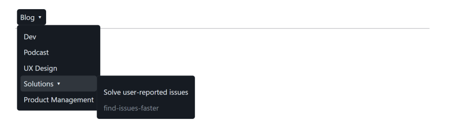
Dropdown menu
We do the same with this:
<!-- Dropdown Menu styles -->
<nav>
  <menu>
    <li>
      <li class="selected">Blog
        <menu>
          <li>Dev</li>
          <li>Podcast</li>
          <li>UX Design</li>
          <li>Solutions
            <menu>
              <li>Solve user-reported issues</li>
              <li class="disabled">find-issues-faster</li>
            </menu>
          </li>
          <li>Product Management</li>
        </menu>
      </li>
      <li class=""><a href="#">Features</a></li>
      <li><a href="#">Solution</a></li>
    </li>
  </menu>
</nav>
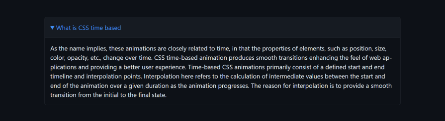
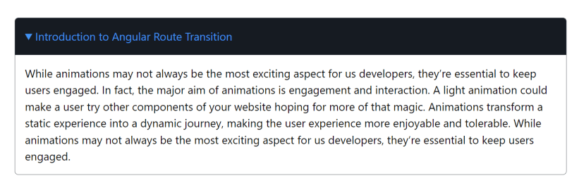
Collapsible
Collapsibles have borders, and by attaching open state, you automatically trigger a collapsible style. Take this LogRocket text as an example to see how it’s implemented:
<!-- Collapsible styles -->
<details class="m-10" open>
  <summary>Introduction to Angular Route Transition</summary>
  <p class="text-black">
    While animations may not always be the most exciting aspect for us developers, they're essential to keep users engaged.
    In fact, the major aim of animations is engagement and interaction. A light animation could make a user try other components
    of your website hoping for more of that magic. Animations transform a static experience into a dynamic journey, making the user
    experience more enjoyable and tolerable. While animations may not always be the most exciting aspect for us developers,
    they're essential to keep users engaged.
  </p>
</details>
This is what it looks like:
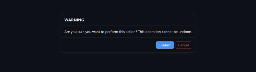
Modals
Modals consist of <dialog> elements which represent a dialog modal with capped size, box shadows, and borders featuring rounded corners plus display a ::backdrop when dialog.showModal() is called. If we copy the code below:
<!-- Modals styles -->
<dialog open>
  <header>
    <h2>WARNING</h2>
  </header>
  <p>Are you sure you want to perform this action? This operation cannot be undone.</p>
  <footer>
    <form method="dialog">
      <button type="submit">Confirm</button>
      <button type="reset">Cancel</button>
    </form>
  </footer>
</dialog>
We will get this result below:
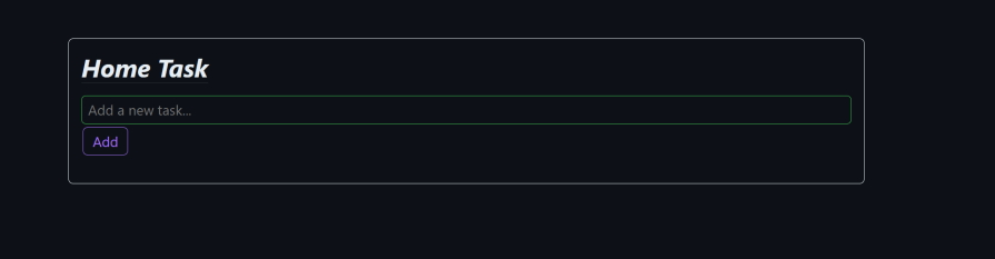
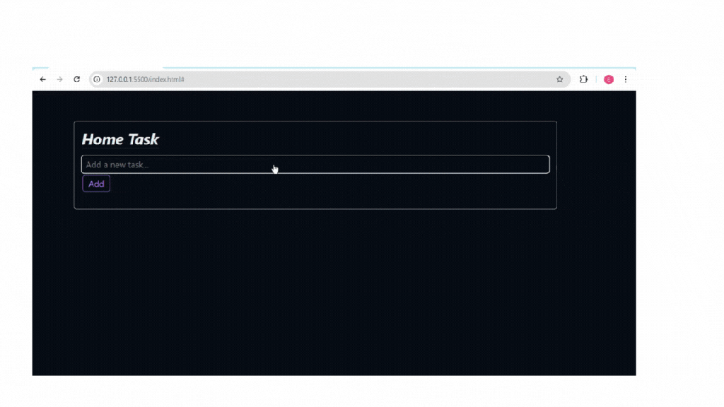
Building an application with matcha.css
Let’s get our hands a little bit dirty using matcha.css by building a simple to-do app that adds, deletes, edits, and shows items that have been completed.
We start by linking to the external CSS file so we can have access to its properties:
<link rel="stylesheet" href="https://matcha.mizu.sh/matcha.css" />To spin up a quick to-do interface, feel free to copy the code below:
<body>
  <div class="flash default">
    <div class="container">
      <header>
        <h1 class="italic">Home Task</h1>
      </header>
      <div class="input-container">
        <input type="text" id="todo-input" placeholder="Add a new task..." />
        <button class="active" id="add-btn">Add</button>
      </div>
      <ul id="todo-list"></ul>
    </div>
  </div>
  <script src="script.js"></script>
</body>
In the code above, matcha.css classes like flash default, italic, and active were used for basic layouts and styling, and this is what it looks like:
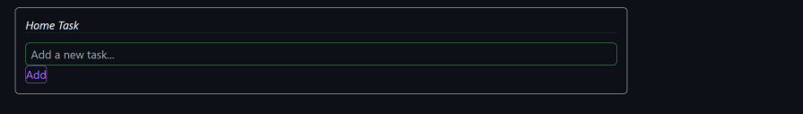
Let’s add the to-do functionality and make it work:
document.addEventListener("DOMContentLoaded", function () {
  const todoInput = document.getElementById("todo-input");
  const addBtn = document.getElementById("add-btn");
  const todoList = document.getElementById("todo-list");
  addBtn.addEventListener("click", function () {
    const taskText = todoInput.value.trim();
    if (taskText) {
      addTask(taskText);
      todoInput.value = "";
    }
  });
  function addTask(taskText) {
    const li = document.createElement("li");
    const taskSpan = document.createElement("span");
    taskSpan.textContent = taskText;
    li.appendChild(taskSpan);
    const completeBtn = document.createElement("button");
    completeBtn.textContent = "✔";
    completeBtn.classList.add("success");
    li.appendChild(completeBtn);
    const editBtn = document.createElement("button");
    editBtn.textContent = "✎";
    editBtn.classList.add("edit-btn");
    li.appendChild(editBtn);
    const deleteBtn = document.createElement("button");
    deleteBtn.type = "reset";
    deleteBtn.textContent = "✘";
    deleteBtn.classList.add("delete-btn");
    li.appendChild(deleteBtn);
    completeBtn.addEventListener("click", function () {
      li.classList.toggle("strikethrough");
    });
    editBtn.addEventListener("click", function () {
      const newTaskText = prompt("Edit your task:", taskText);
      if (newTaskText) {
        taskSpan.textContent = newTaskText.trim();
      }
    });
    deleteBtn.addEventListener("click", function () {
      li.remove();
    });
    todoList.appendChild(li);
  }
});
The code above is programmed to enable users to create, edit, complete, and delete tasks. When the add button is clicked, the addTask function creates the complete, edit, and delete buttons. This is where Matcha plays a unique role.
First off, adding matcha.css in the HTML file enables every future HTML element to be automatically styled by default. Later on, when we create the edit or delete button during a task, matcha.css will automatically implement the styling. If anything, we may just need to add its matcha.css type or class.
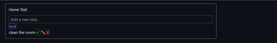
In normal circumstances, we create a class for these buttons. Let’s say we want line-through text decoration on any task we have completed. We would have to create the class in JavaScript and style it in CSS:
completeBtn.addEventListener("click", function () {
  li.classList.toggle("strikethrough");
});
With matcha.css, we do not need to go through the whole styling stress, as it gives us a strikethrough class for such an effect, as seen above.
We also used match.css for more styling as seen in the code below:
const completeBtn = document.createElement("button");
completeBtn.textContent = "✔";
completeBtn.classList.add("success");
li.appendChild(completeBtn);
The success class added above gives the button a green background whenever we hover over it. The delete button wasn’t left alone in the styles:
const deleteBtn = document.createElement("button");
deleteBtn.type = "reset";
deleteBtn.textContent = "✘";
deleteBtn.classList.add("delete-btn");
li.appendChild(deleteBtn);
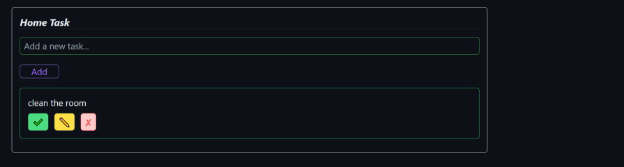
In the delete button, we added a matcha.css button type called reset. All it does is style the button border red, and when we hover over it, it turns red too. At the end of it all, this is what our to-do application looks like:
The ✔ button toggles a strikethrough effect on the task, indicating it has been completed. The ✎ button prompts the user to edit the task’s text, while the ✘ button removes the task entirely from the list.
We have been able to see matcha.css in a real-world project, and despite the application being small, it is very effective. But how does it perform when going head-to-head with a similar library?
How to combine matcha.css with other CSS libraries
If you want to know if combining matcha.css with other libraries is possible, the straight answer is yes, but there are conflicts. While matcha.css is mostly intended to be used along with semantic styling, the Matcha team advises that it is not a full-utility CSS framework and asks users to opt or consider using (or switching to) a utility-first CSS framework if you find the provided utility classes lacking or too limited.
When we attach Tailwind CSS’s script to an HTML file with Matcha originally in use, it overwrites some designs, like our projects after attaching this file:
<script src="https://cdn.tailwindcss.com"></script>
It looks like this:
The right way to be in the mix with these CSS frameworks is to use them for what they are for — matcha.css is not a CSS out-of-the-box utility class framework. Rather, it applies custom styles to individual elements, and this is what it should be used for.
Compare that to Tailwind which is a CSS out-of-the-box utility class framework, and therefore it should be used to personalize your design. For example, you may not be a fan of Matcha’s input styling, but then you prefer with the button styles. In this case, Tailwind should be used for the inputs and matcha.css should be use for the buttons.
Here’s an example where Tailwind ruins some matcha.css styles:
With a few Tailwind edits like this:
document.addEventListener("DOMContentLoaded", function () {
  const todoInput = document.getElementById("todo-input");
  const addBtn = document.getElementById("add-btn");
  const todoList = document.getElementById("todo-list");
  addBtn.addEventListener("click", function () {
    const taskText = todoInput.value.trim();
    if (taskText) {
      addTask(taskText);
      todoInput.value = "";
    }
  });
  function addTask(taskText) {
    const li = document.createElement("li");
    // Add light green border and padding to list items
    li.classList.add(
      "border",
      "border-green-500",
      "p-4",
      "rounded-md",
      "mb-3",
      "shadow-sm",
      "mt-5"
    );
    const taskSpan = document.createElement("span");
    taskSpan.textContent = taskText;
    li.appendChild(taskSpan);
    // Button container with flex and spacing
    const buttonContainer = document.createElement("div");
    buttonContainer.classList.add("flex", "space-x-3", "mt-2");
    // Complete button with softer contrast
    const completeBtn = document.createElement("button");
    completeBtn.textContent = "✔";
    completeBtn.classList.add(
      "bg-green-400",
      "text-white",
      "px-2",
      "py-1",
      "rounded-md",
      "hover:bg-green-500",
      "focus:outline-none",
      "shadow-sm"
    );
    buttonContainer.appendChild(completeBtn);
    // Edit button with less aggressive yellow
    const editBtn = document.createElement("button");
    editBtn.textContent = "✎";
    editBtn.classList.add(
      "bg-yellow-300",
      "text-gray-800",
      "px-2",
      "py-1",
      "rounded-md",
      "hover:bg-yellow-400",
      "focus:outline-none",
      "shadow-sm"
    );
    buttonContainer.appendChild(editBtn);
    // Delete button with a softer red
    const deleteBtn = document.createElement("button");
    deleteBtn.type = "reset";
    deleteBtn.textContent = "✘";
    deleteBtn.classList.add(
      "bg-red-200",
      "text-white",
      "px-2",
      "py-1",
      "rounded-md",
      "hover:bg-red-500",
      "focus:outline-none",
      "shadow-sm"
    );
    buttonContainer.appendChild(deleteBtn);
    li.appendChild(buttonContainer);
    completeBtn.addEventListener("click", function () {
      li.classList.toggle("strikethrough");
    });
    editBtn.addEventListener("click", function () {
      const newTaskText = prompt("Edit your task:", taskText);
      if (newTaskText) {
        taskSpan.textContent = newTaskText.trim();
      }
    });
    deleteBtn.addEventListener("click", function () {
      li.remove();
    });
    todoList.appendChild(li);
  }
});
Then we can have this:
Now we have seen how we can easily use matcha.css with Tailwind. Let’s look at how it performs against its peers.
Matcha CSS vs. Pico CSS
We can see how matcha.css performs against Pico CSS:
| Comparison | Matcha CSS | Pico CSS |
|---|---|---|
| Semantic | ✔ | ✔ |
| Customizable | ✔ | ✔ |
| Open source | ✔ | ✔ |
| Theming | ✘ (Not inbuilt) | ✔ |
| Classes for styling | ✔ | ✔ |
| Responsiveness | ✔ | ✔ |
| Available on CDN and NPM | ✔ | ✔ |
| License | MIT License | MIT License |
| Utility CSS framework | Less support, as its original intent goes against it. | ✔ |
Conclusion
matcha.css holds its ground when it comes to styling HTML and is a solid option even after evaluation.
We’ve explored its use cases and how it can effectively fit into our project. It’s also important to note that matcha.css isn’t trying to compete as a full-utility CSS framework. If its built-in utilities feel too limited for your needs, the creators recommend considering a utility-first CSS framework as an alternative.