
One of the key steps in data analysis is data visualization, as it helps you notice certain features, tendencies, and relevant patterns that may not be obvious in raw data. Matplotlib is one of the most effective libraries for Python, and it allows the plotting of static, animated, and interactive graphics.
This guide explores Matplotlib's capabilities, focusing on solving specific data visualization problems and offering practical examples to apply to your projects.
Here’s what we are going to cover in this article:
Importance of Data Visualization in Data Analysis
Brief Overview of Matplotlib
Getting Started with Matplotlib
Installation and Setup
How to Create Your First Plot
Exploring Different Types of Plots
Advanced Plot Customizations
How to Work with Multiple Plots
How to Enhance Plot Aesthetics
How to Save and Export Plots
Interactive Plotting and Animation
Interactive Features in Matplotlib
How to Create Animations
How to Optimize Plots for Large Datasets
Efficient Plotting Techniques for Large Datasets
Statistical Data Visualization
Common Visualization Pitfalls and How to Avoid Them
Overplotting
Misleading Scales and Axes
Color Misuse
Misleading Use of 3D Plots
Misleading Use of Area Charts
Conclusion
Importance of Data Visualization in Data Analysis
Assuming that you are dealing with the sales data of a big chain of stores. Raw data may contain hundreds or thousands of rows, with possible columns such as product categories, sales regions, and monthly revenues. These useful concepts and raw data analytical approaches present the data in a very complex manner which can be estranged for anyone to undertake.
However, by visualizing the data, you can have a broad view of what is likely to be occurring, such as, which product category is succeeding, or which region is lagging.
Data visualization is a process of getting data into more easily comprehensible and analyzable forms for decision-making. Matplotlib is particularly effective at addressing these challenges for data scientists and analysts, due to the vast number of plot types and possible alterations that are available.
Brief Overview of Matplotlib
Matplotlib, which is now one of the most popular plotting software currently running in the Python environment, was started by John Hunter in the year 2003. With it, one can obtain various forms of static, dynamic, and even animated plots, making it an indispensable tool for any scientist, engineer, or data analyst.
Some common problems that Matplotlib can help solve include:
Visualize large datasets to identify patterns and outliers.
Design exemplary complex graphics for the publication of academic articles.
Combining data gathered from different sources into interactive and informative illustrations.
Adapting trends in plots to make clear the information that is being portrayed.
Installation and Setup
Before we dive into creating plots, let's get Matplotlib installed and set up. You can install Matplotlib using pip or conda:
pip install matplotlib
Alternatively, if you're using Anaconda:
conda install matplotlib
To verify the installation:
import matplotlib
print(matplotlib.__version__)
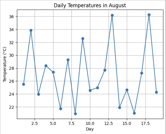
How to Create Your First Plot
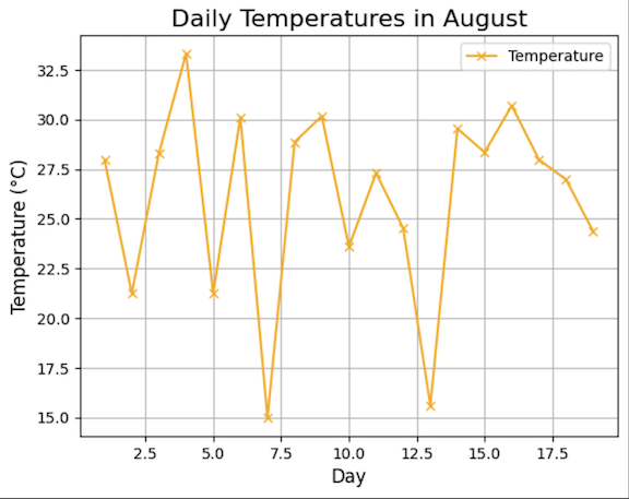
Let’s start by solving a common problem: let’s assume that you have a set of data that records daily temperature for a given month, and you want to study the variation of temperature.
Here’s how you can create a simple line plot to visualize this trend:
import matplotlib.pyplot as plt
import numpy as np
# Simulating daily temperature data
days = np.arange(1,20)
temperature = np.random.normal(loc=25, scale=5, size=len(days))
plt.plot(days, temperature, marker='o')
plt.title('Daily Temperatures in August')
plt.xlabel('Day')
plt.ylabel('Temperature (°C)')
plt.grid(True)
We used
np.arangeto construct a series of days.np.random.normalmodels temperature data with a mean (loc) equaling 20 degrees Celsius and a standard deviation (scale) equal to 5 degrees Celsius.plt.plotcreates a line plot with markers for each day.Titles and labels were added to make the plot informative.
Exploring Different Types of Plots
Matplotlib supports various plot types, each suited to specific data visualization problems.
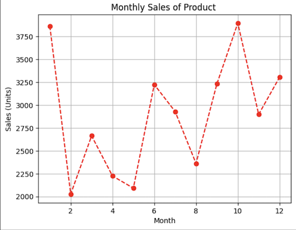
Line Plots
Line plots are ideal for visualizing trends over time or continuous data. For example, tracking the monthly sales of a product:
months = np.arange(1,13)
sales = np.random.randint(2000, 4000, size=len(months))
plt.plot(months, sales, color='red', linestyle='--', marker='o')
plt.title("Monthly Sales of Product ")
plt.xlabel("Month")
plt.ylabel("Sales (Units)")
plt.grid(True)
plt.show()
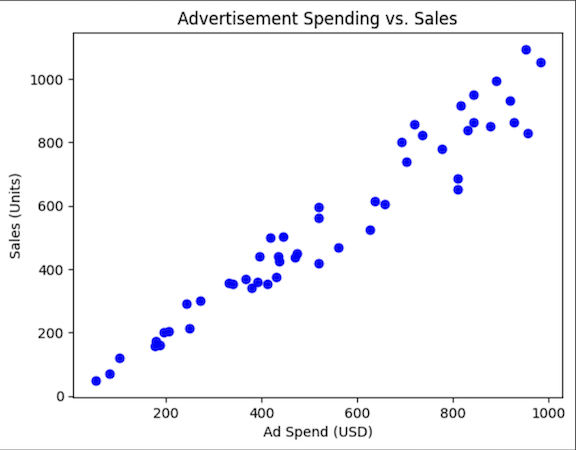
Scatter Plots
They are used for the construction of simple relations between two variables of data where the appearance of the points are compared. For instance, visualizing the relationship between advertisement spending and sales:
ad_spend = np.random.randint(50, 1000, size=50)
sales = ad_spend * np.random.uniform(0.8, 1.2, size=50)
plt.scatter(ad_spend, sales, color='blue')
plt.title("Advertisement Spending vs. Sales")
plt.xlabel("Ad Spend (USD)")
plt.ylabel("Sales (Units)")
plt.show()
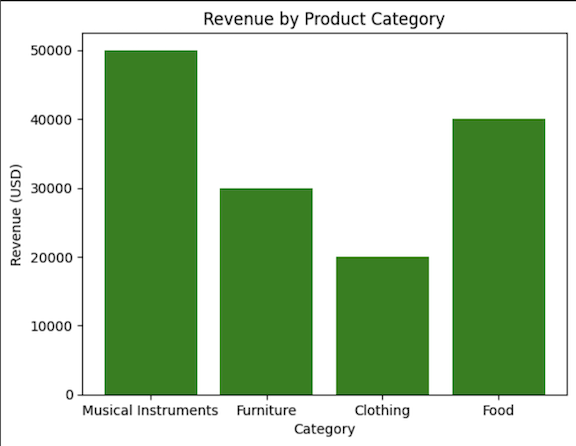
Bar Charts
Bar charts are effective for comparing categorical data. For example, visualizing the total revenue generated by several product groupings:
groupings = ['Musical Instruments', 'Furniture', 'Clothing', 'Food']
revenue = [50000, 30000, 20000, 40000]
plt.bar(groupings, revenue, color='green')
plt.title("Revenue by Product Grouping")
plt.xlabel("Group")
plt.ylabel("Revenue (EURO)")
plt.show()
Histograms
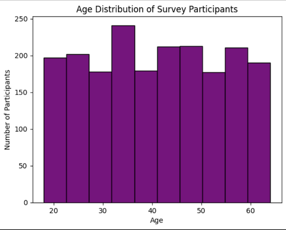
They are used to view the distribution of numerical data based on frequency. For example, visualizing the distribution of customer ages in a survey:
ages = np.random.randint(18, 65, size=2000)
plt.hist(ages, bins=10, color='purple', edgecolor='black')
plt.title("Age Distribution of Survey Participants")
plt.xlabel("Age")
plt.ylabel("Number of Participants")
plt.show()
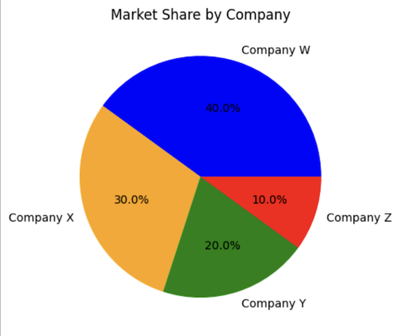
Pie Charts
Pie charts are used to display the percentages of data in graphical format. For example, visualizing the market share of different companies:
companies = ['Company W', 'Company X', 'Company Y', 'Company Z']
market_share = [40, 30, 20, 10]
plt.pie(market_share, labels=companies, autopct='%1.1f%%', colors=['blue', 'orange', 'green', 'red'])
plt.title("Market Share by Company")
plt.show()
Advanced Plot Customizations
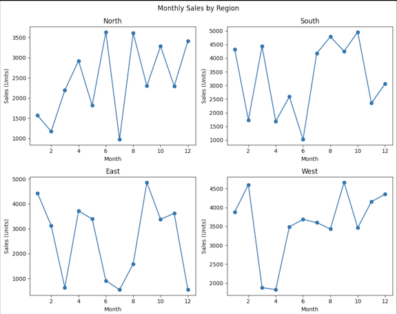
How to Work with Multiple Plots
In some situations, you’ll be required to compare multiple datasets in a single figure. For example, comparing sales trends across different regions. This can be achieved using subplots:
regions = ['North', 'South', 'East', 'West']
sales_data = np.random.randint(500, 5000, size=(4, 12))
fig, axs = plt.subplots(2, 2, figsize=(10, 8))
fig.suptitle('Monthly Sales by Region')
for i, region in enumerate(regions):
    ax = axs[i // 2, i % 2]
    ax.plot(months, sales_data[i], marker='o')
    ax.set_title(region)
    ax.set_xlabel("Month")
    ax.set_ylabel("Sales (Units)")
plt.tight_layout()
plt.show()
How to Enhance Plot Aesthetics
Among the typical options for common plotting is the possibility to control the appearance of a plot to make it informative and aesthetically pleasing.
Here’s an example:
plt.plot(days, temperature, color='orange', marker='x', linestyle='-')
plt.title("Daily Temperatures in August", fontsize=16)
plt.xlabel("Day", fontsize=12)
plt.ylabel("Temperature (°C)", fontsize=12)
plt.grid(True)
plt.legend(['Temperature'], loc='upper right')
plt.annotate('Coldest Day', xy=(5, 10), xytext=(7, 5),
             arrowprops=dict(facecolor='black', arrowstyle='->'))
plt.show()
The code changes colors and markers, line styles, titles, and axis labels of the desired font size, grid on, adds legend and annotates the coldest day by an arrow. These improvements make the plot informative and neat and as a result, a professional and clear message would be delivered.
How to Save and Export Plots
Once you've created a plot, you might need to save it in a specific format for a report or presentation. Below is an example on how to save plots efficiently:
plt.plot(days, temperature)
plt.title("Daily Temperatures in August")
plt.xlabel("Day")
plt.ylabel("Temperature (°C)")
# Saving the plot
plt.savefig("daily_temperatures_august.png", dpi=300, bbox_inches='tight')
plt.savefig("daily_temperatures_august.pdf", format='pdf', bbox_inches='tight')
The dpi parameter controls the resolution of the saved plot, and bbox_inches='tight' ensure that the plot is saved without extra whitespace.
Interactive Plotting and Animation
Interactive Features in Matplotlib
You can also make your plots interactive. For example, rather than viewing an entire plot, one might move closer to a region of interest, or when the plot has to be changed in some way because of the user input.
import matplotlib.pyplot as plt
import numpy as np
x = np.linspace(0, 10, 100)
y = np.cos(x)
fig, ax = plt.subplots()
ax.plot(x, y)
def on_click(event):
    # This function is called when the plot is clicked
    print(f"The Coordinates were clicked at: ({event.xdata}, {event.ydata})")
fig.canvas.mpl_connect('button_press_event', on_click)
plt.show()
The code generates a cosine wave plot and sets a click event handler on it with the on_click name. Once you click anywhere on the plot, the handler prints the coordinates of the click on the Python console.
How to Create Animations
Animations can be handy in showing how things evolve. For instance, the increase of a stock price or the incubation period of a disease:
import matplotlib.animation as animation
fig, ax = plt.subplots()
line, = ax.plot(x, y)
def update(frame):
    line.set_ydata(np.cos(x + frame / 10))
    return line,
ani = animation.FuncAnimation(fig, update, frames=range(100), blit=True)
plt.show()
The code forms an animated cosine wave, which over time seems to move horizontally and creates an impression of a wave moving from left or right. Such animations can also be useful if the data should be represented in terms of change with time.
How to Optimize Plots for Large Datasets
The size of the dataset being considered when dealing with big data is characterized by the amount of data, thus, the importance of performance needs to be expressed. It is often too slow and takes much memory to plot large quantities of data. Here are some tips you need to employ to make the most of your plots.
Efficient Plotting Techniques for Large Datasets
Downsampling
In this process, you sample fewer points than what the original plot has.
import matplotlib.pyplot as plt
import numpy as np
# Generate large dataset
x_huge = np.linspace(0, 100, 10000)
y_huge = np.sin(x_huge) + np.random.normal(0, 0.1, size=x_huge.shape)
# Downsample the data
x_downsampled = x_huge[::10]
y_downsampled = y_huge[::10]
plt.plot(x_downsampled, y_downsampled)
plt.title("Downsampled Plot")
plt.xlabel("X")
plt.ylabel("Y")
plt.show()
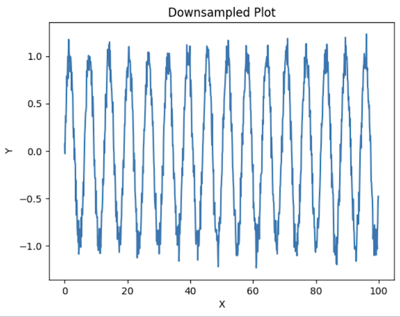
With this, we reduce the number of points to plot the graph on and plot a point after an interval of 10 points. It reduces the load to be rendered but does so without distorting the general structure of the data.
Data Aggregation
Data Aggregation is a process where data gathered in numerical form is grouped into classes to arrive at tabulations of the observations under a given class.
import matplotlib.pyplot as plt
import numpy as np
# Generate large dataset
x_huge = np.linspace(0, 100, 10000)
y_huge = np.sin(x_huge) + np.random.normal(0, 0.1, size=x_huge.shape)
# Aggregate the data into bins
bins = np.linspace(0, 100, 100)
y_aggregated = [np.mean(y_huge[(x_huge >= bins[i]) & (x_huge < bins[i+1])]) for i in range(len(bins)-1)]
plt.plot(bins[:-1], y_aggregated)
plt.title("Aggregated Plot")
plt.xlabel("X")
plt.ylabel("Average Y")
plt.show()
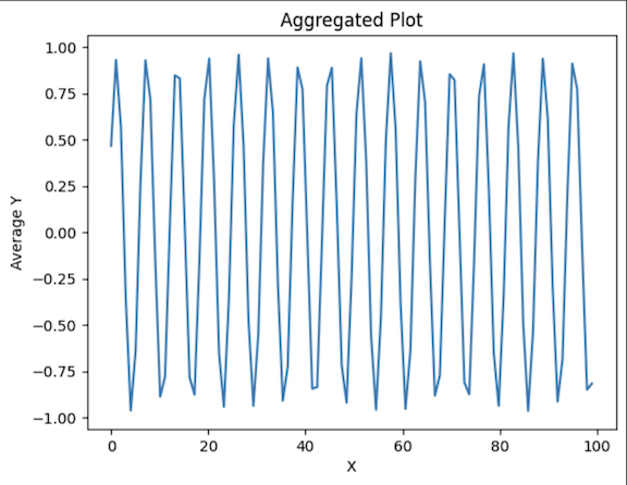
This process reduces the number of data points needed to represent the data distribution, making the plot easier to read and interpret while still capturing the overall trend of the original data.
Statistical Data Visualization
Statistical plots are useful for summarizing and understanding large datasets, some of which include the following:
Box Plots
It displays the data distribution based on a five-number summary: minimum, first quartile, median, third quartile, and maximum.
import matplotlib.pyplot as plt
import numpy as np
# Generate random data
data = np.random.randn(1000)
plt.boxplot(data)
plt.title("Box Plot")
plt.ylabel("Values")
plt.show()
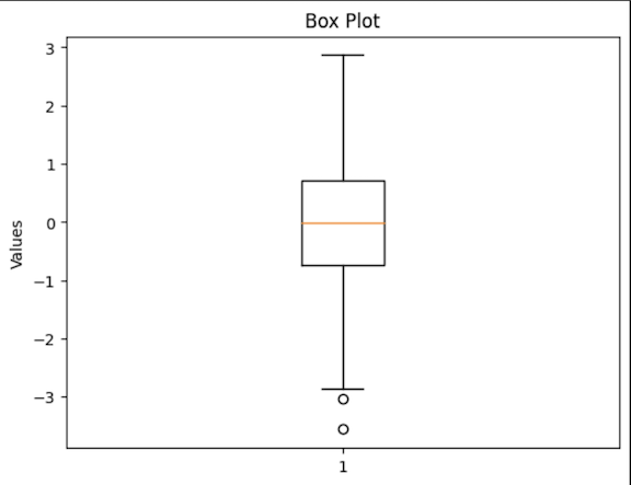
They are especially used in positional outlier detection and the comparison of the dispersion and symmetry of two variables.
Violin Plot
It employs a box plot as well as a density plot to present more specific information regarding the value distribution of the given variables.
import matplotlib.pyplot as plt
import numpy as np
# Generate random data
data = np.random.randn(1000)
plt.violinplot(data)
plt.title("Violin Plot")
plt.ylabel("Values")
plt.show()
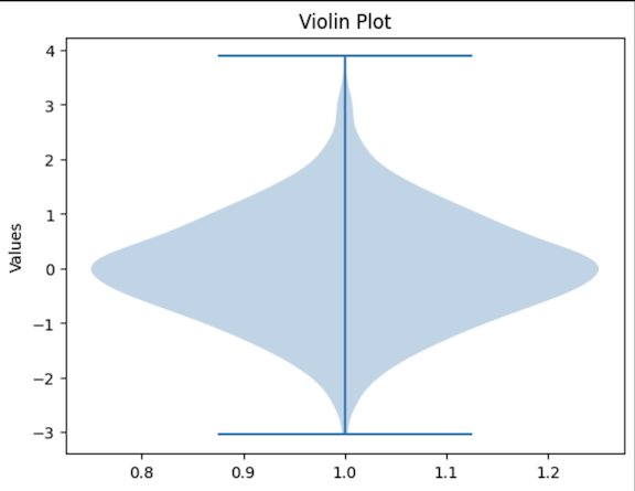
Violin plots can be used when there is a need to represent full distributions.
Common Visualization Pitfalls and How to Avoid Them
Overplotting
A value is rendered over-plotted when many observations are superimposed in the same foreground, which makes the figures messy, and the points or patterns become obscure. This is particularly common in scatter plots or line plots with large datasets.
import matplotlib.pyplot as plt
import numpy as np
# Generate large dataset
x = np.random.rand(10000)
y = np.random.rand(10000)
# Plot without transparency (over-plotting)
plt.scatter(x, y)
plt.title("Scatter Plot with Over-plotting")
plt.xlabel("X")
plt.ylabel("Y")
plt.show()
# Plot with transparency to reduce over-plotting
plt.scatter(x, y, alpha=0.1)  # Set alpha for transparency
plt.title("Scatter Plot with Reduced Over-plotting")
plt.xlabel("X")
plt.ylabel("Y")
plt.show()
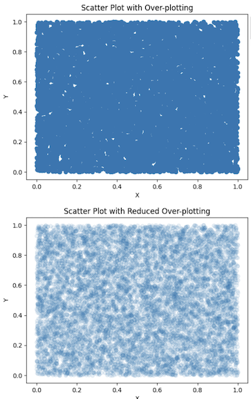
In the first plot, without transparency, the data points overlap significantly, making it hard to identify any patterns or density areas. In the second plot, transparency (alpha=0.1) is applied to the data points, allowing denser regions to become more apparent while reducing clutter. This technique makes it easier to interpret the plot's data distribution.
Misleading Scales and Axes
It is possible to choose the scales and axes in such a way that it changes the overall perception of the plot. Misleading scales mess up the actual picture an analyst gets about the data and leads to making improper conclusions.
import matplotlib.pyplot as plt
import numpy as np
# Generate data
x = np.arange(10)
y1 = np.random.randint(50, 100, size=10)
y2 = y1 + np.random.randint(-5, 5, size=10)
# Plot with truncated y-axis
plt.plot(x, y1, label='Data 1')
plt.plot(x, y2, label='Data 2')
plt.ylim(90, 100)  # Truncated y-axis
plt.title("Plot with Truncated Y-Axis")
plt.xlabel("X")
plt.ylabel("Y")
plt.legend()
plt.show()
# Plot with full y-axis
plt.plot(x, y1, label='Data 1')
plt.plot(x, y2, label='Data 2')
plt.title("Plot with Full Y-Axis")
plt.xlabel("X")
plt.ylabel("Y")
plt.legend()
plt.show()
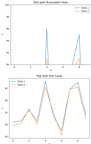
What can be gathered from the first plot is that the range of the y-axis is fixed. This brings out a graph that is quite misleading. The second plot uses the full y-axis, providing a more accurate representation of the data.
Color Misuse
The somewhat weak link in data visualization is the way colors are chosen and, more often than not, used improperly. Issues are low contrasts, picking colors that a color-blind person cannot differentiate, and creating color importance where there is none.
import matplotlib.pyplot as plt
import numpy as np
# Generate data
x = np.linspace(0, 10, 100)
y1 = np.sin(x)
y2 = np.cos(x)
# Plot with non-colorblind-friendly palette
plt.plot(x, y1, color='red', label='sin(x)')
plt.plot(x, y2, color='green', label='cos(x)')
plt.title("Plot with Non-Colorblind-Friendly Colors")
plt.xlabel("X")
plt.ylabel("Y")
plt.legend()
plt.show()
# Plot with colorblind-friendly palette
plt.plot(x, y1, color='#0072B2', label='sin(x)')  # Blue
plt.plot(x, y2, color='#D55E00', label='cos(x)')  # Orange
plt.title("Plot with Colorblind-Friendly Colors")
plt.xlabel("X")
plt.ylabel("Y")
plt.legend()
plt.show()
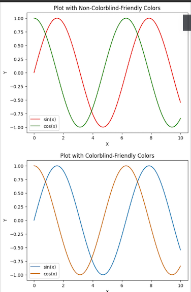
The first plot employs red and green which are notoriously difficult for users with red-green color blindness. The second plot uses a colorblind web-friendly palette to ensure that everyone can understand the plot without being confused by the colors.
Misleading Use of 3D Plots
3D plots can be visually appealing but often add unnecessary complexities and can be misleading if not used appropriately. They are most effective when the third dimension genuinely adds value to the visualization, such as when displaying multivariate data. However, 3D plots make it a bit difficult to have a comparison of the values in the plots.
import matplotlib.pyplot as plt
from mpl_toolkits.mplot3d import Axes3D
import numpy as np
# Generate data
x = np.linspace(-5, 5, 100)
y = np.linspace(-5, 5, 100)
X, Y = np.meshgrid(x, y)
Z = np.sin(np.sqrt(X**2 + Y**2))
# 3D plot
fig = plt.figure()
ax = fig.add_subplot(111, projection='3d')
ax.plot_surface(X, Y, Z, cmap='viridis')
plt.title("3D Plot")
plt.show()
# 2D contour plot
plt.contourf(X, Y, Z, cmap='viridis')
plt.colorbar(label='Z value')
plt.title("2D Contour Plot")
plt.xlabel("X")
plt.ylabel("Y")
plt.show()
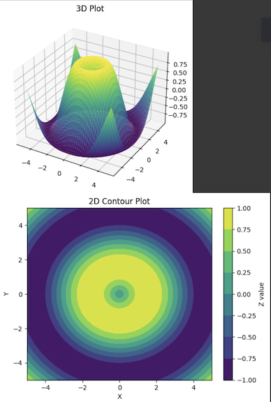
The 3D plot helps to plot the data in three dimensions, but it is not easy to understand the exact height difference of the regions because of the perspective. The 2D contour plot, however, uses varying colors to reflect the dimension data (Z values), making it easier and more accurate to compare areas in the graph. More often than not, the 2D plots used are better representations and easier to understand compared to the 3D ones.
Misleading Use of Area Charts
Area charts can effectively show trends over time or the distribution of a whole into parts. However, they may be confusing if some of the areas intersect or if the accumulation scheme of the chart is not clear.
import matplotlib.pyplot as plt
import numpy as np
# Generate data
x = np.arange(0, 10, 1)
y1 = np.array([1, 2, 3, 4, 5, 6, 7, 8, 9, 10])
y2 = np.array([1, 3, 2, 5, 4, 6, 5, 7, 6, 8])
# Stacked area chart (potentially misleading)
plt.fill_between(x, y1, color='skyblue', alpha=0.5)
plt.fill_between(x, y2, color='orange', alpha=0.5)
plt.title("Misleading Stacked Area Chart")
plt.xlabel("X")
plt.ylabel("Y")
plt.show()
# Improved area chart with non-overlapping areas
plt.fill_between(x, y1, color='skyblue', alpha=0.5)
plt.fill_between(x, y1 + y2, y1, color='orange', alpha=0.5)
plt.title("Improved Stacked Area Chart")
plt.xlabel("X")
plt.ylabel("Y")
plt.show()
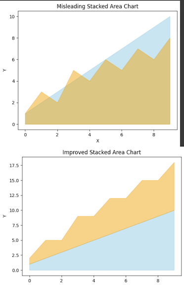
In the first area chart, the areas overlap, which can create confusion about the contribution of each category to the whole. The second plot improves clarity by stacking the areas on top of each other without overlap, clearly showing the cumulative nature of the data.
Conclusion
With Matplotlib, one has many features to solve particular visualization problems in the data analysis field. You can use it for line plots, complex data handling, large data processing, creating animated plots, and so on.
In this guide, we have explored the important aspects of Matplotlib and tried to bring them closer to solving real problems that you may face in your day-to-day programming work.
We also included detailed examples to support these applications. In whatever capacity you engage with the data, whether as a data scientist, engineer, or analyst, Matplotlib enables you to tell your data’s narrative in the best way possible.